Add Legend to Plot in Python Matplotlib & seaborn (4 Examples)
Hi! This tutorial will show how to add a legend to a plot in both Matplotlib and seaborn in the Python programming language.
Here is an overview:
Let’s jump into the Python code!
Install & Import Matplotlib & seaborn Libraries
Before we can build plots using both libraries, we need first to install and import Matplotlib and seaborn.
Therefore, in your preferred Python programming IDE, run the lines of code below to install and import Matplotlib and seaborn:
# install Matplotlib & seaborn
pip install matplotlib seaborn


# import Matplotlib & seaborn
import matplotlib.pyplot as plt
import seaborn as sn
With Matplotlib and seaborn installed and imported into our Python programming environment, we can now go on to create visualizations.
Example 1: Build Simple Line Plot in Matplotlib
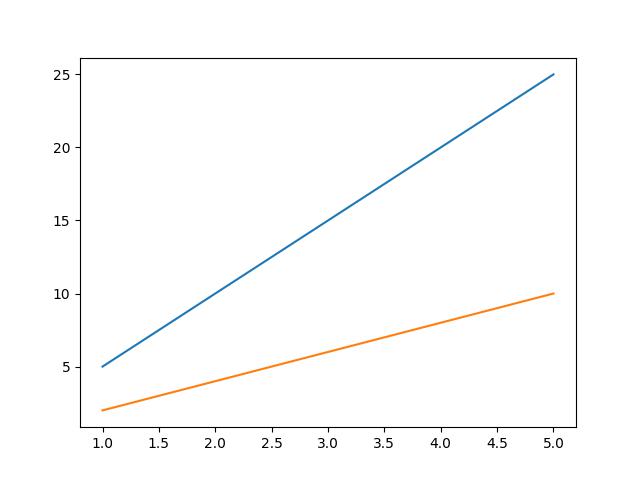
In this first example, we will build a basic line plot without a legend:
x = [1,2,3,4,5]

lineA = [5,10,15,20,25]
lineB = [2,4,6,8,10]

plt.plot(x, lineA)
plt.plot(x, lineB)

plt.show()

In the above example, two lists of data are defined: lineA and lineB. Each list contains 5 numbers, representing the y-values of the lines for each x-values in the x list.
The plt.plot() function is then called twice to create two lines on the same graph. The first argument for each call is the x list, which serves as the x-axis for the graph. The second argument for each call is the lineA and lineB lists, respectively, which provide the y-axis values for the respective lines.
Finally, plt.show() is called to display the resulting graph.
Now, let us demonstrate how to add a legend to the plot.
Example 2: Add Legend to Line Plot in Matplotlib
In this next example, we will add a legend to the line plot:
x = [1,2,3,4,5]
lineA = [5,10,15,20,25]
lineB = [2,4,6,8,10]

plt.plot(x, lineA, label = "Line A")
plt.plot(x, lineB, label = "Line B")

plt.legend()

plt.show()

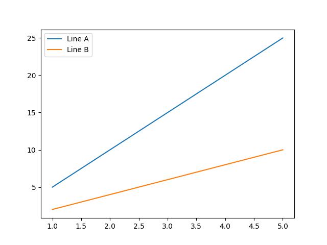
The above plot is the same as the one created in the previous example. The only difference is that, here, we have added a legend to the plot.
In the plt.plot() function, we defined a new argument label = where we parsed the legend label for each of the two lines plotted on the graph.
Next, we introduced a new function plt.legend(), which displays the legend on the plot in the top left corner as the default position. The legend position can be changed, however, that is not the focus of this tutorial.
Example 3: Build Simple Scatter Plot in seaborn
In this example, we are going to build a simple scatter plot using the seaborn library.
First, though, we will need to load the dataset that we will visualize in a scatter plot. We will make use of the tips dataset that comes pre-loaded in seaborn. Therefore, run the code below to load the dataset:
df = sns.load_dataset('tips')
If you wish, you can take a look at the first 10 rows of the DataFrame by running df.head(10).
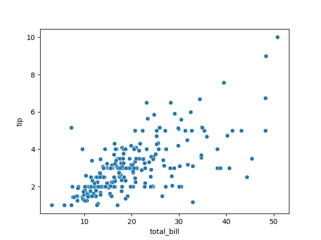
Now, we will plot the total bills column on the x-axis against the tips column on the y-axis:
sns.scatterplot(df, x = "total_bill", y = "tip")

plt.show()

The above example is a very basic scatter plot where we used sns.scatterplot() function to plot total bills against tips from the DataFrame df.
Since seaborn is built on top of Matplotlib, we also use plt.show() to display the plot figure.
Next, we will demonstrate how to add a legend to the scatter plot.
Example 4: Add Legend to Scatter Plot in seaborn
Here, we will add a legend to the scatter plot created in the previous example:
sns.scatterplot(df,x = "total_bill", y = "tip", hue = "day")

plt.legend(labels = ["Thursday", "Friday", "Saturday", "Sunday"], title = "Week Days")

plt.show()

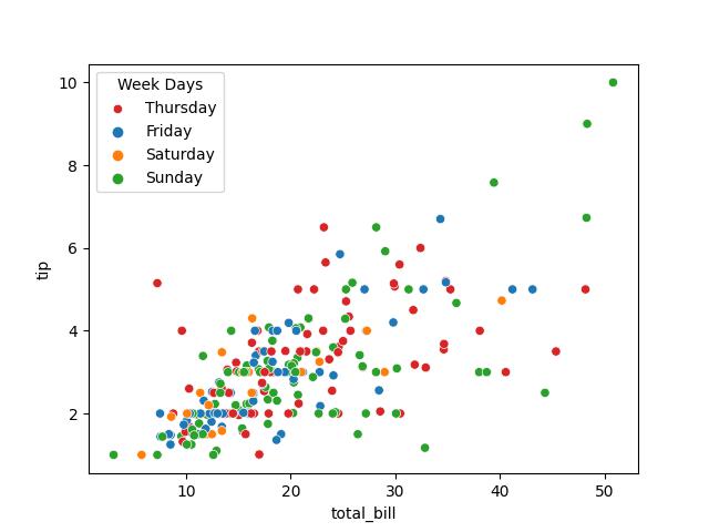
In the sns.scatterplot() function, we defined a new argument hue = to which we parsed day. That argument colored the points by the day of the week to which they belong.
Next, we introduced the plt.legend() function wherein we parsed an array of weekdays to the labels = argument and defined the legend title as well. The result is a legend displayed on the top left corner of the plot, which is the default position.
Lastly, plt.show() is used to display the plot figure.
Video, Further Resources & Summary
Do you need more explanations on how to add a legend to a plot in Python Matplotlib and seaborn? Then you should have a look at the following YouTube video of the Statistics Globe YouTube channel.
In the video, we explain in some more detail how to add a legend to plots in Python Matplotlib and seaborn.
The YouTube video will be added soon.
Furthermore, you could have a look at some other tutorials on Statistics Globe:
- Change Axis Labels of Plot in Python Matplotlib & seaborn
- Change Font Size of Plot in Python Matplotlib & seaborn
- Change Legend Size of Plot in Python Matplotlib & seaborn
- Python Overview
This post has shown how to add a legend to plots in Python Matplotlib and seaborn. In case you have further questions, you may leave a comment below.
This page was created in collaboration with Ifeanyi Idiaye. You might check out Ifeanyi’s personal author page to read more about his academic background and the other articles he has written for the Statistics Globe website.
Subscribe to the Statistics Globe Newsletter
Get regular updates on the latest tutorials, offers & news at Statistics Globe.
I hate spam & you may opt out anytime: Privacy Policy.
Thank you!
Welcome to the Statistics Globe newsletter. From now on, I’ll send you regular emails about statistics, data science, AI, and programming with R and Python.
I’m Joachim Schork. On this website, I provide statistics tutorials as well as code in Python and R programming.
Statistics Globe Newsletter
Get regular updates on the latest tutorials, offers & news at Statistics Globe. I hate spam & you may opt out anytime: Privacy Policy.
Thank you!
Please check your email inbox and click the confirmation link to complete your subscription. If you don’t see the email within a few minutes, please also check your spam/junk folder.


