Change Axis Labels of Plot in Python Matplotlib & seaborn (2 Examples)
Hi! This tutorial will show you how to replace axis labels of plots in Matplotlib and seaborn in the Python programming language.
Here is an overview:
Let’s dive into the Python code!
Install & Import Matplotlib, seaborn & pandas
If you do not have Matplotlib, seaborn, and pandas already installed in your Python environment, then in your Python coding IDE, run the lines of code below to install and import all three libraries:
# install Matplotlib, seaborn, & pandas
pip install matplotlib seaborn pandas


# import Matplotlib & seaborn
import matplotlib.pyplot as plt
import seaborn as sns
import pandas as pd
We need pandas to create the DataFrame that will be used in the examples in this tutorial. The Python pandas library is the foremost library for data manipulation and analysis in Python.
Now, with Matplotlib, seaborn, and pandas installed and imported, we will now create the example dataset that we will use in both examples.
Create Example Dataset
We will be creating a simple line plot in Matplotlib and a scatter plot in seaborn using the same dataset. Therefore, run the code below to create the example dataset:
data = {"x": [30, 35, 40, 45, 50, 55, 60, 65, 70, 75],
        "y": [240, 230, 220, 210, 200, 190, 180, 170, 160, 150]}


df = pd.DataFrame(data)


print(df)

      x    y
# 0  30  240
# 1  35  230
# 2  40  220
# 3  45  210
# 4  50  200
# 5  55  190
# 6  60  180
# 7  65  170
# 8  70  160
# 9  75  150
We first created a dictionary object, and then parsed that to the pd.DataFrame() method to create the DataFrame.
So, now that we have created the example dataset, let us build basic visualizations to demonstrate how to transform the axis labels of plots in Matplotlib and seaborn.
Example 1: Set Axis Labels of Plot in Matplotlib
In this example, we will first build a basic line plot without axis labels, and then demonstrate how to include axis labels subsequently. Therefore, run the code below to build the line plot:
plt.plot(df["x"],df["y"])

plt.show()
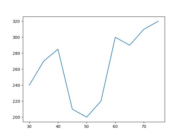
In the above example, we created a simple line plot without axis labels. We simply parsed the X and Y columns of the DataFrame to the plot() function. The plot was then outputted to the console using plt.show().
Next, we will demonstrate how to add axes labels to the plot above. So, in your IDE, run the code below to modify the above plot:
plt.plot(df["x"],df["y"])

plt.xlabel("Average Age")

plt.ylabel("Calorie Consumption")

plt.show()
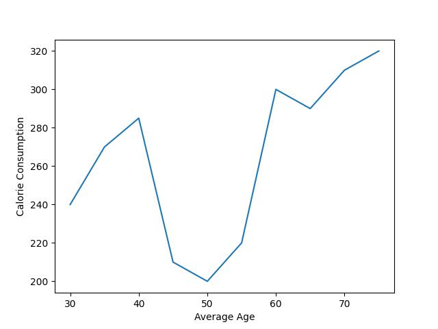
As you can see, we have added X and Y axis labels to the plot. We used the xlabel() function to add a label to the X axis, and the ylabel() function to add a label to the Y axis.
There are other parameter arguments that can be defined in both functions, such as to change the font type, but that is not the focus of this tutorial. You can, however, explore the functions to learn about those other arguments.
Example 2: Set Axis Labels of Plot in seaborn
In this example, we will build a basic scatter plot in seaborn with default axis labels and then demonstrate how to change the axis labels of the plot. Therefore, run the code below to build the scatter plot:
sns.scatterplot(df, x = "x", y = "y")


plt.show()
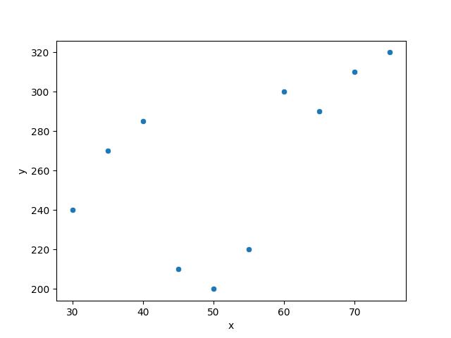
As demonstrated by the above plot, the axes are given the default labels of “x” and “y” because those are the titles of the two columns in our DataFrame that we parsed to the sns.scatterplot() function.
Next, we will demonstrate how to change the axis labels in the above plot. So in your IDE, run the code below to modify the plot:
sns.scatterplot(df, x = "x", y = "y")

plt.xlabel("Average Age")

plt.ylabel("Calorie Consumption")

plt.show()
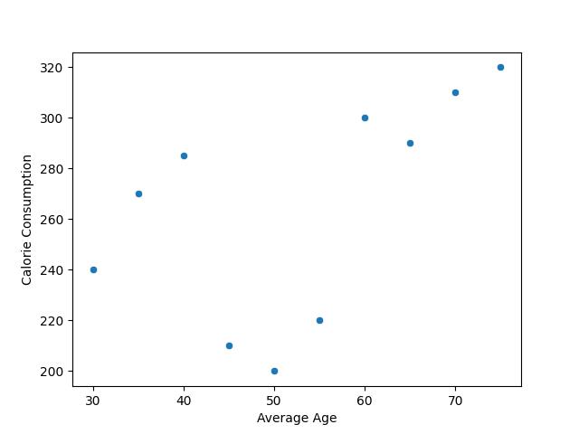
As you would notice in the above plot, we have replaced the axis labels of the previous plot using the plt.xlabel() and plt.ylabel() functions.
You would also notice that the code is very similar to the ones we used in the Matplotlib examples. That is because seaborn is a library built on top of Matplotlib. It uses the same concepts and principles to create more fancy-looking plots than the ones created in Matplotlib.
Video, Further Resources & Summary
Do you need more explanations on how to change the axis labels of plots in both Matplotlib and seaborn in Python? Then you should take a look at the following YouTube video of the Statistics Globe YouTube channel.
In the video, we explain in some more detail how to change the axis labels of plots in both Matplotlib and seaborn in Python.
The YouTube video will be added soon.
So, with these examples, we have demonstrated how to change or set the axis labels of plots in both Matplotlib and seaborn in Python. I do hope you found this tutorial helpful!
- Add Legend to Plot in Python Matplotlib & seaborn (4 Examples)
- Change Font Size of Plot in Python Matplotlib & seaborn
- Introduction to Python Programming
This post has shown how to change the axis labels of plots in both Matplotlib and seaborn in Python.
In the present tutorial, we have modified the axis labels of a line plot and a scatterplot. However, you may use the same syntax to change the axis labels of other types of plots such as boxplots, histograms, heatmaps, density plots, and so on.
In case you have further questions, you may leave a comment below.

This page was created in collaboration with Ifeanyi Idiaye. You might check out Ifeanyi’s personal author page to read more about his academic background and the other articles he has written for the Statistics Globe website.

I’m Joachim Schork. On this website, I provide statistics tutorials as well as code in Python and R programming.
Statistics Globe Newsletter
Get regular updates on the latest tutorials, offers & news at Statistics Globe. I hate spam & you may opt out anytime: Privacy Policy.