Scale Bars of Stacked Barplot to a Sum of 100 Percent in R (2 Examples)
On this page you’ll learn how to convert all bars of a barplot to 100% in R.
The article will consist of these topics:
Let’s dive right in.
Example Data & Basic Plot
We’ll use the following data as basement for this R tutorial:
set.seed(2657984)                   # Create data frame
data <- matrix(round(rnorm(15, 100, 50), 0), ncol = 3)
colnames(data) <- c("Gr1", "Gr2", "Gr3")
rownames(data) <- LETTERS[1:5]
data                                # Print data frame
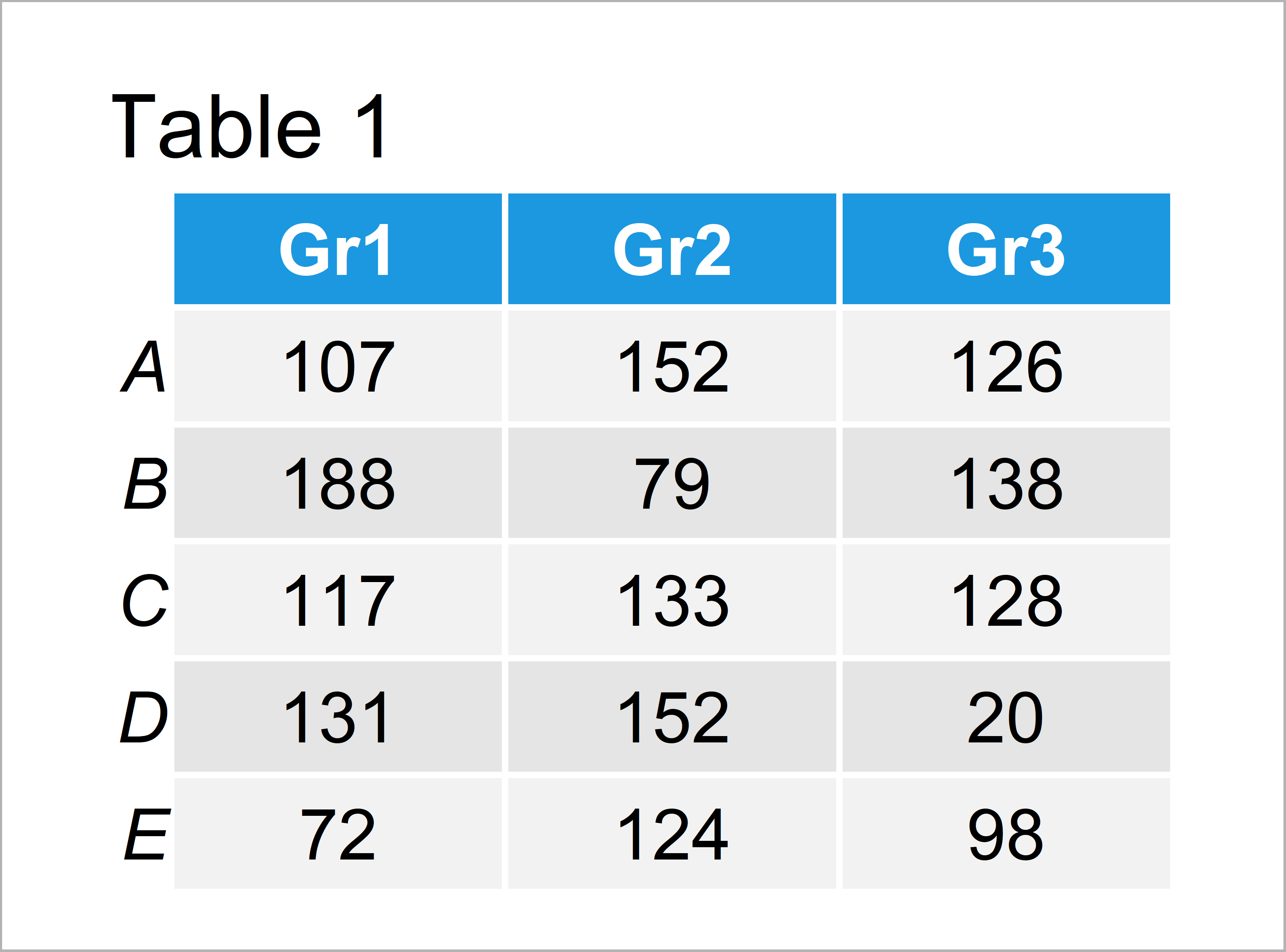
Have a look at the table that got returned by the previous R syntax. It shows that our example data is made up of five data points and three columns.
Example 1: Draw Stacked Barchart Scaled to 1.00 Using Base R
In Example 1, I’ll illustrate how to create a stacked barplot where each bar is scaled to a sum of 1.00 using the basic installation of the R programming language.
First, let’s create a default bargraph where we don’t modify the sum of each bar:
barplot(data) # Create regular barplot
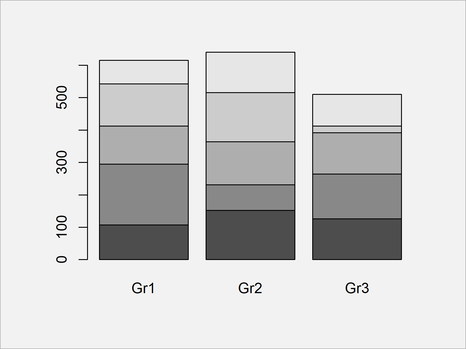
Figure 1 shows the output of the previous R syntax: A Base R barchart with uneven bars.
If we now want to create a barplot where each bar is scaled to 1.00, we can use the prop.table function as shown below:
barplot(prop.table(data, 2)) # Create barplot scaled to 100%
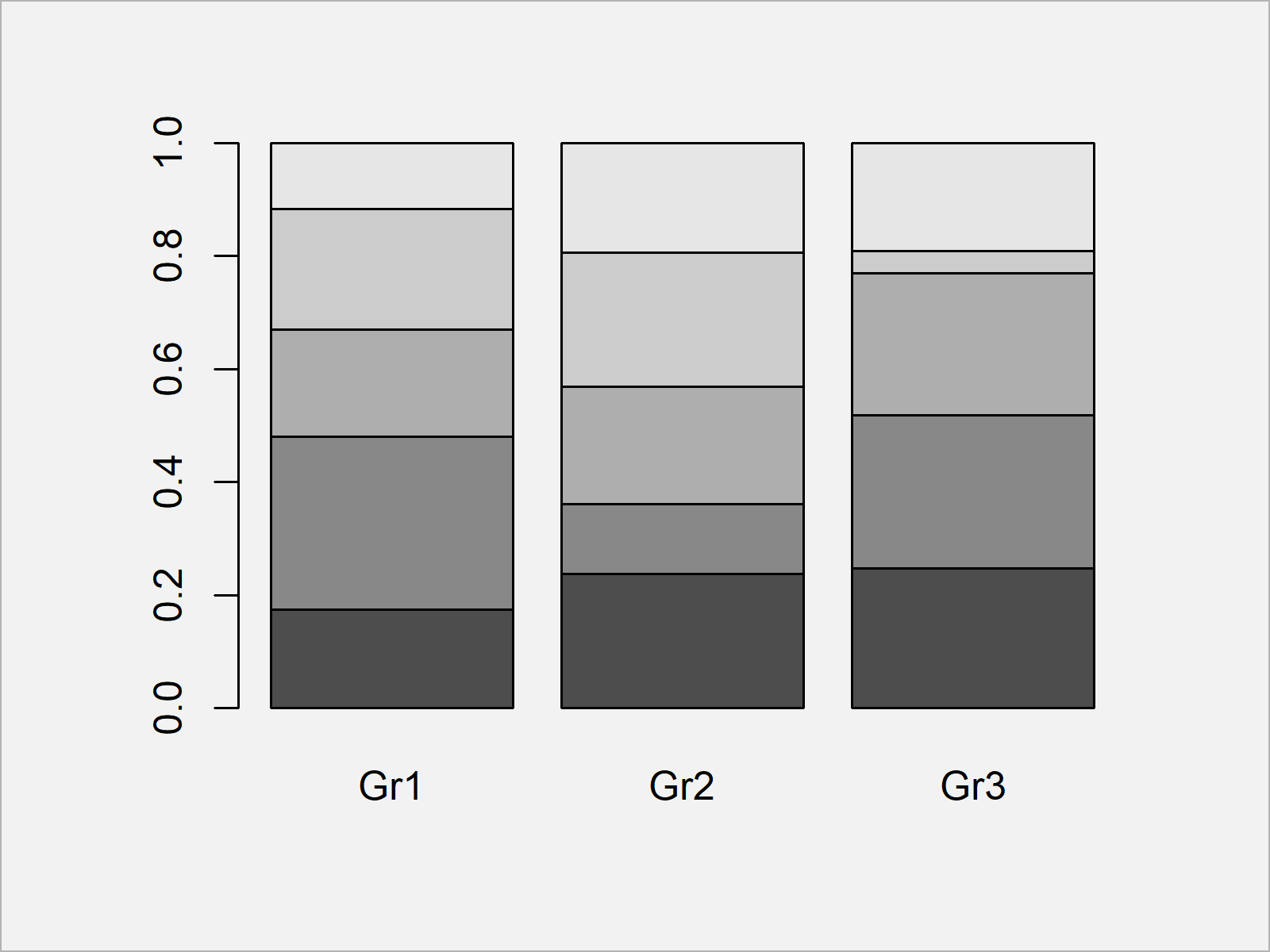
Figure 2 illustrates the output of the previous R syntax – As you can see, all stacked bars were aligned to 1.00. In other words: We are showing the proportions for each category.
Example 2: Draw Stacked Barchart Scaled to 1.00 & 100% Using ggplot2 Package
In Example 2, I’ll show how to use the ggplot2 package to create a stacked barchart where each bar is scaled to a sum of 1.
For this, we first have to reshape our data frame from wide to long format using the reshape2 package.
We first have to install and load the reshape2 package, if we want to use the functions that are contained in the add-on package:
install.packages("reshape2")        # Install & load reshape2 package
library("reshape2")
Now, we can apply the melt function to transform our data to long format:
data_long <- as.data.frame(data)    # Reshape data from wide to long
data_long$subgroup <- rownames(data_long)
data_long <- melt(data_long, id.vars = "subgroup")
data_long                           # Printing long data
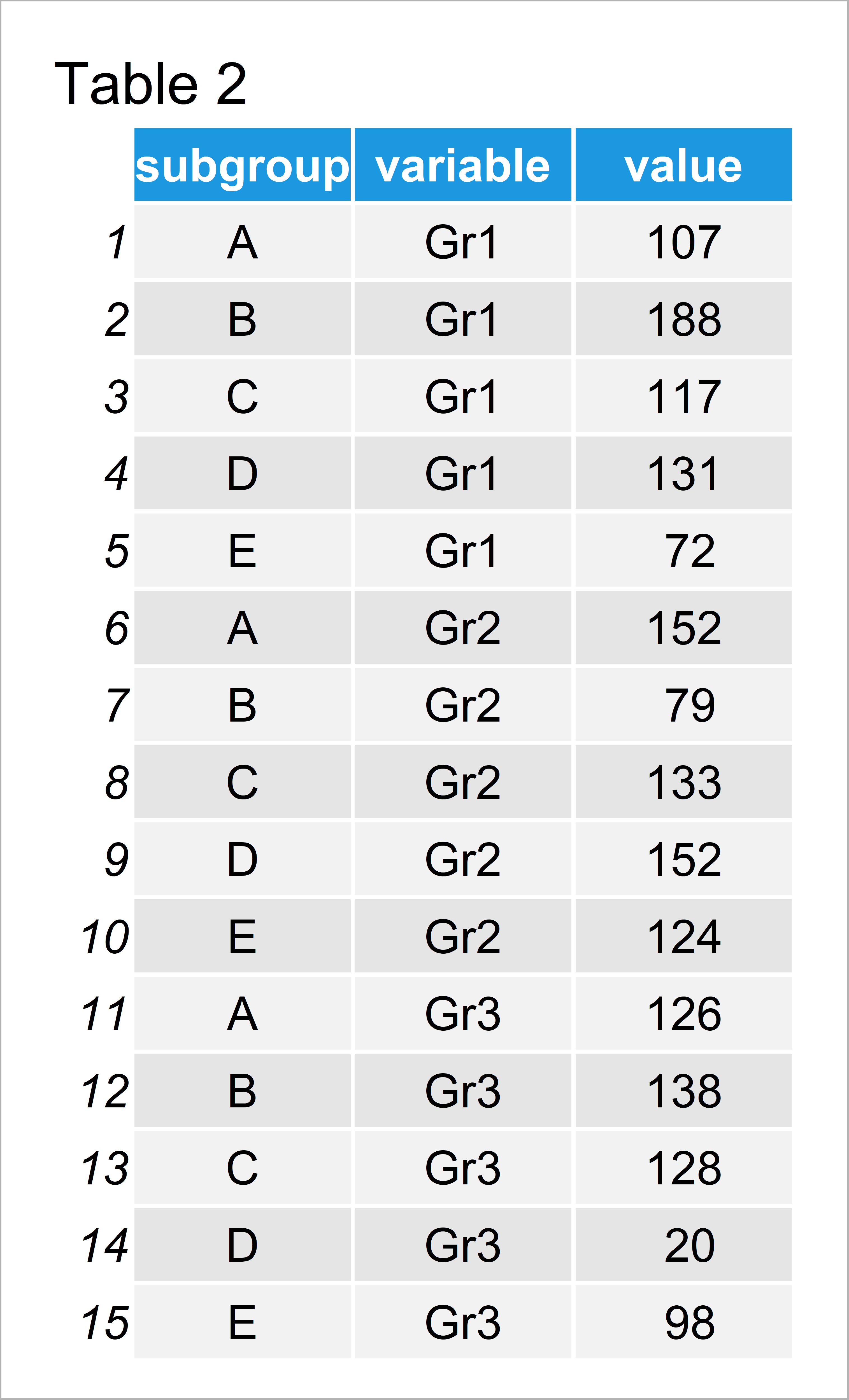
Table 2 shows the structure of our reshaped data frame.
As next step, we have to install and load the ggplot2 package:
install.packages("ggplot2")         # Install ggplot2 package
library("ggplot2")                  # Load ggplot2 package
Now, we can use the ggplot and geom_bar functions to create a barchart where each stacked bar is summed up to 1.00. Note that we are setting the position argument within the geom_bar function to be equal to “fill”:
ggp <- ggplot(data_long,            # Create ggplot2 plot scaled to 1.00
              aes(x = variable,
                  y = value,
                  fill = subgroup)) +
  geom_bar(position = "fill", stat = "identity")
ggp                                 # Draw ggplot2 plot scaled to 1.00
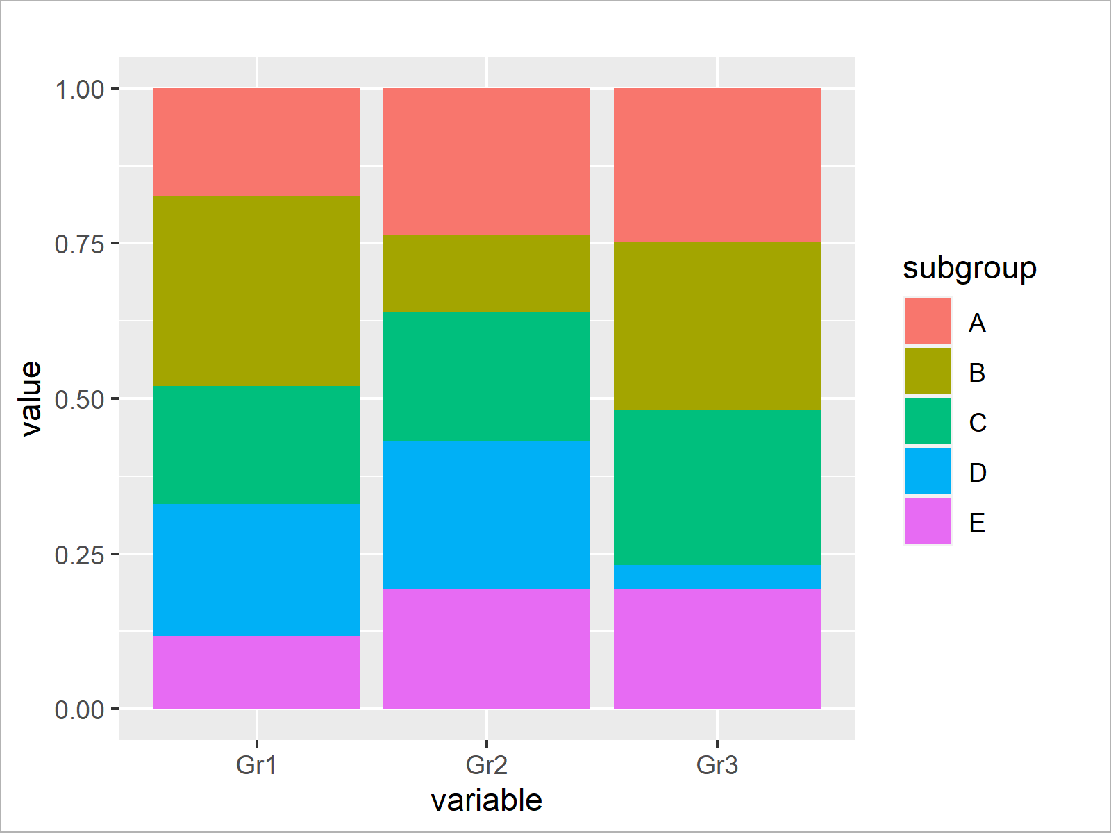
As shown in Figure 3, we have created a stacked barplot where all stacked bars sum up to 1.00 with the previous R programming code.
We can also modify the y-axis of our barchart to be displayed in percentages:
ggp +                               # Draw ggplot2 plot scaled to 100%
  scale_y_continuous(labels = scales::percent_format())
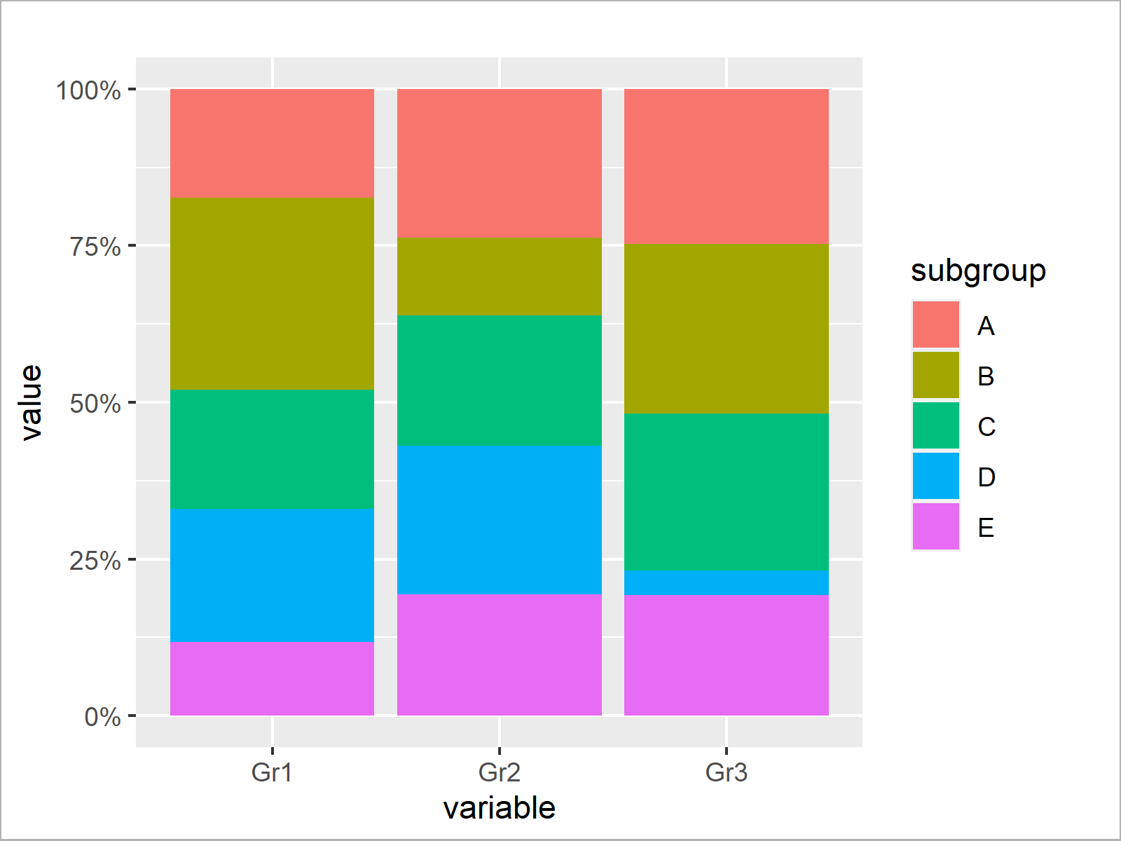
As shown in Figure 4, the previous R programming syntax created a stacked barchart with percentages on the y-axis.
Video, Further Resources & Summary
Have a look at the following video of my YouTube channel. I’m showing the R codes of this article in the video.
In addition, you might want to read the related tutorials of this website. Please find some tutorials about graphics in R here:
- Draw Stacked Barplot in R
- Plot Frequencies on Top of Stacked Bar Chart with ggplot2
- How to Create Barchart & Bargraph in R
- Plots in R
- Introduction to R Programming
In this article, I explained how to create a stacked barchart where each bar is scaled to 100 percent over all factor levels and labels in R. Let me know in the comments section below, in case you have additional questions.


