Keep Unused Factor Levels in ggplot2 Barplot in R (Example)
This tutorial shows how to draw a ggplot2 barplot containing empty factor levels in R programming.
The content of the tutorial is structured like this:
With that, let’s dive right in:
Exemplifying Data, Add-On Packages & Basic Graph
As a first step, we’ll have to create some data that we can use in the example code later on:
data <- data.frame(x = letters[1:5],          # Example data
                   y = c(2, 0, 4, 3, 0))
data <- data[data$y > 0, ]
data                                          # Return data
#   x y
# 1 a 2
# 3 c 4
# 4 d 3
The previous output of the RStudio console shows the structure of our example data – a data frame containing two columns. The first variable defines the groups of our barplot and the second variable the corresponding values.
If we want to plot the data with the ggplot2 package, we also need to install and load ggplot2:
install.packages("ggplot2")                   # Install ggplot2 package
library("ggplot2")                            # Load ggplot2 package
Now, we can draw the data as follows:
ggp <- ggplot(data, aes(x, y, fill = x)) +    # Create barchart without 0-levels
  geom_bar(stat = "identity")
ggp                                           # Draw barplot

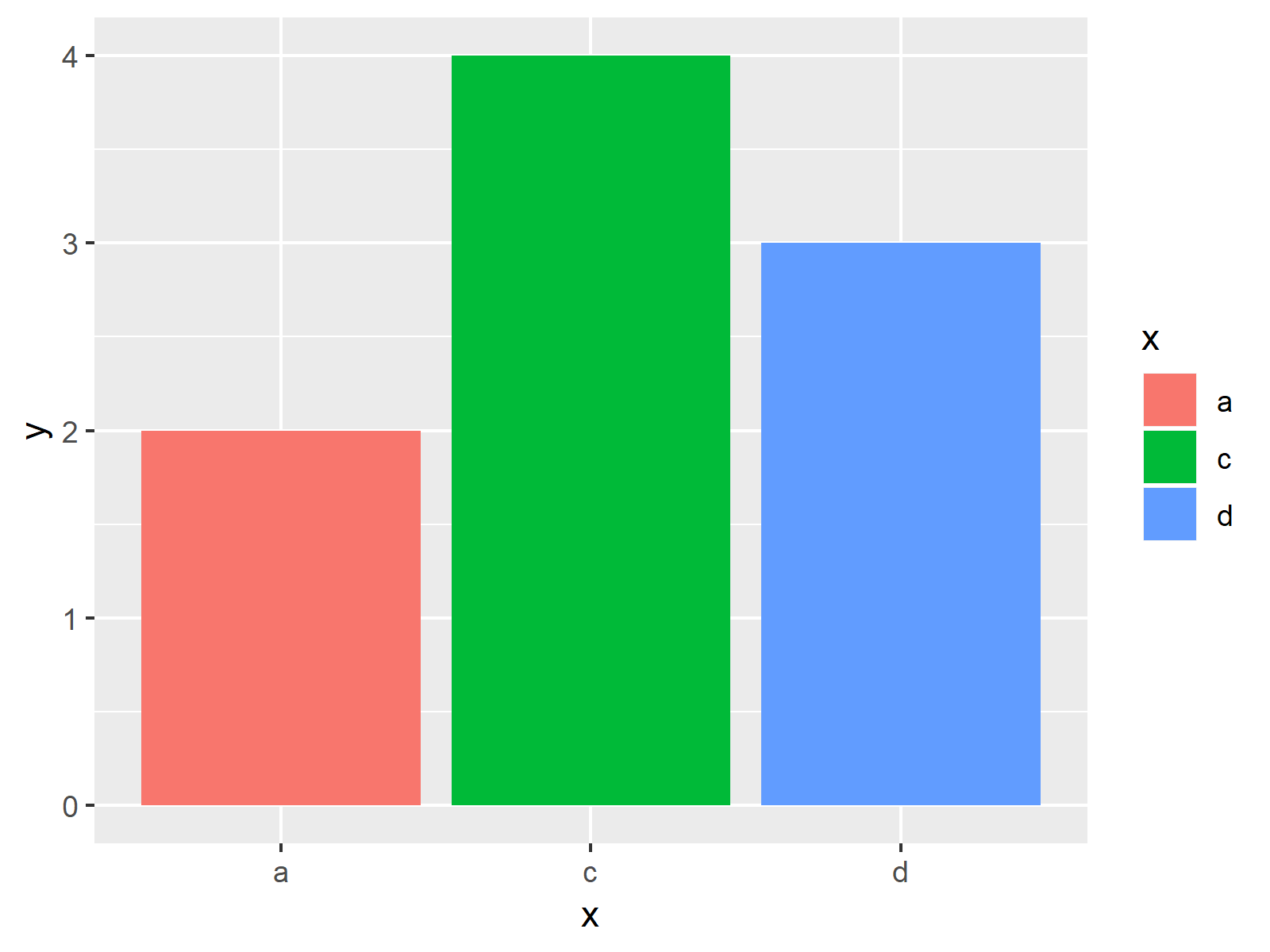
Figure 1 illustrates the output of the previous R code: A barplot showing only factor levels with values larger than 1.
Example: Keep Empty Factor Levels in Barplot
The R code below illustrates how to print a barchart that keeps factor levels with a value of 0. For this task, we have to use the scale_x_discrete function. Within the scale_x_discrete, we have to specify the argument drop to be equal to FALSE:
ggp +                                         # Create barchart with empty factors
  scale_x_discrete(drop = FALSE)

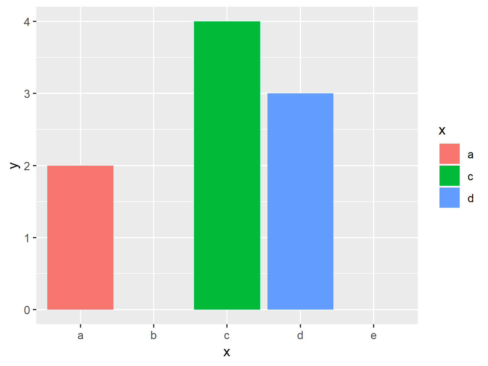
As shown in Figure 2, the previous R programming code created a barchart with empty factor levels.
Video & Further Resources
Do you want to learn more about drawing barcharts with the ggplot2 package? Then you might watch the following video of my YouTube channel. I explain the R programming syntax of this article in the video:
In addition, you might want to have a look at the related articles of my homepage.
- Change Y-Axis to Percentage Points in ggplot2 Barplot
- Add Count Labels on Top of ggplot2 Barchart
- Plot Frequencies on Top of Stacked Bar Chart with ggplot2
- R Graphics Gallery
- The R Programming Language
In this article you learned how to create a barchart that shows empty factor levels in R programming. If you have additional comments and/or questions, let me know in the comments.


