Draw Normal, Left & Right Skewed Distributions in R (2 Examples)
In this tutorial you’ll learn how to plot normal, left, and right skewed densities in R.
The article will consist of this:
Here’s the step-by-step process:
Creating Exemplifying Data
In the first place, let’s define some example data:
set.seed(35486)                    # Create random distributions
data <- data.frame(x1 = rbeta(1000, 10, 2),
                   x2 = rbeta(1000, 5, 2),
                   x3 = rnorm(1000),
                   x4 = rbeta(1000, 2, 5),
                   x5 = rbeta(1000, 2, 10))
head(data)                         # Print head of data
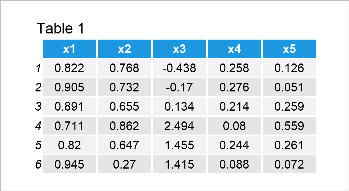
Have a look at the previous table. It reveals the upper rows of our example data, and that our data consists of the five numerical columns “x1”, “x2”, “x3”, “x4”, and “x5”.
Note that we have used the rbeta function to create the variables x1, x2, x4, and x5 (i.e. the left and right skewed variables). The rnorm function was used to create a normally distributed variable.
Let’s draw these data!
Example 1: Plot Normal, Left & Right Skewed Distributions Using Base R
This example explains how to use the basic installation of the R programming language to plot normal, left, and right skewed densities.
To accomplish this, we have to use the plot and lines functions as shown below. Furthermore, I’m creating a legend using the legend() function.
Have a look at the following R code:
plot(density(data$x1), col = 2,    # Overlay all columns as densities
     xlim = c(- 3, 3),
     ylim = c(0, 5))
lines(density(data$x2), col = 3)
NA
lines(density(data$x3), col = 4)
lines(density(data$x4), col = 5)
lines(density(data$x5), col = 6)
legend("topleft",                  # Add legend to plot
       legend = c("x1 = rbeta(1000, 10, 2)",
                  "x2 = rbeta(1000, 5, 2)",
                  "x3 = rnorm(1000)",
                  "x4 = rbeta(1000, 2, 5)",
                  "x5 = rbeta(1000, 2, 10)"),
       col = 2:6,
       lty = 1,
       cex = 0.8)
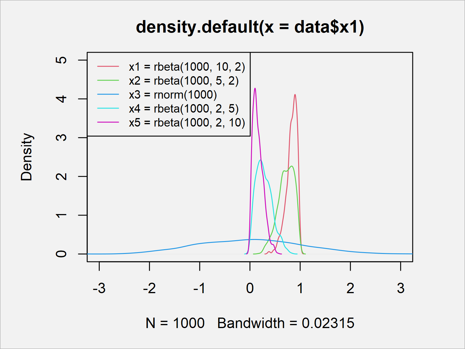
The output of the previous R syntax is shown in Figure 1: A Base R plot containing five overlaid densities and a legend.
As you can see, two of the densities are skewed to the left, two are skewed to the right, and one density is normally distributed.
Example 2: Plot Normal, Left & Right Skewed Distributions Using ggplot2 Package
This example demonstrates how to use the ggplot2 package to create a plot with skewed distributions.
To be able to use the functions of the ggplot2 package, we first have to install and load ggplot2:
install.packages("ggplot2")        # Install ggplot2 package
library("ggplot2")                 # Load ggplot2 package
Furthermore, we have to reshape our data from wide to long format.
We can do that using the tidyr package. To be able to use the functions of the tidyr package, we first need to install and load tidyr.
install.packages("tidyr")          # Install & load tidyr
library("tidyr")
In the next step, we can transform our data frame from wide to long format using the pivot_longer function:
data_long <- data %>%              # Convert wide to long data
  pivot_longer(colnames(data)) %>%
  as.data.frame()
head(data_long)                    # Head of long data
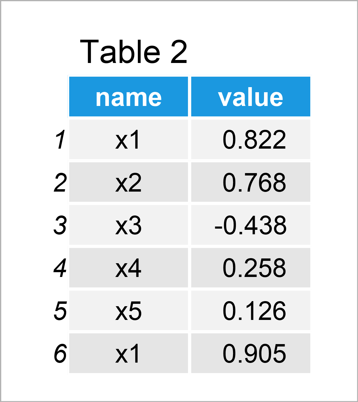
Table 2 shows the output of the previously shown R syntax – A new data frame containing our data in long format.
Next, we can use this data frame to create a ggplot2 plot containing multiple overlaid densities – Some of them skewed to the left, some of them skewed to the right, and one normally distributed density:
ggplot(data_long,                  # Draw all densities in ggplot2 plot
       aes(value,
           fill = name)) +
  geom_density(alpha = 0.25)
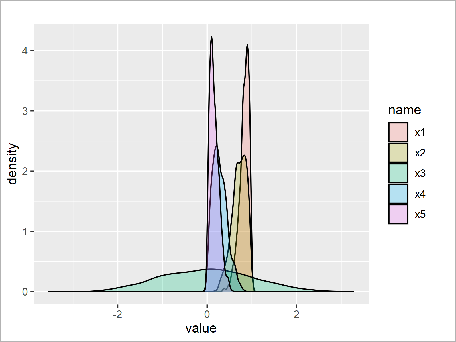
As shown in Figure 2, we have plotted a graphic containing densities for all columns of our input data frame by executing the previous syntax.
Video & Further Resources
Do you need more info on the R programming code of this tutorial? Then I recommend watching the following video on my YouTube channel. I show the contents of this tutorial in the video.
In addition, you may have a look at the related tutorials on https://www.statisticsglobe.com/. I have published several articles already:
In summary: In this tutorial, I have shown how to draw normal, left, and right skewed distributions in the R programming language. Let me know in the comments below, in case you have additional questions.
Subscribe to the Statistics Globe Newsletter
Get regular updates on the latest tutorials, offers & news at Statistics Globe.
I hate spam & you may opt out anytime: Privacy Policy.
Thank you!
Welcome to the Statistics Globe newsletter. From now on, I’ll send you regular emails about statistics, data science, AI, and programming with R and Python.
I’m Joachim Schork. On this website, I provide statistics tutorials as well as code in Python and R programming.
Statistics Globe Newsletter
Get regular updates on the latest tutorials, offers & news at Statistics Globe. I hate spam & you may opt out anytime: Privacy Policy.
Thank you!
Please check your email inbox and click the confirmation link to complete your subscription. If you don’t see the email within a few minutes, please also check your spam/junk folder.


