Draw Scatterplot with Labels in R (3 Examples) | Base R & ggplot2
In this post, I’ll explain how to add labels to a plot in the R programming language.
The article consists of three examples for the addition of point labels. To be more precise, the table of content looks like this:
Here’s the step-by-step process:
Creating Example Data
As a first step, we’ll have to construct some data that we can use in the exemplifying code later on:
data <- data.frame(x = 1:5,                 # Create example data
                   y = 1:5,
                   label = LETTERS[1:5])
data                                        # Return example data to console
#   x y label
# 1 1 1     A
# 2 2 2     B
# 3 3 3     C
# 4 4 4     D
# 5 5 5     E
Have a look at the previous output of the RStudio console. It shows that our exemplifying data consists of five rows and three columns. The variables x and y contain numeric values for an xyplot and the variable label contains the names for the points of the plot.
Example 1: Add Labels to Base R Scatterplot
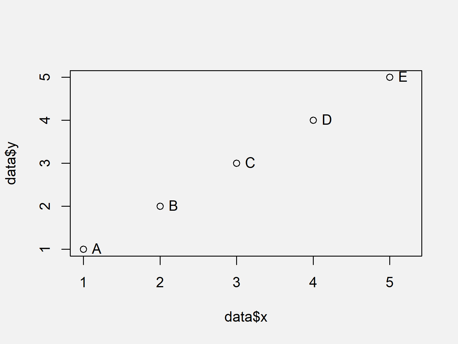
This Example illustrates how to draw labels to a plot created with the basic installation of the R programming language.
For this, we have to use the plot() and text() functions as shown below. Note that we have to increase the xlim of our plot to give enough space for the labels:
plot(data$x,                                # Draw plot
     data$y,
     xlim = c(1, 5.25))
text(data$x,                                # Add labels
     data$y,
     labels = data$label,
     pos = 4)

As shown in Figure 1, the previous syntax created a scatterplot with labels.
Example 2: Add Labels to ggplot2 Scatterplot
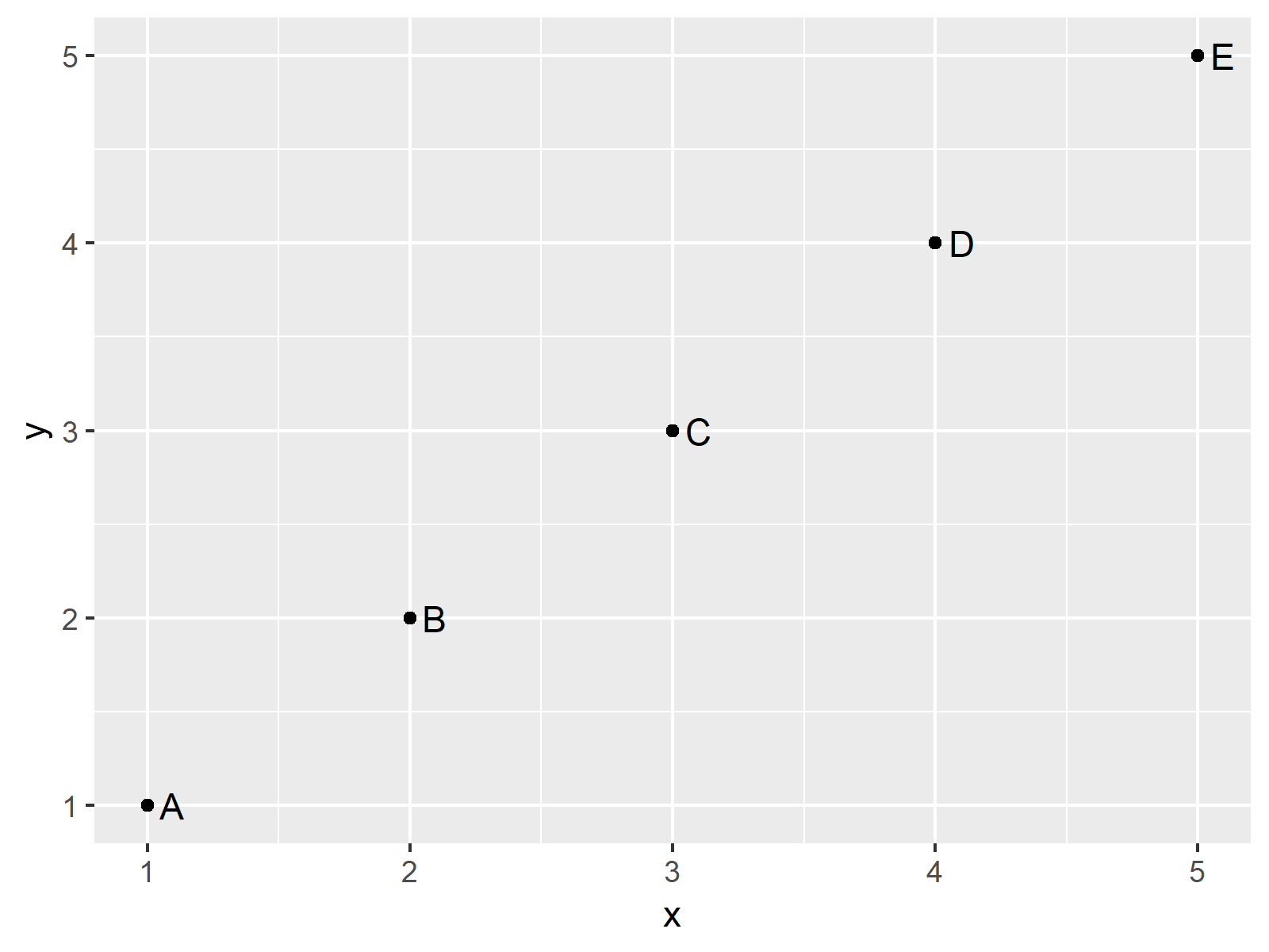
In this Example, I’ll show how to put labels on the points of a ggplot2 scatterplot created by the geom_point function.
If we want to use the functions of the ggplot2 package, we first have to install and load ggplot2:
install.packages("ggplot2")                 # Install & load ggplot2 package
library("ggplot2")
Now, we can use the geom_text function and the label argument to print labels to our xyplot:
ggplot(data, aes(x, y, label = label)) +    # ggplot2 plot with labels
  geom_point() +
  geom_text(aes(label = label), hjust = - 0.5)

As shown in Figure 2, the previous syntax created a ggplot2 scatterplot with labels.
Example 3: Add Labels to Some Points in ggplot2 Scatterplot
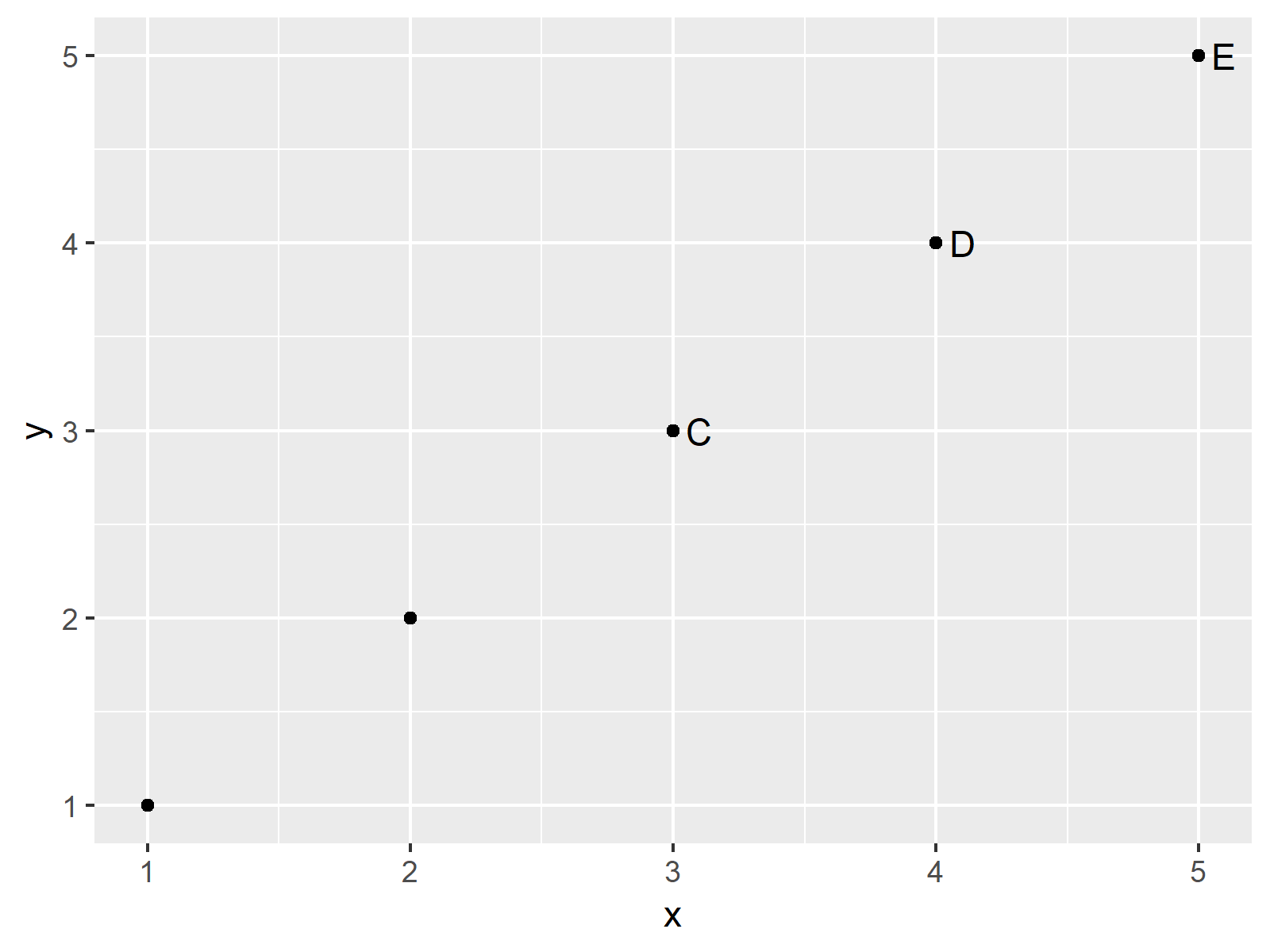
In Example 3, I’ll explain how to specify labels only for some points that fall into a specific range. For this, we have to modify our label column using the ifelse function:
ggplot(data, aes(x, y, label = label)) +    # ggplot2 with some labels
  geom_point() +
  geom_text(aes(label = ifelse(y >= 3, as.character(label), "")), hjust = - 0.5)

Figure 3 shows the output of the previously shown code: A ggplot2 graph with labels for some points of the plot.
Video, Further Resources & Summary
Have a look at the following video of my YouTube channel. In the video tutorial, I explain the R programming codes of this page in a programming session.
Furthermore, you may want to have a look at the related articles of my website. I have published several other tutorials already:
Summary: This tutorial showed how to draw selective labels to a scatterplot in the R programming language. Let me know in the comments below, in case you have further questions or comments.
Subscribe to the Statistics Globe Newsletter
Get regular updates on the latest tutorials, offers & news at Statistics Globe.
I hate spam & you may opt out anytime: Privacy Policy.
Thank you!
Please check your email inbox and click the confirmation link to complete your subscription. If you don’t see the email within a few minutes, please also check your spam/junk folder.
I’m Joachim Schork. On this website, I provide statistics tutorials as well as code in Python and R programming.
Statistics Globe Newsletter
Get regular updates on the latest tutorials, offers & news at Statistics Globe. I hate spam & you may opt out anytime: Privacy Policy.
Thank you!
Please check your email inbox and click the confirmation link to complete your subscription. If you don’t see the email within a few minutes, please also check your spam/junk folder.


