ggplot2 Barplot with Axis Break & Zoom in R (2 Examples)
In this R tutorial you’ll learn how to create a ggplot2 barchart with axis break and zoom.
The tutorial will contain the following contents:
Let’s get started:
Example Data, Packages & Default Plot
Have a look at the following example data:
data <- data.frame(group = LETTERS[1:5],      # Create example data
                   value = c(1:4, 100))
data                                          # Print example data
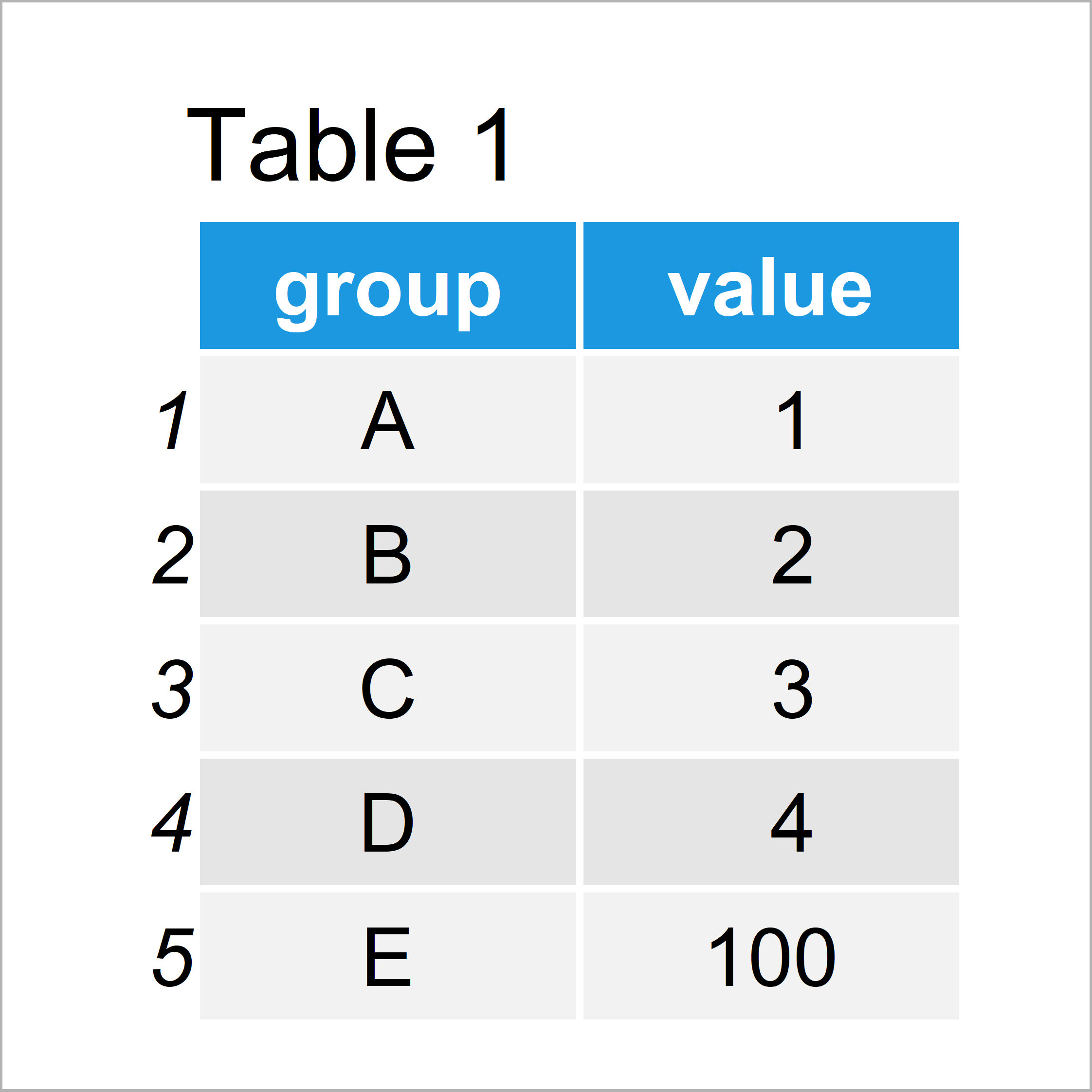
Have a look at the table that got returned after executing the previous R syntax. It shows that our example data is constituted of five rows and two columns, i.e. a grouping variable and the corresponding values.
To be able to draw our data with the ggplot2 package, we also have to install and load ggplot2:
install.packages("ggplot2")                   # Install ggplot2 package
library("ggplot2")                            # Load ggplot2
As next step, we can draw our data in a barplot:
ggplot(data, aes(group, value)) +             # ggplot2 plot without zoom
  geom_bar(stat = "identity")
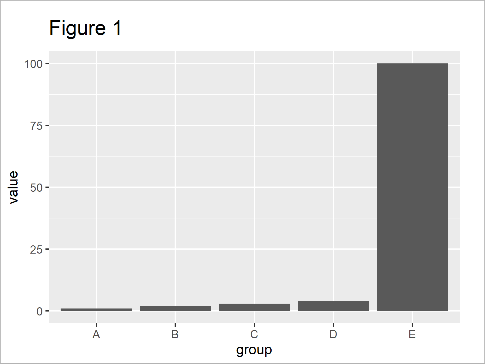
As revealed in Figure 1, we have plotted a ggplot2 barchart with default axis specifications with the previous R code.
As you can see, one of the bars is much larger/higher than the other bars. For that reason, it is difficult to compare the lower bars properly.
In the following examples, I’ll show two solutions how we can handle this problem!
Example 1: Manipulate Data to Show ggplot2 Barchart with Zoom
The following R programming syntax explains how to modify our input data frame to create a ggplot2 barplot with breaks and zoom.
Let’s modify our data:
data_zoom <- data[data$value <= 10, ]         # Manipulate data frame
data_zoom$zoom <- "zoom"
data_extended <- data
data_extended$zoom <- "all"
data_extended <- rbind(data_extended, data_zoom)
data_extended                                 # Print updated data
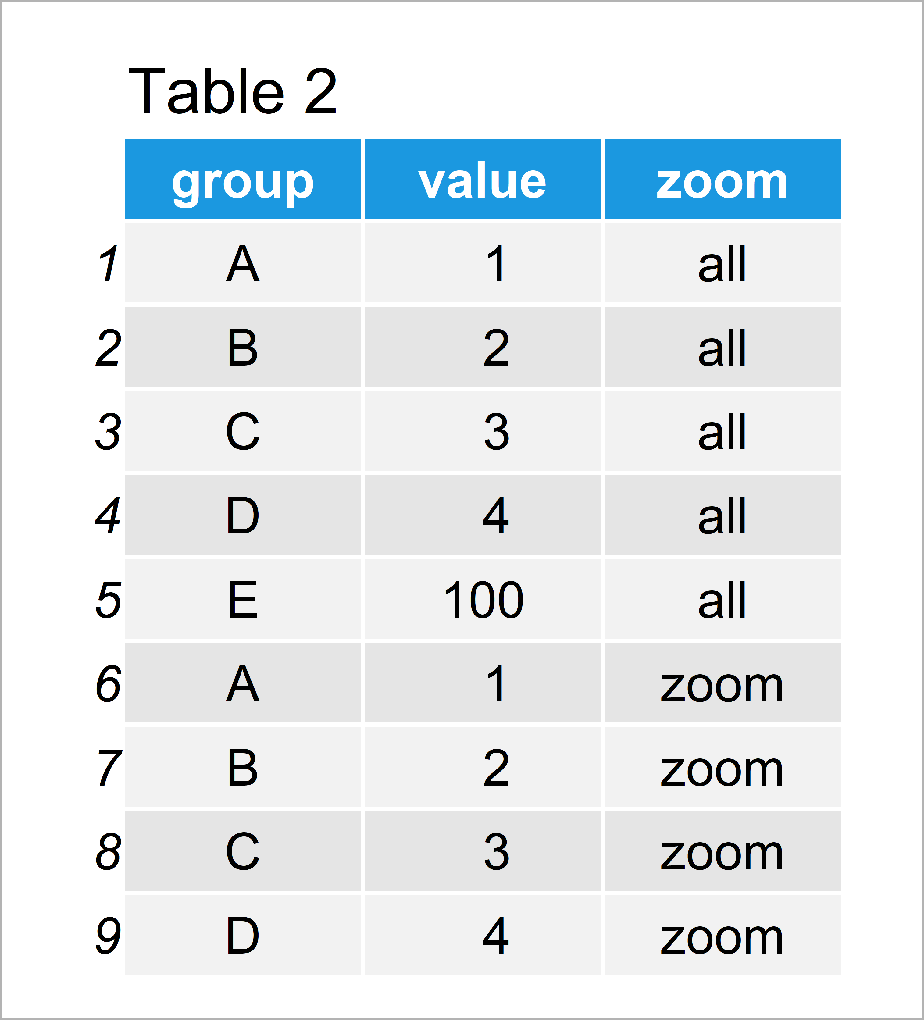
As shown in Table 2, the previous R code has created a new data frame that contains the same rows as our original data plus a duplicate of all rows where the values are below 10.
In addition to that, we have appended a new variable to our data frame that identifies our original data (i.e. “all”) and the appended subset (i.e. “zoom”).
We can now use this updated data frame to create a ggplot2 facet plot:
ggplot(data_extended, aes(group, value)) +    # ggplot2 facet_wrap plot
  geom_bar(stat = "identity") +
  facet_wrap(~ zoom, scales = "free_y")
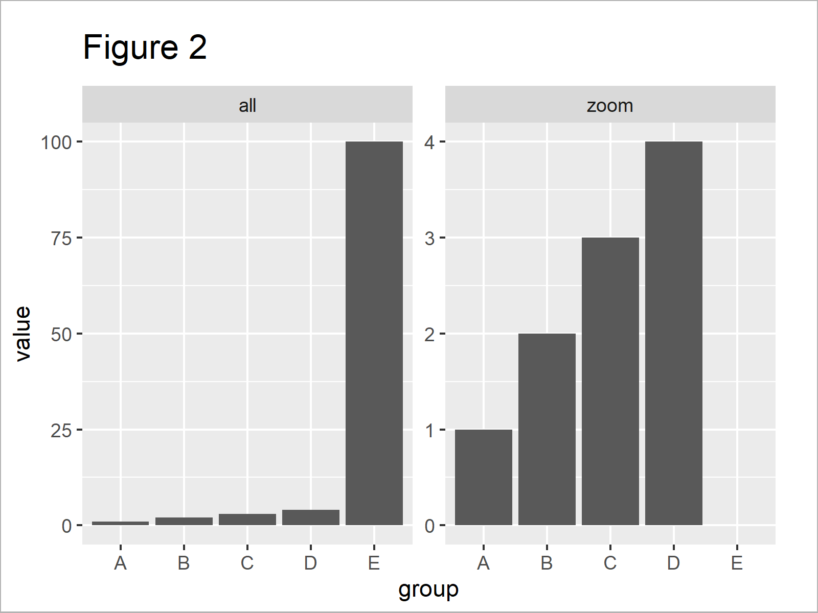
As shown in Figure 2, the previous R programming code has plotted a facet plot where the left plot panel shows our original data and the right panel shows only the subset of smaller values.
Note that the large bar was completely removed from the zoomed version of our plot.
The previous code worked fine. However, in the following Example I’ll show an even easier solution to our problem. So keep on reading!
Example 2: Use ggforce Package to Show ggplot2 Barchart with Zoom
The following R programming code illustrates how to use the ggforce package to create a zoomed version of our data.
In order to use the functions of the ggforce package, we first need to install and load ggforce.
install.packages("ggforce")                   # Install & load ggforce package
library("ggforce")
Next, we can draw our data using the facet_zoom function provided by the ggforce package:
ggplot(data, aes(group, value)) +             # ggplot2 facet_zoom plot
  geom_bar(stat = "identity") +
  geom_col() +
  facet_zoom(ylim = c(0, 10))
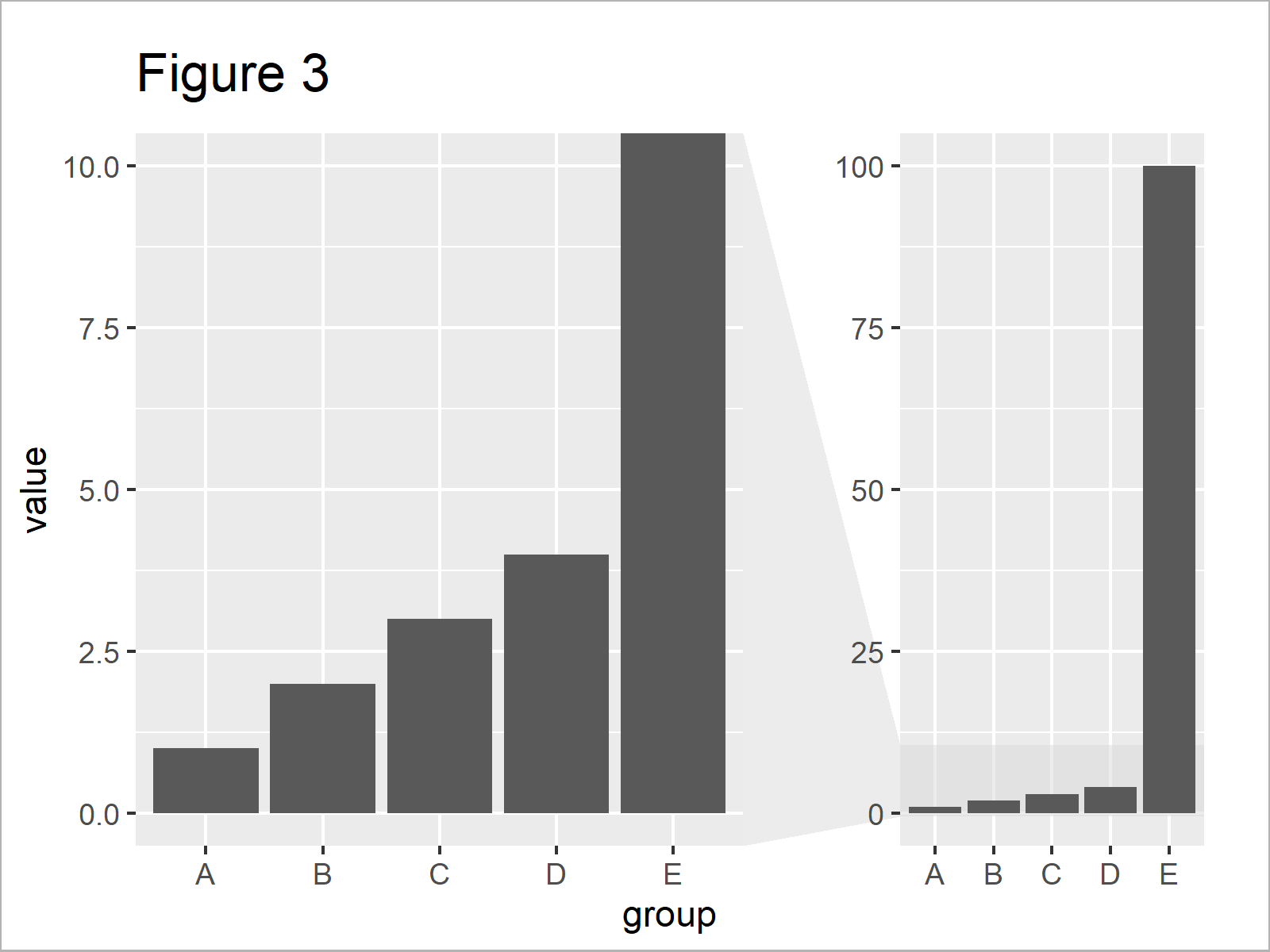
In Figure 3 it is shown that we have created a facet zoom bargraph showing our data in a zoomed version on the left side and the original unzoomed version on the right side.
Note that this time all bars are shown in the zoomed version and the high bar was cut off according to our specification of the axis limits.
Video & Further Resources
Would you like to learn more about ggplot2 graphics? Then you may want to watch the following video of my YouTube channel. In the video, I’m explaining the R codes of this article in the R programming language.
Additionally, you might have a look at the related articles on www.statisticsglobe.com. I have published several related tutorials on topics such as ggplot2, graphics in R, and labels.
- Change Space & Width of Bars in ggplot2 Barplot
- Beginner Tutorial for the ggplot2 Package
- Increase Y-Axis Scale of Barplot in R
- Change Y-Axis to Percentage Points in ggplot2 Barplot
- Keep Unused Factor Levels in ggplot2 Barplot
- Plots in R
- All R Programming Examples
Summary: In this R programming tutorial you have learned how to draw a ggplot2 bargraph with break and zoom in the axis. Don’t hesitate to let me know in the comments, if you have any further comments or questions. Besides that, please subscribe to my email newsletter to get regular updates on new tutorials.
Subscribe to the Statistics Globe Newsletter
Get regular updates on the latest tutorials, offers & news at Statistics Globe.
I hate spam & you may opt out anytime: Privacy Policy.
Thank you!
Welcome to the Statistics Globe newsletter. From now on, I’ll send you regular emails about statistics, data science, AI, and programming with R and Python.
I’m Joachim Schork. On this website, I provide statistics tutorials as well as code in Python and R programming.
Statistics Globe Newsletter
Get regular updates on the latest tutorials, offers & news at Statistics Globe. I hate spam & you may opt out anytime: Privacy Policy.
Thank you!
Please check your email inbox and click the confirmation link to complete your subscription. If you don’t see the email within a few minutes, please also check your spam/junk folder.


