Move X-Axis to Top of Plot in R (2 Examples) | Base R & ggplot2 Package
In this R tutorial you’ll learn how to put an x-axis to the top of a graph.
The page looks as follows:
Let’s dig in!
Construction of Example Data
Have a look at the following example data:
data <- data.frame(x = 1:6,         # Create example data
                   y = c(3, 1, 3, 2, 3, 4))
data                                # Print example data
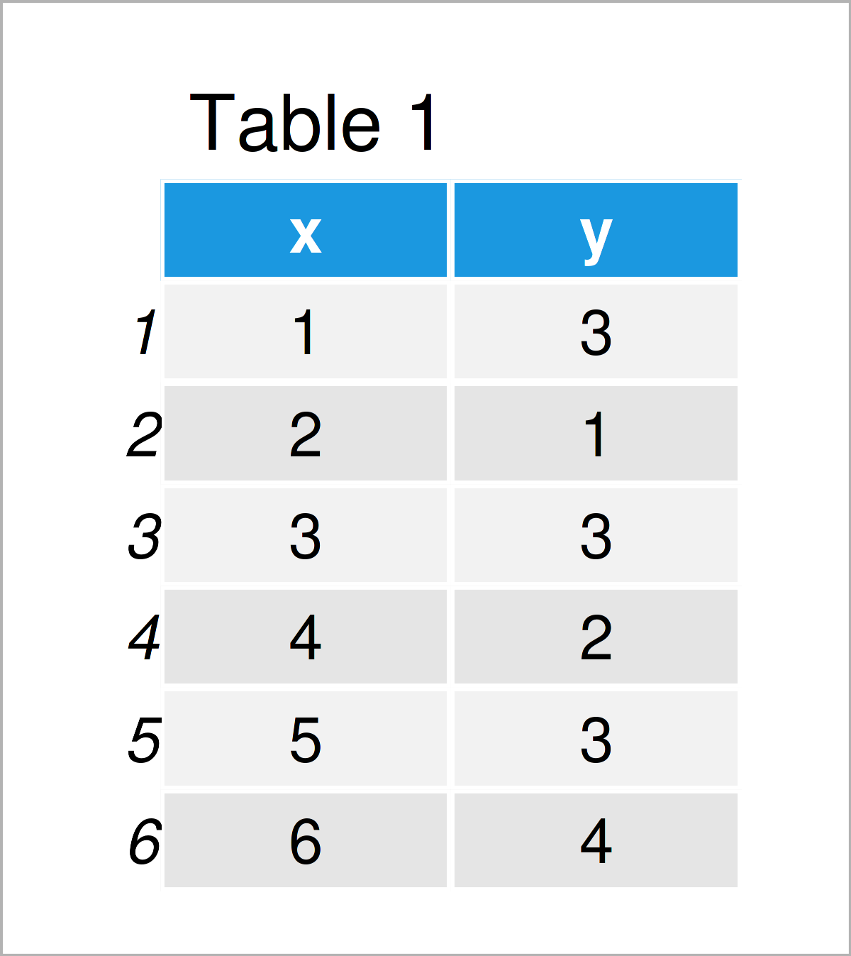
As you can see based on Table 1, our example data is a data frame and has six rows and two columns.
Example 1: Move X-Axis to Top of Base R Plot
This example illustrates how to put the x-axis values and tick marks of a Base R plot to the upper axis of the graph.
Let’s first create a Base R plot with default axis positioning:
plot(data$x, data$y) # Draw Base R plot with default x-axis
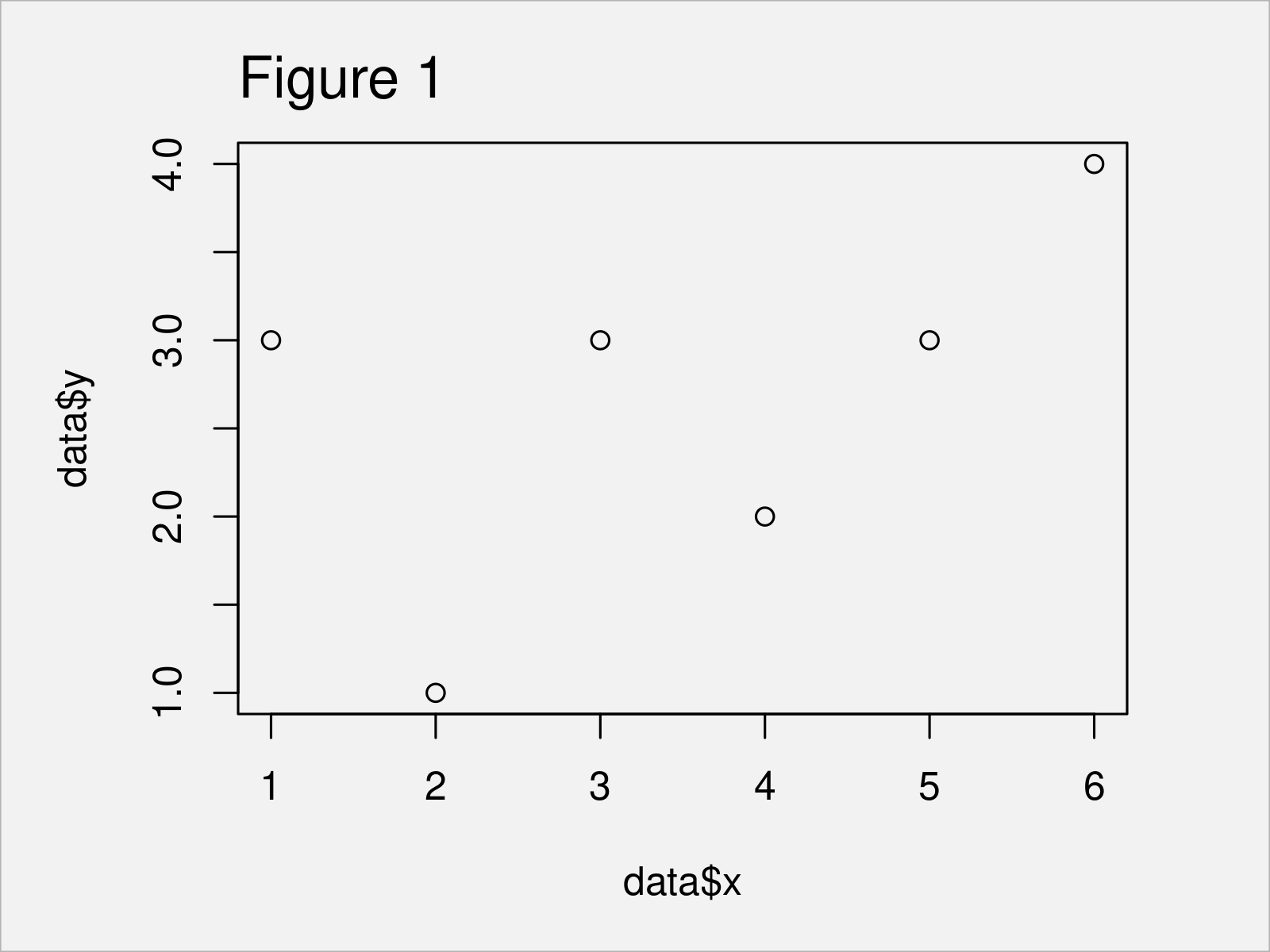
By executing the previous code we have plotted Figure 1, i.e. a Base R scatterplot with x-axis at the bottom of the plot.
If we want to switch the location of our axis to the top of the plot, we can use the xaxt argument of the plot function and the axis function as shown below:
plot(data$x, data$y,                # Move x-axis to the top
     xaxt = "n")
axis(3)
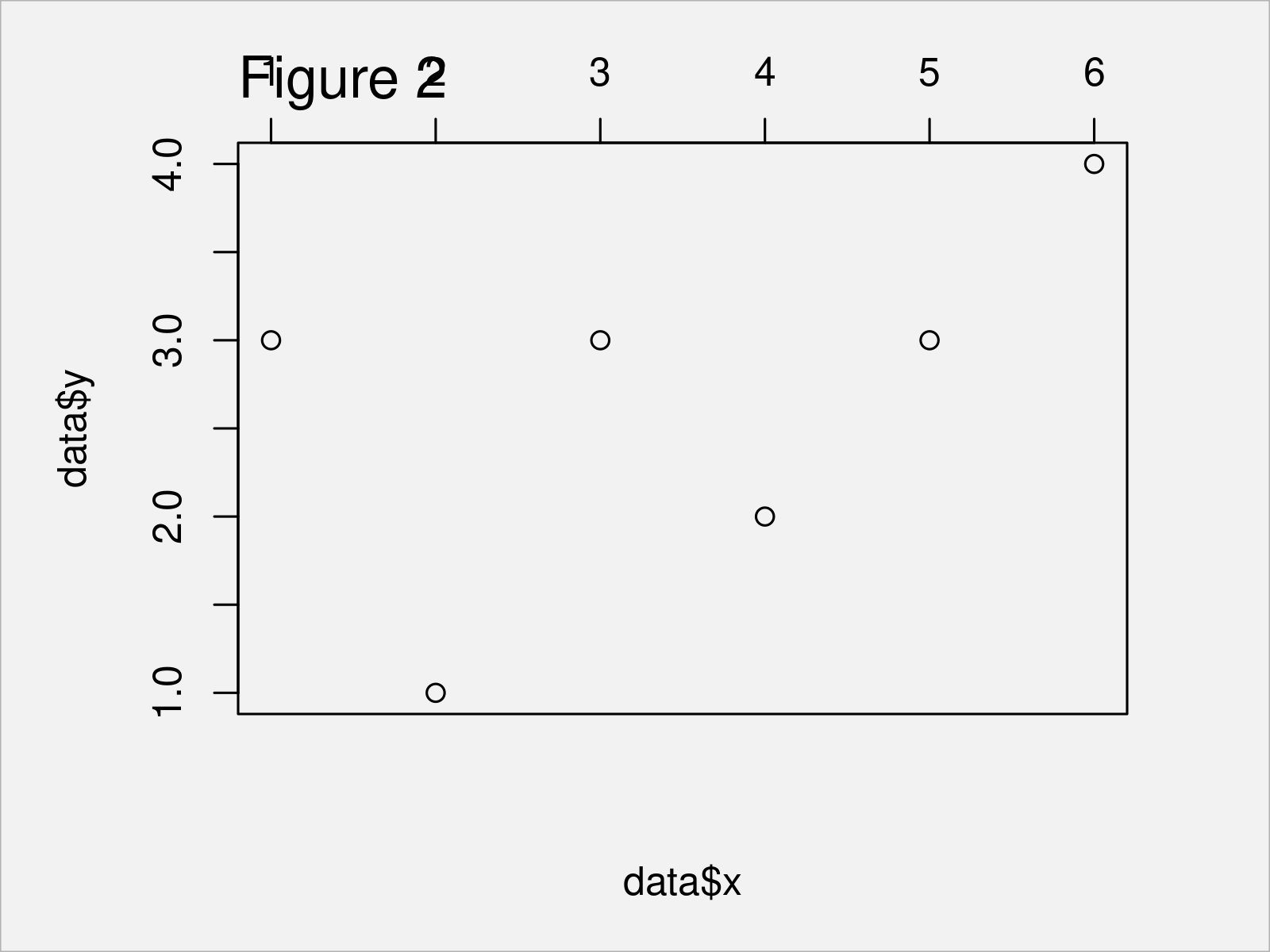
Figure 2 visualizes the output of the previously shown R programming code: A Base R graphic with x-axis on top of the plot.
Example 2: Move X-Axis to Top of ggplot2 Plot
In this example, I’ll explain how to adjust the x-axis position in a ggplot2 plot.
We first have to install and load the ggplot2 package:
install.packages("ggplot2")         # Install & load ggplot2
library("ggplot2")
In the next step, we can draw a ggplot2 plot with default axes as shown in the following R code:
ggp <- ggplot(data, aes(x, y)) +    # Draw ggplot2 plot with default x-axis
  geom_point()
ggp
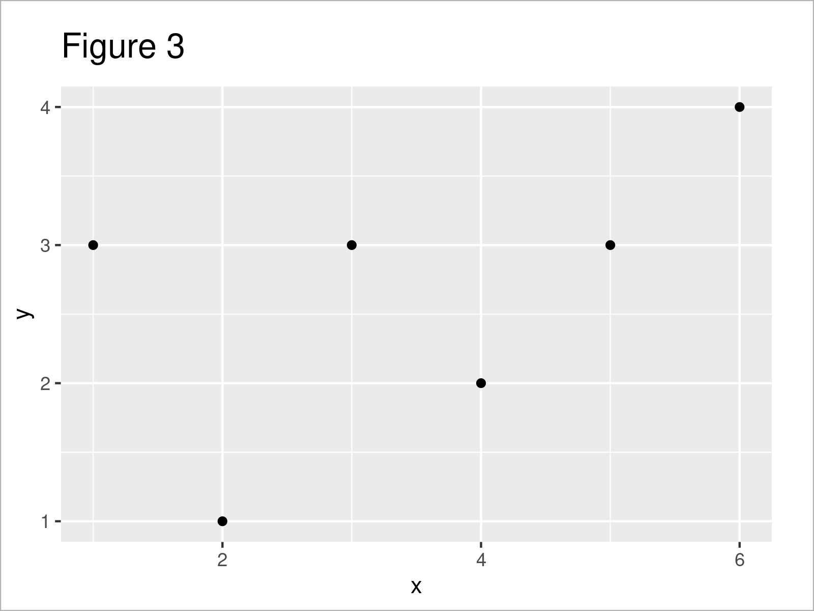
After executing the previous R code the ggplot2 scatterplot with default axes shown in Figure 3 has been created.
Next, we can use the ggp plot object that we have created with the previous R code as basis. Furthermore, we have to specify the position argument within the scale_x_continuous function to be equal to “top”.
Consider the following R code:
ggp +                               # Move x-axis to the top
  scale_x_continuous(position = "top")
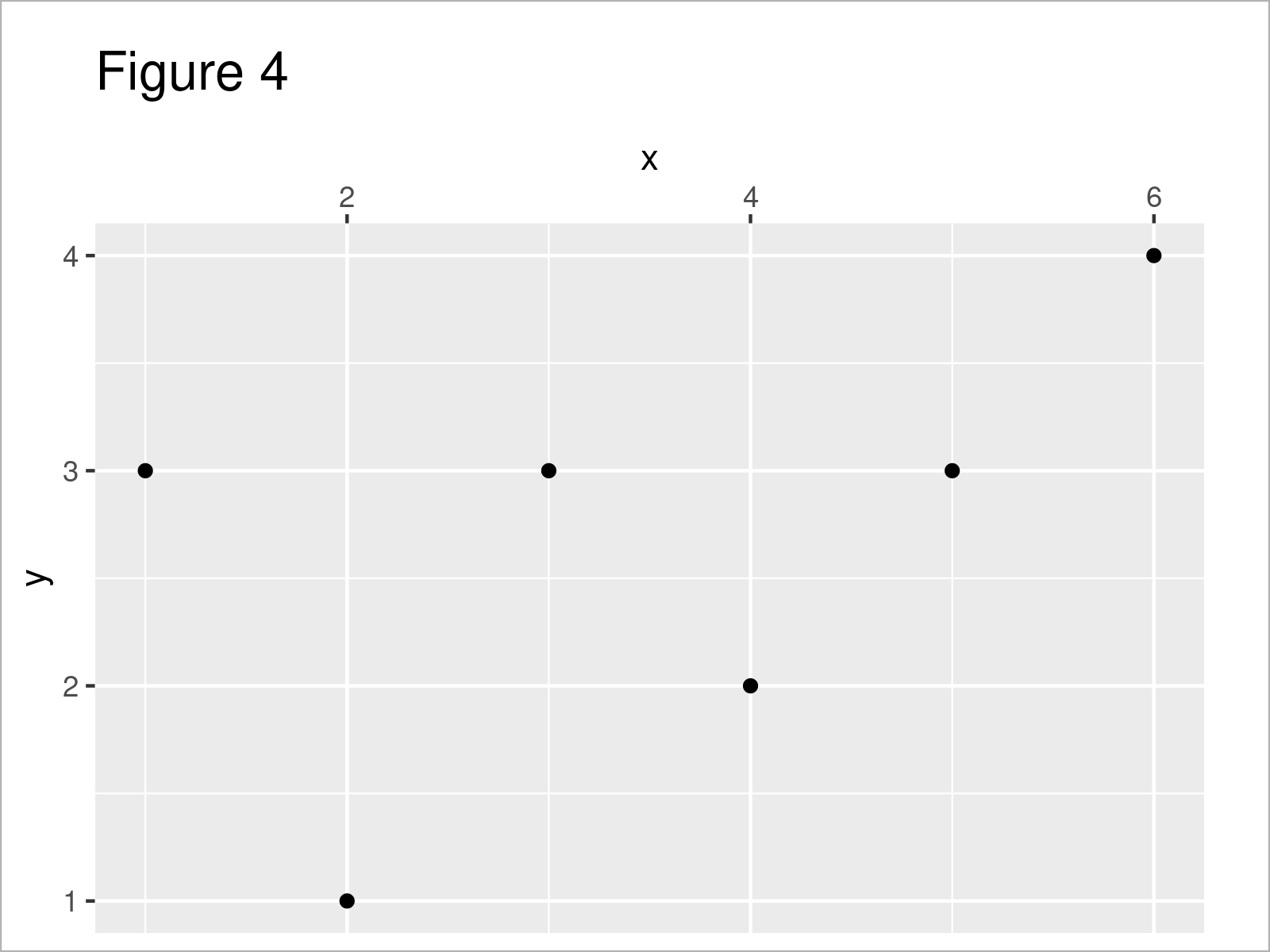
In Figure 4 it is shown that we have plotted a ggplot2 chart with adjusted x-axis position.
Video & Further Resources
If you need further information on the content of this article, you may have a look at the following video that I have published on my YouTube channel. I’m explaining the R codes of this tutorial in the video:
Also, you might have a look at some other articles on my website.
- Move Axis Label Closer to Plot in Base R
- Remove Grid, Background Color, Top & Right Borders from ggplot2 Plot
- Draw Dates to X-Axis of Plot in R
- Add Inset on Top of Previous Plot Using inset_element Function
- Graphics in R
- R Programming Examples
In this article, I have explained how to draw an x-axis on the top of a graphic in R. If you have any further questions, don’t hesitate to let me know in the comments section below. Besides that, don’t forget to subscribe to my email newsletter to get updates on new articles.


