Assign Fixed Colors to Categorical Variable in ggplot2 Plot in R (Example)
This page shows how to assign pre-defined colors to qualitative variables in a ggplot2 plot in R programming.
Table of contents:
Here’s how to do it!
Creating Example Data
Let’s first create two example data frames with different grouping levels in R:
data1 <- data.frame(Group = LETTERS[1:5],                                       # Create two data frames
                    Count = 1:5,
                    stringsAsFactors = TRUE)
data2 <- data.frame(Group = LETTERS[2:6],
                    Count = 2:6,
                    stringsAsFactors = TRUE)
Both of our two data frames contain five different groups. However, data1 contains the groups A, B, C, D, and E; and data2 contains the groups B, C, D, E, and F (i.e. the two data frames contain a different set of groups).
Now, let’s plot these data sets in two barcharts. First, we need to install and load the ggplot2 package in R…
install.packages("ggplot2")                                                     # Install and load ggplot2 package
library("ggplot2")
…and then we can draw the first barchart…
ggp1 <- ggplot(data1, aes(x = Group, y = Count, fill = Group)) +                # Draw first ggplot
  geom_bar(stat = "Identity")
ggp1
…as well as the second barchart:
ggp2 <- ggplot(data2, aes(x = Group, y = Count, fill = Group)) +                # Draw second ggplot
  geom_bar(stat = "Identity")
ggp2

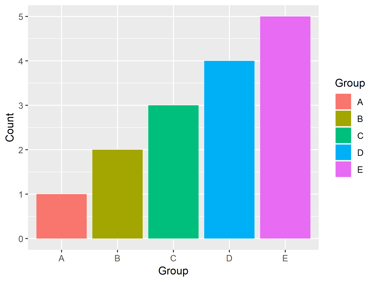
Figure 1: ggplo2 Barchart with Default Color Palette.

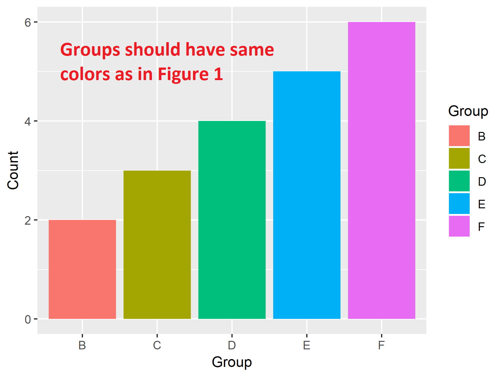
Figure 2: ggplo2 Barchart with Default Color Palette – Group Colors are Different as in Figure 1.
Figures 1 and 2 are illustrating our two graphics. As you can see, both barcharts contain the same set of colors, even though the visualized groups are different.
This might be confusing for the reader of these graphs, since the reader may automatically relate bars with the same color to each other (which would be wrong).
For that reason, it might be advisable to assign fixed colors to each of our groups. And this is precisely what I’m going to show you next…
Example: Assign Fixed Colors to ggplot2 Plot
If we want to assign a fixed color to each value of our qualitative variables (i.e. to each factor level), we first need to specify which colors we would like to assign:
my_colors <- c("red", "blue", "green", "yellow", "orange", "purple") # Create vector of colors
Then, we need to identify all factor levels that are contained in at least one of our input data frames and assign one color to each factor level:
names(my_colors) <- levels(factor(c(levels(data1$Group), levels(data2$Group)))) # Extract all levels of both data
Note that the vector containing our colors (i.e. my_colors) needs to have the same length as the number of factor levels (i.e. 6).
Now, we can apply the scale_fill_manual function of the ggplot2 package in order to set up our color assignment:
my_scale <- scale_fill_manual(name = "Group", values = my_colors) # Specify scale_fill_manual
Finally, we can modify our two ggplot2 barcharts according to the previous R code:
ggp1 + my_scale                                                                 # First plot with manual color
ggp2 + my_scale                                                                 # Second plot with manual color

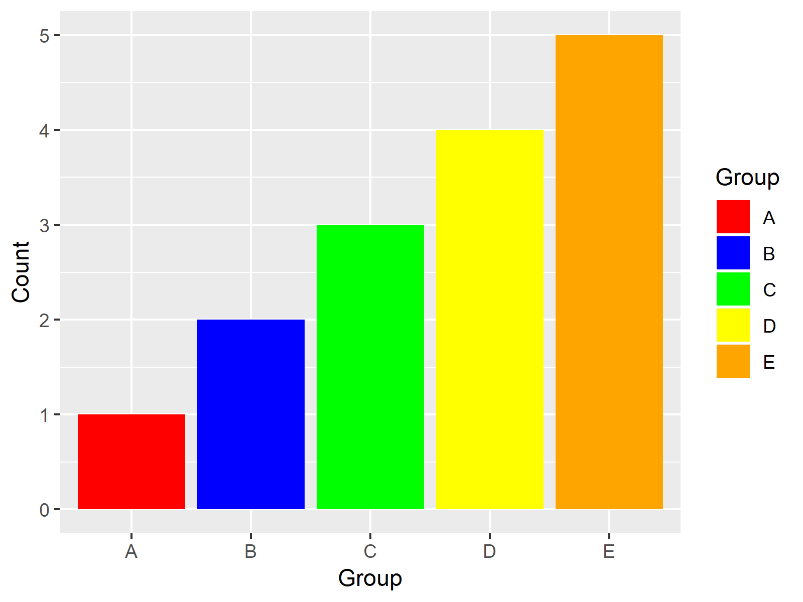
Figure 3: ggplot2 Barchart with Manually Specified Colors.

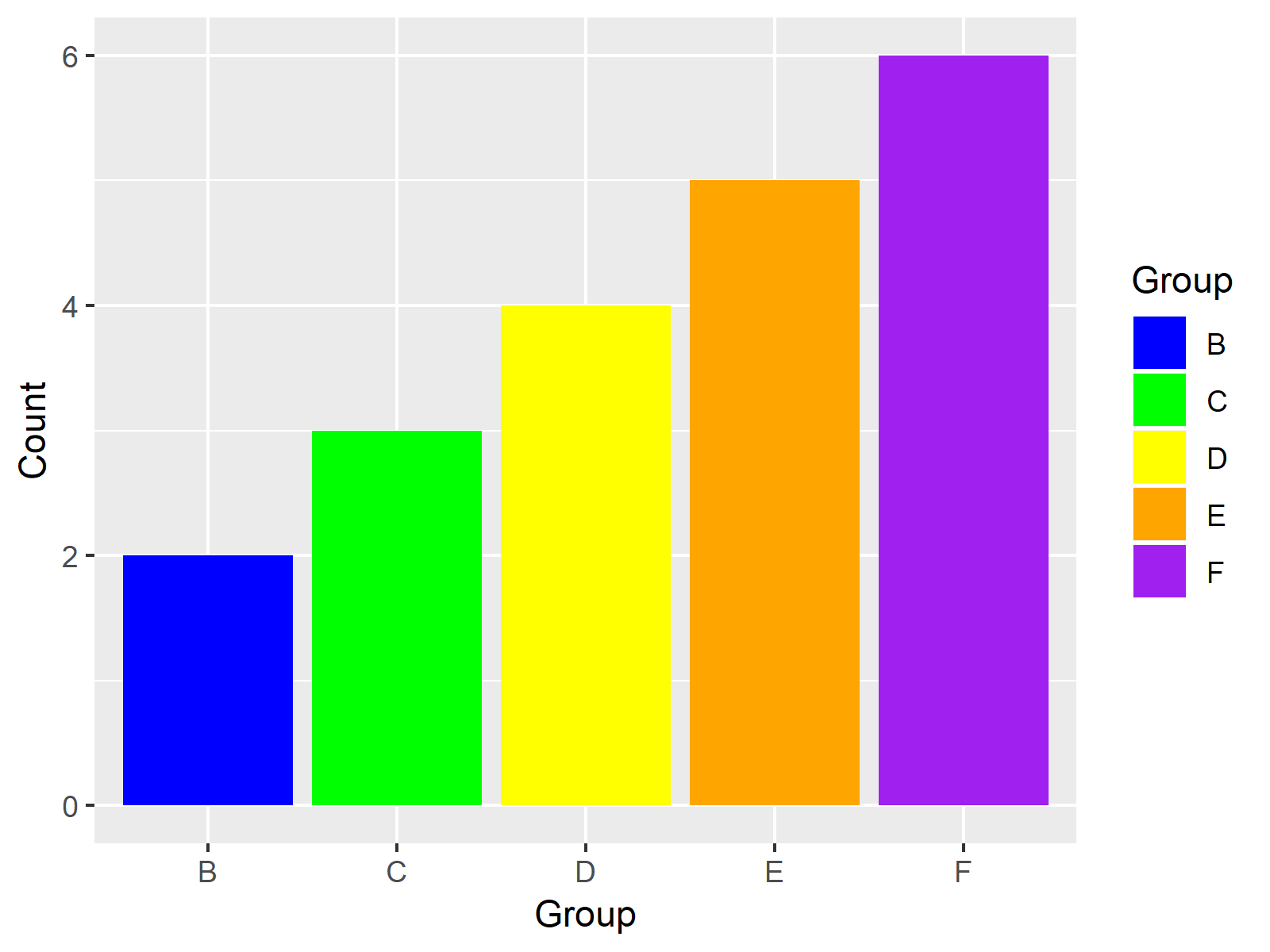
Figure 4: ggplot2 Barchart with Manually Specified Colors – Group Colors as in Figure 3.
Figures 3 and 4 are showing the output: Two barcharts with different groups, but the same color for groups that appear in both plots.
Video & Further Resources
I have recently published a video on my YouTube channel, which shows the R programming syntax of this post. You can find the video below.
In addition to the video, you could have a look at the other articles of my homepage:
To summarize: At this point you should have learned how to take control of colors in ggplot2 plots by mapping a specific color to each group of a qualitative variable. Let me know in the comments below, in case you have additional questions. Besides that, please subscribe to my email newsletter to get updates on new articles.
Subscribe to the Statistics Globe Newsletter
Get regular updates on the latest tutorials, offers & news at Statistics Globe.
I hate spam & you may opt out anytime: Privacy Policy.
Thank you!
Welcome to the Statistics Globe newsletter. From now on, I’ll send you regular emails about statistics, data science, AI, and programming with R and Python.
I’m Joachim Schork. On this website, I provide statistics tutorials as well as code in Python and R programming.
Statistics Globe Newsletter
Get regular updates on the latest tutorials, offers & news at Statistics Globe. I hate spam & you may opt out anytime: Privacy Policy.
Thank you!
Please check your email inbox and click the confirmation link to complete your subscription. If you don’t see the email within a few minutes, please also check your spam/junk folder.


