Data Exploration in R (9 Examples) | Exploratory Analysis & Visualization
In this R tutorial you’ll learn how to explore a data frame using different exploratory data analysis techniques.
Table of contents:
So here’s how to do it…
Loading Example Data
To begin with, we’ll need to load some example data. In this tutorial, we’ll use the mtcars data set, which contains information about motor trend car road tests.
We can import the mtcars data set to the current R session using the data() function as shown below:
data(mtcars) # Import example data frame
The following examples demonstrate different ways on how to explore this data set in the R programming language.
Let’s do that!
Example 1: Print First Six Rows of Data Frame Using head() Function
As a very first analysis step, it is often useful to print the first few rows of a data frame to the RStudio console.
We can return the first six rows of a data frame by applying the head function as shown in the following R code:
head(mtcars) # Print first six rows

Table 1 shows that our example data consists of eleven numerical columns.
Example 2: Return Column Names of Data Frame Using names() Function
We can also return only the variable names of a data frame using the names function.
Consider the R code and its output below:
names(mtcars)                          # Get column names
#  [1] "mpg"  "cyl"  "disp" "hp"   "drat" "wt"   "qsec" "vs"   "am"   "gear"
# [11] "carb"
Example 3: Get Number of Rows & Columns of Data Frame Using dim() Function
In this example, I’ll show how to return the dimensions of our data frame, i.e. the number of rows and columns.
We can do this using the dim function:
dim(mtcars)                            # Number of rows & columns
# [1] 32 11
Note that the first value shows the number of rows (i.e. 32 rows), and the second value corresponds to the number of columns (i.e. 11 columns).
Example 4: Explore Structure of Data Frame Columns Using str() Function
In Example 4, I’ll illustrate how to get some basic info on the structure of our data frame variables.
To accomplish this, we can apply the str function:
str(mtcars)                            # Structure of variables
# 'data.frame':	32 obs. of  11 variables:
#  $ mpg : num  21 21 22.8 21.4 18.7 18.1 14.3 24.4 22.8 19.2 ...
#  $ cyl : num  6 6 4 6 8 6 8 4 4 6 ...
#  $ disp: num  160 160 108 258 360 ...
#  $ hp  : num  110 110 93 110 175 105 245 62 95 123 ...
#  $ drat: num  3.9 3.9 3.85 3.08 3.15 2.76 3.21 3.69 3.92 3.92 ...
#  $ wt  : num  2.62 2.88 2.32 3.21 3.44 ...
#  $ qsec: num  16.5 17 18.6 19.4 17 ...
#  $ vs  : num  0 0 1 1 0 1 0 1 1 1 ...
#  $ am  : num  1 1 1 0 0 0 0 0 0 0 ...
#  $ gear: num  4 4 4 3 3 3 3 4 4 4 ...
#  $ carb: num  4 4 1 1 2 1 4 2 2 4 ...
The previous output shows the name, the data class, and the first values of each column in our data set.
Example 5: Calculate Descriptive Statistics Using summary() Function
It is also possible to compute certain summary statistics for the variables in a data frame.
A quite effective way for this is provided by the summary function. We can simply apply this function to the entire data frame as shown below:
summary(mtcars)                        # Basic descriptive statistics
#       mpg             cyl             disp             hp
#  Min.   :10.40   Min.   :4.000   Min.   : 71.1   Min.   : 52.0
#  1st Qu.:15.43   1st Qu.:4.000   1st Qu.:120.8   1st Qu.: 96.5
#  Median :19.20   Median :6.000   Median :196.3   Median :123.0
#  Mean   :20.09   Mean   :6.188   Mean   :230.7   Mean   :146.7
#  3rd Qu.:22.80   3rd Qu.:8.000   3rd Qu.:326.0   3rd Qu.:180.0
#  Max.   :33.90   Max.   :8.000   Max.   :472.0   Max.   :335.0
#       drat             wt             qsec             vs
#  Min.   :2.760   Min.   :1.513   Min.   :14.50   Min.   :0.0000
#  1st Qu.:3.080   1st Qu.:2.581   1st Qu.:16.89   1st Qu.:0.0000
#  Median :3.695   Median :3.325   Median :17.71   Median :0.0000
#  Mean   :3.597   Mean   :3.217   Mean   :17.85   Mean   :0.4375
#  3rd Qu.:3.920   3rd Qu.:3.610   3rd Qu.:18.90   3rd Qu.:1.0000
#  Max.   :4.930   Max.   :5.424   Max.   :22.90   Max.   :1.0000
#        am              gear            carb
#  Min.   :0.0000   Min.   :3.000   Min.   :1.000
#  1st Qu.:0.0000   1st Qu.:3.000   1st Qu.:2.000
#  Median :0.0000   Median :4.000   Median :2.000
#  Mean   :0.4062   Mean   :3.688   Mean   :2.812
#  3rd Qu.:1.0000   3rd Qu.:4.000   3rd Qu.:4.000
#  Max.   :1.0000   Max.   :5.000   Max.   :8.000
The output above shows the minimum, 1st quantile, median, mean, 3rd quantile, and the maximum value for each of the columns in our data.
Example 6: Count NA Values by Column Using colSums() & is.na() Functions
The following R programming syntax demonstrates how to count the number of NA values in each column of a data frame.
To do this, we can apply the colSums and is.na functions:
colSums(is.na(mtcars))                 # Count missing values
#  mpg  cyl disp   hp drat   wt qsec   vs   am gear carb
#    0    0    0    0    0    0    0    0    0    0    0
As you can see, none of the columns in our data frame contains missing values.
Example 7: Draw Pairs Plot of Data Frame Columns Using ggpairs() Function of GGally Package
Until now, we have performed an analytical exploratory data analysis based on numbers and certain RStudio console outputs.
However, when it comes to data exploration, it is also important to have a visual look at your data.
The following R code demonstrates how to create a pairs plot using the .
For this, we need the functions of the ggplot2 and GGally packages.
By installing and loading GGally, the ggplot2 package is also imported. So it’s enough to install and load GGally:
install.packages("GGally")             # Install GGally package
library("GGally")                      # Load GGally package
Next, we can apply the ggpairs function of the GGally package to our data frame:
ggpairs(mtcars) # Draw pairs plot

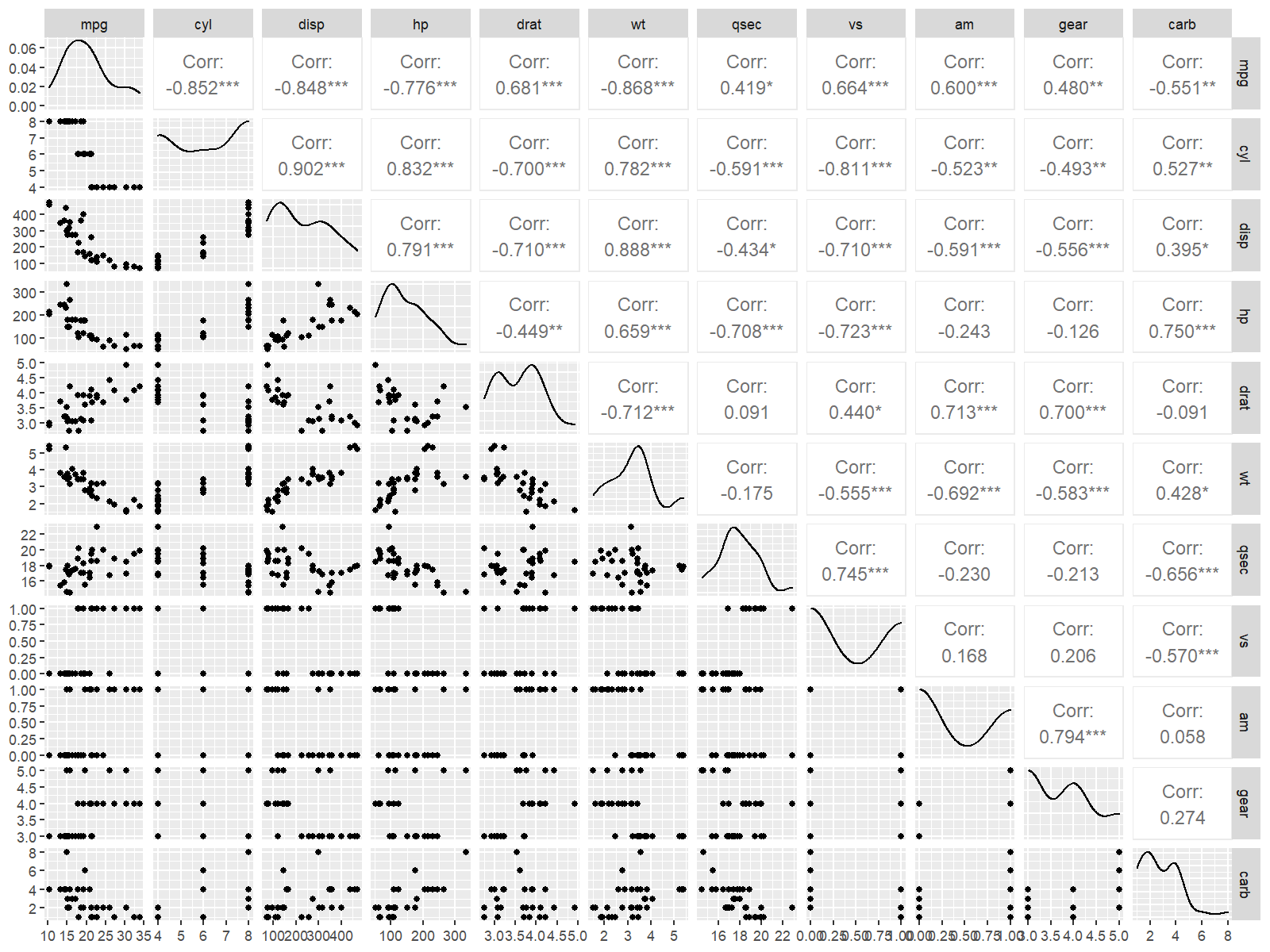
Figure 1 shows a pairs plot of our data frame columns. This type of graph contains a scatterplot for each variable pair, as well as the corresponding correlations. Furthermore, a kernel density plot is shown for each of our variables.
Example 8: Draw Boxplots of Multiple Columns Using ggplot2 Package
Boxplots are another popular way to visualize the columns of data sets.
To draw such a graph, we first have to manipulate our data using the tidyr package. In order to use the functions of the tidyr package, we first need to install and load tidyr to RStudio:
install.packages("tidyr")              # Install & load tidyr
library("tidyr")
Next, we can apply the pivot_longer function to reshape some of the columns of our data from wide to long format:
mtcars_long <- pivot_longer(mtcars,    # Reshape data frame
                            c("mpg", "disp", "hp", "qsec"))
Finally, we can apply the ggplot and geom_boxplot functions to our data to visualize each of the selected columns in a side-by-side boxplot graphic:
ggplot(mtcars_long,                    # Draw boxplots
       aes(x = value,
           fill = name)) +
  geom_boxplot()

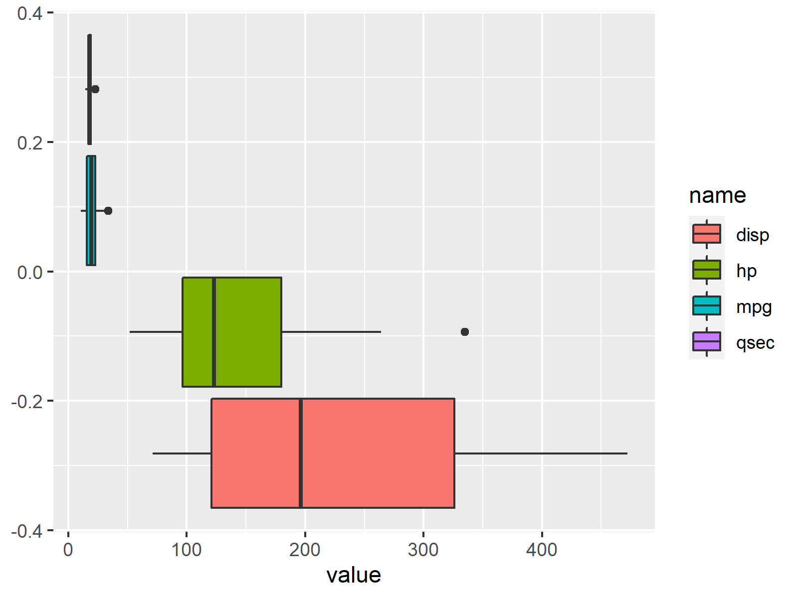
Figure 2 illustrates each of our columns in a separate boxplot. Based on this we can see the value distribution in each column, and how the values in our columns compare to each other.
Example 9: Draw facet_wrap Histograms of Multiple Columns Using ggplot2 Package
Typically, we would also have a look at our numerical columns in a histogram plot.
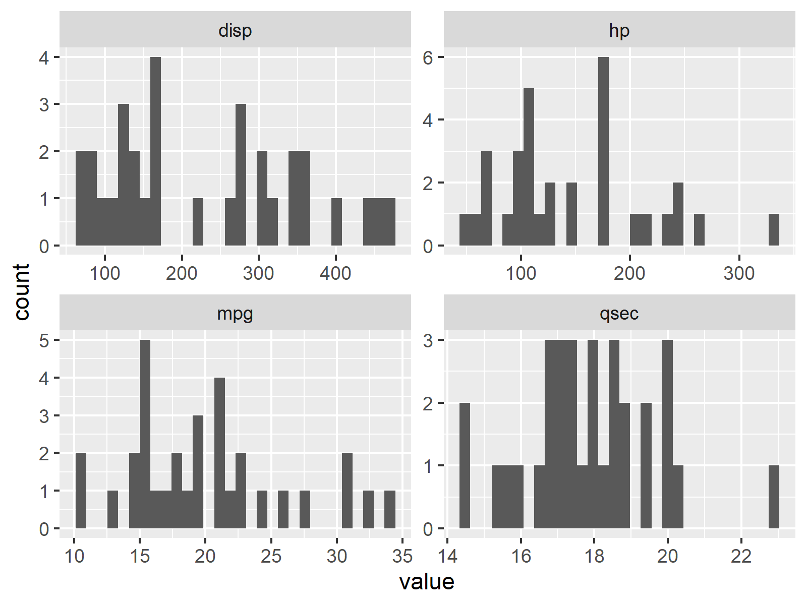
In the following R syntax, I’m creating a histogram for each of our columns. Furthermore, I’m using the facet_wrap function to separate each column in its own plotting panel:
ggplot(mtcars_long,                    # Draw histograms
       aes(x = value)) +
  geom_histogram() +
  facet_wrap(name ~ ., scales = "free")

Figure 3 illustrates our data frame columns in separate histograms. Note that the scales of each panel are different.
Video, Further Resources & Summary
Would you like to know more about the exploring of a data frame? Then you might watch the following video on my YouTube channel. I illustrate the R programming code of this tutorial in the video.
The YouTube video will be added soon.
Besides the video, you might want to read some of the other articles on this homepage. I have published numerous tutorials already.
In summary: In this tutorial you have learned how to conduct an exploratory data analysis in R. In case you have any additional questions, let me know in the comments.
Subscribe to the Statistics Globe Newsletter
Get regular updates on the latest tutorials, offers & news at Statistics Globe.
I hate spam & you may opt out anytime: Privacy Policy.
Thank you!
Welcome to the Statistics Globe newsletter. From now on, I’ll send you regular emails about statistics, data science, AI, and programming with R and Python.
I’m Joachim Schork. On this website, I provide statistics tutorials as well as code in Python and R programming.
Statistics Globe Newsletter
Get regular updates on the latest tutorials, offers & news at Statistics Globe. I hate spam & you may opt out anytime: Privacy Policy.
Thank you!
Please check your email inbox and click the confirmation link to complete your subscription. If you don’t see the email within a few minutes, please also check your spam/junk folder.


