Combine ggplot2 Line & Barchart with Double-Axis in R (2 Examples)
In this article you’ll learn how to draw a line and a barplot in the same graphic in the R programming language.
The tutorial contains two examples for the drawing of a line and a barchart in the same plot. More precisely, the article contains this:
You’re here for the answer, so let’s get straight to the R code…
Exemplifying Data, Software Packages & Default Plot
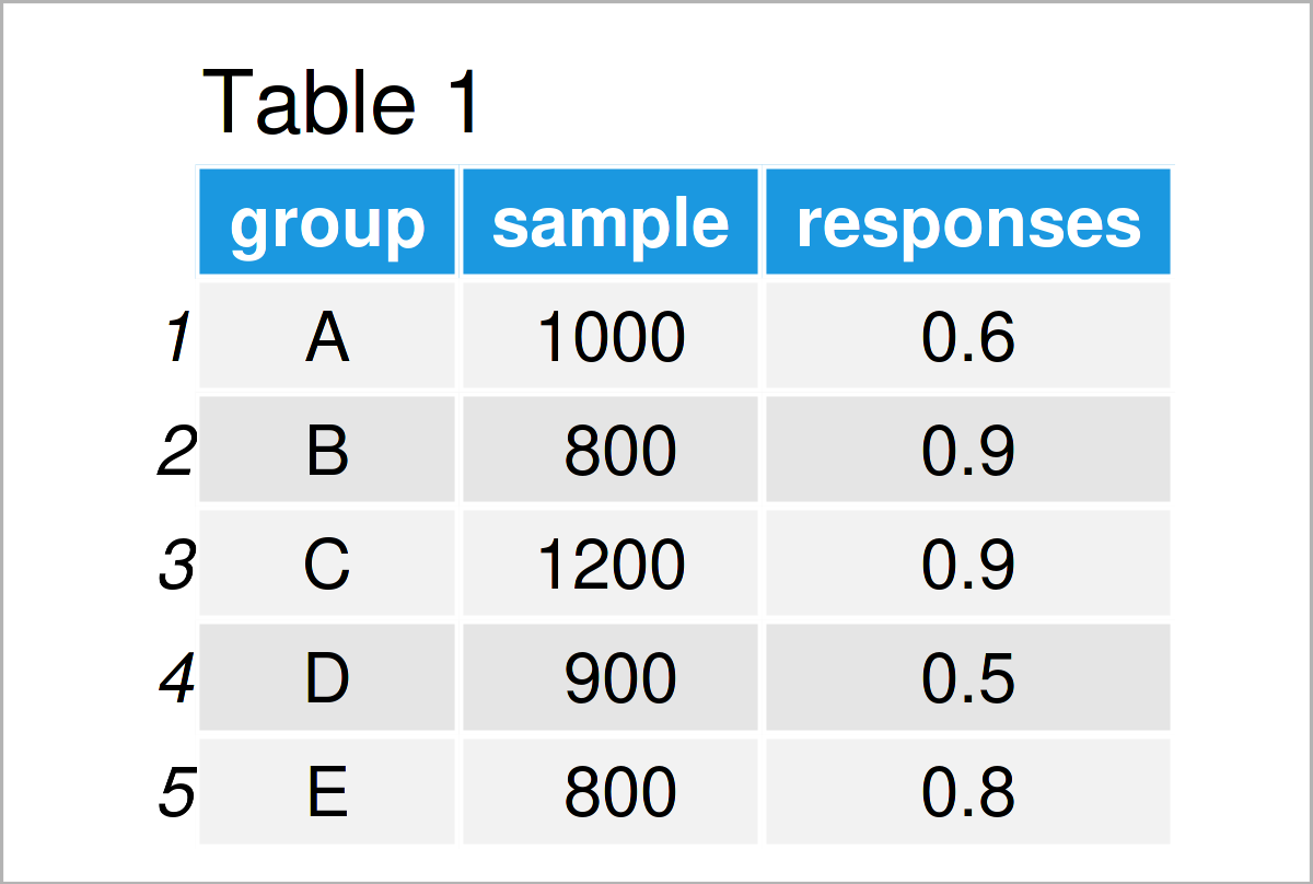
Have a look at the following example data:
data <- data.frame(group = LETTERS[1:5],    # Create example data
                   sample = c(1000, 800, 1200, 900, 800),
                   responses = c(0.6, 0.9, 0.9, 0.5, 0.8))
data                                        # Print example data

As you can see based on Table 1, our example data is a data frame composed of five observations and three columns with the names “group”, “sample”, and “responses”.
Let’s assume that we want to create a ggplot2 barchart with a line on top, where the bars represent the sample column and the line represents the responses column.
In order to use the functions of the ggplot2 package, we also need to install and load ggplot2.
install.packages("ggplot2")                 # Install ggplot2 package
library("ggplot2")                          # Load ggplot2
As a next step, we can draw our data in a barplot:
ggp1 <- ggplot(data) +                      # Draw ggplot2 barplot
  geom_bar(aes(group, sample), stat = "identity")
ggp1

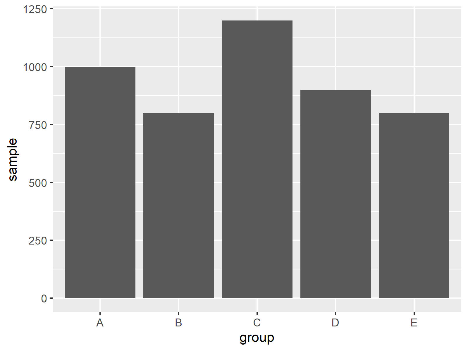
By executing the previous code we have plotted Figure 1, i.e. a ggplot2 bargraph without any lines or secondary y-axes.
Let’s modify this plot!
Example 1: Add Line to ggplot2 Barplot
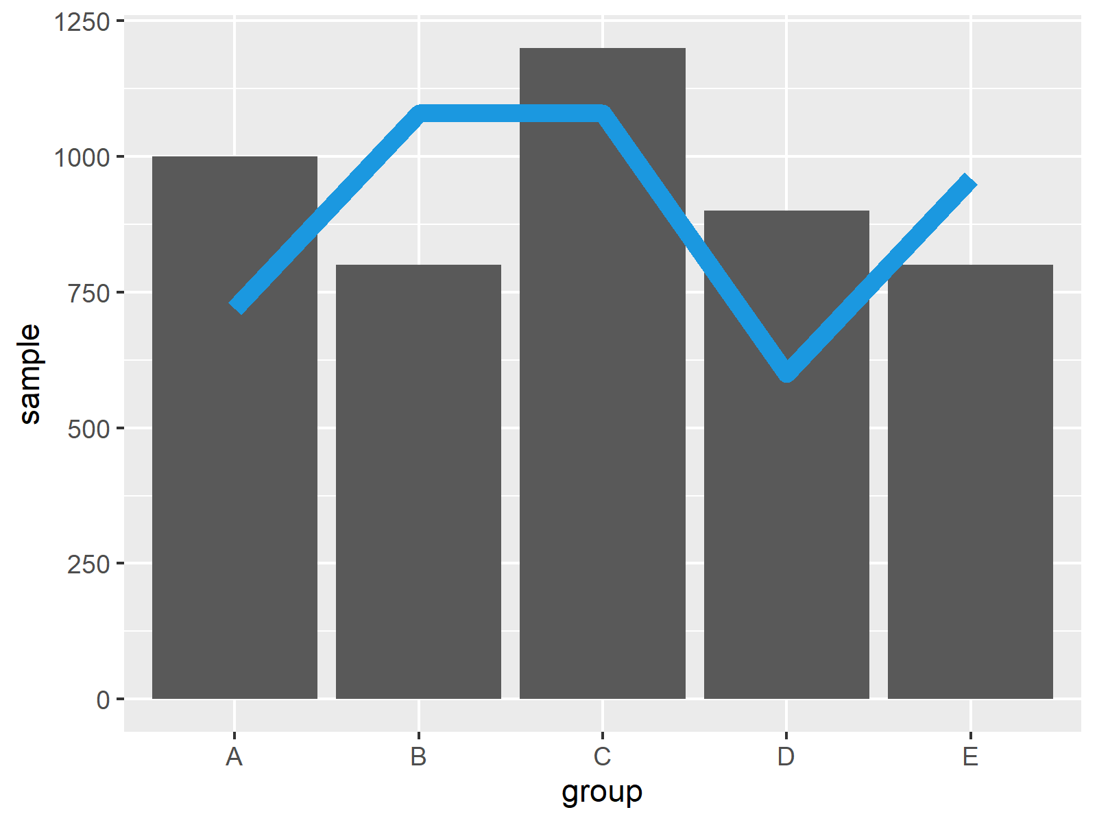
Example 1 illustrates how to overlay a line on top of a ggplot2 barchart. To achieve this, we can apply the geom_line function as shown below.
Note that we are multiplying the variable that we want to overlay as a line (i.e. responses) by the maximum of the variable that is shown in the barchart (i.e. sample). This way we can ensure that the bars and the line have a similar height.
Let’s do this:
ggp2 <- ggp1 +                              # Add line to barplot
  geom_line(aes(group, responses * max(sample), group = 1),
            col = "#1b98e0", lwd = 3)
ggp2

Figure 2 shows an updated version of our barchart: This time we have added a line on top of the bars. Note that this line represents a different variable than the bars.
Furthermore, note that the y-axis is not representing the values shown on the line properly. Let’s fix this!
Example 2: Add Secondary Y-Axis to ggplot2 Plot
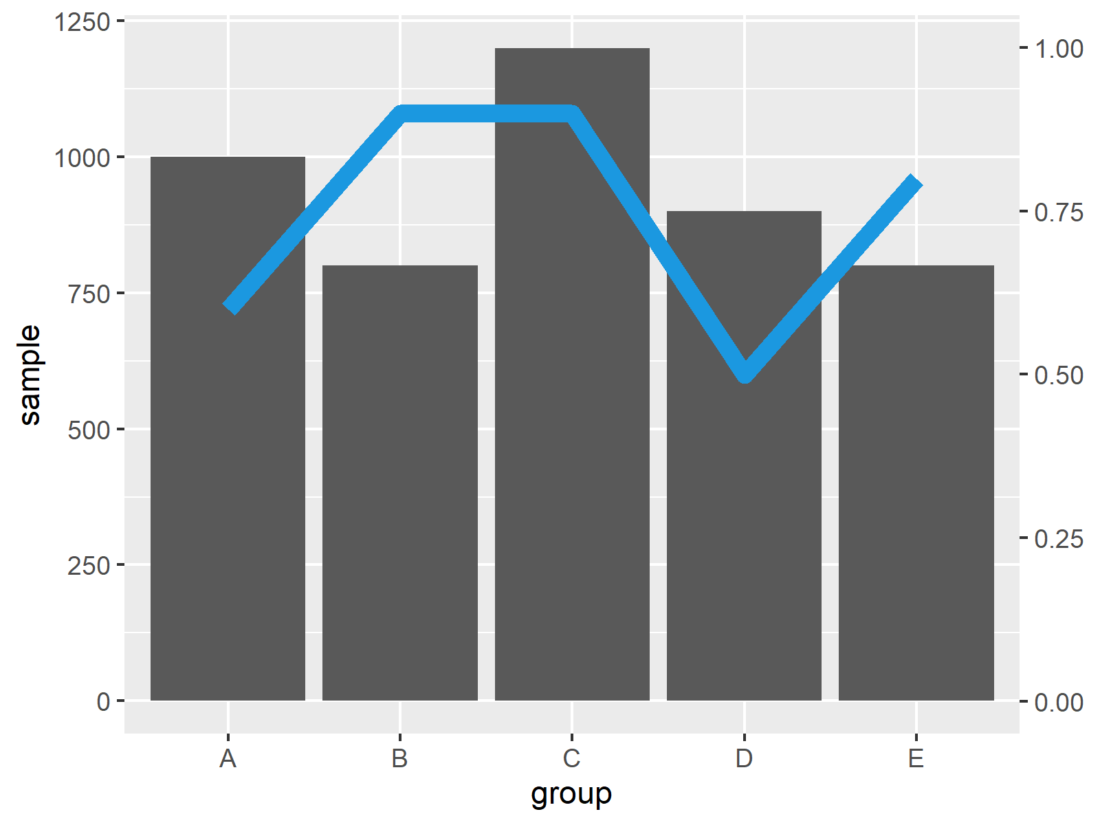
This example shows how to add a second y-axis to our plot, which represents the values of the line that we have annotated in Example 1.
For this, we can use the scale_y_continuous function and the sec.axis argument as shown below:
ggp3 <- ggp2 +                              # Add secondary axis
  scale_y_continuous(sec.axis = sec_axis(~ . / max(data$sample)))
ggp3

As shown in Figure 3, we have drawn a ggplot2 bar and line plot containing two y-axes. Note that the scale of the y-axis on the left side is different compared to the y-axis on the right side.
Video, Further Resources & Summary
Have a look at the following video on my YouTube channel. I’m illustrating the R code of this tutorial in the video:
Furthermore, you could have a look at the related tutorials on this website.
- Draw ggplot2 Plot with Two Y-Axes in R
- Draw Base R Plot with Two Y-Axes
- Change Colors in ggplot2 Line Plot in R
- Overlay ggplot2 Boxplot with Line in R
- Combine Multiple ggplot2 Legends in R
- Draw Vertical Line to X-Axis of Class Date in ggplot2 Plot
- Graphics Gallery in R
- Introduction to R
This article has demonstrated how to create a line and a barplot in the same plot in R programming. Tell me about it in the comments below, in case you have additional questions. Furthermore, don’t forget to subscribe to my email newsletter for updates on the newest tutorials.
Subscribe to the Statistics Globe Newsletter
Get regular updates on the latest tutorials, offers & news at Statistics Globe.
I hate spam & you may opt out anytime: Privacy Policy.
Thank you!
Welcome to the Statistics Globe newsletter. From now on, I’ll send you regular emails about statistics, data science, AI, and programming with R and Python.
I’m Joachim Schork. On this website, I provide statistics tutorials as well as code in Python and R programming.
Statistics Globe Newsletter
Get regular updates on the latest tutorials, offers & news at Statistics Globe. I hate spam & you may opt out anytime: Privacy Policy.
Thank you!
Please check your email inbox and click the confirmation link to complete your subscription. If you don’t see the email within a few minutes, please also check your spam/junk folder.


2 Comments. Leave new
R programming is important for all
I definitely agree, Ashebir! Thanks for the kind comment.
Regards,
Joachim