clip Function in R (Example) | Set Plot Clipping Region in User Coordinates
In this R programming tutorial you’ll learn how to specify the clipping region of a graphic using the clip() function.
The article is structured as follows:
Let’s dive right into the tutorial…
Creation of Example Data
Before the creation of our example data, we should set a random seed for reproducibility:
set.seed(2867522) # Set seed for reproducibility
Next, we can create some random example data. The following data is used as basement for this R programming tutorial:
x <- rnorm(500)                             # Create first variable
head(x)                                     # Print head of first variable
# [1] -0.2902467 -1.1870326 -1.0458948 -1.0735910  1.1994708  1.2593651
y <- rnorm(500) + x                         # Create second variable
head(y)                                     # Print head of second variable
# [1] -1.06160804 -0.87593452  0.07499881  1.04589969  2.40849932 -0.18085915
As you can see based on the previous outputs of the RStudio console, we have created two numeric vector objects called x and y.
Example: Set Clipping Region of Plot Using clip() Function
This example illustrates how to use the clip function to specify different clipping areas within a Base R plot.
Let’s first create a plot with default clipping specifications:
plot(x, y,                                  # Draw plot
     pch = 16,
     cex = 3)

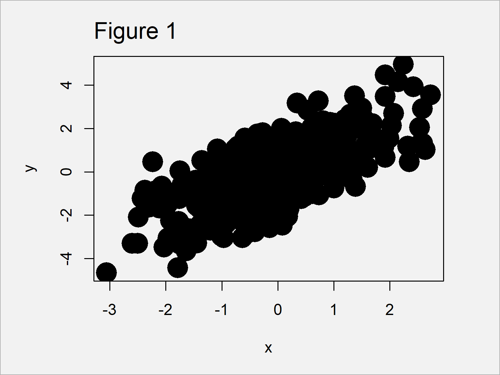
Figure 1 shows the output of the previous R syntax – A Base R scatterplot.
Let’s extract the coordinates of the plotting region of this graphic using the par function:
my_usr <- par("usr") # Save coordinates of plotting region
Now, we can use these coordinates within the clip function to change only one cut-off value of our plotting area. In the following code, we change the second coordinate to – 1:
clip(my_usr[1], - 1, my_usr[3], my_usr[4]) # Apply clip function
If we now use the points() function to overlay the same data with a different color on top of our previously created plot, only the clipped area is changed:
points(x, y,                                # Overlay points in clipped region
       pch = 16,
       cex = 3,
       col = "#1b98e0")

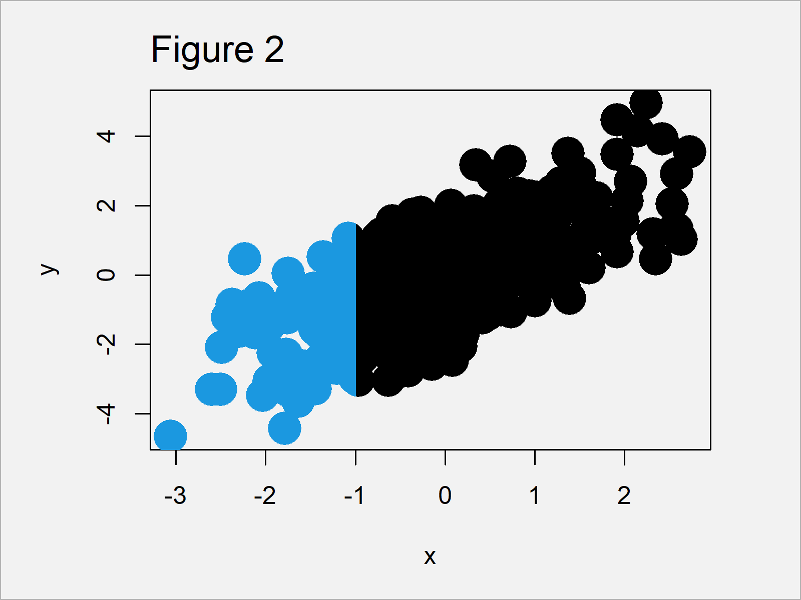
Figure 2 visualizes the output of the previous R syntax.
As you can see, we have changed the colors only to the left of the x-axis value – 1. However, the plot on the right side of this benchmark have not been changed.
You can also see that the points that overlap this benchmark have been changed only in the clipped region, i.e. they have been divided into two different colors.
If we want, we can repeat this process for other plot regions as well. The following syntax changes the first coordinate in our clipped region:
clip(0, my_usr[2], my_usr[3], my_usr[4]) # Apply clip function
If we now overlay our data with a different color once again, the graph is updated once more:
points(x, y,                                # Overlay points in clipped region
       pch = 16,
       cex = 3,
       col = "#f6f805")

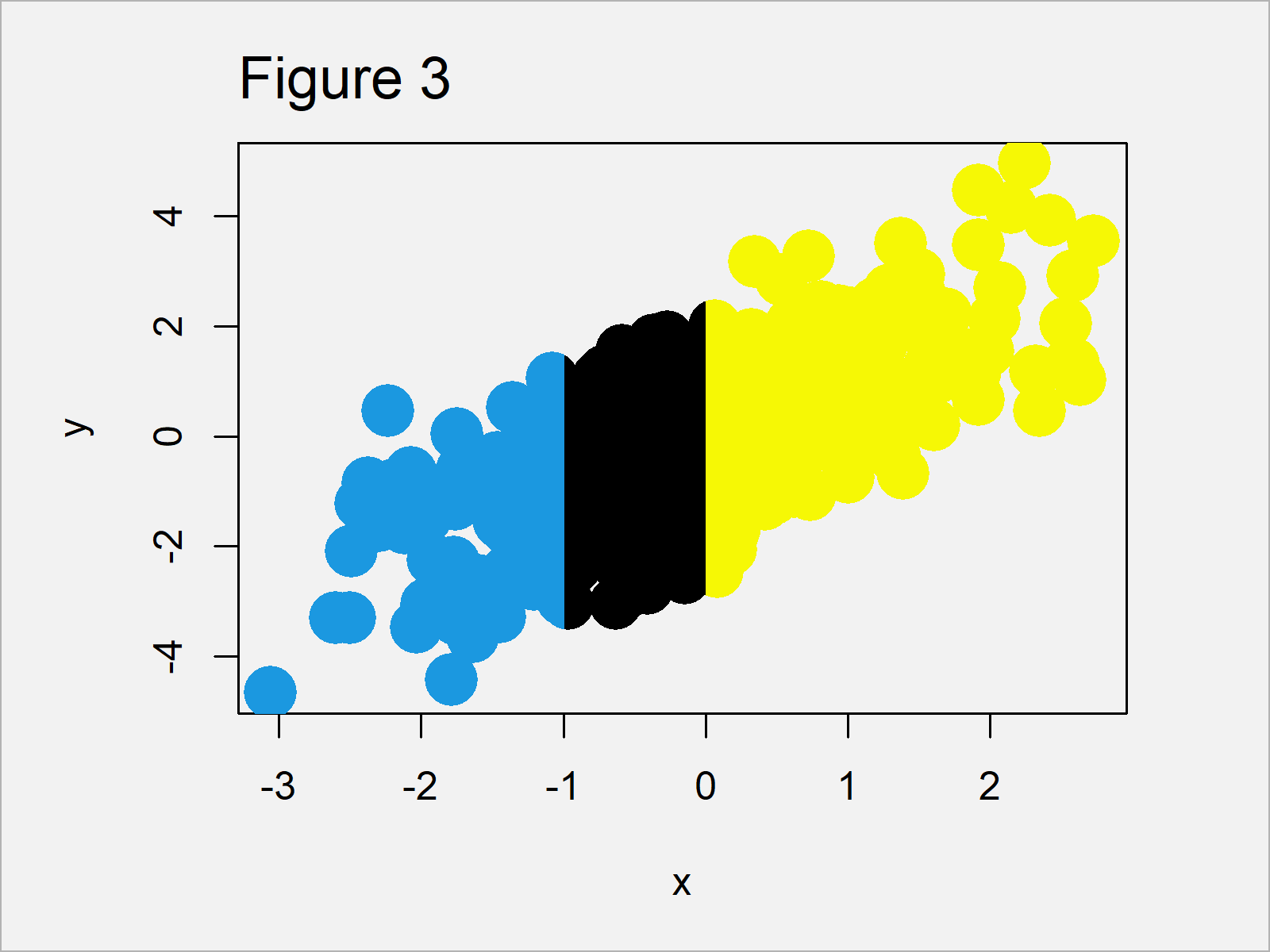
Figure 3 shows the updated xyplot that we have created with the previous R code. As you can see, the color to the right of the value 0 on the x-axis has been changed.
Once we have finished the manipulation of our plot, we can set the clipping region back to the default values using the do.call and as.list functions:
do.call("clip", as.list(my_usr)) # Reset to original plot region
After running the previous syntax, the plotting area is reset to the original coordinates.
Video & Further Resources
Do you need more info on the topics of this article? Then I recommend having a look at the following video on my YouTube channel. In the video, I explain the R programming code of this tutorial:
The YouTube video will be added soon.
Furthermore, you could read some of the other articles on my website:
- Draw Histogram with Different Colors in R
- Change Colors of Bars in ggplot2 Barchart
- Change Color of ggplot2 Boxplot in R
- Change Continuous Color Range in ggplot2 Plot
- Change ggplot2 Color & Fill Using scale_brewer Functions & RColorBrewer Package
- Draw ggplot2 Plot with Different Background Colors by Region
- Important Commands in R (Examples)
- R Programming Tutorials
This post has shown how to set the clipping region of a graph using the clip() function in the R programming language. Please let me know in the comments, if you have any additional questions and/or comments.
Subscribe to the Statistics Globe Newsletter
Get regular updates on the latest tutorials, offers & news at Statistics Globe.
I hate spam & you may opt out anytime: Privacy Policy.
Thank you!
Welcome to the Statistics Globe newsletter. From now on, I’ll send you regular emails about statistics, data science, AI, and programming with R and Python.
I’m Joachim Schork. On this website, I provide statistics tutorials as well as code in Python and R programming.
Statistics Globe Newsletter
Get regular updates on the latest tutorials, offers & news at Statistics Globe. I hate spam & you may opt out anytime: Privacy Policy.
Thank you!
Please check your email inbox and click the confirmation link to complete your subscription. If you don’t see the email within a few minutes, please also check your spam/junk folder.


