Change Tick Frequency of Plot in Python Matplotlib & seaborn (2 Examples)
Hi! This tutorial will demonstrate how to adjust the tick frequency of a plot in Matplotlib and seaborn in Python.
Here is an overview:
Let’s dive into the Python code!
Install & Import Matplotlib, seaborn, pandas, & NumPy
To install and import Matplotlib, seaborn, pandas and NumPy, run the lines of code below in your preferred Python programming IDE or code editor:
# install Matplotlib, seaborn, pandas & NumPy
pip install matploltib seaborn pandas numpy

# import Matplotlib, seaborn, pandas & NumPy
import matplotlib.pyplot as plt

import seaborn as sns

import pandas as pd

import numpy as np
In Python, pandas is the go-to library for data analysis and DataFrame manipulation. We need pandas in order to create the example dataset that we will use in this tutorial.
As for NumPy, it is the foremost library in Python for scientific and numeric computations. We will show how to use one of its functions in this tutorial as well.
So, with Matplotlib, seaborn, pandas and NumPy installed and imported into our Python programming environment, we can now go on to create the example dataset.
Create Example Dataset
Here we will create the example dataset that we will use to build visualizations in Matplotlib and seaborn. To load and view the DataFrame, run the lines of code below:
df = pd.DataFrame(
    {"x":[10, 60, 100, 150, 220, 300, 400],
     "y":[10, 20, 30, 40, 50, 60, 70]}
)

print(type(df))

# <class 'pandas.core.frame.DataFrame'>

print(df)

#        x	 y
#0	10	10
#1	60	20
#2	100	30
#3	150	40
#4	220	50
#5	300	60
#6	400	70
Now that we have created the example dataset, we can now see examples.
Example 1: Adjust Tick Frequency of Plot in Matplotlib
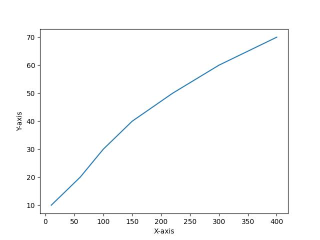
We will first build a simple line plot, with its default axis ticks and then demonstrate how to change its tick frequency. Run the code below to build the line plot:
plt.plot(df["x"],df["y"])

plt.xlabel('X-axis')

plt.ylabel('Y-axis')

plt.show()

In the above example, we pass the x and y columns of df to the plt.plot() method to create the line plot.
Then, we set the labels of the x and y axes using plt.xlabel() and plt.ylabel(). We finally displayed the plot using plt.show().
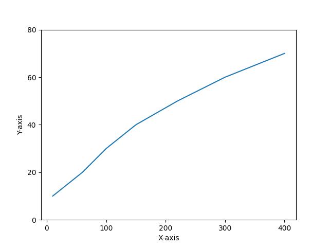
Now, we will demonstrate how to change the axis tick frequency of the plot for both the x and y axes. Run the lines of code below to do so:
plt.plot(df["x"],df["y"])

plt.xlabel('X-axis')

plt.ylabel('Y-axis')

plt.xticks(np.arange(0, 500, 100))

plt.yticks(np.arange(0,100,20))

plt.show()

As you can see, the tick frequency for both the x and y axes of the plot has been altered. To achieve that, we passed the np.arange() method to both the plt.xticks() and the plt.yticks().
In np.arange(), we set the axis range and the interval or step between each tick. For example, for the y-axis, we wanted it to range from 0 to 100 with intervals of 20, which is different from the default plot that has intervals of 10 between each tick.
That way, you can change or modify the tick frequency of plots in Matplotlib.
Example 2: Adjust Tick Frequency of Plot in seaborn
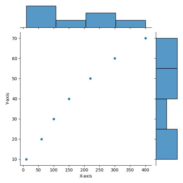
Here we will build a basic joint plot with default axis ticks frequency. To do so, run the lines of code below:
sns.jointplot(df, x = "x", y = "y")

plt.xlabel('X-axis')

plt.ylabel('Y-axis')

plt.show()

In the example above, we created the joint plot using the sns.jointplot() method wherein we passed the DataFrame df and x column to the x-axis and the y column to the y-axis.
Then, as we did in the Matplotlib example above, we used plt.xlabel() and plt.ylabel() to add axis labels to the plot.
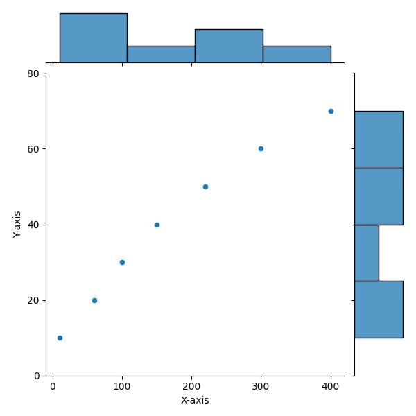
Now, we will demonstrate how to change the plot’s axis ticks frequency. Run the lines of code below to do so:
sns.jointplot(df, x = "x", y = "y")

plt.xlabel('X-axis')

plt.ylabel('Y-axis')

plt.xticks(np.arange(0, 500, 100))

plt.yticks(np.arange(0,100,20))

plt.show()

As you can see, the axis ticks frequency has been adjusted for both the x and y axes. Just as we did in the Matplotlib example above, we passed the np.arange() method with axis ticks range and interval to the plt.xticks() and plt.yticks() methods.
We could apply the same solution as in Matplotlib to seaborn because seaborn is a Python library that is based on Matplotlib. Therefore, many Matplotlib approaches work in seaborn.
Video, Further Resources & Summary
Do you need more explanations on how to change a plot’s axis ticks frequency in Python Matplotlib and seaborn? Then, you should have a look at the following YouTube video of the Statistics Globe YouTube channel.
In the video, we explain in some more detail how to change a plot’s axis ticks frequency in Python Matplotlib and seaborn.
The YouTube video will be added soon.
So, we have demonstrated how to change the axis ticks frequency of plots in Python Matplotlib and seaborn. Furthermore, you could have a look at some of the other interesting Matplotlib and seaborn tutorials on Statistics Globe:
- Save Plot to Image File in Python Matplotlib & seaborn (2 Examples)
- Set Color by Group in Plot in Python Matplotlib & seaborn (2 Examples)
- Set Axis Limits of Plot in Python Matplotlib & seaborn (2 Examples)
- Add Grid to Plot in Python Matplotlib & seaborn (2 Examples)
- Rotate Axis Text in Python Matplotlib & seaborn (2 Examples)
- Introduction to Python Programming
This post has shown how to change a plot’s axis ticks frequency in Python Matplotlib and seaborn. I hope you found it helpful! In case you have further questions, you may leave a comment below.
This page was created in collaboration with Ifeanyi Idiaye. You might check out Ifeanyi’s personal author page to read more about his academic background and the other articles he has written for the Statistics Globe website.


