Add Grid to Plot in Python Matplotlib & seaborn (2 Examples)
Hi! This tutorial will show you how to include gridlines in a plot in Matplotlib and seaborn in the Python programming language.
Here is an overview:
Let’s get into the Python code!
Install & Import Matplotlib, seaborn & pandas
To install and import Matplotlib, seaborn and pandas, run the lines of code below in your Python programming IDE or code editor:
# install Matplotlib, seaborn & pandas
pip install matplotlib seaborn pandas

# import Matplotlib, seaborn & pandas
import  matplotlib.pyplot as plt

import seaborn as sns

import pandas as pd
In Python, pandas is the go-to library for data analysis and DataFrame manipulation, and we need it to create the DataFrame that we will use in the examples in this tutorial.
So, with Matplotlib, seaborn and pandas installed and loaded into our Python programming environment, we can now build visualizations.
First, though, we need an example dataset.
Create Example Dataset
We will now create an example dataset that we will use in the examples in this tutorial. Run the lines of code below to create the example dataset and preview it:
df_dict = {"x": ["chair","table","stool","bed","fan","mug","ball","bowl","cup","brush"],
           "y": [240, 250, 260, 270, 280, 290, 300, 310, 320, 330],
           "z":[300,290,280,270,260,250,240,230,220,210]}

df = pd.DataFrame(df_dict)

print(type(df))

# <class 'pandas.core.frame.DataFrame'>

print(df)

#         x	 y	 z
#0	chair	240	300
#1	table	250	290
#2	stool	260	280
#3	bed	270	270
#4	fan	280	260
#5	mug	290	250
#6	ball	300	240
#7	bowl	310	230
#8	cup	320	220
#9	brush	330	210
With the example dataset created, we can now create plots in Matplotlib and seaborn.
Example 1: Add Grid to Plot in Matplotlib
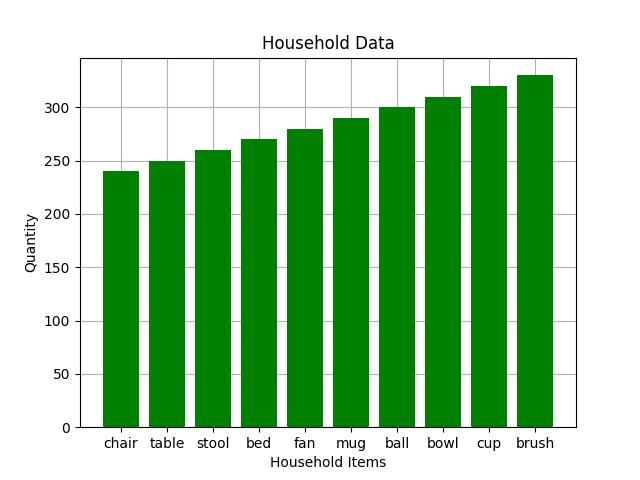
In this example, we will first build a basic bar plot without gridlines, then we will demonstrate how to add gridlines to the plot. To build the basic bar plot, run the lines of code below:
plt.bar(df["x"], df["y"], color = "green")

plt.title("Household Data")

plt.xlabel("Household Items")

plt.ylabel("Quantity")

plt.show()

In the above example, we passed the x and y columns of the DataFrame to the plt.bar() method wherein we also set the green color for the bars of the plot.
Next, we gave the plot a title using the plt.title() method and labeled the x and y axes too using plt.xlabel() and plt.ylabel().
Finally, we displayed the plot using plt.show().
Having built the basic bar plot, we will now demonstrate how to add gridlines to the plot. To do so, run the lines of code below:
plt.bar(df["x"], df["y"], color = "green")

plt.title("Household Data")

plt.xlabel("Household Items")

plt.ylabel("Quantity")

plt.gca().set_axisbelow(True)

plt.grid()

plt.show()

In the above example, we introduced two lines of code to draw the gridlines in the plot. The line of code plt.gca().set_axisbelow(True) is used to first get the current axes of the plot and then set the gridlines (or other elements) below the main plot element, which in this case are bars.
Then the plt.grid() method is used to display the gridlines in the plot.
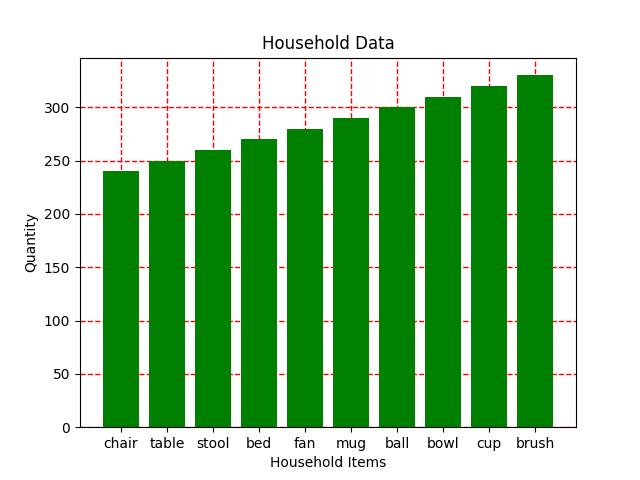
You can add some customizations to the gridlines, such as changing its color, width and line style:
plt.bar(df["x"], df["y"], color = "green")

plt.title("Household Data")

plt.xlabel("Household Items")

plt.ylabel("Quantity")

plt.gca().set_axisbelow(True)

plt.grid(color = "red", linestyle = '--', linewidth = 1)

plt.show()

In the plt.grid() method, we set the gridlines color to red, set the line style to dashed (--), and then set the line width to 1. You can play around with these parameters according to your use case.
Also, if you set axis = "x" in plt.grid(), it will include only vertical gridlines for the x axis of the plot. Similarly, if you set axis = "y" in plt.grid(), it will include only horizontal gridlines for the y axis of the plot.
Example 2: Add Grid to Plot in seaborn
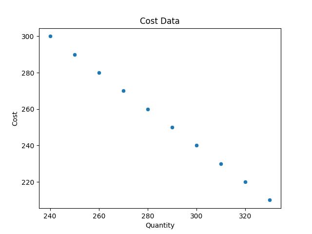
Here, we will build a basic scatter plot without gridlines. Then, we will show how to add gridlines to the scatter plot. To build the basic scatter plot, run the lines of code below:
sns.scatterplot(df, x = "y", y = "z")

plt.title("Cost Data")

plt.xlabel("Quantity")

plt.ylabel("Cost")

plt.show()

In the example above, we built the scatter plot using the sns.scatterplot() method wherein we passed the DataFrame and the y and z columns as the x and y axes of the plot.
Then we set the x axis label of the plot using plt.xlabel() and the y axis label using plt.ylabel(), and then we displayed the plot with plt.show().
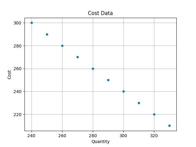
Now that we have built the basic scatter plot, we will demonstrate how to add gridlines to the plot. To do so, run the lines of code below:
sns.scatterplot(df, x = "y", y = "z")

plt.title("Cost Data")

plt.xlabel("Quantity")

plt.ylabel("Cost")

plt.gca().set_axisbelow(True)

plt.grid()

plt.show()

As you can see, with the exception of sns.scatterplot(), the syntax is virtually the same as in the Matplotlib example. We added gridlines to the plot using the same methods as in the Matplotlib example. This is because seaborn is a Python library based on Matplotlib; therefore, it borrows a lot of features from its base library.
You can also customize the gridlines just as we demonstrated in the earlier example above.
Video, Further Resources & Summary
Do you need more explanations on how to add gridlines to a Matplotlib plot and a seaborn plot in Python? Then you should have a look at the following YouTube video of the Statistics Globe YouTube channel.
In the video, we explain in some more detail how to add gridlines to Matplotlib and seaborn plots in Python.
The YouTube video will be added soon.
With that, we have demonstrated how to easily add gridlines to Matplotlib and seaborn plots in Python. Furthermore, you could have a look at some of the other interesting Matplotlib and seaborn plot tutorials on Statistics Globe:
- Change Axis Labels of Plot in Python Matplotlib & seaborn (2 Examples)
- Change Font Size of Plot in Python Matplotlib & seaborn (2 Examples)
- Change Legend Size of Plot in Python Matplotlib & seaborn (2 Examples)
- Remove Legend from Plot in Python Matplotlib & seaborn (2 Examples)
- Add Legend to Plot in Python Matplotlib & seaborn (4 Examples)
- Introduction to Python Programming
This post has shown how to add gridlines to both Matplotlib and seaborn plots in Python. I hope you found it helpful! In case you have further questions, you may leave a comment below.
This page was created in collaboration with Ifeanyi Idiaye. You might check out Ifeanyi’s personal author page to read more about his academic background and the other articles he has written for the Statistics Globe website.
Subscribe to the Statistics Globe Newsletter
Get regular updates on the latest tutorials, offers & news at Statistics Globe.
I hate spam & you may opt out anytime: Privacy Policy.
Thank you!
Welcome to the Statistics Globe newsletter. From now on, I’ll send you regular emails about statistics, data science, AI, and programming with R and Python.
I’m Joachim Schork. On this website, I provide statistics tutorials as well as code in Python and R programming.
Statistics Globe Newsletter
Get regular updates on the latest tutorials, offers & news at Statistics Globe. I hate spam & you may opt out anytime: Privacy Policy.
Thank you!
Please check your email inbox and click the confirmation link to complete your subscription. If you don’t see the email within a few minutes, please also check your spam/junk folder.


