Rotate Axis Text in Python Matplotlib & seaborn (2 Examples)
Hi! This tutorial will demonstrate how to change the position of the axis text of a plot in Matplotlib and seaborn in the Python programming language.
Here is an overview:
Let’s get into the Python code!
Install & Import Matplotlib & seaborn
To install and import Matplotlib and seaborn, run the lines of code below in your preferred Python programming IDE or code editor:
# install Matplotlib & seaborn
pip install matplotlib seaborn

# import Matplotlib & seaborn
import matplotlib.pyplot as plt

import seaborn as sns
With Matplotlib and seaborn installed and imported into our Python environment, we can now create visualizations. However, we need data to visualize.
Create Sample Dataset
Here, we will create the sample dataset that we will use in the examples in this tutorial. We will make use of the popular tips dataset that comes preloaded in seaborn. Please note that you can use any dataset of your choice to follow along with this tutorial.
To load and preview the first 10 rows of the dataset, run the lines of code below:
df = sns.load_dataset("tips")

df.head(10)

#  total_bill	tip	sex	smoker	day	time	size
#0	16.99	1.01	Female	No	Sun	Dinner	2
#1	10.34	1.66	Male	No	Sun	Dinner	3
#2	21.01	3.50	Male	No	Sun	Dinner	3
#3	23.68	3.31	Male	No	Sun	Dinner	2
#4	24.59	3.61	Female	No	Sun	Dinner	4
#5	25.29	4.71	Male	No	Sun	Dinner	4
#6	8.77	2.00	Male	No	Sun	Dinner	2
#7	26.88	3.12	Male	No	Sun	Dinner	4
#8	15.04	1.96	Male	No	Sun	Dinner	2
#9	14.78	3.23	Male	No	Sun	Dinner	2
Now that the sample dataset has been created, we can see examples of how to rotate the axis text of plots in Matplotlib and seaborn.
Example 1: Change Position of Axis Text in Matplotlib Plot
In this example, we will create a basic bar plot with the axis text at their default positions. To do so, run the lines of code below:
plt.bar(df["day"], df["tip"])

plt.xlabel("Week Days")

plt.ylabel("Tip ($)")

plt.show()

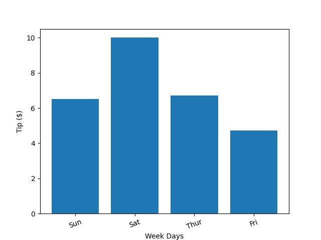
In the above example, we passed the DataFrame to the plt.bar() method and also passed the day and tip columns to the x and y axis respectively.
Then, we set the x axis label using the plt.xlabel() method and set the y axis label using the plt.ylabel() method. Finally, we displayed the bar plot with plt.show().
As you can see, the axis text are at their default position on the plot. Now, we will show how to rotate or change their position angle.
To do so, run the lines of code below:
plt.bar(df["day"],df["tip"])

plt.xlabel("Week Days")

plt.ylabel("Tip ($)")

plt.xticks(rotation = 20)

plt.show()

In order to change or rotate the axis text of the above bar plot, we used the plt.xticks() method. In it, we set the rotation to 20, which means we want the axis text to be at the angle of 20 degrees. You can play with other angles according to your need.
Example 2: Change Position of Axis Text in seaborn Plot
Here, we will build a simple joint plot with the axis text at their default position. To do so, run the code below:
sns.jointplot(df, x = "total_bill", y = "tip", hue = "sex")

plt.show()

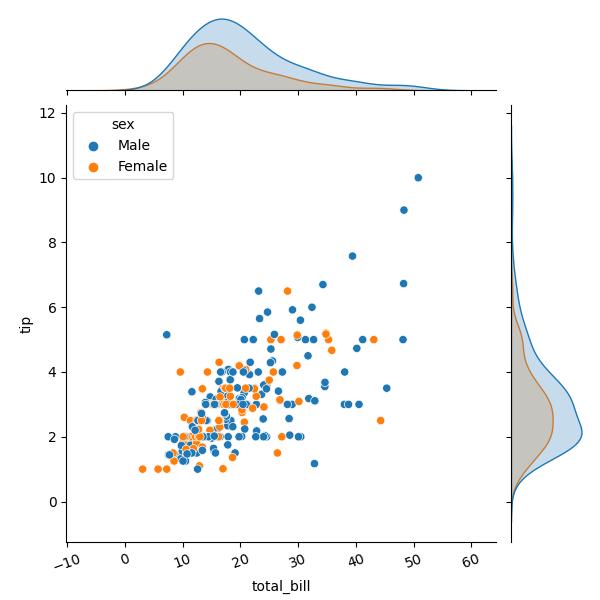
In the example above, we built the joint plot with the axis text at their default position using the sns.jointplot() method wherein we passed the DataFrame df.
Then we also passed the total_bill and tip columns to the x and y axes respectively, and then colored the data points by the sex column. Lastly, we displayed the plot using plt.show().
Now, we will show how to change or rotate the position of the plot’s axis text. To do so, run the code below:
sns.jointplot(df, x = "total_bill", y = "tip", hue = "sex")

plt.xticks(rotation = 20)

plt.show()

As you can see, to change the position of the axis text, we used the plt.xticks() method just like we did in the Matplotlib example. We also set the angle to 20 degrees, which changed the position of the axis text.
Video, Further Resources & Summary
Do you need more explanations on how to rotate the axis text of a plot in Matplotlib and seaborn in Python? Then you should have a look at the following YouTube video of the Statistics Globe YouTube channel.
In the video, we explain in some more detail how to rotate the axis text of a plot in Matplotlib and seaborn in Python.
The YouTube video will be added soon.
So we have demonstrated how to easily change or rotate the position of the axis text of a plot in Matplotlib and seaborn in Python. Furthermore, you could have a look at some of the other interesting Matplotlib and seaborn tutorials on Statistics Globe:
- Change Font Size of Plot in Python Matplotlib & seaborn (2 Examples)
- Change Legend Size of Plot in Python Matplotlib & seaborn (2 Examples)
- Remove Legend From Plot in Python Matplotlib & seaborn (2 Examples)
- Add Legend to Plot in Python Matplotlib & seaborn (4 Examples)
- Change Axis Labels of Plot in Python Matplotlib & seaborn (2 Examples)
- Introduction to Python Programming
This post has shown how to rotate the axis text of a plot in Matplotlib and seaborn in Python. I hope you found it helpful! In case you have further questions, you may leave a comment below.
This page was created in collaboration with Ifeanyi Idiaye. You might check out Ifeanyi’s personal author page to read more about his academic background and the other articles he has written for the Statistics Globe website.
Subscribe to the Statistics Globe Newsletter
Get regular updates on the latest tutorials, offers & news at Statistics Globe.
I hate spam & you may opt out anytime: Privacy Policy.
Thank you!
Welcome to the Statistics Globe newsletter. From now on, I’ll send you regular emails about statistics, data science, AI, and programming with R and Python.
I’m Joachim Schork. On this website, I provide statistics tutorials as well as code in Python and R programming.
Statistics Globe Newsletter
Get regular updates on the latest tutorials, offers & news at Statistics Globe. I hate spam & you may opt out anytime: Privacy Policy.
Thank you!
Please check your email inbox and click the confirmation link to complete your subscription. If you don’t see the email within a few minutes, please also check your spam/junk folder.


