Set Color by Group in Plot in Python Matplotlib & seaborn (2 Examples)
Hi! This tutorial will demonstrate how to determine the color by group in a plot in Matplotlib and seaborn in the Python programming language.
Here is an overview:
Let’s get into the discussion!
Install & Import Matplotlib & seaborn
To install and import Matplotlib and seaborn, run the lines of code below in your Python programming IDE:
# install Matplotlib & seaborn
pip install matplotlib seaborn

# import Matplotlib & seaborn
import matplotlib.pyplot as plt

import seaborn as sns
Having installed and imported Matplotlib and seaborn into our Python programming environment, we can now create the example dataset that we will use in this tutorial.
Create Example Dataset
We will use the popular iris dataset as our example dataset in this tutorial. The iris dataset is shipped along with the seaborn Python library. Nevertheless, you can make use of any dataset of your choice to follow along with this tutorial.
To load and preview the first 10 rows of the dataset, run the lines of code below:
df = sns.load_dataset("iris")

df.head(10)

# sepal_length	sepal_width	petal_length	petal_width	species
#0	   5.1	        3.5	         1.4	        0.2	setosa
#1	   4.9	        3.0	         1.4	        0.2	setosa
#2	   4.7	        3.2	         1.3	        0.2	setosa
#3	   4.6	        3.1	         1.5	        0.2	setosa
#4	   5.0	        3.6	         1.4	        0.2	setosa
#5	   5.4	        3.9	         1.7	        0.4	setosa
#6	   4.6	        3.4	         1.4	        0.3	setosa
#7	   5.0	        3.4	         1.5	        0.2	setosa
#8	   4.4	        2.9	         1.4	        0.2	setosa
#9	   4.9	        3.1	         1.5	        0.1	setosa
With the dataset loaded, we can now build visualizations.
Example 1: Determine Plot Color by Group in Matplotlib
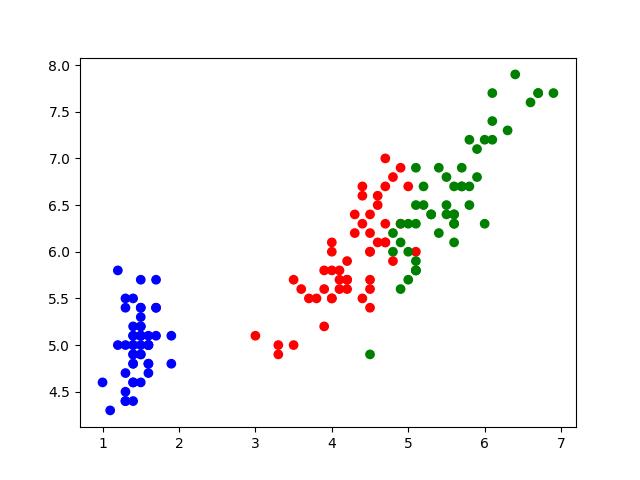
In this first example, we will build a simple scatter plot and color the points by the group:
colors = {"setosa": "blue", "versicolor": "red", "virginica": "green"}

plt.scatter(df["petal_length"], df["sepal_length"], c = df["species"].map(colors))

plt.show()

In the above example, we first created a Python dictionary assigning colors to each of the species group in the DataFrame.
Next, we used plt.scatter() to build the scatter plot. In that method, we passed the petal_length column to the x axis and the sepal_length column to the y axis.
Then, we defined the color argument by mapping the species column of the DataFrame to the colors defined earlier. Finally, we displayed the plot using plt.show().
Example 2: Determine Plot Color by Group in seaborn
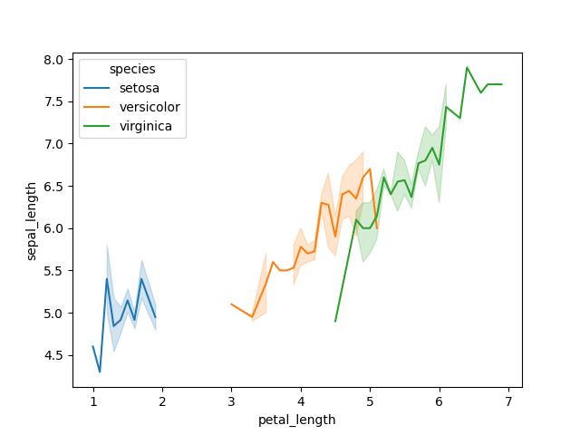
Here we will build a line plot and demonstrate how to color the plot by group:
sns.lineplot(df, x = "petal_length", y = "sepal_length", hue = "species")

plt.show()

As you can see, the lines in the line plot are grouped by different colors, with each color representing a species in the dataset.
We used sns.lineplot() to build the line plot, and in it, we passed the DataFrame df and petal_length to the x axis and sepal_length to the y axis. Then we passed species to the hue = argument in order to group the lines by color. By default, seaborn creates a legend for the plot where there is a color grouping.
Lastly, we displayed the plot with plt.show().
Video, Further Resources & Summary
Do you need more explanations on how to set the color by group in a plot in Matplotlib and seaborn in Python? Then you should have a look at the following YouTube video of the Statistics Globe YouTube channel.
In the video, we explain in some more detail how to set the color by group in a plot in Matplotlib and seaborn in Python.
The YouTube video will be added soon.
So, with that, we have demonstrated how to color a plot by group in both Matplotlib and seaborn in Python. Furthermore, you could have a look at some of the other interesting Matplotlib and seaborn tutorials on Statistics Globe:
- Change Legend Size of Plot in Python Matplotlib & seaborn (2 Examples)
- Change Font Size of Plot in Python Matplotlib & seaborn (2 Examples)
- Remove Legend from Plot in Python Matplotlib & seaborn (2 Examples)
- Change Axis Labels of Plot in Python Matplotlib & seaborn (2 Examples)
- AddLegend to Plot in Python Matplotlib & seaborn (2 Examples)
- Introduction to Python Programming
This post has shown how to set the color by group in a plot in Matplotlib and seaborn in Python. I hope you found it helpful! In case you have further questions, you may leave a comment below.
This page was created in collaboration with Ifeanyi Idiaye. You might check out Ifeanyi’s personal author page to read more about his academic background and the other articles he has written for the Statistics Globe website.
Subscribe to the Statistics Globe Newsletter
Get regular updates on the latest tutorials, offers & news at Statistics Globe.
I hate spam & you may opt out anytime: Privacy Policy.
Thank you!
Welcome to the Statistics Globe newsletter. From now on, I’ll send you regular emails about statistics, data science, AI, and programming with R and Python.
I’m Joachim Schork. On this website, I provide statistics tutorials as well as code in Python and R programming.
Statistics Globe Newsletter
Get regular updates on the latest tutorials, offers & news at Statistics Globe. I hate spam & you may opt out anytime: Privacy Policy.
Thank you!
Please check your email inbox and click the confirmation link to complete your subscription. If you don’t see the email within a few minutes, please also check your spam/junk folder.


