Set Axis Limits of Plots in Python Matplotlib & seaborn (2 Examples)
Hi! This tutorial will demonstrate how to change the axis limits of plots in Matplotlib and seaborn in the Python programming language.
Here is an overview:
Let’s get into the Python code!
Install & Import Matplotlib, seaborn & NumPy
To install and import Matplotlib, seaborn and NumPy, run the lines of code below in your Python programming IDE or code editor:
# install Matplotlib, seaborn & NumPy
pip install matplotlib seaborn numpy

# import Matplotlib, seaborn & NumPy
import matplotlib.pyplot as plt

import seaborn as sns

import numpy as np
We need the NumPy Python library in this project to generate random numbers that we will use in the demonstrations.
Now that we have installed and imported the necessary libraries, we can go on to demonstrate how to set the axis limits of plots in both Matplotlib and seaborn.
Example 1: Set Axis Limits of Plot in Matplotlib
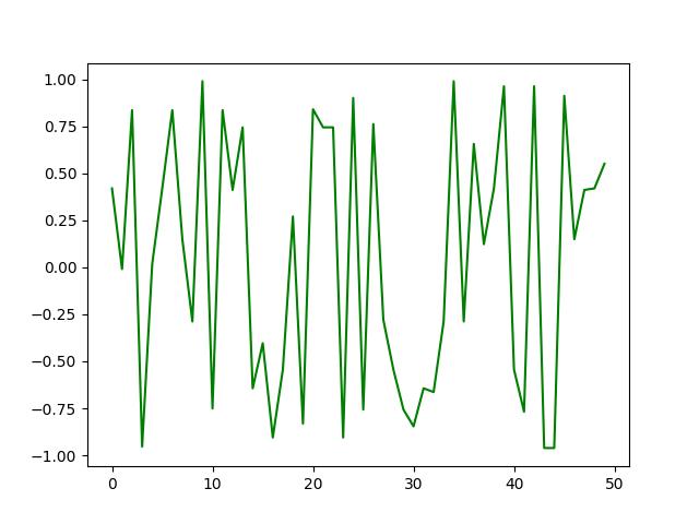
In this first example, we will build a basic Matplotlib line plot:
x = np.random.randint(1, 50, 50)

y = np.sin(x)

plt.plot(y, color = "green")

plt.show()

In the example above, we used the random.randint() function to generate 50 random numbers from 1 to 50, which we stored in x.
Next, we calculated the sine of x using NumPy’s sin() function and stored the values in y.
Then, we built the plot using plt.plot() function, wherein we passed the y variable and colored the lines green.
Finally, we displayed the plot using plt.show().
Note that since we are using a random number generator, your plot may not look exactly like the one in this tutorial post.
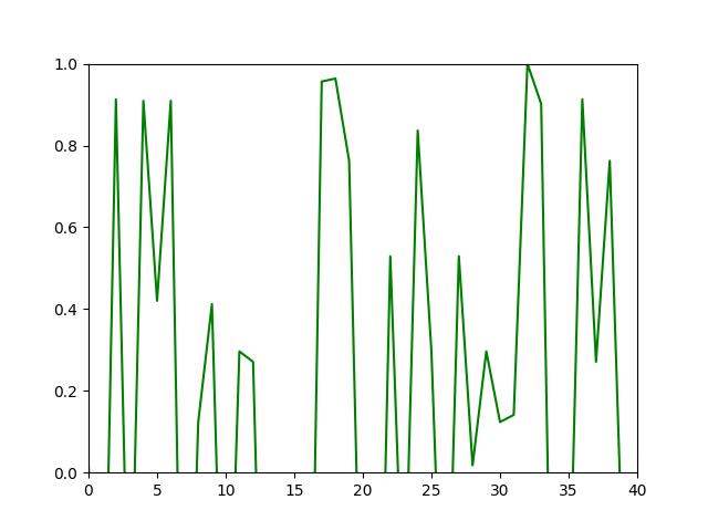
Next, we will change the x and y axis limits of the plot:
x = np.random.randint(1, 50, 50)

y = np.sin(x)

plt.xlim(0, 40)

plt.ylim(0,1)

plt.plot(y,color = "green")

plt.show()

Here, in order to set the plot’s axis limits, we used the xlim() function and the ylim() function.
In xlim(), we specified the x axis range from 0 to 40 while in ylim(), we specified the y axis range from 0 to 1. That way, we have set the axis limits of the plot.
Example 2: Set Axis Limits of Plot in seaborn
Here we will build a basic scatter plot using the popular tips dataset, which is shipped along with the seaborn library.
To load the dataset, run the line of code below.
df = sns.load_dataset("tips")
You can preview the first 10 rows of the dataset, if you wish, by running df.head(10).
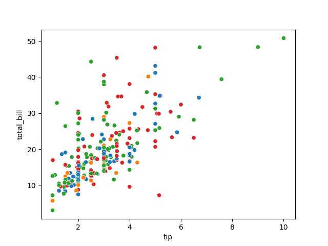
Now that we have loaded the dataset, we can build a basic scatter plot:
sns.scatterplot(df, x = "tip", y = "total_bill", hue = "day", legend = False)

plt.show()

To build the scatter plot, we used the sns.scatterplot() function wherein we passed the DataFrame df and set the tip column on the x axis and the total_bill column on the y axis.
We colored the data points by day and set legend to False. Lastly, we displayed the plot using plt.plot().
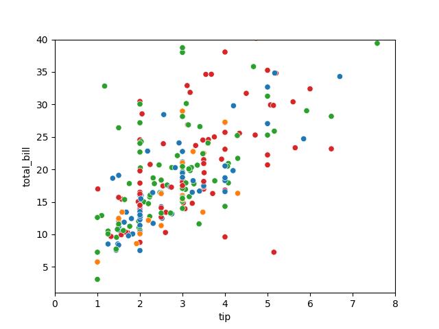
We will now adjust the axis limits of both the x and y axes:
sns.scatterplot(df,x = "tip", y = "total_bill", hue = "day",legend = False)

plt.xlim(0,8)

plt.ylim(1,40)

plt.show()

As you can see, the process of setting or changing the axis limits of the plot is the same as in the Matplotlib example above. This is because seaborn is built on top of Matplotlib, so they share a number of methods.
Now, the x axis ranges from 0 to 8 while the y axis ranges from 1 to 40.
Video, Further Resources & Summary
Do you need more explanations on how to set the axis limits of plots in Python’s Matplotlib and seaborn? Then you should have a look at the following YouTube video of the Statistics Globe YouTube channel.
In the video, we explain how to set the axis limits of plots in Python’s Matplotlib and seaborn in some more detail.
The YouTube video will be added soon.
So with these examples, we have shown how to easily set the axis limits of plots in both Matplotlib and seaborn in Python. You could also have a look at some of the other interesting Matplotlib and seaborn tutorials on Statistics Globe:
- Change Legend Size of Plot in Python Matplotlib & seaborn (2 Examples)
- Add Legend to Plot in Python Matplotlib & seaborn (4 Examples)
- Remove Legend from Plot in Python Matplotlib & seaborn (2 Examples)
- Change Axis Labels of Plot in Python Matplotlib & seaborn (2 Examples)
- Change Font Size of Plot in Python Matplotlib & seaborn (2 Examples)
- Introduction to Python Programming
This post has shown how to set the axis limits of plots in Python’s Matplotlib and seaborn. In case you have further questions, you may leave a comment below.
This page was created in collaboration with Ifeanyi Idiaye. You might check out Ifeanyi’s personal author page to read more about his academic background and the other articles he has written for the Statistics Globe website.


