Break Axis of Plot in R (2 Examples)
In this tutorial, I’ll demonstrate how to cut out a part of the axis of a graphic in R.
Table of contents:
Let’s jump right to the examples!
Example Data
The following data will be used as basement for this R tutorial:
x <- 1:100                         # Create example data
y <- 1:100
As you can see, our data consists of two numeric vectors both ranging from 1 to 100.
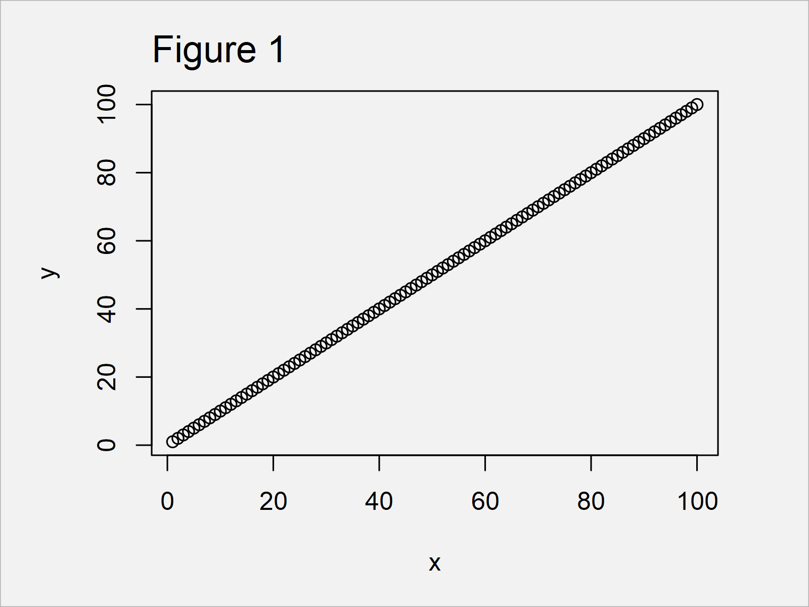
Now, we can draw our data as shown below:
plot(x, y) # Regular plot of example data

In Figure 1 it is shown that we have plotted a scatterplot of our entire data set.
Example 1: Break Y-Axis of Plot Using gap.plot() Function of plotrix Package
Example 1 demonstrates how to remove a particular part of the y-axis from our plot.
For this, we can use the functions of the plotrix package. We first have to install and load plotrix:
install.packages("plotrix")        # Install & load plotrix
library("plotrix")
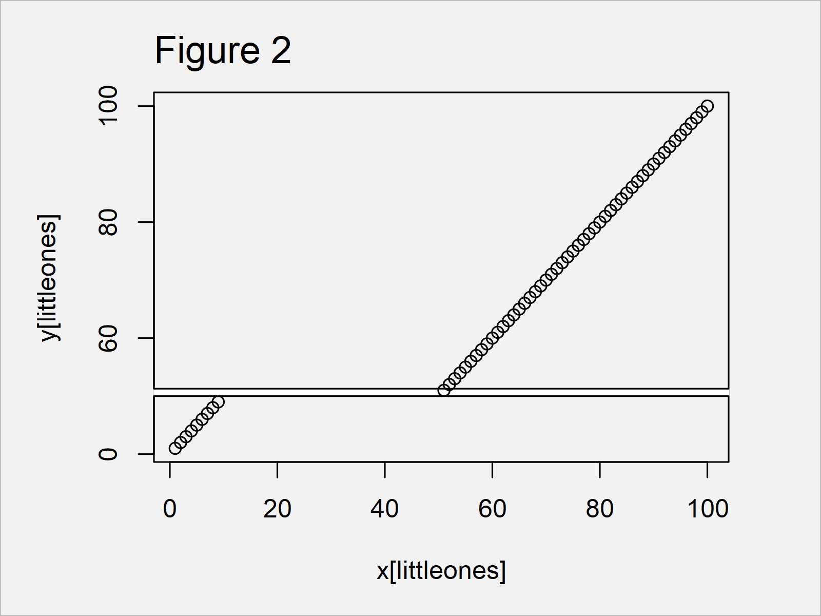
Next, we can use the gap.plot function to insert an axis break in our graph:
gap.plot(x, y,                     # Apply gap.plot function
         gap = c(10, 50))

As shown in Figure 2, we have managed to create a gap between the values 10 and 50 on the y-axis of our graphic by executing the previous R programming syntax.
Example 2: Break X-Axis of Plot Using gap.plot() Function of plotrix Package
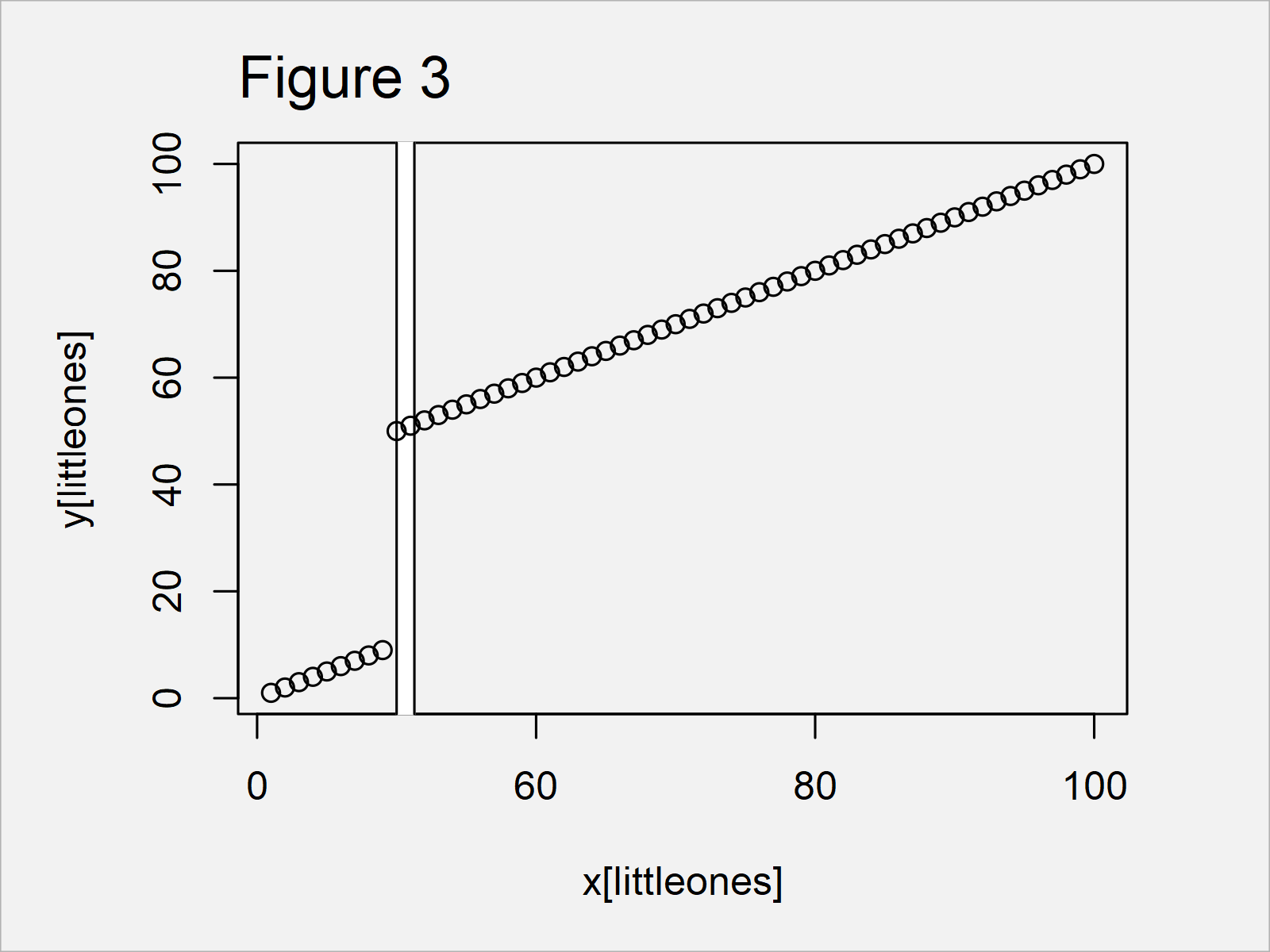
Example 2 explains how to add a break on the x-axis of our plot.
For this, we have to set the gap.axis argument to be equal to “x”.
gap.plot(x, y,                     # Apply gap.plot function
         gap = c(10, 50),
         gap.axis = "x")

As shown in Figure 3, the previously shown R syntax has created a plot with break on the x-axis.
Video & Further Resources
If you need further info on the content of this article, I recommend having a look at the following video on my YouTube channel. I’m explaining the R code of this article in the video:
Also, you might want to read the other articles on my website. Some articles are listed here.
- ggplot2 Barplot with Axis Break & Zoom
- Transform ggplot2 Plot Axis to log10 Scale
- Set Axis Limits of Plot
- Draw Plot with Actual Values as Axis Ticks & Labels
- Creating Plots in R
- R Programming Language
In summary: At this point you should know how to remove the middle of the plot area in R. Let me know in the comments section, in case you have any further comments or questions.


