Add p-Values to Correlation Matrix Plot in R (2 Examples)
On this page you’ll learn how to draw a correlation plot with p-values in the R programming language.
The tutorial will consist of this:
Sound good? Let’s just jump right in…
Example Data & Packages
As the first step, let’s create some example data:
set.seed(3673845)                    # Create example data
x1 <- rnorm(1000)
x2 <- rnorm(1000) + 0.3 * x1
x3 <- runif(1000) - 0.2 * x1 + 0.1 * x2
x4 <- rnorm(1000) + 0.03 * x1
data <- data.frame(x1, x2, x3, x4)
head(data)                           # Print head of example data
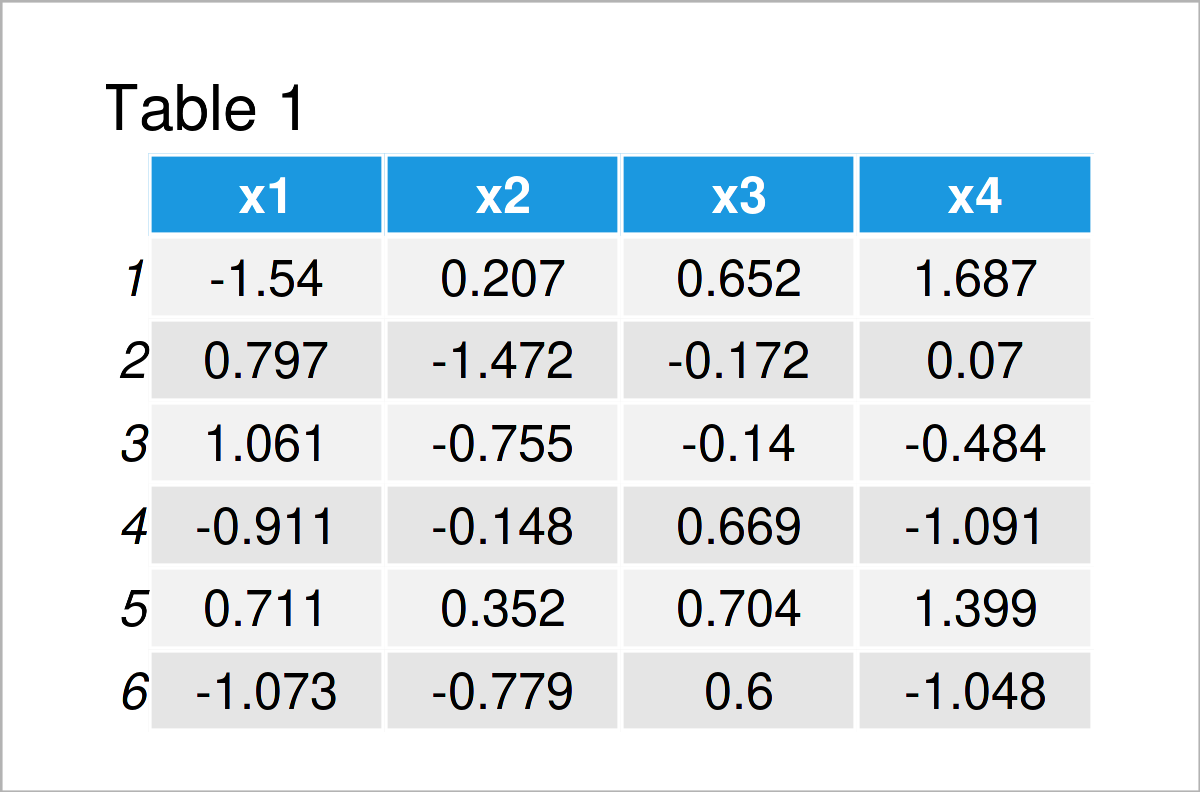
Table 1 shows that our example data is composed of four numeric columns.
Let’s create a correlation matrix of these data:
cor_mat <- cor(data)                 # Correlation matrix of example data
cor_mat                              # Print correlation matrix
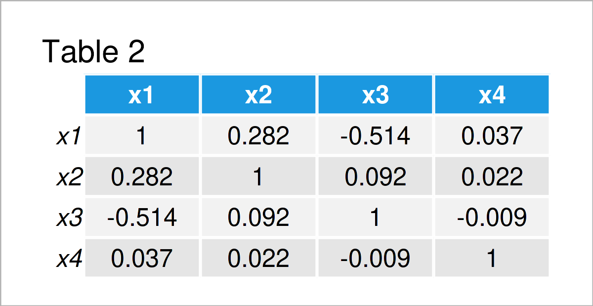
The output of the previous code is shown in Table 2 – A correlation matrix of our input data frame.
In the next step, we have to create a matrix containing the p-values corresponding to our data.
For this task, we can use the psych package. In order to use the functions of the psych package, we also need to install and load psych:
install.packages("psych")            # Install psych package
library("psych")                     # Load psych package
Now, we can apply the corr.test function of the psych package as shown below:
cor_test_mat <- corr.test(data)$p    # Apply corr.test function
cor_test_mat                         # Print matrix of p-values
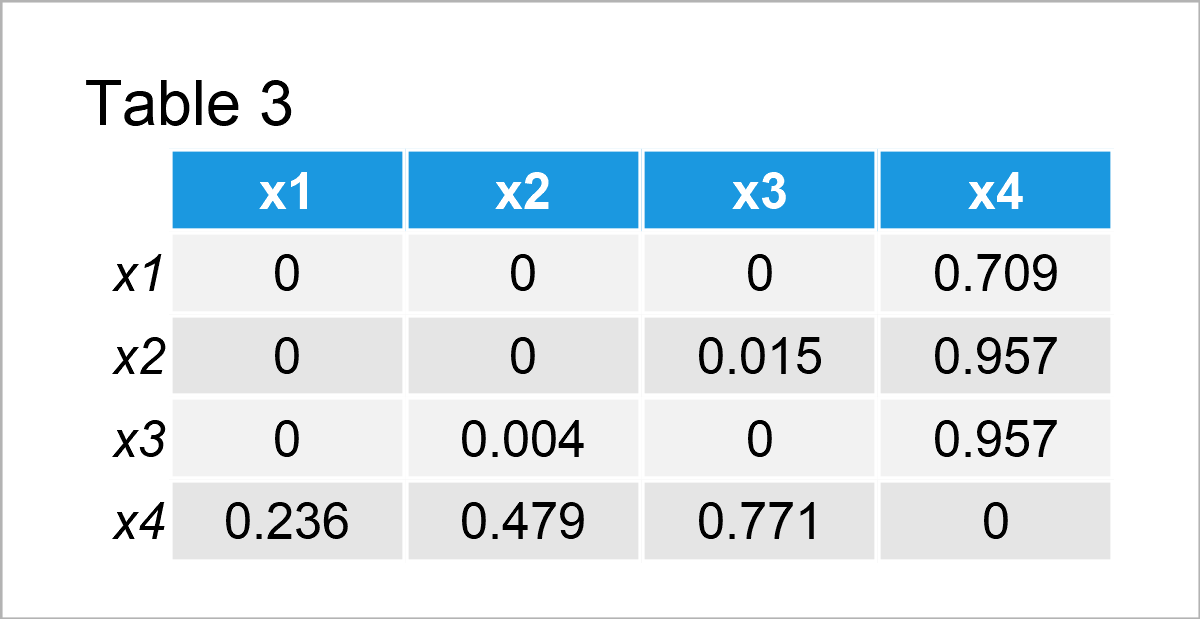
Table 3 contains the p-values on the lower part of the matrix and the adjusted p-values on the upper triangular of the matrix.
Let’s add these p-values to correlation matrix plot!
Example 1: Draw Correlation Plot with p-Values Using corrplot Package
In this example, I’ll explain how to draw a correlation matrix graph with p-values using the corrplot package.
If we want to apply the functions of the corrplot add-on package, we first need to install and load corrplot:
install.packages("corrplot")         # Install corrplot package
library("corrplot")                  # Load corrplot package
We can now create a graphic of our correlation matrix without showing the p-values as shown below:
corrplot(cor_mat) # Draw corrplot
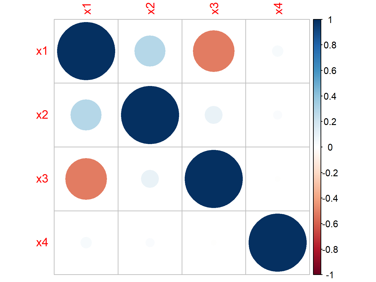
Figure 1 shows a corrplot with default specifications, i.e. no p-values.
If we want to add p-values to this corrplot, we can use the matrix of p-values that we have created at the beginning of this tutorial.
Consider the following R code:
corrplot(cor_mat,                    # Draw corrplot with p-values
         p.mat = cor_test_mat,
         insig = "p-value")
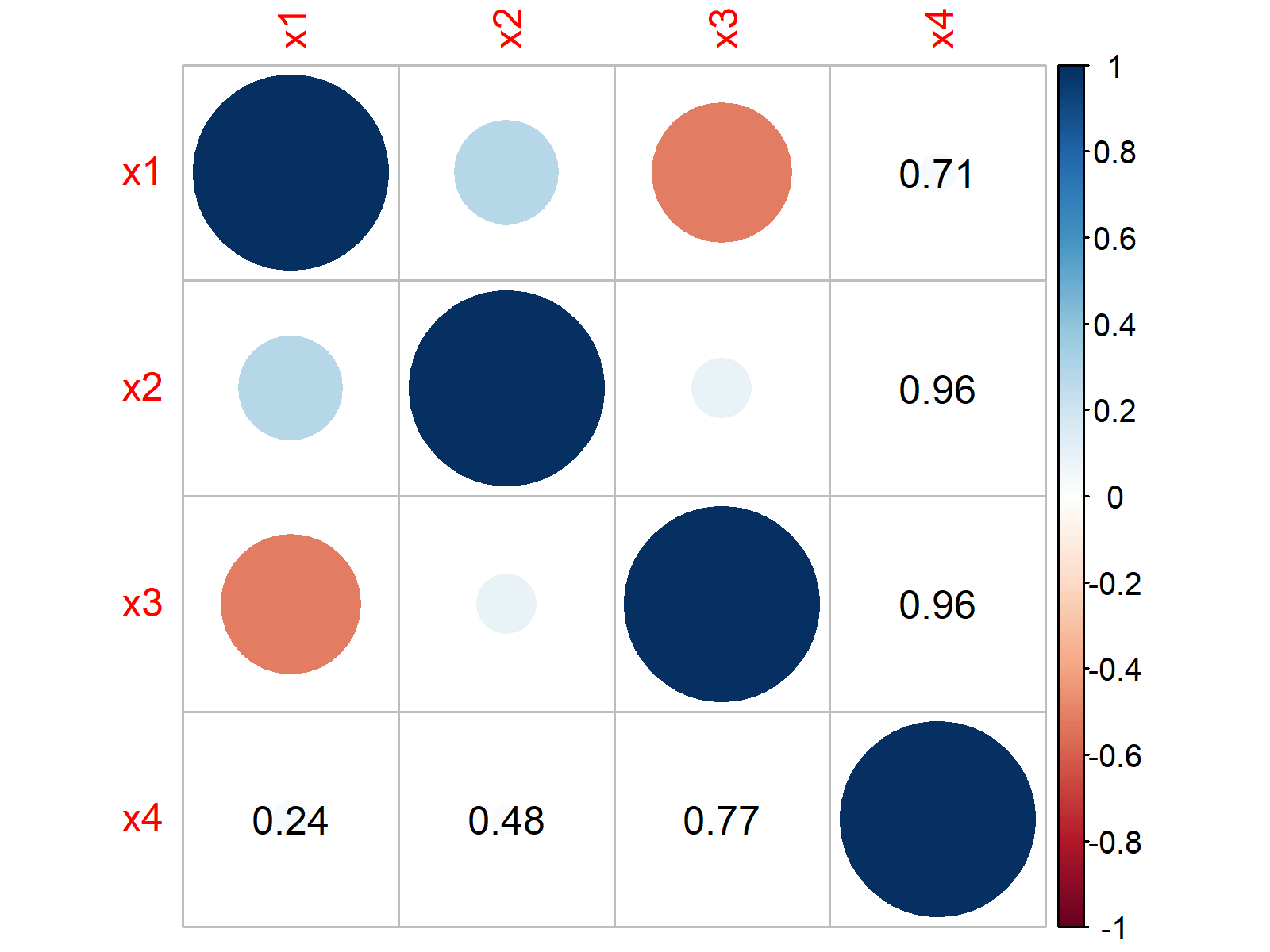
The previous graphic shows our updated corrplot. As you can see, we have added some p-values to the lower triangular matrix and adjusted p-values to the upper triangular matrix.
Note that we have only added p-values to those cells, where the correlation coefficients are not significant.
Example 2: Draw Correlation Plot with p-Values Using ggcorrplot Package
In Example 2, I’ll demonstrate how to use the ggcorrplot package (i.e. ggplot2 style) to visualize non-significant p-values in a correlation matrix plot.
In order to use the functions of the ggcorrplot package, we first need to install and load ggcorrplot:
install.packages("ggcorrplot")       # Install ggcorrplot package
library("ggcorrplot")                # Load ggcorrplot package
We can now draw a default ggcorrplot graph using the following R syntax:
ggcorrplot(cor_mat) # Draw ggcorrplot
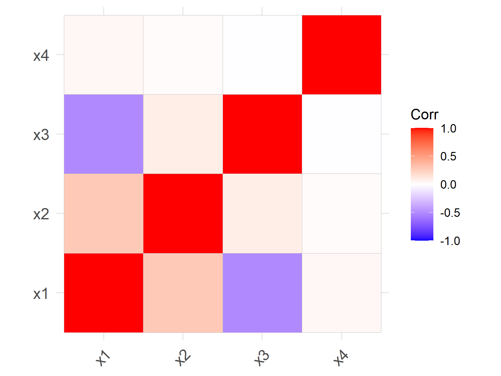
Figure 3 visualizes a ggcorrplot without identifying non-significant p-values.
If we want to highlight non-significant p-values, we can use the p.mat argument of the ggcorrplot function as illustrated below:
ggcorrplot(cor_mat,                  # Draw ggcorrplot with p-values
           p.mat = cor_test_mat)

As you can see in Figure 4, we have added a cross at each matrix position where the correlation coefficient is not significant.
Unfortunately, I have not found a solution of how to add the actual p-values to a ggcorrplot. Please let me know in the comments in case you have any ideas on how to do that.
Video, Further Resources & Summary
If you need more info on the R syntax of the present tutorial, I can recommend watching the following video on my YouTube channel. In the video, I’m demonstrating the contents of this article.
Furthermore, you could have a look at the related articles on my website. I have published numerous articles on topics such as regression models, graphics in R, and distributions already.
- Correlation Matrix in R
- Calculate Correlation Matrix Only for Numeric Columns
- How to Calculate Correlation Coefficients
- Correlation of One Variable to All Others
- Graphics Gallery in R
- The R Programming Language
Summary: At this point in the tutorial you should have learned how to create a correlation plot with p-values in the R programming language. In case you have further questions, don’t hesitate to let me know in the comments section.
Subscribe to the Statistics Globe Newsletter
Get regular updates on the latest tutorials, offers & news at Statistics Globe.
I hate spam & you may opt out anytime: Privacy Policy.
Thank you!
Welcome to the Statistics Globe newsletter. From now on, I’ll send you regular emails about statistics, data science, AI, and programming with R and Python.
I’m Joachim Schork. On this website, I provide statistics tutorials as well as code in Python and R programming.
Statistics Globe Newsletter
Get regular updates on the latest tutorials, offers & news at Statistics Globe. I hate spam & you may opt out anytime: Privacy Policy.
Thank you!
Please check your email inbox and click the confirmation link to complete your subscription. If you don’t see the email within a few minutes, please also check your spam/junk folder.



2 Comments. Leave new
For ggcorrplot, to have the p-values shown – just set lab argument to TRUE:
ggcorrplot(cor_mat, p.mat = cor_test_mat, lab = TRUE)
Hey Vita,
Thanks a lot for the comment.
This is showing the actual correlations, and not the p-values, though. Or am I getting something wrong?
Regards,
Joachim