Add Panel Border to ggplot2 Plot in R (Example)
In this article you’ll learn how to draw a panel border to a ggplot graphic in the R programming language.
Table of contents:
Let’s dive into it!
Example Data, Add-On Packages & Default Plot
The first step is to create some data that we can use in the examples below:
data <- data.frame(x = c(4, 1, 3, 3, 7, 2),    # Create example data
                   y = 1:6)
data                                           # Print example data

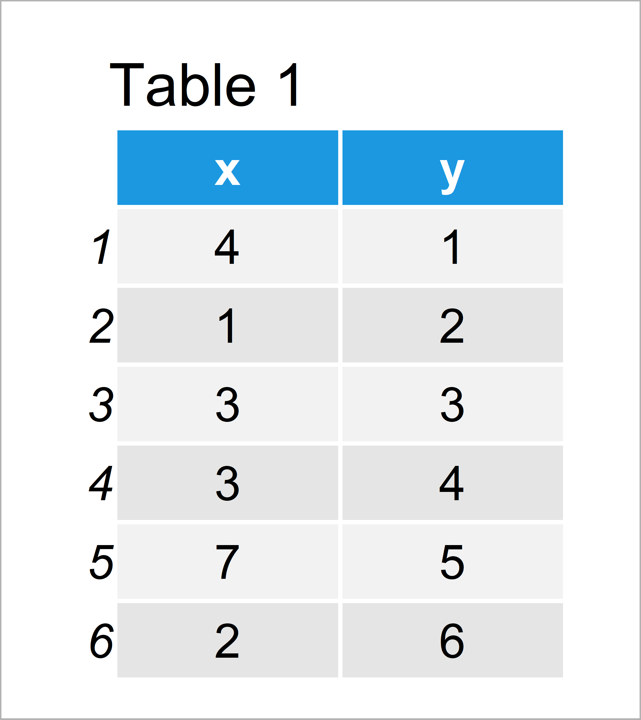
Table 1 shows the structure of our exemplifying data: It contains six rows and two columns.
We also have to install and load the ggplot2 package, to be able to use the corresponding functions:
install.packages("ggplot2")                    # Install & load ggplot2
library("ggplot2")
Now, we can plot our data as follows:
ggp <- ggplot(data, aes(x, y)) +               # Create ggplot2 plot without panel border
  geom_point()
ggp                                            # Draw ggplot2 plot without panel boarder

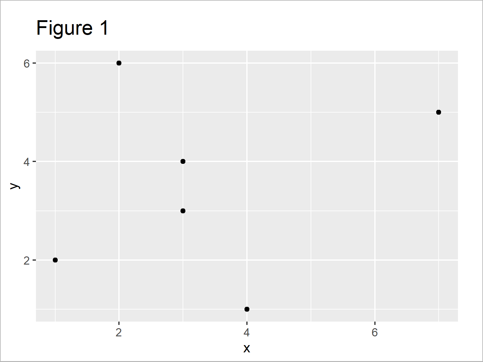
As shown in Figure 1, the previous syntax has plotted a ggplot2 scatterplot without any panel borders.
Example: Draw Panel Border to ggplot2 Plot Using theme() Function & panel.border Argument
This example illustrates how to show a panel box around our ggplot2 plot. For this, we can use the theme function and the panel.border argument as shown below:
ggp +                                          # Add panel border to ggplot2 plot
  theme(panel.border = element_rect(color = "#1b98e0",
                                    fill = NA,
                                    size = 10))

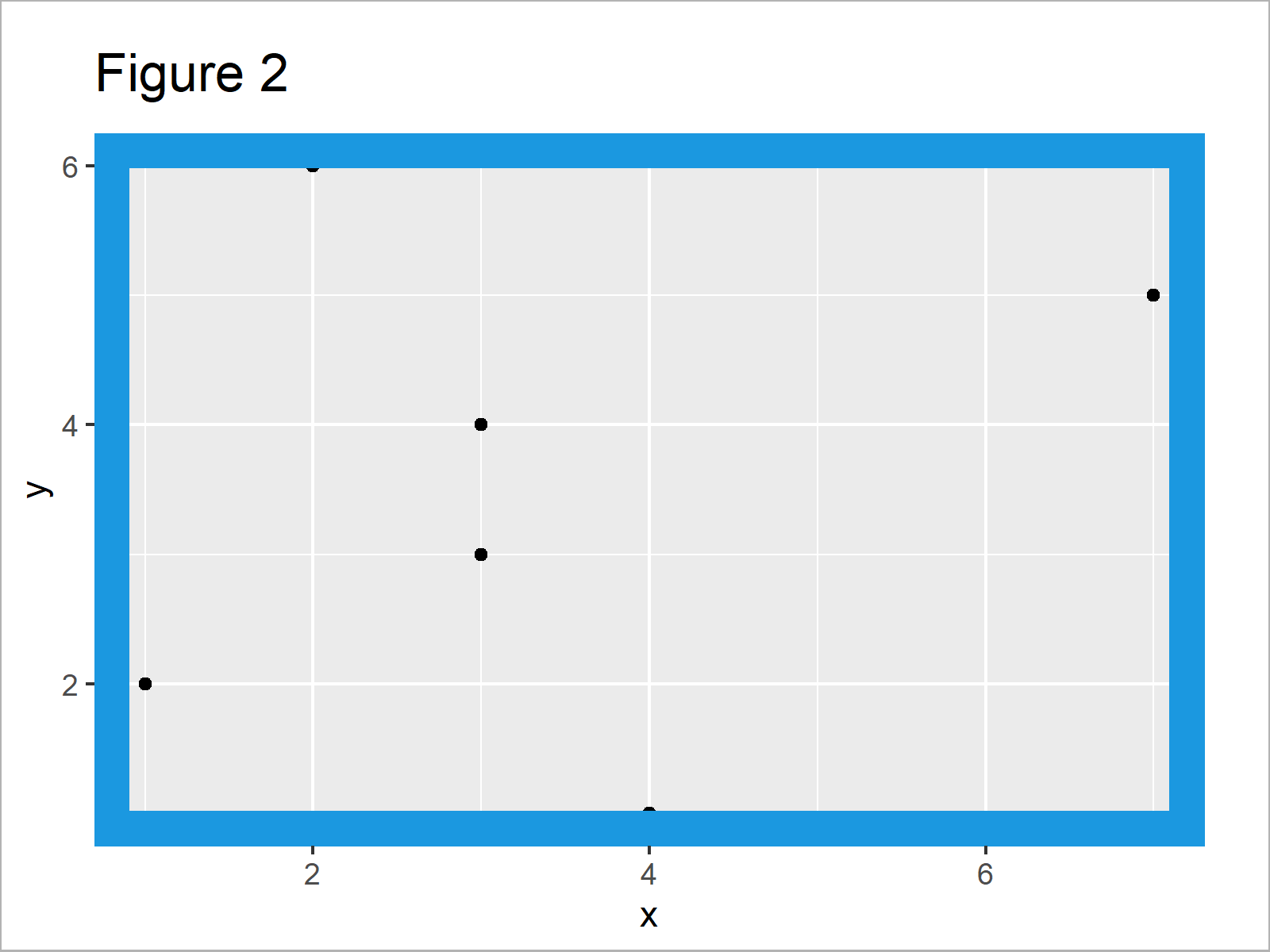
In Figure 2 it is shown that we have created a ggplot2 plot with relatively thick blue panel borders using the previous R code.
Note that you can change the color and line width of our panel borders by modifying the color and size arguments within the element_rect function.
Video, Further Resources & Summary
In case you need more information on the R programming codes of this article, I recommend watching the following video which I have published on my YouTube channel. In the video, I show the R code of this tutorial in R:
Furthermore, you might want to have a look at some of the other articles on my website.
- Introduction to the ggplot2 Package
- Add Regression Line to ggplot2 Plot
- Add Legend without Border & White Background to Plot
- Add X & Y Axis Labels to ggplot2 Plot
- Add Image to Plot in R
- Add Greek Symbols to ggplot2 Plot
- R Graphics Gallery
- The R Programming Language
In this R tutorial you have learned how to add panel borders to plots. If you have additional questions, don’t hesitate to let me know in the comments below.
Subscribe to the Statistics Globe Newsletter
Get regular updates on the latest tutorials, offers & news at Statistics Globe.
I hate spam & you may opt out anytime: Privacy Policy.
Thank you!
Welcome to the Statistics Globe newsletter. From now on, I’ll send you regular emails about statistics, data science, AI, and programming with R and Python.
I’m Joachim Schork. On this website, I provide statistics tutorials as well as code in Python and R programming.
Statistics Globe Newsletter
Get regular updates on the latest tutorials, offers & news at Statistics Globe. I hate spam & you may opt out anytime: Privacy Policy.
Thank you!
Please check your email inbox and click the confirmation link to complete your subscription. If you don’t see the email within a few minutes, please also check your spam/junk folder.


