Remove Legend from Plot in Python Matplotlib & seaborn (2 Examples)
Hi! This tutorial will show you how to eliminate the legend from a plot in Matplotlib and seaborn in the Python programming language.
In Matplotlib, legend is not plotted by default. However, when using the pandas approach, it is plotted by default as we will soon see.
Here is an overview:
Let’s get into the Python code!
Install & Import Matplotlib, seaborn & pandas
We will need to install and import Matplotlib, seaborn and pandas.
The pandas library is the foremost library in Python for data manipulation and analysis, and we need it in order to create the DataFrame that we will use in the examples in this tutorial.
So, in your Python programming IDE, run the lines of code below to install and import all three libraries:
# install Matplotlib, seaborn & pandas
pip install matplotlib seaborn pandas

# import Matplotlib, seaborn & pandas
import matplotlib.pyplot as plt

import seaborn as sns

import pandas as pd
With Matplotlib, seaborn and pandas installed and imported in our Python programming environment, we can now explore ways to take legend away from plots.
First, though, we will need to create the example DataFrame that we will use in this tutorial.
Create Example DataFrame
Run the code below to create the example DataFrame:
data_dict = {"Count":[205, 202, 220, 270, 203],
             "Value":[260, 200, 250, 180, 275],
             "Color":["Green","Red","Red","Green","Blue"]}

df = pd.DataFrame(data_dict)

print(df)

#   Count  Value  Color
#0    205    260  Green
#1    202    200    Red
#2    220    250    Red
#3    270    180  Green
#4    203    275   Blue
Now that we have created the DataFrame, let us now see ways to get rid of legend in plots in Matplotlib and seaborn.
Example 1: Eliminate Legend from Plot in Matplotlib
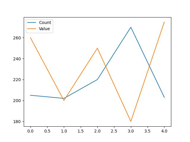
Here, we will first of all build a basic line plot with a legend:
df.plot()

In Figure 1 above, we used df.plot(), which is a pandas DataFrame plotting method built on top of Matplotlib, to create the plot.
It generates a a line plot of the two columns in the DataFrame with a default legend in place as well.
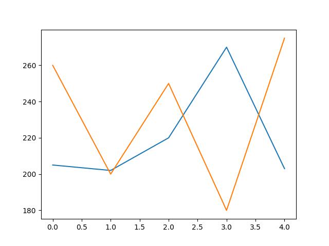
Let us now demonstrate how to get rid of the legend in the plot. Run the code below to do so:
df.plot(legend = False)

As you can see in Figure 2 above, the default plot legend has been removed. To achieve this, we simply defined the legend = argument in df.plot() as False.
Consequently, the plot legend has been eliminated from the plot.
Example 2: Eliminate Legend from Plot in seaborn
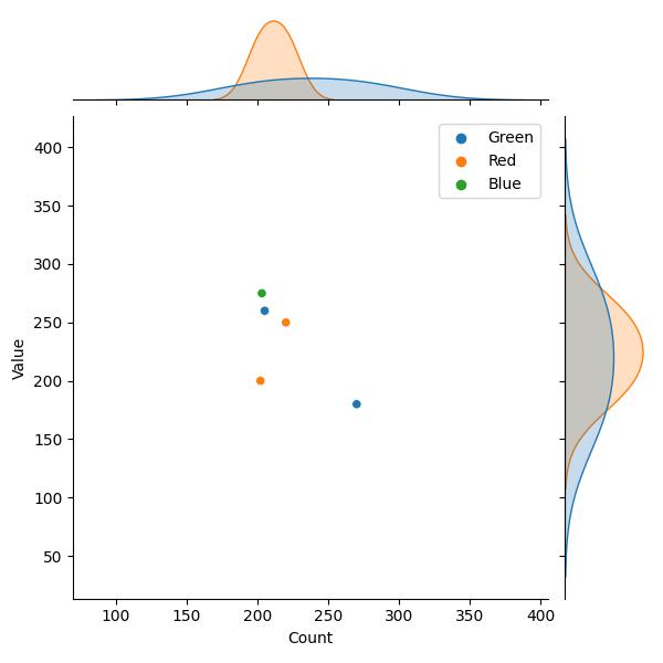
As we did in the Matplotlib example, we will first of all build a basic joint plot with the default legend, and then demonstrate how to remove the legend from the plot.
Run the code below to build the basic joint plot:
sns.jointplot(df, x = "Count", y = "Value", hue = "Color")

plt.show()

In the above example, we used sns.jointplot() to construct the joint plot.
In that method, we parsed the DataFrame (df) and the columns of interest (Count, Value) to the respective arguments.
We also parsed the Color column to the hue = argument and then displayed the plot using plt.show().
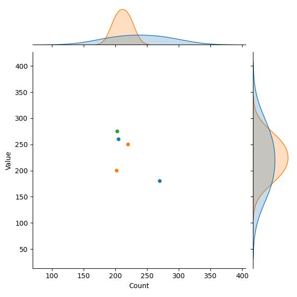
Now, let us demonstrate how to eliminate the legend of the plot. Run the code below to do so:
sns.jointplot(df, x = "Count", y = "Value", hue = "Color", legend = False)

plt.show()

In Figure 4 above, you can see that the legend has been removed from the plot. All we needed to do to remove the legend was to define the legend = argument in sns.jointplot() as False.
That effectively eliminated the legend from the plot.
Video, Further Resources & Summary
Do you need more explanations on how to remove the legend from a plot in Python Matplotlib and seaborn? Then you should have a look at the following YouTube video of the Statistics Globe YouTube channel.
In the video, we explain in some more detail how to remove the legend from a plot in Python Matplotlib and seaborn.
The YouTube video will be added soon.
In addition, you might read other posts on this homepage.
- Change Axis Labels of Plot in Python Matplotlib & seaborn (2 Examples)
- Add Legend to Plot in Python Matplotlib & seaborn (4 Examples)
- Change Legend Size of Plot in Python Matplotlib & seaborn (2 Examples)
- Change Font Size of Plot in Python Matplotlib & seaborn (2 Examples)
- Introduction to Python Programming
This post has shown how to remove the legend from a plot in Python Matplotlib and seaborn. In the present tutorial, we have removed the legend from a line plot and joint plot. However, you may use the same syntax to remove the legend from other types of plots such as boxplots, histograms, heatmaps, density plots, and so on. I do hope you found this tutorial helpful!
In case you have further questions, you may leave a comment below.
This page was created in collaboration with Ifeanyi Idiaye. You might check out Ifeanyi’s personal author page to read more about his academic background and the other articles he has written for the Statistics Globe website.
Subscribe to the Statistics Globe Newsletter
Get regular updates on the latest tutorials, offers & news at Statistics Globe.
I hate spam & you may opt out anytime: Privacy Policy.
Thank you!
Welcome to the Statistics Globe newsletter. From now on, I’ll send you regular emails about statistics, data science, AI, and programming with R and Python.
I’m Joachim Schork. On this website, I provide statistics tutorials as well as code in Python and R programming.
Statistics Globe Newsletter
Get regular updates on the latest tutorials, offers & news at Statistics Globe. I hate spam & you may opt out anytime: Privacy Policy.
Thank you!
Please check your email inbox and click the confirmation link to complete your subscription. If you don’t see the email within a few minutes, please also check your spam/junk folder.


