Change Colors of Ranges in ggplot2 Heatmap in R (2 Examples)
In this tutorial you’ll learn how to modify the colors of value ranges in a ggplot2 heatmap in R programming.
The article looks as follows:
With that, let’s dive right into the exemplifying R syntax.
Exemplifying Data, Packages & Default Graphic
Have a look at the example data below:
set.seed(56489)                                       # Set random seed
data <- data.frame(x = rep(LETTERS[1:10], each = 5),  # Create example data
                   y = letters[1:5],
                   values = runif(50, 0, 10))
head(data)                                            # Print head of example data
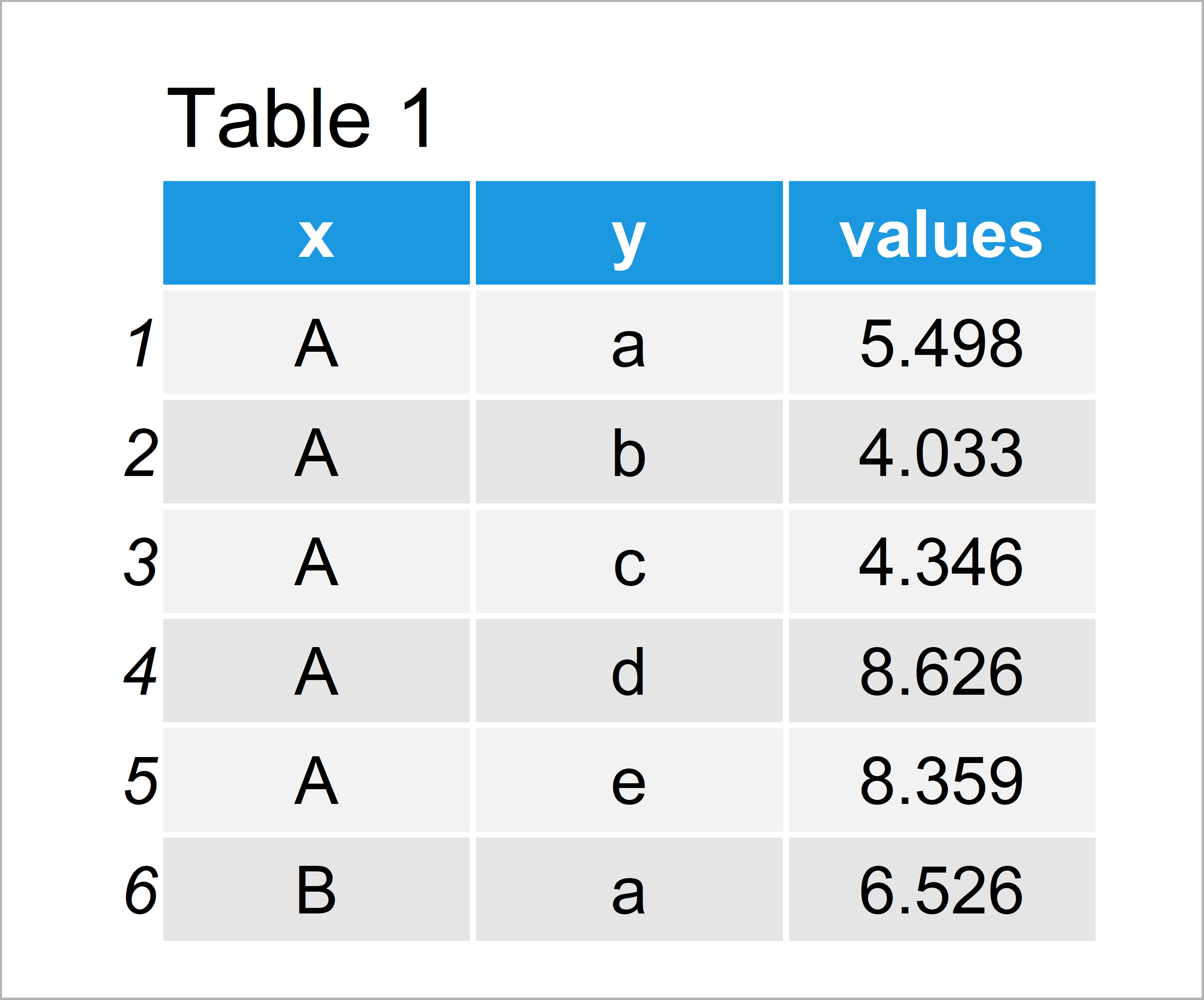
Have a look at the previous table. It shows that our example data is composed of three columns.
In this tutorial, we’ll also need to install and load the ggplot2 package to R:
install.packages("ggplot2")                           # Install ggplot2 package
library("ggplot2")                                    # Load ggplot2 package
As next step, we can plot the data in a heatmap as shown below:
ggplot(data, aes(x, y, fill = values)) +              # Default ggplot2 heatmap
  geom_tile()
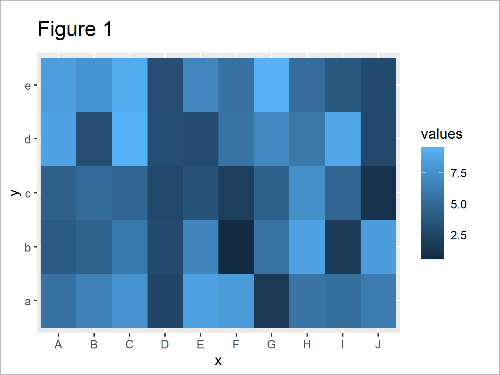
In Figure 1 you can see that we have managed to create a ggplot2 heatmap in R. However, the color range is based on the default color palette of the ggplot2 package.
Next, I’ll show how to change this color range. So keep on reading!
Example 1: Change Color Range in Heatmap Using scale_fill_gradient Function
The syntax below demonstrates how to adjust the color range by defining a low and high color of our color gradient range.
For this, we can use the scale_fill_gradient function as shown in the following R code:
ggplot(data, aes(x, y, fill = values)) +              # Change gradient color
  geom_tile() +
  scale_fill_gradient(low = "#353436",
                      high = "#f6f805",
                      guide = "colorbar")
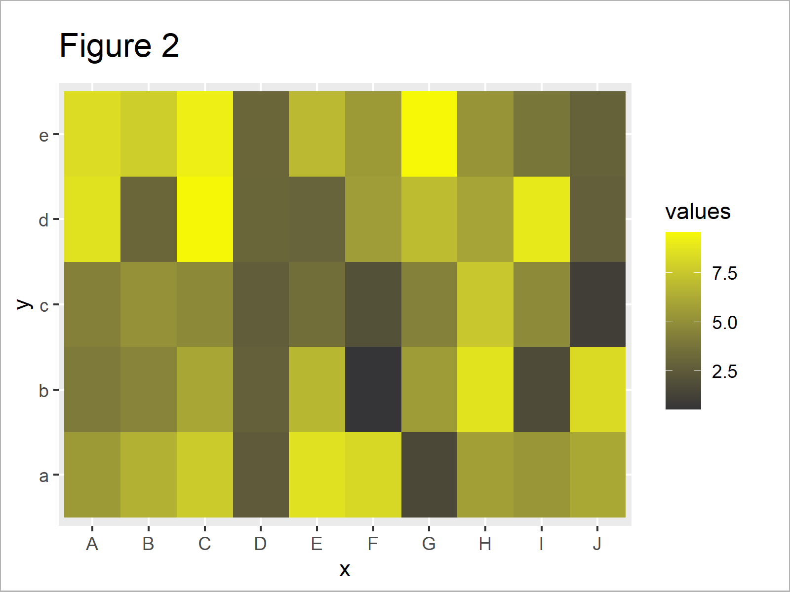
After running the previous syntax the heatmap shown in Figure 2 has been created. As you can see, we have changed the color gradient in our graphic.
However, you can also see that the previous heatmap is still based on two main colors. In the following example, I’ll show how to use very different colors to highlight the cells and data points of our heatmap.
Example 2: Change Colors of Range-Groups in Heatmap Using scale_fill_manual Function
The R programming syntax below shows how to define ranges and assign heatmap colors based on these ranges.
First, we have to convert our numerical values to categories:
data_new <- data                                      # Duplicate data
data_new$groups <- cut(data_new$values,               # Add group column
                       breaks = c(0, 2, 4, 6, 8, 10))
head(data_new)                                        # Print head of updated data
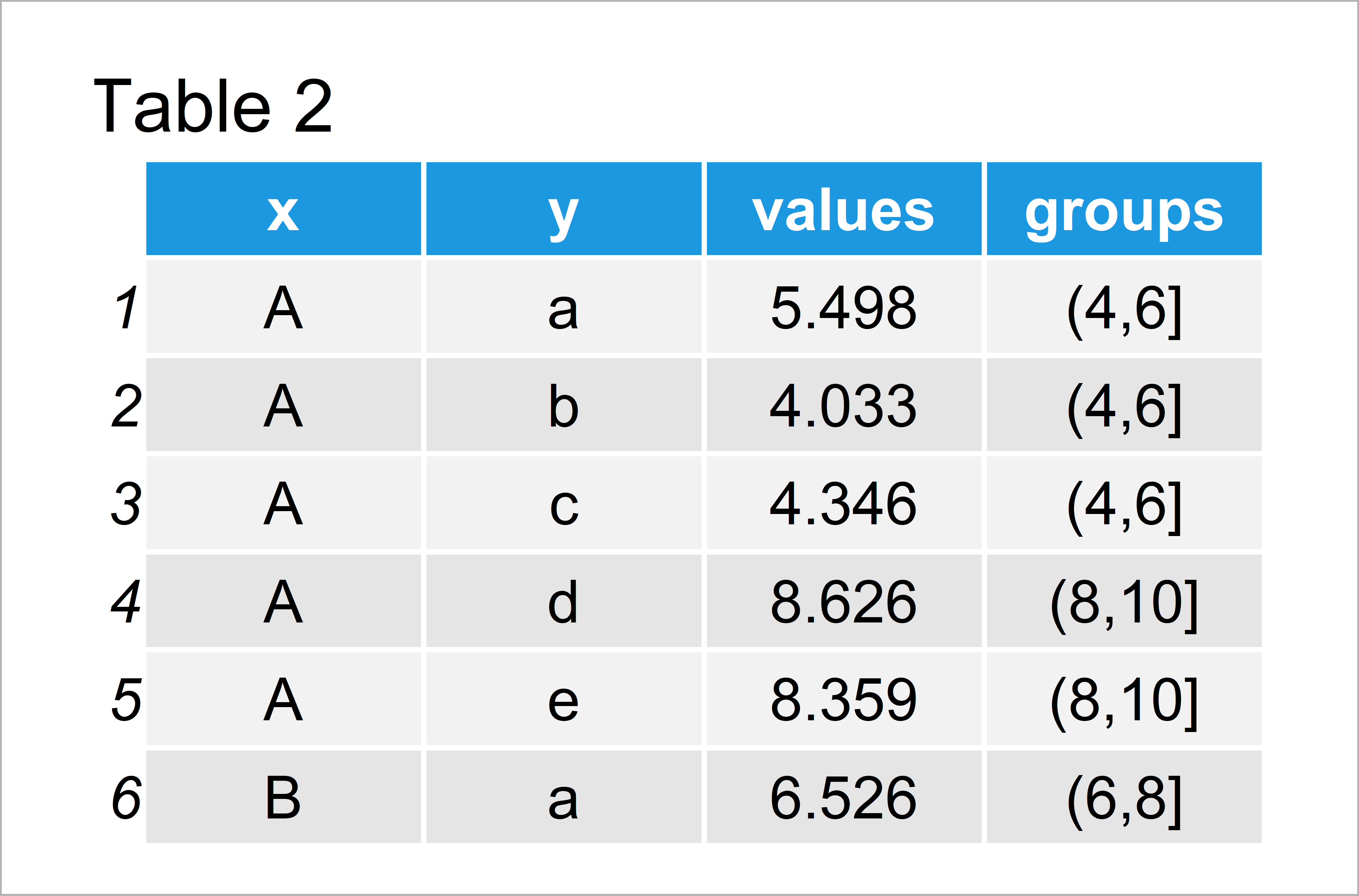
By running the previous R code we have created Table 2, i.e. a data frame containing a categorical variable for our ranges.
In the next step, we can apply the scale_fill_manual function to define a color for each of our categories:
ggplot(data_new, aes(x, y, fill = groups)) +          # Specify colors manually
  geom_tile() +
  scale_fill_manual(breaks = levels(data_new$groups),
                    values = c("#353436", "#f6f805", "#1b98e0", "white", "green"))
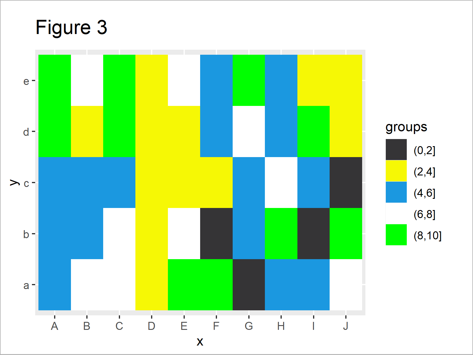
By running the previous R syntax we have created Figure 3, i.e. a heatmap with completely different colors for each range of values in our data.
Video, Further Resources & Summary
In case you need more explanations on the R code of this tutorial, you could have a look at the following video of the Statistics Globe YouTube channel. In the video, I explain the R programming codes of this tutorial:
In addition, you may want to read the related tutorials on this website. A selection of tutorials on similar topics such as graphics in R, ggplot2, and lines is shown below.
- Create Heatmap Using Base R, ggplot2 & plotly
- Change Colors of Bars in ggplot2 Barchart
- Change Colors in ggplot2 Line Plot in R
- Plotting Data in R
- R Programming Language
On this page you have learned how to change the cell colors in a heatmap that shows ranges of numerical values in R. In case you have additional questions, don’t hesitate to let me know in the comments.
Subscribe to the Statistics Globe Newsletter
Get regular updates on the latest tutorials, offers & news at Statistics Globe.
I hate spam & you may opt out anytime: Privacy Policy.
Thank you!
Welcome to the Statistics Globe newsletter. From now on, I’ll send you regular emails about statistics, data science, AI, and programming with R and Python.
I’m Joachim Schork. On this website, I provide statistics tutorials as well as code in Python and R programming.
Statistics Globe Newsletter
Get regular updates on the latest tutorials, offers & news at Statistics Globe. I hate spam & you may opt out anytime: Privacy Policy.
Thank you!
Please check your email inbox and click the confirmation link to complete your subscription. If you don’t see the email within a few minutes, please also check your spam/junk folder.


