Reverse Order of ggplot2 Plot Legend in R (Example)
In this tutorial you’ll learn how to reverse the ordering of a ggplot2 plot legend in R.
Table of contents:
Let’s dive right in…
Example Data, Software Packages & Default Graphic
Initially, let’s create some example data:
data <- data.frame(x = 1:8,        # Create example data
                   y = c(1, 3, 6, 3, 2, 5, 4, 5),
                   group = LETTERS[1:4])
data                               # Print example data

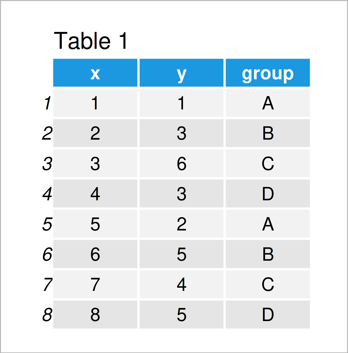
Table 1 shows the structure of our example data – It contains eight rows and three columns. The variable x has the integer class, the variable y is numerical, and the variable group has the character class.
We also have to install and load the ggplot2 package, in order to use the corresponding functions:
install.packages("ggplot2")        # Install ggplot2 package
library("ggplot2")                 # Load ggplot2
Now, we can draw our example data as shown below:
ggp <- ggplot(data,                # Basic ggplot2 plot
              aes(x = x,
                  y = y,
                  color = group)) +
  geom_point(size = 3)
ggp                                # Draw plot

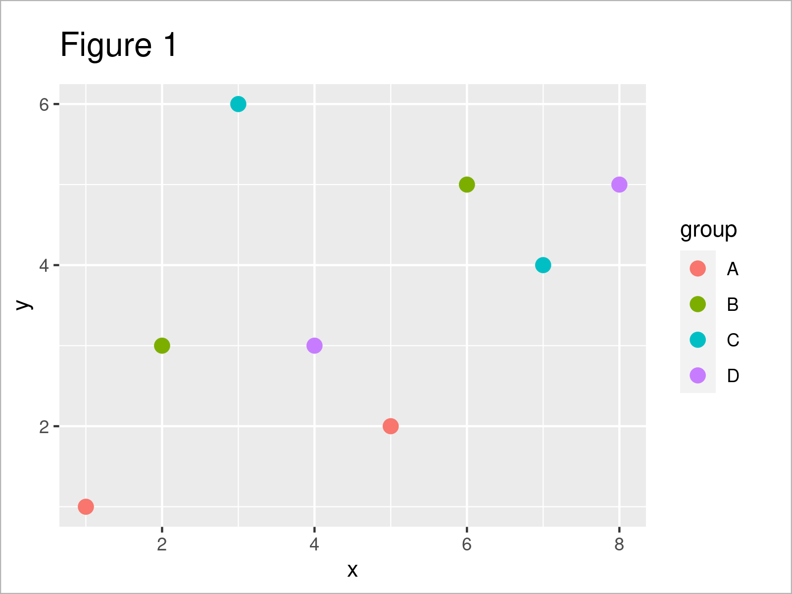
As shown in Figure 1, the previous code has managed to create a ggplot2 scatterplot. The display order of the legend follows the default settings of the ggplot2 package (i.e. alphabetically sorted).
Let’s change this order!
Example: Reverse Ordering of ggplot2 Plot Legend Using guides() & guide_legend() Functions
The following syntax explains how to reverse the order of a ggplot2 graphic legend.
For this task, we can apply the guides() and guide_legend() functions as shown below:
ggp +                              # Reverse legend order
  guides(col = guide_legend(reverse = TRUE))

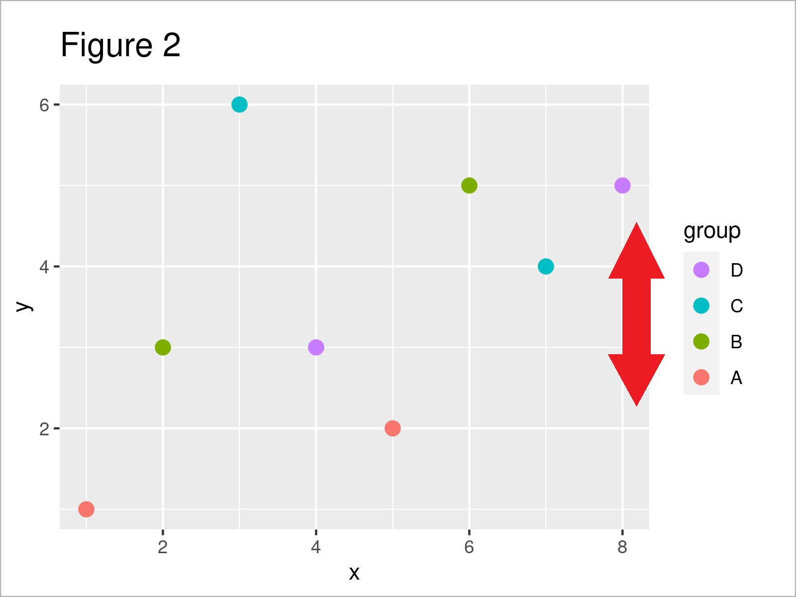
After executing the previous R programming code the legend of our ggplot2 plot has been reversed, i.e. the legend item D is shown at the top and the legend item A is shown at the bottom of the legend.
Video, Further Resources & Summary
Have a look at the following video on my YouTube channel. I illustrate the topics of this tutorial in the video:
Furthermore, you may want to read the related tutorials on this homepage:
- Change Display Order of ggplot2 Plot Legend
- Change Drawing Order of Points in ggplot2 Plot
- Show ggplot2 Legend at the Bottom of a Plot & Horizontally Aligned
- Remove Legend Title from ggplot2 Plot
- Change Spacing Between Horizontal Legend Items of ggplot2 Plot
- R Graphics Gallery
- R Programming Examples
You have learned in this tutorial how to reverse the value and label order of a ggplot2 graph legend so that the highest value is shown at the top and the lowest value is shown at the bottom in R. Don’t hesitate to kindly let me know in the comments section, if you have further questions.


2 Comments. Leave new
Great tutorial! You make it very easy to understand, as usual 🙂
Thanks a lot for the kind words Flo, glad you think so! 🙂