Draw Heatmap with Clusters Using pheatmap R Package (4 Examples)
In this tutorial, I’ll explain how to draw a clustered heatmap using the pheatmap package in the R programming language.
Table of contents:
Let’s start right away:
Basic Information about the pheatmap Package
The pheatmap package, created by Raivo Kolde, offers extensive control over dimensions and appearance of heatmaps. A big advantage of the package is that it enables the user to visually cluster heatmaps.
Before we dive deeper into the exemplifying R codes…
- Here you can find the documentation of the pheatmap package.
- Here you can find the CRAN page of the pheatmap package.
Make sure to visit the previous links for more details and instructions on how to use the pheatmap package in the R programming language.
So without further ado, let’s move on to the example codes in R!
Example Data & pheatmap Software Package
As a first step, let’s create some example data:
set.seed(354896)                     # Create example data
data <- matrix(round(rnorm(150), 2), nrow = 15)
colnames(data) <- LETTERS[1:10]
rownames(data) <- letters[1:15]
data                                 # Print example data
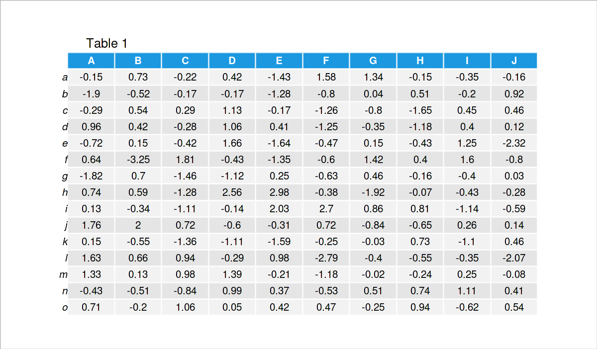
Have a look at the previous table. It shows that our example data is a matrix that has 15 rows and the ten numerical columns called “A”, “B”, “C”, “D”, “E”, “F”, “G”, “H”, “I”, and “J”.
We also have to install and load the pheatmap package to R, if we want to use the functions that are contained in the package:
install.packages("pheatmap")         # Install & load pheatmap package
library("pheatmap")
Looks good, let’s draw some heatmaps using the pheatmap package!
Example 1: Draw Default Heatmap Using pheatmap Package
The following code shows how to draw a heatmap using the pheatmap function. Note that we do not have to specify anything, but the name of our data matrix that we want to draw.
pheatmap(data) # Heatmap with default specifications
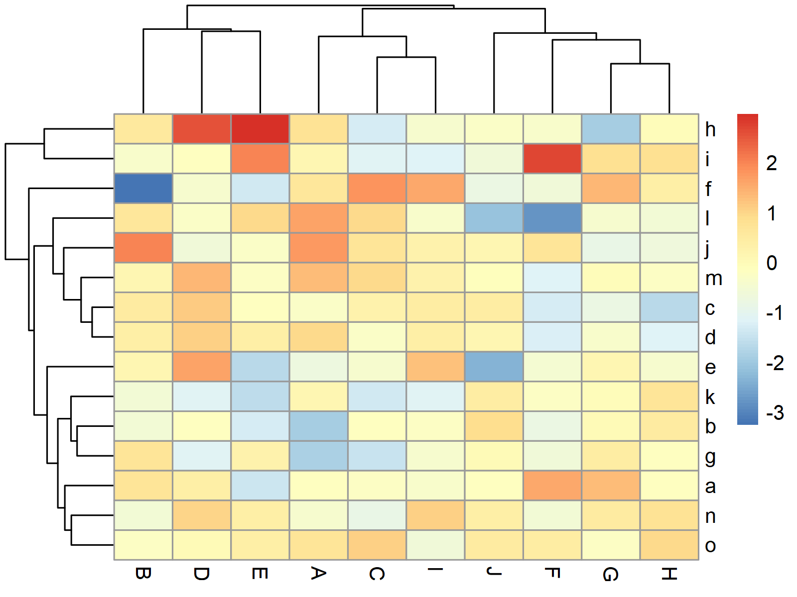
Figure 1 shows the graphic that was created by the previous R code – A heatmap created with the default specifications of the pheatmap package.
Example 2: Draw Heatmap with kmeans Clusters
The pheatmap function provides numerous optional parameters that can be used to make the heatmap prettier, and to show additional clusters in the heatmap.
Example 2 shows how to use a kmeans cluster algorithm to split our heatmap in a certain number of clusters (i.e. 4).
pheatmap(data,                       # Heatmap with kmeans clusters
         kmeans_k = 4)
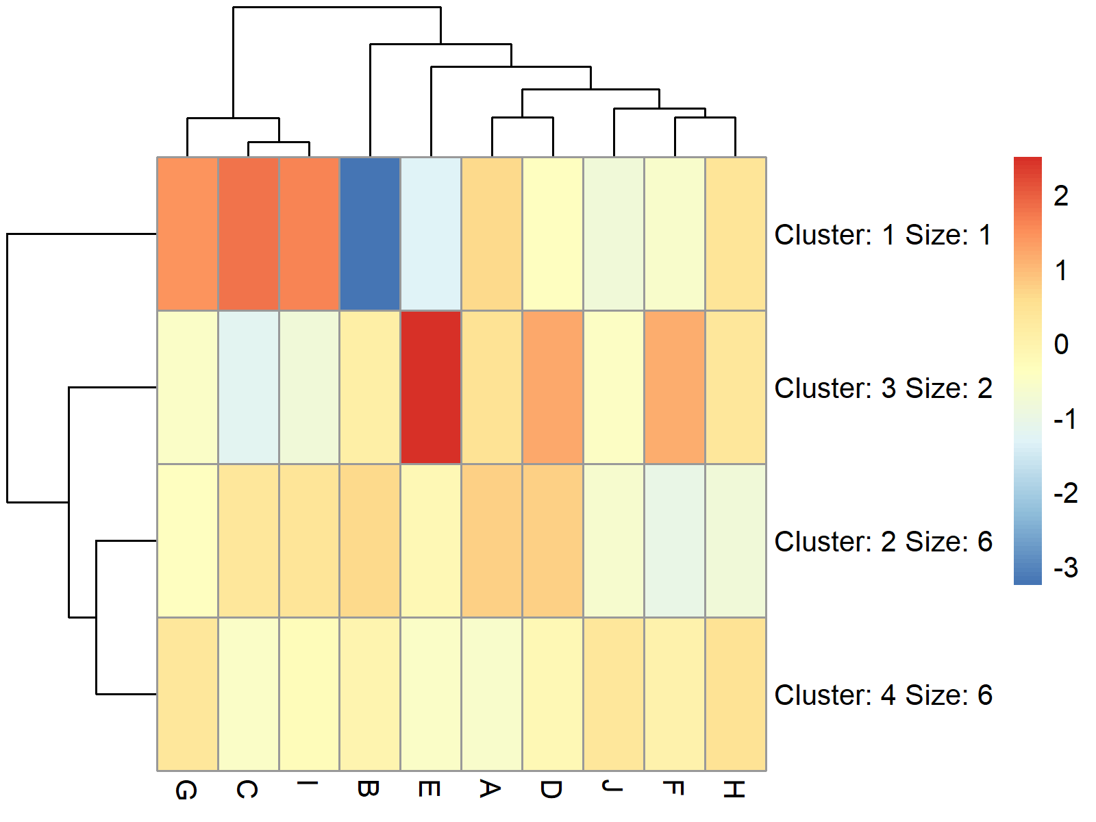
Figure 2 visualizes our data in a heatmap with four clusters. As you can see, the cells in these clusters have been combined.
Example 3: Draw Heatmap with Row Clusters
In Example 3, I’ll show how to split our heatmap without combining the cells in the different clusters (as in Example 2).
For this, we can use the cutree_rows argument within the pheatmap function as shown below:
pheatmap(data,                       # Heatmap with row clusters
         cutree_rows = 4)

Figure 3 shows our heatmap split in four different groups by rows.
Example 4: Draw Heatmap with Row & Column Clusters
This example demonstrates how to split a heatmap by rows and columns (not only by rows as in Example 3).
For this, we have to specify the cutree_cols argument in addition to the cutree_rows argument:
pheatmap(data,                       # Heatmap with row & column clusters
         cutree_rows = 4,
         cutree_cols = 3)
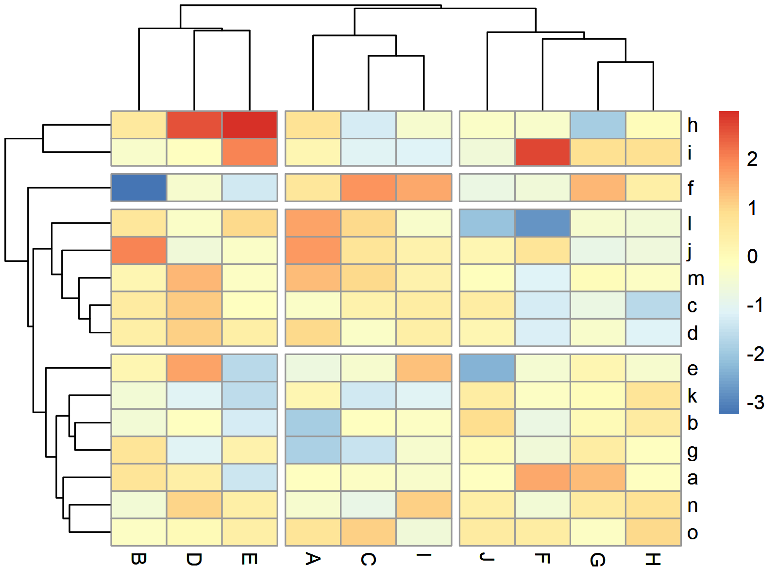
Figure 4 illustrates our heatmap clustered by rows and by columns.
Video & Further Resources
I have recently published a video on my YouTube channel, which illustrates the R programming codes of this article. You can find the video below.
Besides the video, you might read the other R tutorials on my website:
- Create Heatmap Using Base R, ggplot2 & plotly Packages
- Change Colors of Ranges in ggplot2 Heatmap
- Add Values to Heatmap in R
- R Programming Language
In summary: In this article you have learned how to create a clustered heatmap with dendogram using the pheatmap package in R. Let me know in the comments section below, in case you have additional questions. Furthermore, don’t forget to subscribe to my email newsletter in order to receive updates on new tutorials.
Subscribe to the Statistics Globe Newsletter
Get regular updates on the latest tutorials, offers & news at Statistics Globe.
I hate spam & you may opt out anytime: Privacy Policy.
Thank you!
Welcome to the Statistics Globe newsletter. From now on, I’ll send you regular emails about statistics, data science, AI, and programming with R and Python.
I’m Joachim Schork. On this website, I provide statistics tutorials as well as code in Python and R programming.
Statistics Globe Newsletter
Get regular updates on the latest tutorials, offers & news at Statistics Globe. I hate spam & you may opt out anytime: Privacy Policy.
Thank you!
Please check your email inbox and click the confirmation link to complete your subscription. If you don’t see the email within a few minutes, please also check your spam/junk folder.


2 Comments. Leave new
Hi! How can I extract the gene names from the different kmeans clusters?
Hey Ritu,
Are you looking for this?
Regards,
Joachim