Fit Vertical Labels to Plotting Window in R (2 Examples)
In this R programming tutorial you’ll learn how to increase the space below a plot to display an entire vertical label.
The post is structured as follows:
Let’s jump right to the examples!
Creation of Example Data
The first step is to construct some data that we can use in the examples later on:
data <- data.frame(                # Create example data
  x = paste("My Loooooooong Label Number", LETTERS[1:5]),
  y = 1:5)
data                               # Print example data

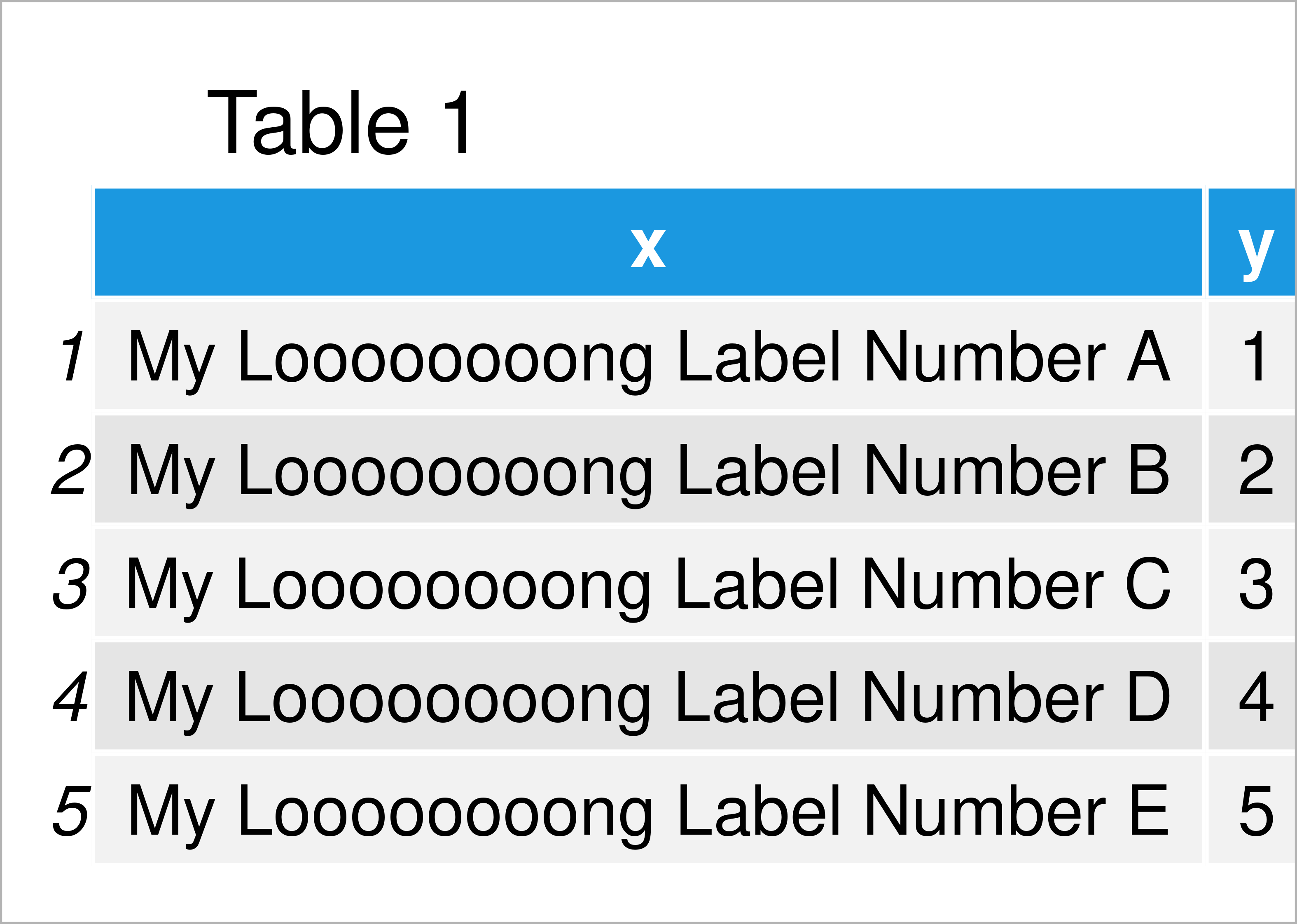
Table 1 shows the structure of the example data: It contains five rows and two columns. The variable x has the character class and the column y has the integer class.
Example 1: Display Entire Vertical X-Axis Label Using Base R
Example 1 demonstrates how to fit a vertical axis label to the plotting window using the basic installation of the R programming language.
Let’s first draw our data in a barplot without any additional specification for the x-axis:
barplot(data$y,                    # Default barplot
        names.arg = data$x,
        las = 2)

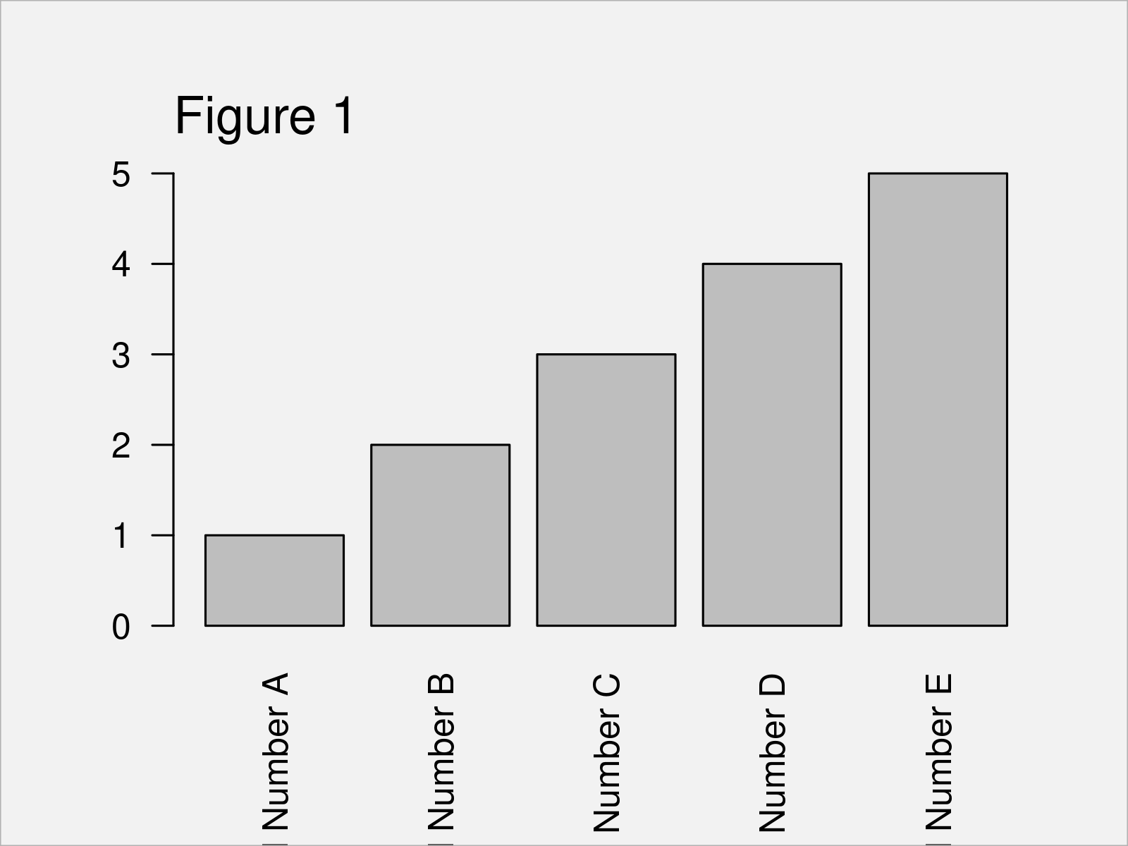
The output of the previous R syntax is shown in Figure 1: As you can see, our x-axis labels are cut off.
If we want to increase the space below our graphic to show the vertical x-axis labels entirely, we can use the par function and the mar argument.
The first value assigned to the mar argument specifies the space below our graphic (i.e. 15):
par(mar = c(15, 4, 4, 2) + 0.1) # Modify plotting options
Next, we can use exactly the same R syntax as before to draw our barplot:
barplot(data$y,                    # Draw barplot with updated options
        names.arg = data$x,
        las = 2)

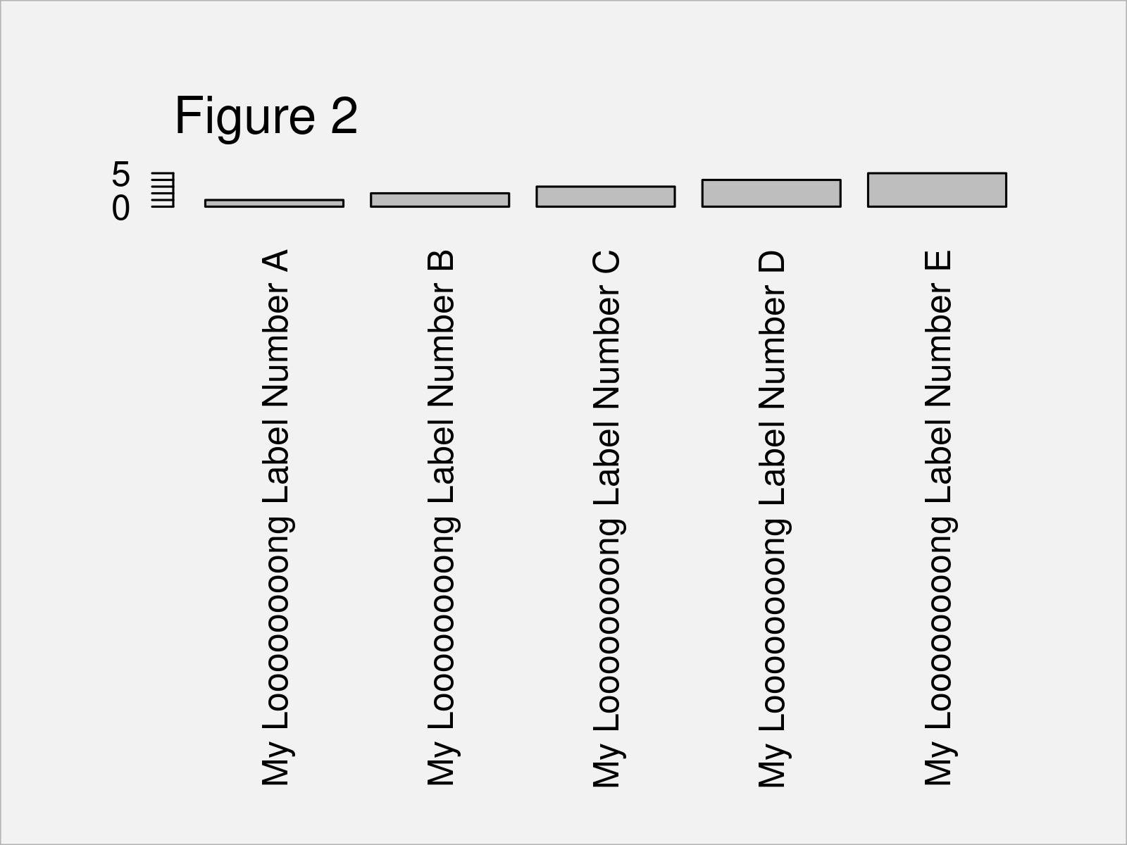
In Figure 2 you can see that we have drawn another barplot with increased space below the plot. The x-axis test is shown without being cut off.
Please note that the par/mar options that we have specified before are kept until we specify these options differently, or until we restart our RStudio session.
Example 2: Display Entire Vertical X-Axis Label Using ggplot2 Package
The following R programming syntax explains how to use the functions of the ggplot2 package to fit large axis labels into the plotting window.
To be able to use the functions of the ggplot2 package, we first need to install and load ggplot2:
install.packages("ggplot2")        # Install & load ggplot2 package
library("ggplot2")
Next, we can plot our data in a ggplot2 barchart as shown below:
ggplot(data, aes(x, y)) +          # Draw ggplot2 plot
  geom_bar(stat = "identity") +
  theme(axis.text.x = element_text(angle = 90))

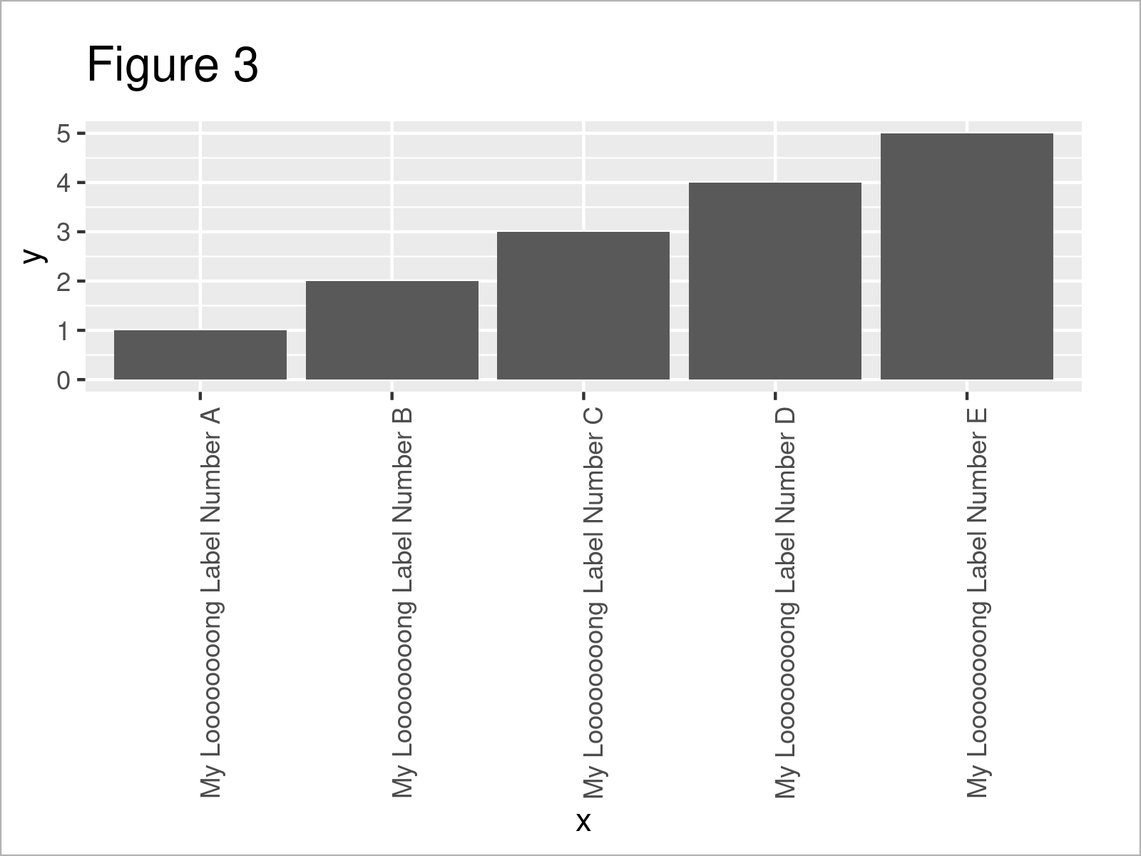
In Figure 3 it is shown that we have managed to create a ggplot2 bargraph where the entire x-axis labels are shown.
Please note that we could apply the same kind of R syntax to increase the space below a graph in case we want to draw other types of graphics such as density plots, scatterplots, line charts, and so on.
Video, Further Resources & Summary
Would you like to learn more about the increase the space below a plot to display an entire vertical label? Then I recommend having a look at the following video on my YouTube channel. In the video, I explain the R programming codes of this post.
Furthermore, you may want to have a look at some of the related articles on this homepage.
In summary: You have learned in this post how to fit vertical axis labels to the plotting window in the R programming language. Tell me about it in the comments, in case you have any additional questions.


