Display All X-Axis Labels of Barplot in R (2 Examples)
In this tutorial, I’ll show how to show every x-axis label of a barplot in R programming.
The article consists of these topics:
Let’s dive into it…
Example Data & Default Graphic
We’ll use the data below as basement for this R programming tutorial:
data <- data.frame(value = 11:30,    # Create example data
                   group = paste0("Group_", LETTERS[1:20]))
head(data)                           # Head of example data

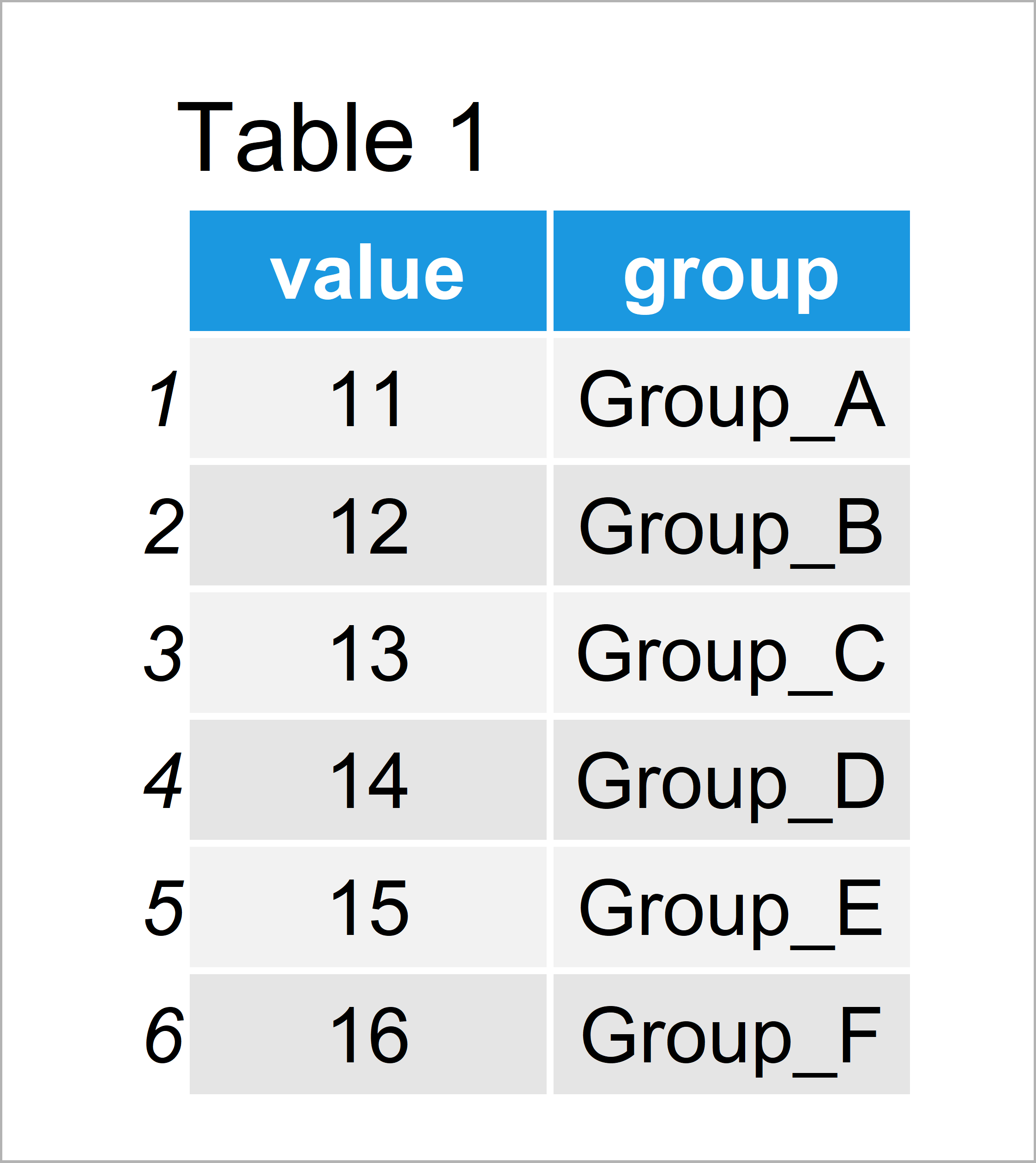
Have a look at the table that got returned by the previous syntax. It shows that our example data has 20 rows and two columns. Each row represents a different bar of our barplot.
As next step, we can draw our data with default specifications:
barplot(data$value ~ data$group) # Default barchart in Base R

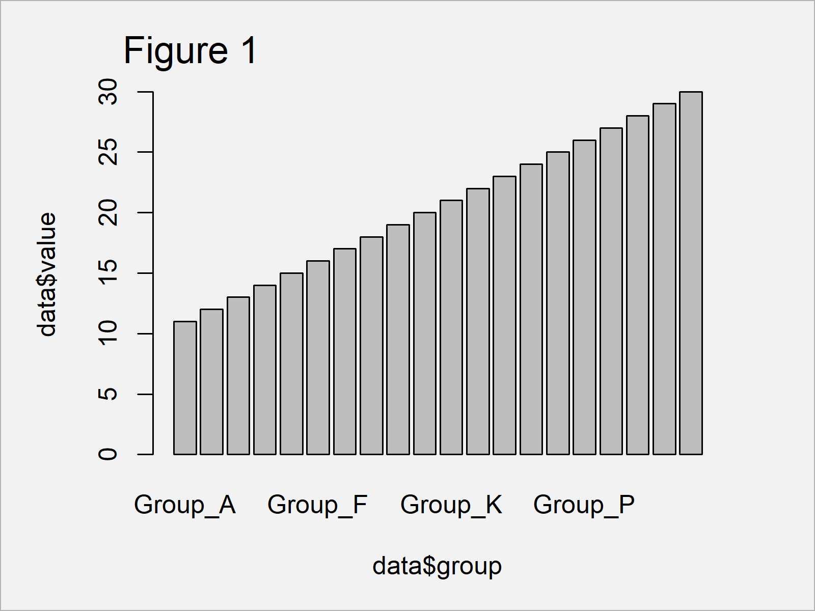
As shown in Figure 1, we have managed to create a bargraph by executing the previous code. However, since our graphic contains too many bars, not all axis labels are shown.
Let’s change that!
Example 1: Show All Barchart Axis Labels of Base R Plot
Example 1 explains how to display all barchart labels in a Base R plot.
There are basically two major tricks, when we want to show all axis labels:
- We can change the angle of our axis labels using the las argument.
- We can decrease the font size of the axis labels using the cex.names argument.
Let’s do both in R:
barplot(data$value ~ data$group,     # Modify x-axis labels
        las = 2,
        cex.names = 0.7)

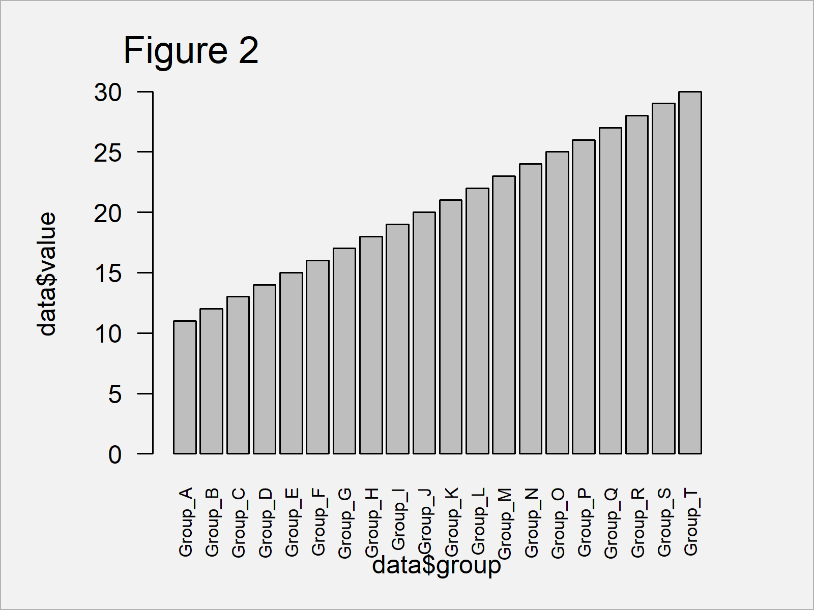
In Figure 2 you can see that we have created a barplot with 90-degree angle and a smaller font size of the axis labels. All text labels are shown.
Example 2: Show All Barchart Axis Labels of ggplot2 Plot
In this example, I’ll show how to display all axis text labels of a ggplot2 graph.
In order to use the functions of the ggplot2 package, we first have to install and load ggplot2:
install.packages("ggplot2")          # Install & load ggplot2 package
library("ggplot2")
Next, we can use the theme function and the axis.text.x argument to change the angle and decrease the font size of the axis labels:
ggplot(data, aes(group, value)) +    # ggplot2 plot with modified x-axis labels
  geom_bar(stat = "identity") +
  theme(axis.text.x = element_text(angle = 90, size = 5))

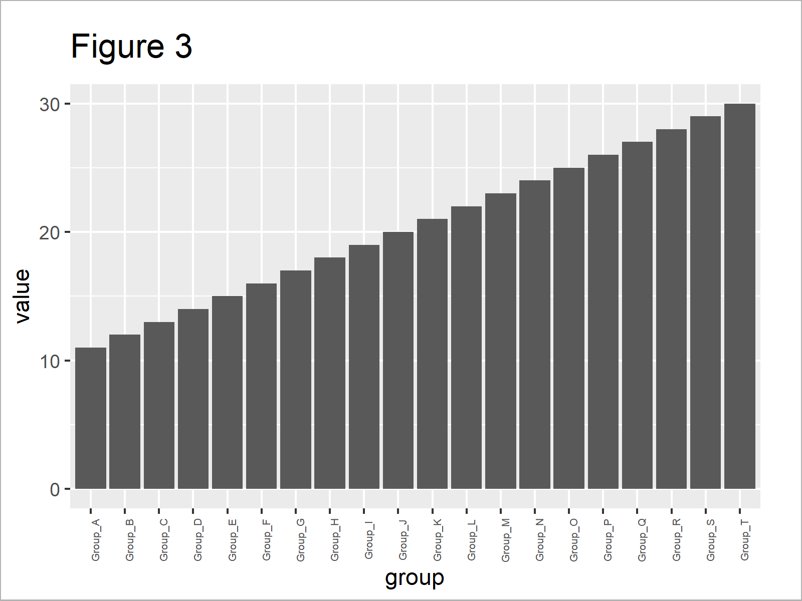
As shown in Figure 3, the previous syntax has drawn a ggplot2 barplot in which all axis labels are displayed.
Video & Further Resources
Do you need more explanations on the R programming code of this tutorial? Then you may want to have a look at the following video of my YouTube channel. I illustrate the R code of this post in the video.
Furthermore, you may want to have a look at the other tutorials on my homepage. A selection of articles about graphics in R is shown below.
To summarize: At this point you should know how to display all text labels of a barchart axis in the R programming language. Please note that we could use the same kind of syntax to show all labels of other types of graphics such as boxplots or heatmaps.
Don’t hesitate to let me know in the comments, in case you have additional questions and/or comments. Besides that, please subscribe to my email newsletter to get updates on new tutorials.
Subscribe to the Statistics Globe Newsletter
Get regular updates on the latest tutorials, offers & news at Statistics Globe.
I hate spam & you may opt out anytime: Privacy Policy.
Thank you!
Welcome to the Statistics Globe newsletter. From now on, I’ll send you regular emails about statistics, data science, AI, and programming with R and Python.
I’m Joachim Schork. On this website, I provide statistics tutorials as well as code in Python and R programming.
Statistics Globe Newsletter
Get regular updates on the latest tutorials, offers & news at Statistics Globe. I hate spam & you may opt out anytime: Privacy Policy.
Thank you!
Please check your email inbox and click the confirmation link to complete your subscription. If you don’t see the email within a few minutes, please also check your spam/junk folder.


4 Comments. Leave new
When I do the ggplot geom_bar, only a few X-axis labels show
Hello Stephen,
Does it persist after you rotate the labels like in Example 2 in this tutorial? You can also try to decrease the font size using the size= argument in the element_text() function.
Best,
Cansu
I am plotting the hourly time series data using ggplot2 and my time series data start from 2011 June from 08:00 to 16:00, this data goes up to 2023 June 08:00 to 16:00. The plot I get starts from 2015 to 2022 and is not showing all the x-axis. Can you please assist
Hello Moses,
If your ggplot2 plot is not displaying the entire range of your data, there are a few potential reasons and fixes you can try:
Here’s a a sample data and the visualisation code using all methods mentioned above.
Best,
Cansu