Create Raster Plot from Data Frame in R (2 Examples)
On this page you’ll learn how to convert a data frame to a raster plot in R.
The page is structured as follows:
Here’s the step-by-step process:
Example 1: Convert Data Frame to Raster
Example 1 shows a simplified example on how to draw a raster graphic from a data frame in R.
First, we have to specify the number of rows and columns of our raster:
n1 <- 2 # Specify number of raster rows & columns
Furthermore, we have to set a random seed to make our examples reproducible:
set.seed(3287253) # Set seed for reproducibility
Next, we can create a data frame for our raster plot:
data1 <- data.frame(x = rep(1:n1, each = n1),    # Create data frame for raster
                    y = rep(1:n1, n1),
                    value = runif(n1^2))
data1                                            # Print data frame
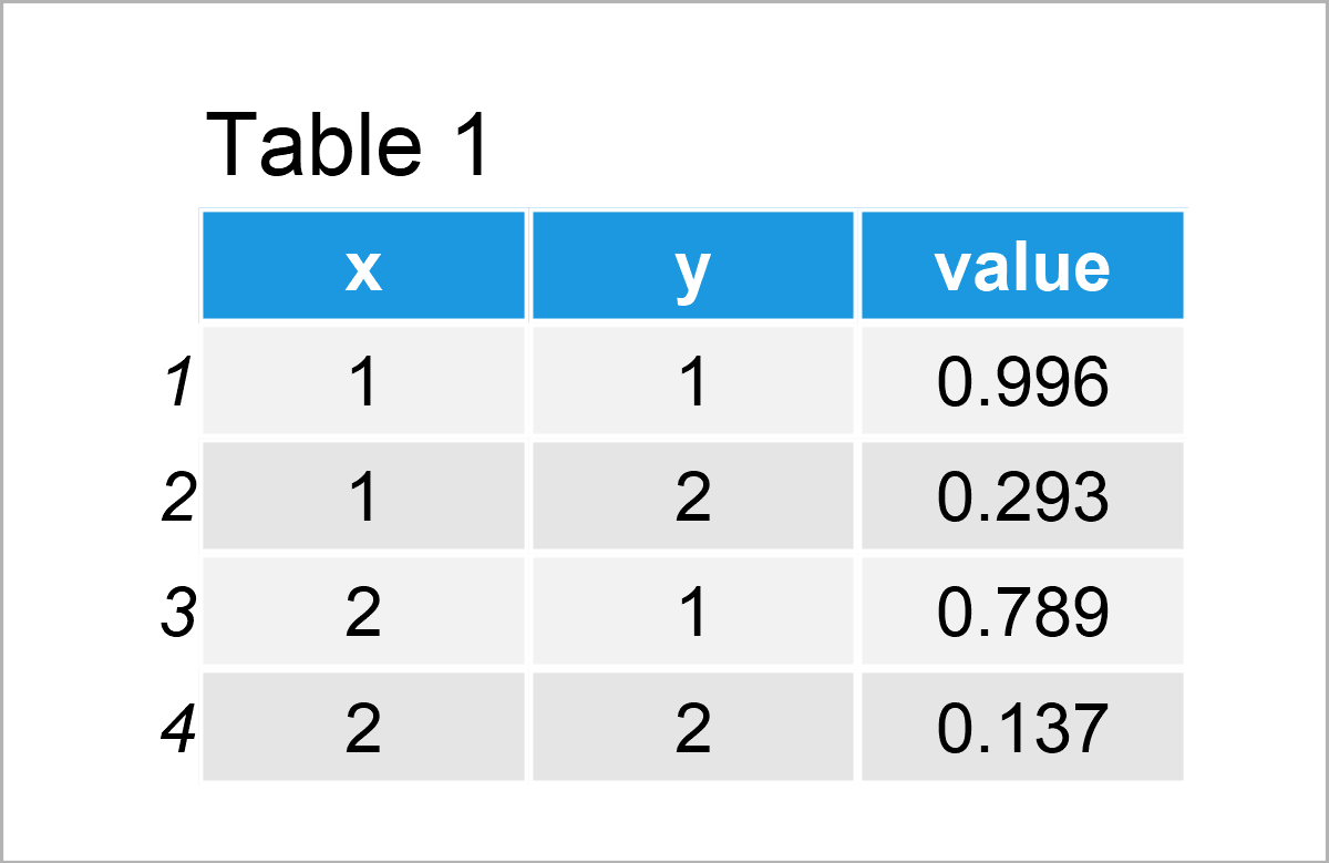
As shown in Table 1, we have created a new data frame containing four rows and three columns. The first two columns are the coordinates and the third column contains the values that correspond to each coordinate.
Next, we have to install and load the raster package, to be able to use the functions that are contained in the package:
install.packages("raster")                       # Install & load raster package
library("raster")
Now, we can use the rasterFromXYZ function of the raster package to convert our data frame to a raster object:
data_raster1 <- rasterFromXYZ(data1)             # Convert data frame to raster object
data_raster1                                     # Print raster object
# class      : RasterLayer
# dimensions : 2, 2, 4  (nrow, ncol, ncell)
# resolution : 1, 1  (x, y)
# extent     : 0.5, 2.5, 0.5, 2.5  (xmin, xmax, ymin, ymax)
# crs        : NA
# source     : memory
# names      : value
# values     : 0.1371583, 0.9959187  (min, max)
We can now apply the plot function to our raster object to draw a raster graphic:
plot(data_raster1) # Draw raster
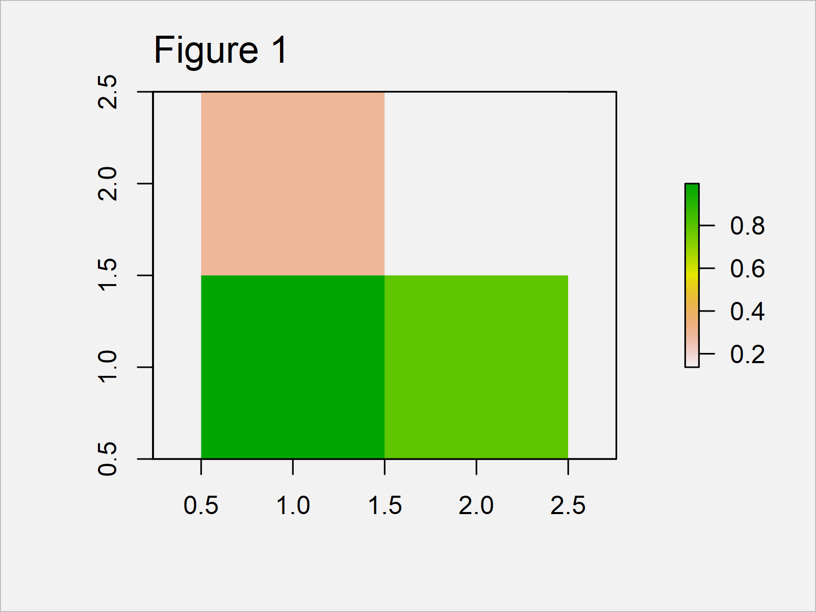
In Figure 1 you can see that we have plotted a very simple raster by running the previous syntax.
The next example will show how to make the raster more complex.
Example 2: Creating Raster Plot of More Complex Data
In Example 2, I’ll explain how to use our code to create more complex raster graphs in R.
For this, we simply have to increase the number of rows and columns of our raster plot. In this case, we are using the number 30:
n2 <- 30 # Specify number of raster rows & columns
The following code is very similar to Example 1. First we have to create a data frame
data2 <- data.frame(x = rep(1:n2, each = n2),    # Create data frame for raster
                    y = rep(1:n2, n2),
                    value = runif(n2^2))
head(data2)                                      # Print head of data frame
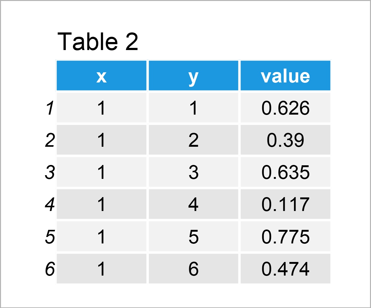
Table 2 shows the first six rows of our data frame.
Next, we can apply the rasterFromXYZ function to transform our data frame to a raster object…
data_raster2 <- rasterFromXYZ(data2)             # Convert data frame to raster object
data_raster2                                     # Print raster object
# class      : RasterLayer
# dimensions : 30, 30, 900  (nrow, ncol, ncell)
# resolution : 1, 1  (x, y)
# extent     : 0.5, 30.5, 0.5, 30.5  (xmin, xmax, ymin, ymax)
# crs        : NA
# source     : memory
# names      : value
# values     : 0.0001614387, 0.9979389  (min, max)
…and finally, we can draw our raster:
plot(data_raster2) # Draw raster
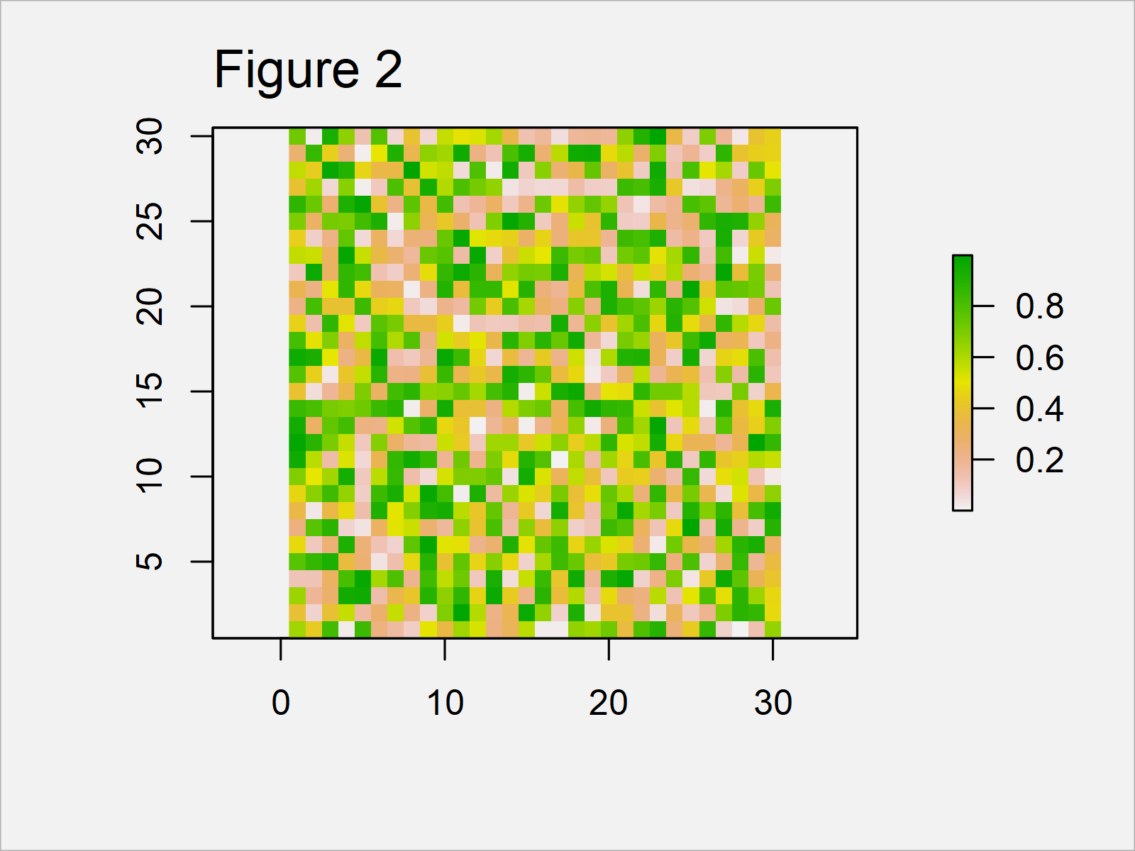
The output of the previous syntax is shown in Figure 2: A more complex raster graphic.
Obviously, this raster plot doesn’t make much sense. However, you might change the values of the coordinates to create more useful raster plots in R.
Video, Further Resources & Summary
Have a look at the following video on my YouTube channel. I’m explaining the R codes of this tutorial in the video.
Furthermore, you may read some related tutorials on this website:
- Create Data Frame of Unequal Lengths
- Create List of Data Frames
- Boxplot in R
- Fit Smooth Curve to Plot of Data in R
- Graphics Overview in R
- All R Programming Tutorials
This tutorial has demonstrated how to draw a raster plot based on a data frame in R programming. In case you have further comments or questions, don’t hesitate to let me know in the comments.




2 Comments. Leave new
I followed the method. Used rasterFromXYZ on a dataset with lat/lon and created the raster, everything looks with data wise. But the output when I plot it isn’t right, the grid cells are tiny and barely visible- they look like small dots. I asked the question on with reproducible available on StackOverflow, but no luck.
https://stackoverflow.com/questions/76893950/grid-cell-size-on-raster-plot-too-small-not-filling-in-map-bearly-visible-r.
Do you have any ideas?
Thanks!
Hello Tariq,
The issue may be related to the resolution of the raster, plotting parameters, or display settings. Here are some suggestions that might help you solve this problem:
Make sure the resolution of your raster is appropriate. You can check and set the resolution with the res() function:
If the issue is with the plotting parameters, you might need to adjust the point size. This can be done using the cex parameter in the plot function:
The size of the plotting device might also affect how your raster looks. Try resizing the plotting device or saving the plot to a file with a larger size. For example:
I hope one of these solutions helps.
Best,
Cansu