Set Axis Limits of Subplots in Python Matplotlib & seaborn (2 Examples)
Hi! This tutorial will explain how to define the axis limits of subplots in Matplotlib and seaborn in Python.
Here is an overview:
Let’s get into the Python code!
Install & Import Matplotlib & seaborn
To install and import Matplotlib and seaborn, run the lines of code below in your preferred Python programming IDE or code editor:
# install Matplotlib & seaborn
pip install matplotlib seaborn

# import Matplotlib & seaborn
import matplotlib.pyplot as plt

import seaborn as sns
Now that we have installed and imported both Matplotlib and seaborn into our Python programming environment, we can now create the example dataset that we will use in this tutorial.
Create Example Dataset
We will use the diamonds dataset that can be loaded from the seaborn package as our example dataset. Therefore, to load and preview the first 10 rows of the dataset, run the lines of code below:
df = sns.load_dataset("diamonds")

print(type(df))

# <class 'pandas.core.frame.DataFrame'>

df.head(10)

#      carat	cut	color	clarity	depth	table	price	x	y	z
#0	0.23	Ideal	   E	SI2	61.5	55.0	326	3.95	3.98	2.43
#1	0.21	Premium	   E	SI1	59.8	61.0	326	3.89	3.84	2.31
#2	0.23	Good	   E	VS1	56.9	65.0	327	4.05	4.07	2.31
#3	0.29	Premium	   I	VS2	62.4	58.0	334	4.20	4.23	2.63
#4	0.31	Good	   J	SI2	63.3	58.0	335	4.34	4.35	2.75
#5	0.24	Very Good  J	VVS2	62.8	57.0	336	3.94	3.96	2.48
#6	0.24	Very Good  I	VVS1	62.3	57.0	336	3.95	3.98	2.47
#7	0.26	Very Good  H	SI1	61.9	55.0	337	4.07	4.11	2.53
#8	0.22	Fair	   E	VS2	65.1	61.0	337	3.87	3.78	2.49
#9	0.23	Very Good  H	VS1	59.4	61.0	338	4.00	4.05	2.39
With the example dataset loaded, we can now see some examples.
Example 1: Define Axis Limits of Subplots in Matplotlib
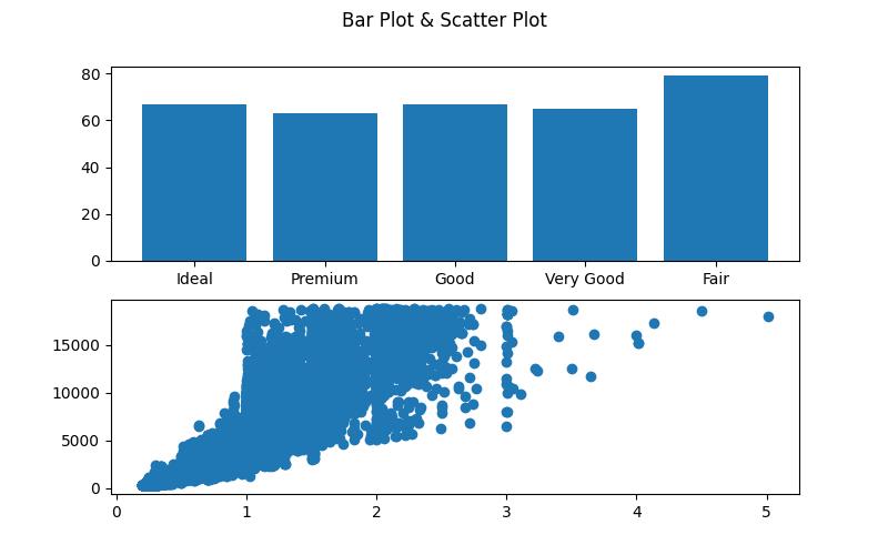
In this first example, we will first build subplots of a bar plot and a scatter plot with their default axis limits. Then, we will demonstrate how to set the axis limits of the plots in the subplot.
Run the lines of code below to build the subplots:
fig, ax = plt.subplots(2, figsize = (8,5))

fig.suptitle("Bar Plot & Scatter Plot")

ax[0].bar(df["cut"], df["depth"])

ax[1].scatter(df["carat"], df["price"])

plt.show()

In the above example, the fig, ax = plt.subplots(2, figsize=(8,5)) line initializes a figure and two axes (subplots) with a specified size. The title of the entire figure is set as “Bar Plot & Scatter Plot” using fig.suptitle().
In the first subplot (ax[0]), a bar plot is created using the bar function, where the x-axis represents the cut column from df, and the y-axis represents the depth column.
In the second subplot (ax[1]), a scatter plot is generated using the scatter function, with carat as the x-axis and price as the y-axis. Finally, plt.show() is called to display the entire figure with the two subplots.
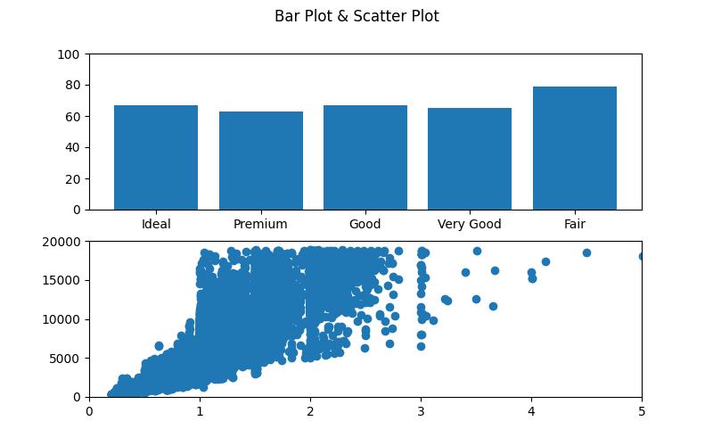
Let’s now demonstrate how to set the axis limits. Run the lines of code below:
fig, ax = plt.subplots(2, figsize = (8,5))

fig.suptitle("Bar Plot & Scatter Plot")

ax[0].bar(df["cut"], df["depth"])

ax[0].set_ylim(bottom = 0, top = 100)

ax[1].scatter(df["carat"], df["price"])

ax[1].set_xlim(left = 0, right = 5)

ax[1].set_ylim(bottom = 0, top = 20000)

plt.show()

Here, we used the .set_xlim() and .set_ylim() methods to set the axis limits of both the bar plot and the scatter plot.
Being a bar plot, we defined only the axis limit of the y-axis in ax[0].set_ylim(bottom = 0, top = 100), setting the range from 0 to 100. As for the scatter plot, we set the axis limits of both the x-axis (a range from 0 to 5) and the y-axis (a range from 0 to 20000).
Example 2: Define Axis Limits of Subplots in seaborn
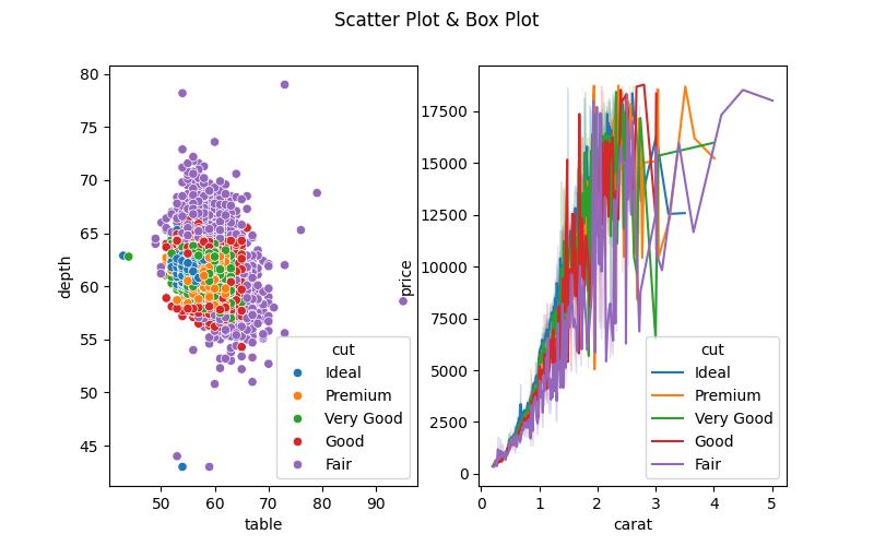
In this second example, we will build subplots of both a scatter plot and a line plot with their default axis limits. Then we will demonstrate how to change the axis limits of the plots.
Run the lines of code below to build the subplots:
fig, ax = plt.subplots(1,2, figsize = (8,5))

fig.suptitle("Scatter Plot & Box Plot")

sns.scatterplot(df, x = "table", y = "depth", hue = "cut", ax = ax[0])

sns.lineplot(df, x = "carat", y = "price", hue = "cut", ax = ax[1])

plt.show()

We first initialize a figure with two axes (subplots) side by side with the fig, ax = plt.subplots(1, 2, figsize=(8,5)) line. Then in the first subplot (ax[0]), a scatter plot is created using the sns.scatterplot() method, where table is the x-axis, depth is the y-axis, and points are colored based on the cut column of df.
In the second subplot (ax[1]), a line plot is generated with sns.lineplot(), where carat is on the x-axis, price on the y-axis, and lines are distinguished by the cut column.
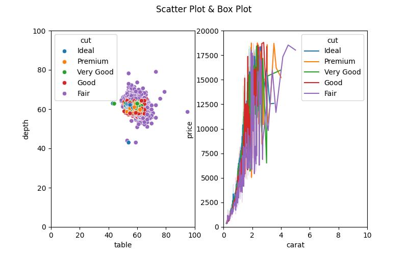
We will now show how to set the axis limits of the subplots. Run the lines of code below to do so:
fig, ax = plt.subplots(1,2, figsize = (8,5))

fig.suptitle("Scatter Plot & Box Plot")

sns.scatterplot(df, x = "table", y = "depth", hue = "cut", ax = ax[0])

ax[0].set_xlim(left = 0, right = 100)

ax[0].set_ylim(bottom = 0, top = 100)

sns.lineplot(df, x = "carat", y = "price", hue = "cut", ax = ax[1])

ax[1].set_xlim(left = 0, right = 10)

ax[1].set_ylim(bottom = 0, top = 20000)

plt.show()

From the above, you can see that the axis limits of both the scatter plot and the line plot have been set using the .set_xlim() and .set_ylim() methods. You may also notice that the scatter plot layout has changed. This is because we altered the axis limit of the y-axis. There are ways to readjust the plot layout, including changing the position of the legend. However, that is beyond the scope of this tutorial.
So, from the example above, you can see that there are similarities between Matplotlib and seaborn as seaborn is based on Matplotlib. This means that you can use many methods in Matplotlib in your seaborn projects.
Video, Further Resources & Summary
Do you need more explanations on how to set the axis limits of subplots in Matplotlib and seaborn in Python? Then you should have a look at the following YouTube video of the Statistics Globe YouTube channel.
In the video, we explain how to set the axis limits of subplots in Matplotlib and seaborn in Python.
The YouTube video will be added soon.
With that, we have shown with examples how to set or define the axis limits of subplots in Matplotlib and seaborn in Python. Furthermore, you could have a look at some of the other interesting Matplotlib and seaborn tutorials on Statistics Globe:
- Change Axis Labels of Subplots in Python Matplotlib & seaborn (2 Examples)
- Add Grid to Plot in Python Matplotlib & seaborn (2 Examples)
- Change Size of Figures in Python Matplotlib & seaborn (2 Examples)
- Rotate Axis Text in Python Matplotlib & seaborn (2 Examples)
- Save Plot to Image in Python Matplotlib & seaborn (2 Examples)
- Introduction to Python Programming
This post has shown how to set the axis limits of subplots in Matplotlib and seaborn in Python. I hope you found it helpful! In case you have further questions, you may leave a comment below.
This page was created in collaboration with Ifeanyi Idiaye. You might check out Ifeanyi’s personal author page to read more about his academic background and the other articles he has written for the Statistics Globe website.


