Change Axis Labels of Subplots in Python Matplotlib & seaborn (2 Examples)
Hi! This tutorial will show you how to modify the axis labels of subplots in Matplotlib and seaborn in the Python programming language.
Here is an overview:
Let’s jump into the Python code!
Install & Import Matplotlib & seaborn
To install and import Matplotlib and seaborn, run the lines of code below in your preferred Python programming IDE or code editor:
# install Matplotlib & seaborn
pip install matplotlib seaborn

# import Matplotlib & seaborn
import matplotlib.pyplot as plt

import seaborn as sns
Having installed and imported Matplotlib and seaborn into our Python environment, we can now go on to create the example dataset that we will use in this tutorial.
Create Example Dataset
We will use the iris dataset that can be loaded from the seaborn package as our example dataset. Note that you can use whatever dataset you like to follow along with this tutorial.
To load and preview the first 10 rows of the dataset, run the lines of code below:
df = sns.load_dataset("iris")

print(type(df))

# <class 'pandas.core.frame.DataFrame'>

df.head(10)

#             sepal_length	sepal_width	petal_length	petal_width	species
#0	               5.1	        3.5	         1.4	        0.2	 setosa
#1	               4.9	        3.0	         1.4	        0.2	 setosa
#2	               4.7	        3.2	         1.3	        0.2	 setosa
#3	               4.6	        3.1	         1.5	        0.2	 setosa
#4	               5.0	        3.6	         1.4	        0.2	 setosa
#5	               5.4	        3.9	         1.7	        0.4	 setosa
#6	               4.6	        3.4	         1.4	        0.3	 setosa
#7	               5.0	        3.4	         1.5	        0.2	 setosa
#8	               4.4	        2.9	         1.4	        0.2	 setosa
#9	               4.9	        3.1	         1.5	        0.1	 setosa
Now that we have loaded and previewed the example dataset, we can build visualizations.
Example 1: Adjust Axis Labels of Subplots in Matplotlib
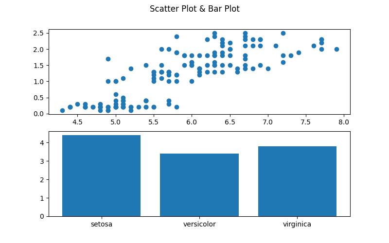
In this example, we will build subplots of a scatter plot and a bar plot, then we will demonstrate how to change the axis labels of the subplots.
To build the subplots, run the lines of code below:
fig, ax = plt.subplots(2, figsize = (8,5))

fig.suptitle("Scatter Plot & Bar Plot")

ax[0].scatter(df["sepal_length"], df["petal_width"])

ax[1].bar(df["species"], df["sepal_width"])

plt.show()

In the above example, we create a subplot with two plots arranged vertically using the plt.subplots() method wherein the figure size is set to (8,5) for better visualization. Then, we give the overall figure a title using the fig.suptitle() method.
The first subplot (ax[0]) is a scatter plot where the x-axis represents the sepal_length and the y-axis represents the petal_width from df. The second subplot (ax[1]) is a bar plot with species on the x-axis and sepal_width on the y-axis from df as well.
Finally, plt.show() is used to display the figure with both the scatter plot and bar plot.
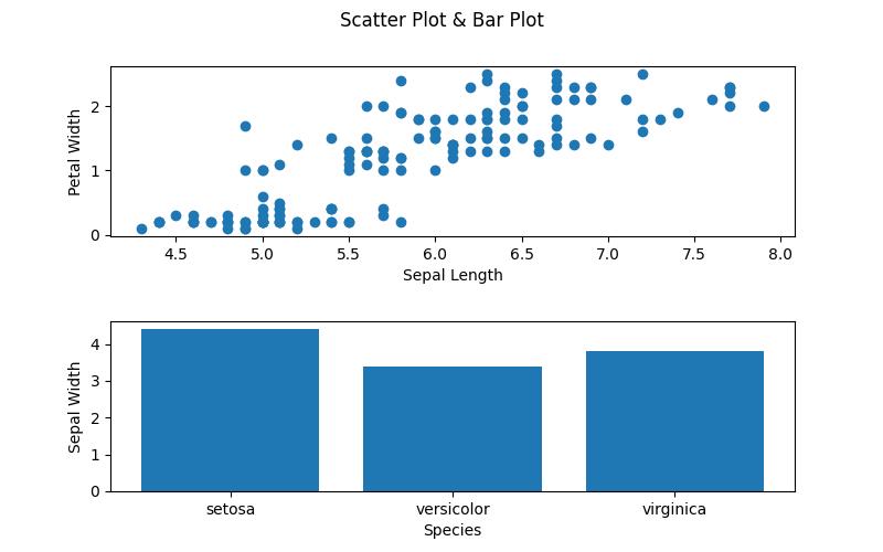
Let us now demonstrate how to change the axis labels of the subplots. Run the lines of code below:
fig, ax = plt.subplots(2, figsize=(8, 5))

fig.suptitle("Scatter Plot & Bar Plot")

ax[0].scatter(df["sepal_length"], df["petal_width"])

ax[0].set_xlabel("Sepal Length")

ax[0].set_ylabel("Petal Width")

ax[1].bar(df["species"], df["sepal_width"])

ax[1].set_xlabel("Species")

ax[1].set_ylabel("Sepal Width")

plt.subplots_adjust(hspace=0.5)

plt.show()

As you can see, we have changed the axis labels of the subplots. To achieve that, we used the .set_xlabel() and .set_ylabel() methods to define the axis labels for both the scatter plot and the bar plot.
Then, to make the labels more visible, we added some horizontal space between both subplots using the plt.subplots_adjust() method wherein we defined the argument hspace as 0.5. You can increase the space between both plots further according to your need.
Example 2: Adjust Axis Labels of Subplots in seaborn
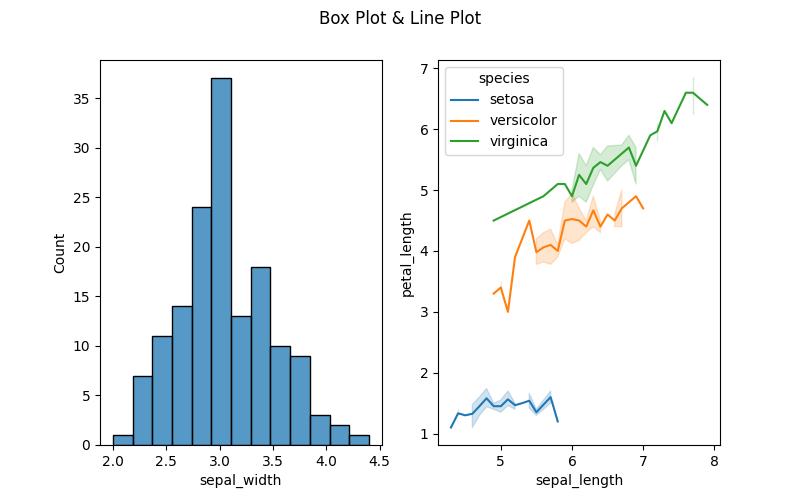
In this second example, we will build subplots of a histogram and a line plot. Thereafter, we will show how to change the axis labels of the subplots. Run the lines of code below to build the plots:
fig, ax = plt.subplots(1,2, figsize = (8,5))

fig.suptitle("Box Plot & Line Plot")

sns.histplot(df, x = "sepal_width",ax = ax[0])

sns.lineplot(df, x = "sepal_length", y = "petal_length", hue = "species", ax = ax[1])

plt.show()

Here, we use the plt.subplots(1,2, figsize=(8,5)) method call to generate a figure with one row and two columns, creating two subplots. The first subplot, accessed through ax[0], is a histogram created using sns.histplot() method, and representing the distribution of sepal widths from df.
The second subplot, accessed through ax[1], is a line plot created using sns.lineplot(), and illustrating the relationship between sepal length and petal length, differentiated by species through the hue parameter.
We will now show how to change the axis labels. Run the following lines of code to do so:
fig, ax = plt.subplots(1,2, figsize = (8,5))

fig.suptitle("Box Plot & Line Plot")

sns.histplot(df, x = "sepal_width",ax = ax[0])

ax[0].set_xlabel("Sepal Width")

ax[0].set_ylabel("Count Values")

sns.lineplot(df, x = "sepal_length", y = "petal_length", hue = "species", ax = ax[1])

ax[1].set_xlabel("Sepal Length")

ax[1].set_ylabel("Petal Length")

plt.show()

As you can see, we have changed the axis labels of the subplots using the same .set_xlabel() and .set_ylabel() methods from the Matplotlib example. This is possible because seaborn is based on Matplotlib. Therefore, many Matplotlib methods also work well in seaborn visualizations too.
Video, Further Resources & Summary
Do you need more explanations on how to change the axis labels of subplots in Matplotlib and seaborn in Python? Then you should have a look at the following YouTube video of the Statistics Globe YouTube channel.
In the video, we explain in some more detail how to change the axis labels of subplots in Matplotlib and seaborn in Python.
The YouTube video will be added soon.
So we have demonstrated how to change or adjust the axis labels of subplots in Python Matplotlib and seaborn. Furthermore, you could have a look at some of the other interesting Matplotlib and seaborn tutorials on Statistics Globe, starting with these:
- Change Size of Figures in Python Matplotlib & seaborn
- Rotate Axis Text in Python Matplotlib & seaborn
- Add Grid to Plot in Python Matplotlib & seaborn
- Save Plot to Image in Python Matplotlib & seaborn
- Set Color by Group in Plot in Python Matplotlib & seaborn
- Introduction to Python Programming
This post has shown how to change the axis labels of subplots in Matplotlib and seaborn in Python. I hope you found it helpful! In case you have further questions, you may leave a comment below.
This page was created in collaboration with Ifeanyi Idiaye. You might check out Ifeanyi’s personal author page to read more about his academic background and the other articles he has written for the Statistics Globe website.


