Remove Axes & Labels from Plot in Python Matplotlib & seaborn (2 Examples)
Hi! This tutorial will show you how to eliminate axes and labels from plots in Matplotlib and seaborn in Python.
Here is an overview:
Let’s get right into the Python code!
Install & Import Matplotlib & seaborn
To install and import Matplotlib and seaborn, run the lines of code below in your preferred Python programming IDE or code editor:
# install Matplotlib & seaborn
pip install matplotlib seaborn

# import Matplotlib & seaborn
import matplotlib.pyplot as plt

import seaborn as sns
With Matplotlib and seaborn installed and imported into our Python programming environment, we can now create the sample dataset that we will use in the examples in this tutorial.
Create Sample Dataset
We will use the tips dataset that comes preloaded in seaborn as our sample dataset.
To load and preview the first 10 rows of the sample dataset, run the lines of code below:
df = sns.load_dataset("tips")

df.head(10)

#  total_bill	tip	sex	smoker	day	time	size
#0	16.99	1.01	Female	No	Sun	Dinner	2
#1	10.34	1.66	Male	No	Sun	Dinner	3
#2	21.01	3.50	Male	No	Sun	Dinner	3
#3	23.68	3.31	Male	No	Sun	Dinner	2
#4	24.59	3.61	Female	No	Sun	Dinner	4
#5	25.29	4.71	Male	No	Sun	Dinner	4
#6	8.77	2.00	Male	No	Sun	Dinner	2
#7	26.88	3.12	Male	No	Sun	Dinner	4
#8	15.04	1.96	Male	No	Sun	Dinner	2
#9	14.78	3.23	Male	No	Sun	Dinner	2
Now that we have created the sample dataset, we can demonstrate how to remove plot axes and labels in Matplotlib and seaborn.
Example 1: Eliminate Axes & Labels from Plot in Matplotlib
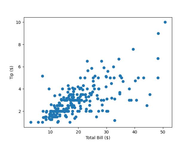
In this example, we will build a simple scatter plot visualizing the relationship between total bill on the x-axis and tip on the y-axis:
plt.scatter(df["total_bill"],df["tip"])

plt.xlabel("Total Bill ($)")

plt.ylabel("Tip ($)")

plt.show()

In the above example, we built the scatter plot using the plt.scatter() method where we passed total_bill on the x-axis and tip on the y-axis.
Then we labelled the x and y axes of the plot using plt.xlabel() and plt.ylabel() and displayed the plot with plt.show().
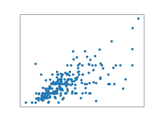
Now, we will demonstrate how to remove the axes and labels of the plot. Run the lines of code below to do so:
plt.scatter(df["total_bill"], df["tip"])

plt.xlabel("Total Bill ($)")

plt.ylabel("Tip ($)")

plt.gca().axes.get_xaxis().set_visible(False)

plt.gca().axes.get_yaxis().set_visible(False)

plt.show()

Here, we used the plt.gca() method to access the current axes instance, and then we hid both the x-axis and y-axis tick marks and labels using axes.get_xaxis().set_visible(False) and axes.get_yaxis().set_visible(False), respectively.
Note that this overrides the axes labels we had set previously with plt.xlabel() and plt.ylabel(), and results in a scatter plot without any visible axis ticks or labels.
Example 2: Eliminate Axes & Labels from Plot in seaborn
In this example, we will build a simple box plot to visualize total bills on each day of the week. Run the lines of code below to build the box plot:
sns.boxplot(df, x = "day", y = "total_bill")

plt.show()

In the above example, we have created a box plot using the sns.boxplot() method wherein we passed the DataFrame df and set day on the x-axis and total_bill on the y-axis.
We then displayed the box plot using plt.show().
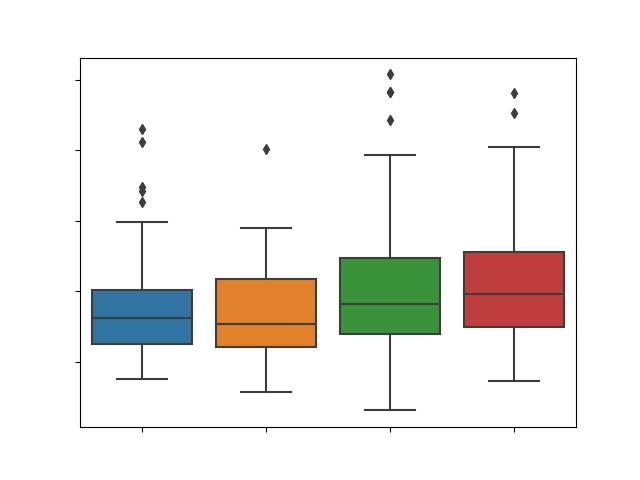
Now, we will demonstrate how to remove the axes and labels of the box plot. Run the lines of code below to do so:
box = sns.boxplot(df, x = "day", y = "total_bill")

box.set(xticklabels = [])

box.set(xlabel = None)

box.set(yticklabels = [])

box.set(ylabel = None)

plt.show()

Here, we first stored the figure object in a variable called box. This enables us to call methods on the figure object more neatly.
Next, we called the set() method wherein we passed an empty array to the xticklabels = argument, and in another call passed the keyword None to the xlabel = argument.
This has eliminated the x-axis ticks and labels, similar to what we did in the Matplotlib example above. The same actions are carried out for the y-axis of the plot as well to eliminate the axes and labels.
Video, Further Resources & Summary
Do you need more explanations on how to remove axes and labels from plots in Python Matplotlib and seaborn? Then, you should have a look at the following YouTube video of the Statistics Globe YouTube channel.
In the video, we explain in some more detail how to remove axes and labels from a plot in Python Matplotlib and seaborn.
The YouTube video will be added soon.
With that, we have demonstrated how to eliminate the axes and labels of a plot in Python Matplotlib and seaborn. Furthermore, you could have a look at some of the other interesting Matplotlib and seaborn tutorials on Statistics Globe:
- Change Font Size of Plot in Python Matplotlib & seaborn (2 Examples)
- Change Axis Labels of Plot in Python Matplotlib & seaborn (2 Examples)
- Change Legend Size of Plot in Python Matplotlib & seaborn (2 Examples)
- Remove Legend from Plot in Python Matplotlib & seaborn (2 Examples)
- Add Legend to Plot in Python Matplotlib & seaborn (4 Examples)
- Introduction to Python Programming
This post has shown how to remove axes and labels from plots in Python Matplotlib and seaborn. I hope you found it helpful! In case you have further questions, you may leave a comment below.
This page was created in collaboration with Ifeanyi Idiaye. You might check out Ifeanyi’s personal author page to read more about his academic background and the other articles he has written for the Statistics Globe website.
Subscribe to the Statistics Globe Newsletter
Get regular updates on the latest tutorials, offers & news at Statistics Globe.
I hate spam & you may opt out anytime: Privacy Policy.
Thank you!
Welcome to the Statistics Globe newsletter. From now on, I’ll send you regular emails about statistics, data science, AI, and programming with R and Python.
I’m Joachim Schork. On this website, I provide statistics tutorials as well as code in Python and R programming.
Statistics Globe Newsletter
Get regular updates on the latest tutorials, offers & news at Statistics Globe. I hate spam & you may opt out anytime: Privacy Policy.
Thank you!
Please check your email inbox and click the confirmation link to complete your subscription. If you don’t see the email within a few minutes, please also check your spam/junk folder.


