Plot Correlation Matrix in Python Matplotlib & seaborn (2 Examples)
Hi! This tutorial will demonstrate how to visualize a correlation matrix in Maplotlib and seaborn in Python.
Here is an overview:
Let’s get into the Python code!
Install & Import Matplotlib, seaborn & NumPy
To install and import Matplotlib, seaborn and NumPy, run the lines of code below in your preferred Python programming IDE:
# install Matplotlib, seaborn & NumPy
pip install matplotlib seaborn numpy

# import Matplotlib, seaborn & NumPy
import matplotlib.pyplot as plt

import seaborn as sns

import numpy as np
Now that we have installed and imported Matplotlib, seaborn and NumPy into our Python programming environment, we will now create our example dataset.
Create Example Dataset
In this tutorial, we will make use of the popular iris dataset as our example dataset, and you can load it from seaborn. You can follow along with any dataset of your choice too.
To load and preview the first 10 rows of the dataset, run the lines of code below:
df = sns.load_dataset("iris")

df.head(10)

#   sepal_length   sepal_width	 petal_length	petal_width	species
#0	     5.1	   3.5	          1.4	        0.2	 setosa
#1	     4.9	   3.0	          1.4	        0.2	 setosa
#2	     4.7	   3.2	          1.3	        0.2	 setosa
#3	     4.6	   3.1	          1.5	        0.2	 setosa
#4	     5.0	   3.6	          1.4	        0.2	 setosa
#5	     5.4	   3.9	          1.7	        0.4	 setosa
#6	     4.6	   3.4	          1.4	        0.3	 setosa
#7	     5.0	   3.4	          1.5	        0.2	 setosa
#8	     4.4	   2.9	          1.4	        0.2	 setosa
#9	     4.9	   3.1	          1.5	        0.1	 setosa
With our example dataset loaded, we will now demonstrate how to visualize correlations in both Matplotlib and seaborn.
Example 1: Visualize Correlation Matrix in Matplotlib
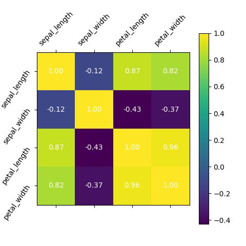
In this example, we will build a heatmap to visualize the correlation among the numeric columns of the dataset:
corr_matrix = df.corr()

plt.figure(figsize=(10, 8))

# Plot the matrix
plt.matshow(corr_matrix, cmap="viridis")

# Set ticks
plt.xticks(range(len(corr_matrix.columns)), corr_matrix.columns, rotation="vertical")
plt.yticks(range(len(corr_matrix.columns)), corr_matrix.columns)

# Add color bar
plt.colorbar()

# Add text annotations
for i in range(len(corr_matrix.columns)):
    for j in range(len(corr_matrix.columns)):
        plt.text(j, i, f"{corr_matrix.iloc[i, j]:.2f}", ha="center", va="center", color="w")

plt.show()

First, we have created a correlation matrix from the iris dataset. Then, we set up a figure with a size of 10 by 8 inches using plt.figure().
The plt.matshow() method is then used to display the correlation matrix of the DataFrame as a heatmap, with the "viridis" colormap applied.
The x-axis and y-axis labels are set to the column names of the DataFrame, and the y-axis labels are rotated vertically for better readability. A color bar is added to indicate the correlation values using plt.colorbar().
Additionally, for each cell in the heatmap, we iterate through the correlation matrix, adding annotations displaying the correlation coefficients rounded to two decimal places. The annotations are positioned at the center of each cell and are displayed in white.
Finally, the plt.show() command is used to display the complete heatmap plot.
Example 2: Visualize Correlation Matrix in seaborn
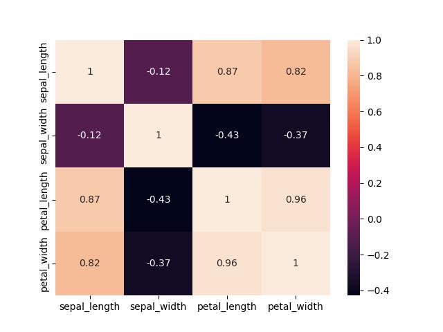
Here, we will also build a heatmap to visualize the correlation among the numeric columns in the dataset:
corr_matrix = df.corr()

sns.heatmap(corr_matrix, annot = True)

plt.show()

To generate the heatmap, the sns.heatmap() method is used with the argument corr_matrix to calculate the correlation coefficients between different pairs of columns in the DataFrame.
The resulting heatmap provides a color-coded representation of these correlation values, where warmer colors indicate stronger positive correlations, cooler colors represent stronger negative correlations, and neutral colors denote weaker or no correlations.
The annot = True parameter adds numerical annotations to each cell of the heatmap, displaying the precise correlation values.
Finally, plt.show() is used to display the generated heatmap.
Video, Further Resources & Summary
Do you need more explanations on how to visualize a correlation matrix in Python Matplotlib and seaborn? Then you should have a look at the following YouTube video of the Statistics Globe YouTube channel.
In the video, we explain how to visualize a correlation matrix in Python Matplotlib and seaborn.
The YouTube video will be added soon.
So we have demonstrated how to visualize a correlation matrix in Python Matplotlib and seaborn. Furthermore, you could have a look at some of the other interesting Matplotlib and seaborn tutorials on Statistics Globe:
- Set Color by Group in Plot in Python Matplotlib & seaborn (2 Examples)
- Rotate Axis Text in Python Matplotlib & seaborn (2 Examples)
- Add Grid to Plot in Python Matplotlib & seaborn (2 Examples)
- Set Axis Limits of Plot in Python Matplotlib & seaborn (2 Examples)
- Save Plot to Image File in Python Matplotlib & seaborn (2 Examples)
- Introduction to Python Programming
This post has shown how to visualize a correlation matrix in Python Matplotlib and seaborn. I hope you found it helpful! In case you have further questions, you may leave a comment below.
This page was created in collaboration with Ifeanyi Idiaye. You might check out Ifeanyi’s personal author page to read more about his academic background and the other articles he has written for the Statistics Globe website.
Subscribe to the Statistics Globe Newsletter
Get regular updates on the latest tutorials, offers & news at Statistics Globe.
I hate spam & you may opt out anytime: Privacy Policy.
Thank you!
Welcome to the Statistics Globe newsletter. From now on, I’ll send you regular emails about statistics, data science, AI, and programming with R and Python.
I’m Joachim Schork. On this website, I provide statistics tutorials as well as code in Python and R programming.
Statistics Globe Newsletter
Get regular updates on the latest tutorials, offers & news at Statistics Globe. I hate spam & you may opt out anytime: Privacy Policy.
Thank you!
Please check your email inbox and click the confirmation link to complete your subscription. If you don’t see the email within a few minutes, please also check your spam/junk folder.


