Draw Logarithmic Axis in Plot in Python Matplotlib & seaborn (2 Examples)
Hi! This short tutorial will demonstrate how to draw logarithmic axis in plot in Matplotlib and seaborn in Python.
Here is an overview:
Let’s get into the Python code!
Install & Import Matplotlib & seaborn
To install and import Matplotlib and seaborn, run the lines of code below in your preferred Python programming IDE or code editor:
# install Matplotlib & seaborn
pip install matplotlib seaborn

# import Matplotlib & seaborn
import matplotlib.pyplot as plt

import seaborn as sns
Having installed and imported Matplotlib and seaborn into our Python programming environment, let’s now create the example dataset that we will use in this tutorial.
Create Example Dataset
We will use the iris dataset as our example dataset. Please note that you can choose to use any other dataset of your choice to follow along with this tutorial.
To load and preview the first 10 rows of the example dataset, run the lines of code below:
df = sns.load_dataset("iris")

print(type(df))

# <class 'pandas.core.frame.DataFrame'>

df.head(10)

#sepal_length	sepal_width	petal_length	petal_width    species
#0	  5.1	        3.5	         1.4	        0.2	setosa
#1	  4.9	        3.0	         1.4	        0.2	setosa
#2	  4.7	        3.2	         1.3	        0.2	setosa
#3	  4.6	        3.1	         1.5	        0.2	setosa
#4	  5.0	        3.6	         1.4	        0.2	setosa
#5	  5.4	        3.9	         1.7	        0.4	setosa
#6	  4.6	        3.4	         1.4	        0.3	setosa
#7	  5.0	        3.4	         1.5	        0.2	setosa
#8	  4.4	        2.9	         1.4	        0.2	setosa
#9	  4.9	        3.1	         1.5	        0.1	setosa
With the example dataset loaded, we can now build graphs.
Example 1: Draw Logarithmic Axis in Matplotlib Plot
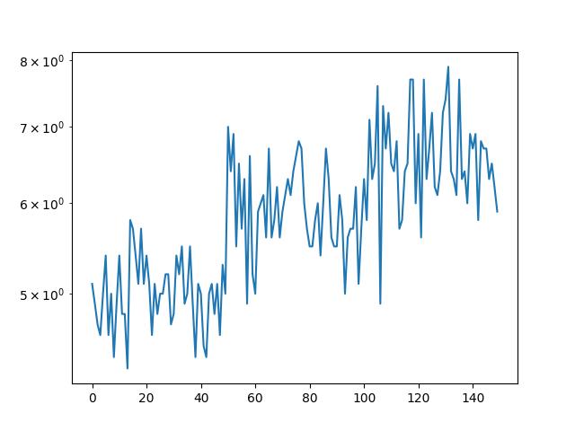
In this example, we will build a line plot of the sepal_length column of the DataFrame and draw a logarithmic scale on the y-axis:
plt.yscale("log")

plt.plot(df['sepal_length'])

In the above example, we set the y-axis scale to logarithmic using plt.yscale("log"), which means the values on the y-axis will be spaced logarithmically. Then, we plot the sepal_length column of df using plt.plot().
By setting the y-axis scale to logarithmic, the resulting plot will visually compress the data, making it easier to observe small changes across a wide range of values, particularly useful when dealing with data that spans several orders of magnitude.
Example 2: Draw Logarithmic Axis in seaborn Plot
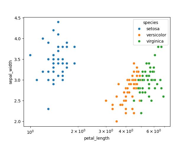
In this example, we will build a scatter plot of the petal_length and sepal_width columns of the DataFrame and draw a logarithmic axis scale on the x-axis:
plt.xscale("log")

sns.scatterplot(df, x = "petal_length", y = "sepal_width", hue = "species")

Here, we first configure the x-axis scale to be logarithmic using plt.xscale(), meaning the x-axis values will be displayed logarithmically.
Then, we build a scatter plot using sns.scatterplot() method, plotting petal_length on the x-axis and sepal_width on the y-axis from df.
Additionally, the species column is utilized to color-code the data points. By setting the x-axis scale to logarithmic, the plot effectively represents data that spans a wide range of values in a visually interpretable manner.
Video, Further Resources & Summary
Do you need more explanations on how to draw logarithmic axis in plot in Python Matplotlib and seaborn? Then you should have a look at the following YouTube video of the Statistics Globe YouTube channel.
In the video, we explain in some more detail how to draw logarithmic axis in plot in Python Matplotlib and seaborn.
The YouTube video will be added soon.
So, we have demonstrated how to draw logarithmic axis in plot in Python Matplotlib and seaborn. Furthermore, you could have a look at some of the other interesting Matplotlib and seaborn tutorials on Statistics Globe, starting with these:
- Change Figure Size of Subplot in Python Matplotlib & seaborn (2 Examples)
- Change Axis Labels of Subplots in Python Matplotlib & seaborn (2 Examples)
- Set Color by Group in Plot in Python Matplotlib & seaborn (2 Examples)
- Change Tick Frequency of Plot in Python Matplotlib & seaborn (2 Examples)
- Change Size of Figures in Python Matplotlib & seaborn (2 Examples)
- Introduction to Python Programming
This post has shown how to draw logarithmic axis in plot in Python Matplotlib and seaborn. I hope you found it helpful! In case you have further questions, you may leave a comment below.
This page was created in collaboration with Ifeanyi Idiaye. You might check out Ifeanyi’s personal author page to read more about his academic background and the other articles he has written for the Statistics Globe website.
Subscribe to the Statistics Globe Newsletter
Get regular updates on the latest tutorials, offers & news at Statistics Globe.
I hate spam & you may opt out anytime: Privacy Policy.
Thank you!
Welcome to the Statistics Globe newsletter. From now on, I’ll send you regular emails about statistics, data science, AI, and programming with R and Python.
I’m Joachim Schork. On this website, I provide statistics tutorials as well as code in Python and R programming.
Statistics Globe Newsletter
Get regular updates on the latest tutorials, offers & news at Statistics Globe. I hate spam & you may opt out anytime: Privacy Policy.
Thank you!
Please check your email inbox and click the confirmation link to complete your subscription. If you don’t see the email within a few minutes, please also check your spam/junk folder.


