Change Figure Size of Subplot in Python Matplotlib & seaborn (2 Examples)
Hi! This tutorial will demonstrate how to adjust the figure size of subplots in Matplotlib and seaborn in the Python programming language.
Here is an overview:
Let’s dive into the Python code!
Install & Import Matplotlib & seaborn
To install and import Matplotlib and seaborn, run the lines of code below in your preferred Python programming IDE or code editor:
# install Matplotlib & seaborn
pip install matplotlib seaborn

# import Matplotlib & seaborn
import matplotlib.pyplot as plt

import seaborn as sns
Having installed and imported Matplotlib and seaborn into our Python programming environment, we can now go on to create the example dataset that we will use in this tutorial.
Create Example Dataset
We will use the popular tips dataset that is shipped along with the seaborn package. To load and preview the first 10 rows of the dataset, run the lines of code below:
df = sns.load_dataset("tips")

print(type(df))

# <class 'pandas.core.frame.DataFrame'>

df.head(10)

#  total_bill	 tip	sex	smoker	day	time	size
#0	16.99	1.01	Female	No	Sun	Dinner	2
#1	10.34	1.66	Male	No	Sun	Dinner	3
#2	21.01	3.50	Male	No	Sun	Dinner	3
#3	23.68	3.31	Male	No	Sun	Dinner	2
#4	24.59	3.61	Female	No	Sun	Dinner	4
#5	25.29	4.71	Male	No	Sun	Dinner	4
#6	8.77	2.00	Male	No	Sun	Dinner	2
#7	26.88	3.12	Male	No	Sun	Dinner	4
#8	15.04	1.96	Male	No	Sun	Dinner	2
#9	14.78	3.23	Male	No	Sun	Dinner	2
With the dataset loaded, we can now build visualizations.
Example 1: Adjust Figure Size of Subplot in Matplotlib
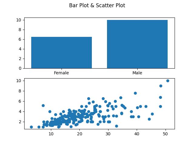
In this example, we will first of all build subplots comprising a bar plot and a scatterplot, then we will demonstrate how to change the figure size of the subplots.
To build the subplot, run the lines of code below:
fig, ax = plt.subplots(2)

fig.suptitle("Bar Plot & Scatter Plot")

ax[0].bar(df['sex'], df['tip'])

ax[1].scatter(df['total_bill'], df['tip'])

plt.show()

In the above example, the first subplot (ax[0]), a bar plot, is generated using the sex column from the DataFrame df as the categorical variable on the x-axis and the tip column as the corresponding y-axis values inside the .bar() method.
In the second subplot (ax[1]), a scatter plot is created with total_bill on the x-axis and tip on the y-axis inside the .scatter() method.
Finally, the plt.show() method is called to display the combined figure with both subplots.
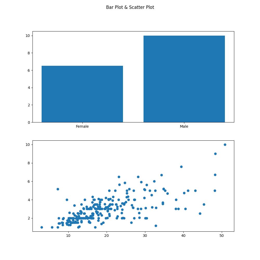
We will now show how to modify the figure size of the subplot by increasing it. Run the lines of code below to do so:
fig, ax = plt.subplots(2, figsize = (10, 10))

fig.suptitle("Bar Plot & Scatter Plot")

ax[0].bar(df['sex'], df['tip'])

ax[1].scatter(df['total_bill'], df['tip'])

plt.show()

Here, you will notice that the code remains largely the same with the exception of the figsize argument in the plt.subplots() method.
The figsize argument takes a tuple of two values, representing the width and height of the figure in inches.
In this particular example, the specified figsize is (10, 10), indicating that the width and height of the figure will both be set to 10 inches.
A larger figsize would result in a larger overall figure size, and a smaller figsize would produce a smaller figure.
Example 2: Adjust Figure Size of Subplot in seaborn
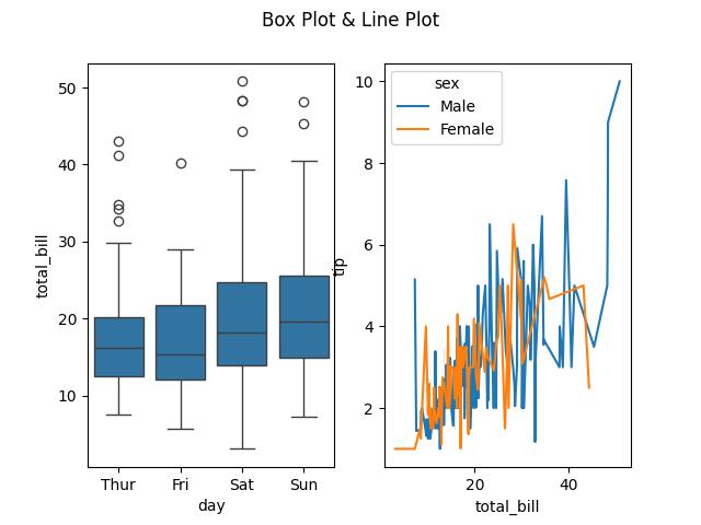
In this second example, we will first build a subplot consisting of a box plot and a line plot, then we will adjust the figure size of the subplot.
To build the subplot, run the lines of code below:
fig, ax = plt.subplots(1,2)

fig.suptitle("Box Plot & Line Plot")

sns.boxplot(df, x = "day", y = "total_bill", ax = ax[0])

sns.lineplot(df, x = "total_bill", y = "tip", hue = "sex", ax = ax[1])

plt.show()

In the first subplot (ax[0]), a box plot is generated using the sns.boxplot() method, displaying the distribution of total_bill values across different day from df.
The second subplot (ax[1]) features a line plot created using sns.lineplot() method, depicting the relationship between total_bill and tip, with the plot differentiated by the sex column through different hues.
The plt.show() method is then used to display the entire figure with both subplots.
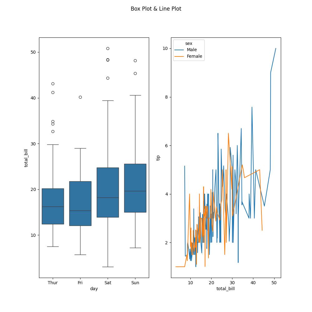
Let us now demonstrate how to change the size of the subplot’s figure. To do so, run the lines of code below:
fig, ax = plt.subplots(1,2, figsize = (10,8))

fig.suptitle("Box Plot & Line Plot")

sns.boxplot(df, x = "day", y = "total_bill", ax = ax[0])

sns.lineplot(df, x = "total_bill", y = "tip", hue = "sex", ax = ax[1])

plt.show()

As you would notice, the subplot figure is now bigger than previously. This is because we defined the figsize argument inside plt.subplots(). Just as we did in the Matplotlib example, we passed a tuple of the dimensions (10,8) of the subplot to the figsize argument in order to change the figure size by increasing it.
Since seaborn is built on top of Matplotlib, we can apply the same approach to modifying or enhancing plots built with Matplotlib on those built with seaborn.
Video, Further Resources & Summary
Do you need more explanations on how to change the figure size of subplots in Matplotlib and seaborn in Python? Then you should have a look at the following YouTube video of the Statistics Globe YouTube channel.
In the video, we explain in some more detail how to change the figure size of subplots in Matplotlib and seaborn in Python.
The YouTube video will be added soon.
With that, we have demonstrated how to change the figure size of subplots in Matplotlib and seaborn. Furthermore, you could have a look at some of the other interesting Matplotlib and seaborn tutorials on Statistics Globe, starting with these:
- Save Plot Image to File in Python Matplotlib & seaborn (2 Examples)
- Set Plot Color by Group in Python Matplotlib & seaborn (2 Examples)
- Rotate Axis Text in Python Matplotlib & seaborn (2 Examples)
- Add Grid to Plot in Python Matplotlib & seaborn (2 Examples)
- Change Size of Figures in Python Matplotlib & seaborn (2 Examples)
- Introduction to Python Programming
This post has shown how to change the figure size of subplots in Matplotlib and seaborn in Python. I hope you found it helpful! In case you have further questions, you may leave a comment below.
This page was created in collaboration with Ifeanyi Idiaye. You might check out Ifeanyi’s personal author page to read more about his academic background and the other articles he has written for the Statistics Globe website.


