Control the Size of the Points in a Scatterplot in R (Example)
In this article, I’ll show how to increase or decrease the point size in a scatterplot in the R programming language.
The tutorial will consist of one example. To be more precise, the tutorial will contain the following content blocks:
Let’s just jump right in:
Default Scatterplot
In R, we can draw a default scatterplot (or xy-plot) with the plot() function as follows:
plot(1:10, 1:10) # Create default scatterplot

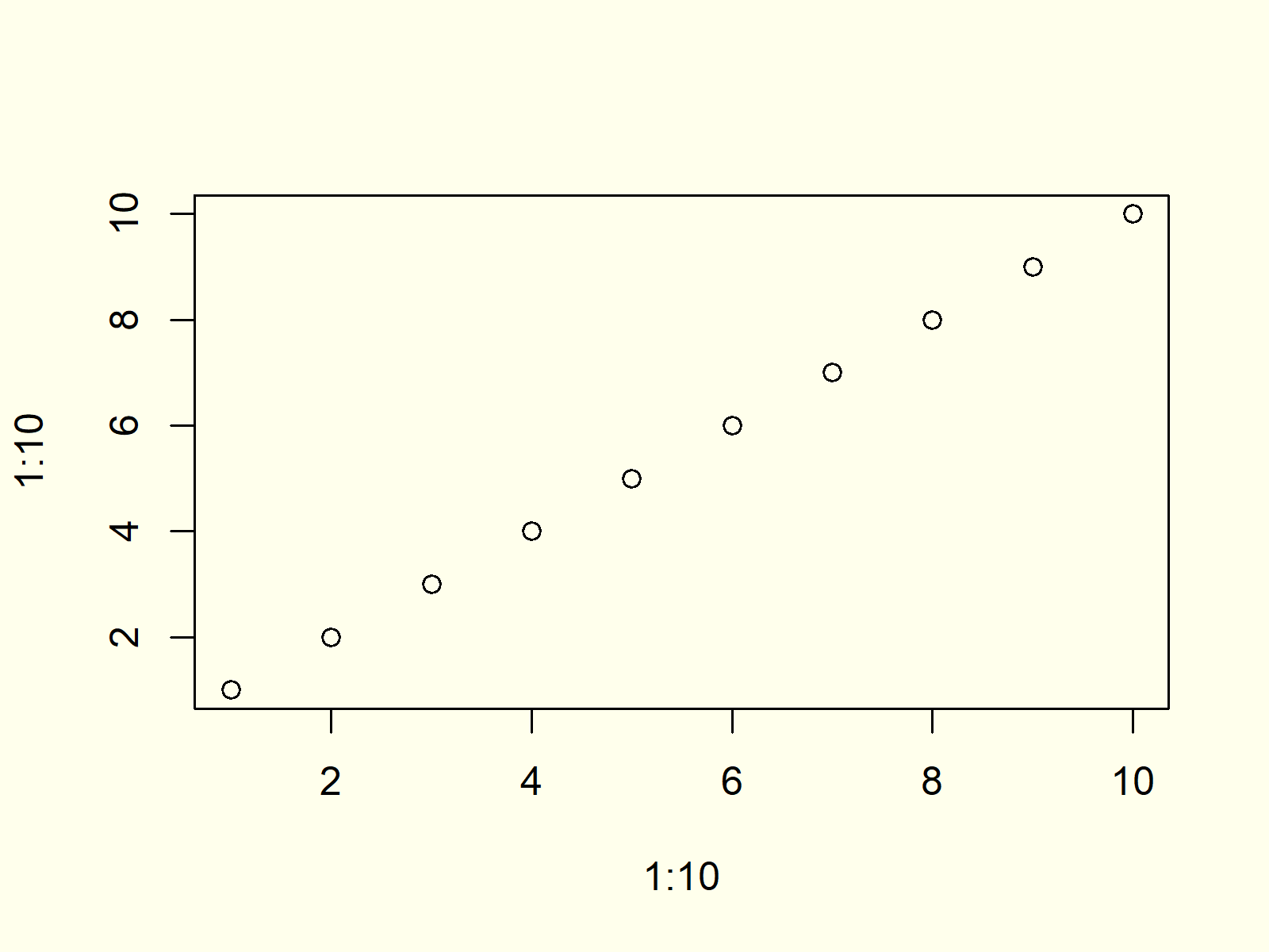
Figure 1: Default Scatterplot in R.
Figure 1 shows how a default scatterplot in R looks like. As you can see, the points are relatively small.
Example: Increase Point Size of Plot
If we want to increase the size of the points of our plot, we can use the cex argument of the plot function:
plot(1:10, 1:10, cex = 3) # Increase size of points

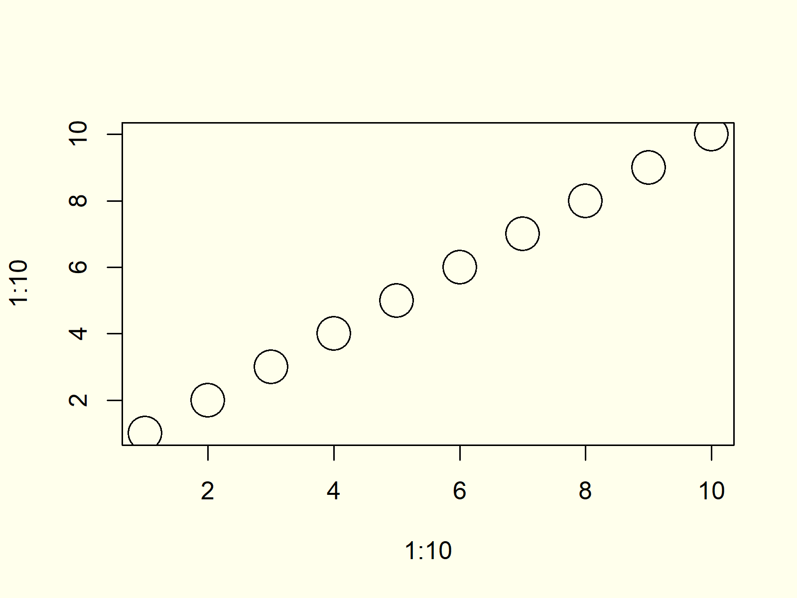
Figure 2: Scatterplot with Increased Size of Points.
Compare the points shown in Figure 2 with the points shown in Figure 1. As you can see, the point size was increased.
Note that we could specify any numeric value for the cex argument. Smaller values indicate a smaller point size; larger values indicate a larger point size.
Video, Further Resources & Summary
Would you like to learn more about plotting data in R? Then you might want to have a look at the following video of my YouTube channel. I explain the R programming syntax of this tutorial in the video.
In addition, you might have a look at the other articles of www.statisticsglobe.com.
At this point of the post you should know how to control and modify the size and thickness of the dots in a xy-plot in R. Please let me know in the comments, if you have any additional questions and/or comments.
Subscribe to the Statistics Globe Newsletter
Get regular updates on the latest tutorials, offers & news at Statistics Globe.
I hate spam & you may opt out anytime: Privacy Policy.
Thank you!
Welcome to the Statistics Globe newsletter. From now on, I’ll send you regular emails about statistics, data science, AI, and programming with R and Python.
I’m Joachim Schork. On this website, I provide statistics tutorials as well as code in Python and R programming.
Statistics Globe Newsletter
Get regular updates on the latest tutorials, offers & news at Statistics Globe. I hate spam & you may opt out anytime: Privacy Policy.
Thank you!
Please check your email inbox and click the confirmation link to complete your subscription. If you don’t see the email within a few minutes, please also check your spam/junk folder.


