Avoid Overlapping Axis Labels in R (2 Examples)
This tutorial shows how to avoid overlapping axis labels in the R programming language.
The table of content is structured as follows:
Let’s take a look!
Data Sample, Add On Packages & Default Plot
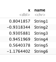
For this tutorial, we use the following data:
set.seed(999)
data_sample <- data.frame(x = rnorm(30),
                          name = paste0("String",1:30))
head(data_sample)
If not installed yet, please install the ggplot2 package in order to draw our sample data:
install.packages("ggplot2")
library("ggplot2")
If you have already installed ggplot2, you just need to load the package:
library("ggplot2")
Now, we can draw our data:
ggplot(data_sample) +
  geom_point(aes(name,x)) +
  ggtitle("Figure 1")
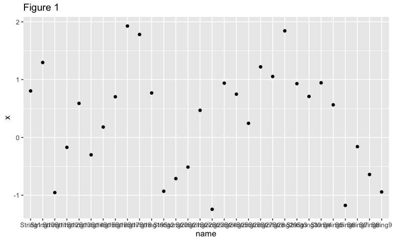
As we can see in Figure 1, it’s almost impossible to read names in the x-axis due to the overlapping labels. What can we do about it?
Example 1: Avoid Overlapping Axis Labels in a Graph Using guide_axis() Function
Fortunately, the latest version of ggplot2 (3.3.0) offers a quick solution to this problem. We can use a function called guide_axis() to avoid overlapping axis labels by stacking the labels:
ggplot(data_sample) +
  geom_point(aes(name,x)) +
  scale_x_discrete(guide=guide_axis(n.dodge=3)) +
  ggtitle("Figure 2")

The argument we are using inside guide_axis, “n.dodge=3”, arranges every three axis labels separately from the x-axis. We can change this argument depending on the length of the label names we are using in our data frame.
Example 2: Avoid Overlapping Axis Labels in a Graph Using theme() Function
Another solution to avoid overlap in axis labels is to rotate the x-axis by using the theme() function that the ggplot2 package offers. In this case, we will rotate the x-axis labels by 90 degrees, but this rotation number can be changed as needed:
ggplot(data_sample) +
  geom_point(aes(name,x)) +
  theme(axis.text.x = element_text(angle = 90,
                                   vjust = 0.5,
                                   hjust = 0.5)) +
  ggtitle("Figure 3")
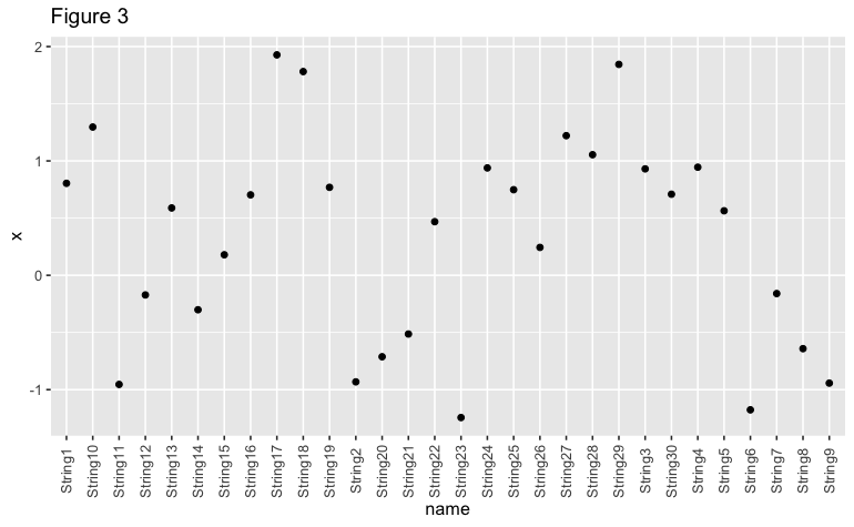
As shown in Figures 2 and 3, it is possible to create a ggplot2 plot that avoids an overlap in axis labels in R.
Video, Further Resources & Summary
Do you need more explanations on how to avoid an overlap of axis labels? Then you should have a look at the following YouTube video of the Statistics Globe YouTube channel.
The YouTube video will be added soon.
Furthermore, you could have a look at some of the other tutorials on Statistics Globe:
- Remove Legend in ggplot2
- Change Position of ggplot Title in R
- Draw ggplot2 Plot with Lines and Points in R
This post shows how to remove overlap for axis labels in R. In case you have further questions, you may leave a comment below.

This page was created in collaboration with Paula Villasante Soriano. Please have a look at Paula’s author page to get more information about her academic background and the other articles she has written for Statistics Globe.

I’m Joachim Schork. On this website, I provide statistics tutorials as well as code in Python and R programming.
Statistics Globe Newsletter
Get regular updates on the latest tutorials, offers & news at Statistics Globe. I hate spam & you may opt out anytime: Privacy Policy.