Plot Mean in ggplot2 Barplot in R (Example)
This page explains how to create a ggplot2 barchart that shows the mean of each group in the R programming language.
The page looks as follows:
You’re here for the answer, so let’s get straight to the tutorial!
Example Data, Add-On Packages & Basic Graph
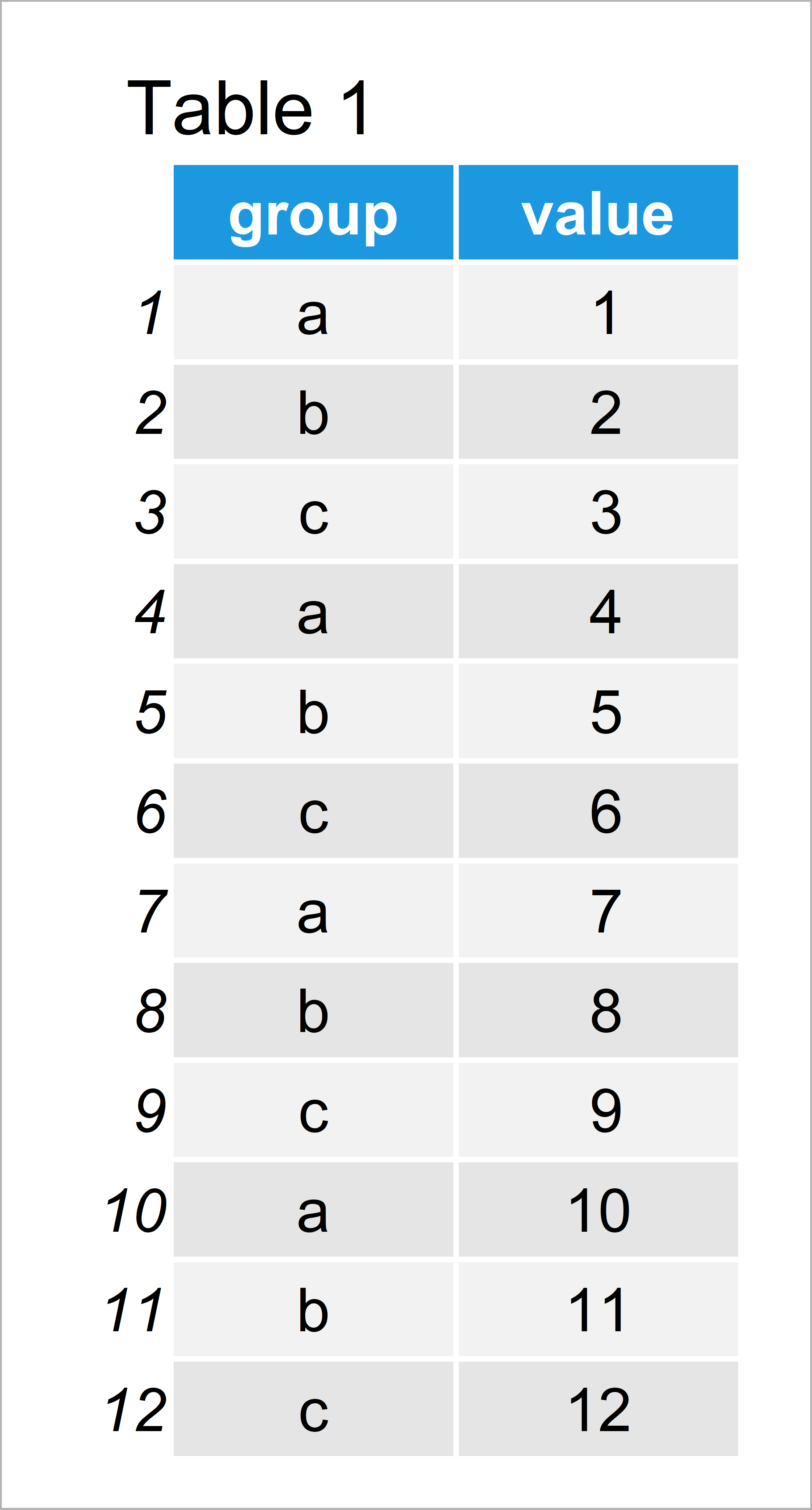
To start with, we’ll need to create some example data:
data <- data.frame(group = letters[1:3],    # Create example data
                   value = 1:12)
data                                        # Print example data

Have a look at the previous table. It shows that our example data contains twelve rows and two columns.
In order to apply the functions of the ggplot2 package, we also have to install and load ggplot2:
install.packages("ggplot2")                 # Install & load ggplot2
library("ggplot2")
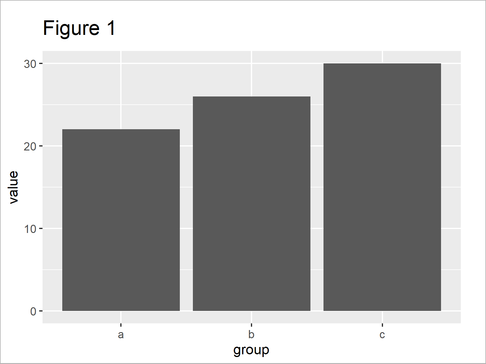
Now, we can draw our data in a ggplot2 barchart as shown below. In this first plot, we’ll use the default specifications of the geom_bar function, i.e. the sum of each group.
ggplot(data, aes(group, value)) +           # ggplot2 barplot with sum
  geom_bar(stat = "identity")

In Figure 1 it is shown that we have created a ggplot2 bargraph with sums.
Example: Plot Mean in ggplot2 Barchart Using position, stat & fun Arguments
This example shows how to draw the mean in a ggplot2 barplot.
For this, we have to specify three arguments within the geom_bar function:
- position = “dodge”
- stat = “summary”
- fun = “mean”
Have a look at the following R code:
ggplot(data, aes(group, value)) +           # ggplot2 barplot with mean
  geom_bar(position = "dodge",
           stat = "summary",
           fun = "mean")

By executing the previous R code we have created Figure 2, i.e. a ggplot2 barchart showing the mean of each category or factor level.
Video, Further Resources & Summary
If you need more information on the topics of this tutorial, you could watch the following video of my YouTube channel. In the video, I’m explaining the content of this article.
Furthermore, you might want to read the related articles of Statistics Globe.
You have learned in this post how to plot the mean in a ggplot2 barplot in R. In case you have any further questions, please let me know in the comments section.


