Read, Row-Bind, Summarize & Visualize Multiple Data Sets in R (4 Examples)
In this tutorial, I’ll demonstrate how to import, combine, summarize, and visualize two data sets in the R programming language.
This is a bonus tutorial for the Statistics Globe online course on “Data Manipulation in R Using dplyr & the tidyverse”, and hence we will focus on tidyverse functions in this article as well. By the way, if you’d like to learn more about the inline course, you may check out this page.
The post is structured as follows:
Let’s dive right into it…
Installing & Loading tidyverse packages
If we want to use the commands and functions of the tidyverse such as dplyr and ggplot2, we first have to install and load the tidyverse packages:
install.packages("tidyverse")                      # Install & load tidyverse package
library("tidyverse")
Now, we are set up and can move on to importing our data sets.
Read Multiple tibbles Using readr Package
In this tutorial, we will use two CSV files. You may download them here:
When reading or writing data in R, the first step is to specify a file location path:
my_path <- "C:/Users/Joach/Desktop/my project/" # Specify working directory
Next, we can use the read_csv function of the readr package in combination with the str_c function of the stringr package to import our first data set as a tibble object.
data1 <- read_csv(str_c(my_path, "data1.csv"))     # Import first data set
data1                                              # Print first data set
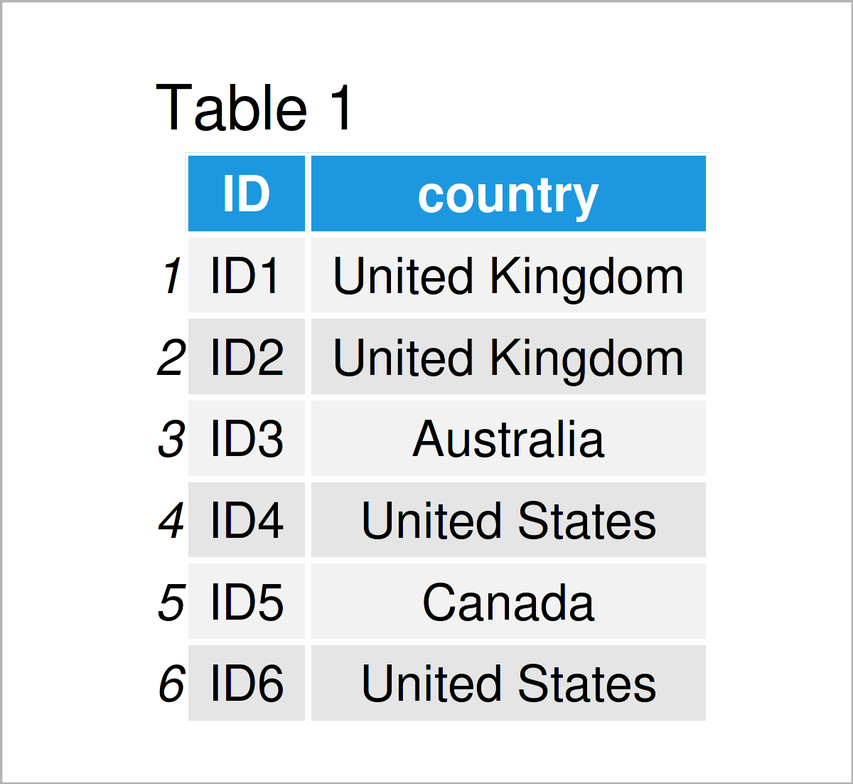
Table 1 shows the first rows of our first imported example tibble – it is also shown that our data consists of two columns. The ID column is an identifier for the participants, and the country column contains the countries where each participant is from.
This first data set contains the participants of the initial registration phase of the dplyr course. However, there was a late registration which resulted in another country data set. Let’s read this second data set:
data2 <- read_csv(str_c(my_path, "data2.csv"))     # Import second data set
data2                                              # Print second data set
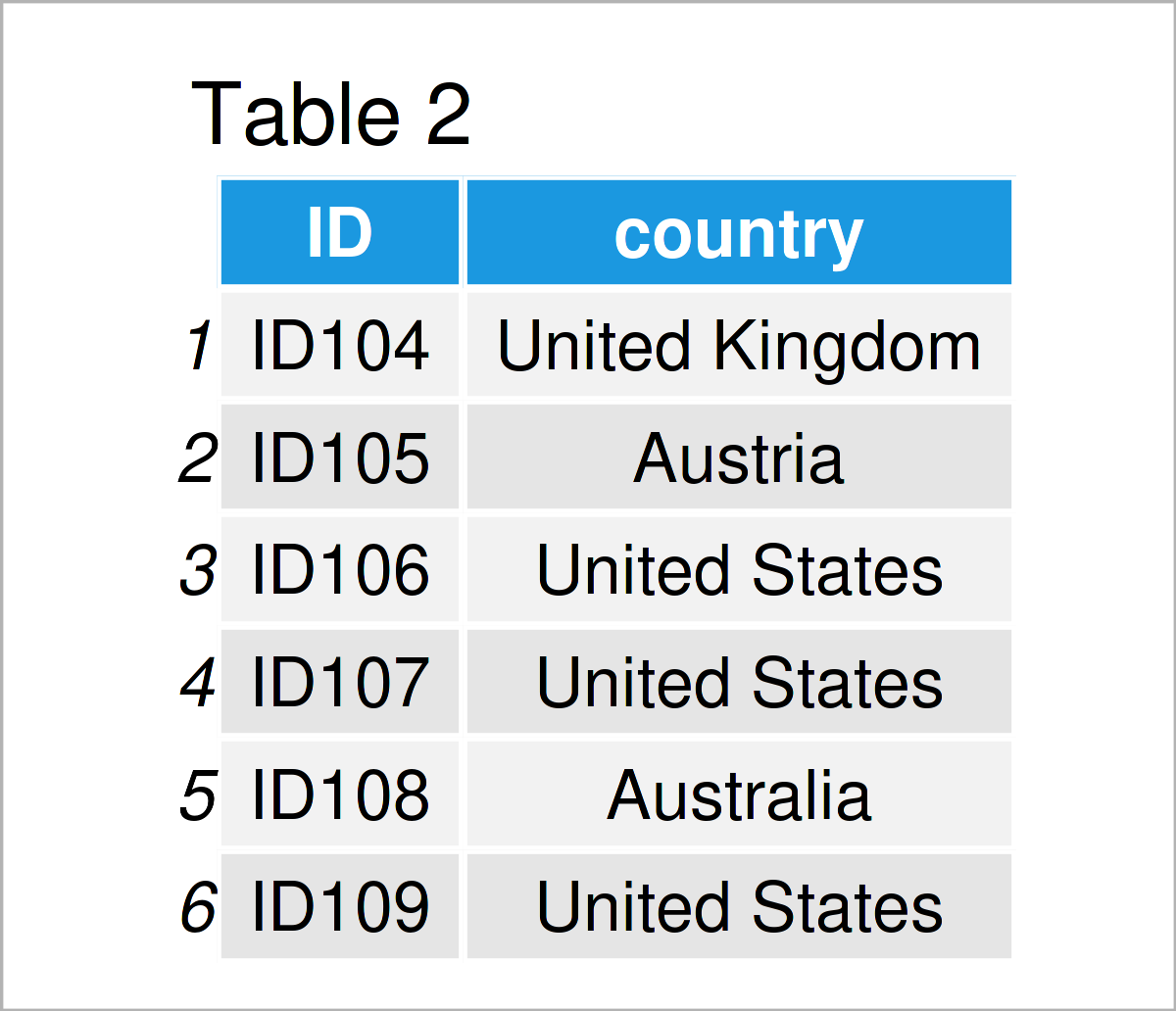
Table 2 shows the output of the previous R programming code: Our second example tibble with the same column names as our first tibble.
Let’s work with these data!
Remove Certain Rows of a tibble
In this section, I’ll demonstrate how to extract specific rows of a data set.
The reason why I’m doing this in this tutorial is that 3 out of the 103 participants of the initial registration phase used their 30-days-money-back-guarantee. That’s a great result, by the way, since it shows that almost everybody is happy with the course! 🙂
We can achieve this by using the filter function of the dplyr package:
data1_upd <- data1 %>%                             # Filter rows
  filter(! ID %in% c("ID5", "ID13", "ID55"))
head(data1_upd)

After running the previous R code, the new tibble illustrated in Table 3 has been created. As you can see, for example, the ID No. 5 was removed from the data set.
Bind Two tibbles by Rows
The next step is to combine our two tibbles in a single tibble. For this, we can apply the bind_rows function of the dplyr package as shown below:
data_all <- data1_upd %>%                          # Row-bind multiple data sets
  bind_rows(data2)
head(data_all) # Head of combined data
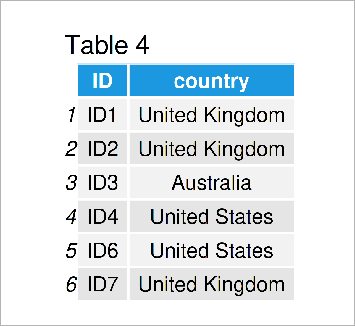
The output of the previous code is shown in Table 4: The first six rows of a unified tibble that contains 111 rows, i.e. all final participants of the course.
We may also use the tail function to return the bottom rows of our combined tibble:
tail(data_all) # Tail of combined data
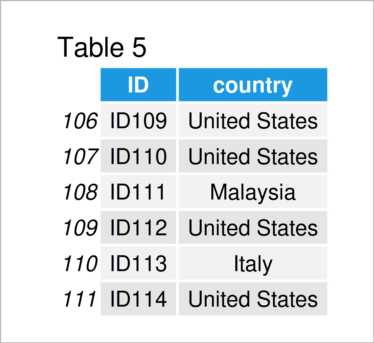
Let’s check the final number of participants once again using the nrow function:
nrow(data_all)                                     # Total number of participants
# [1] 111
111 participants, what a great success!
Summarize tibble
Next, I would like to check the country distribution in the course. For this task, I use the group_by and summarize functions of dplyr.
data_summ <- data_all %>%                          # Convert vector to tibble
  group_by(country) %>%                            # Group tibble
  summarize(country_count = n()) %>%               # Calculate country count
  arrange(desc(country_count))                     # Arrange tibble descendingly
data_summ                                          # Print country data
# # A tibble: 31 × 2
#    country        country_count
#    <chr>                  <int>
#  1 United States             44
#  2 United Kingdom            12
#  3 Germany                    5
#  4 Mexico                     5
#  5 Australia                  4
#  6 Canada                     4
#  7 Netherlands                4
#  8 Ireland                    3
#  9 Spain                      3
# 10 Sweden                     3
# # ℹ 21 more rows
# # ℹ Use `print(n = ...)` to see more rows
As you can see, we have created another tibble that contains the country counts of the participants in our course.
Visualize tibble Using ggplot2
Finally, I would like to visualize our country data in a ggplot2 barplot to identify the countries with the most participants.
Take a look at the R code below:
data_summ %>%                                      # Create ggplot2 plot
  ggplot(aes(x = reorder(country, - country_count),
             y = country_count)) +
  geom_col() +                                     # Specify to draw a barplot
  theme(axis.text.x = element_text(angle = 90,     # Vertical x-axis labels
                                   hjust = 1,
                                   vjust = 0.3)) +
  xlab("Country") +                                # Change x-axis label
  ylab("Count") +                                  # Change y-axis label
  annotate("text",                                 # Add text element to plot
           x = 15,
           y = 25,
           label = "Course Participants\nby Country",
           size = 15,
           color = "#1b98e0")
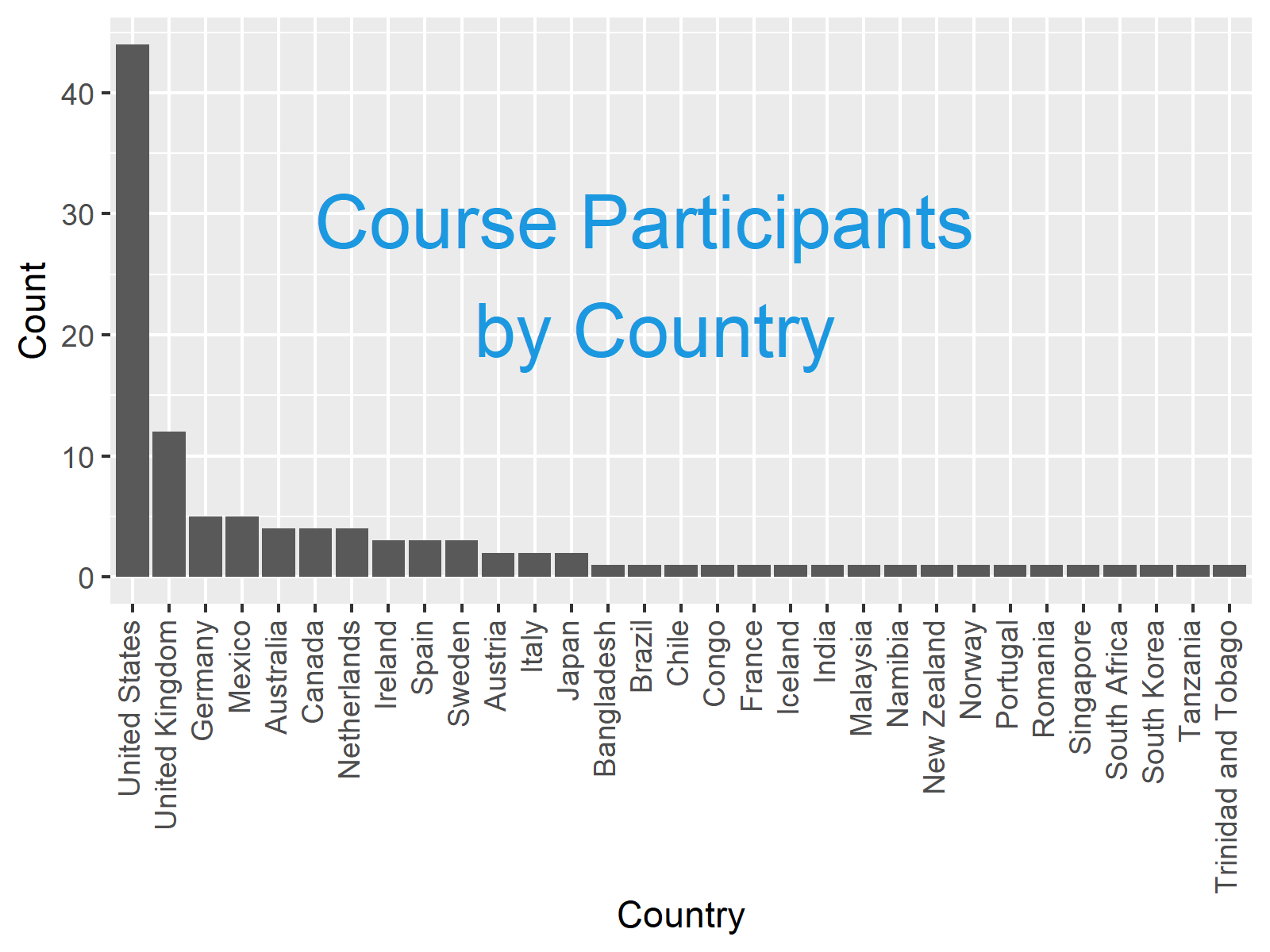
As demonstrated in the graph above, the most participants come from the United States, followed by the United Kingdom, Germany, and Mexico. What a nice international group! 🙂
Video, Further Resources & Summary
Do you want to know more about the topics of this article? Then I recommend watching the following video instruction which I have published on my YouTube channel. I illustrate the examples of this tutorial in the video.
In addition, you might take a look at the other tutorials on my website:
- Summarize Multiple Columns of data.table by Group
- cbind R Command
- Sort Data Frame by Multiple Columns
- Drop Multiple Columns from Data Frame Using dplyr Package
- R Programming Language
At this point of the post, you should know how to work with multiple data sets using the functions of the tidyverse in R. If you have further questions, please let me know in the comments section. Furthermore, please subscribe to my email newsletter for updates on the newest articles.


2 Comments. Leave new
Great video! How can I rotate plot for easier reading?
Thanks George, glad you like it! 🙂
You may use the coord_flip() function for this:
Regards,
Joachim