R ggplot2 Error: Insufficient values in manual scale. X needed but only Y provided. (2 Examples)
In this tutorial you’ll learn how to avoid the “Error: Insufficient values in manual scale. X needed but only Y provided.” in the R programming language.
Table of contents:
Let’s dive right into the exemplifying R code…
Example Data, Add-On Packages & Default Plot
The first step is to construct some data that we can use in the examples below:
data <- data.frame(x = letters[1:5],          # Create example data frame
                   y = 1:5)
data                                          # Print example data frame

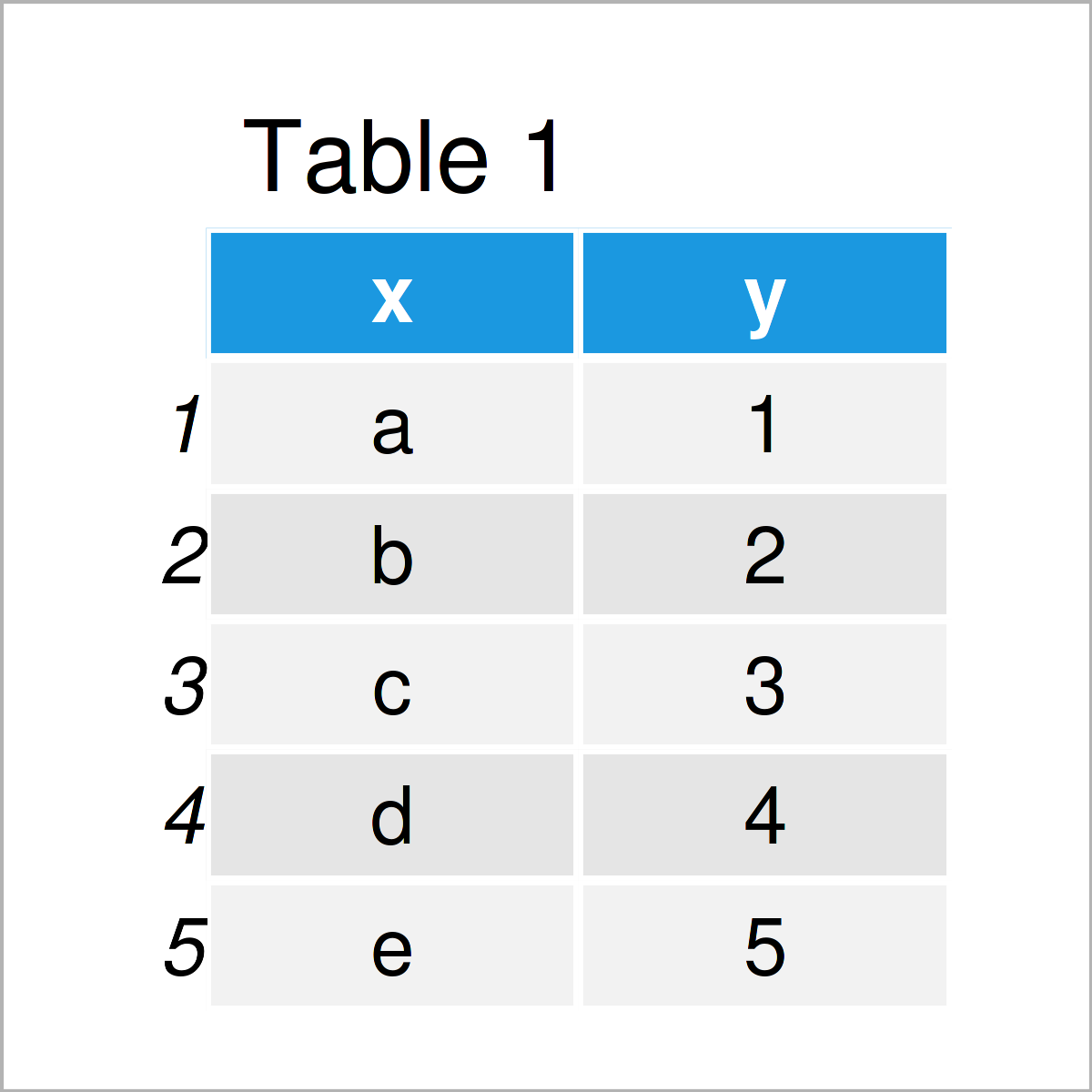
As you can see based on Table 1, our exemplifying data is a data frame consisting of five rows and two columns called “x” and “y”.
To be able to use the functions of the ggplot2 package, we also have to install and load ggplot2:
install.packages("ggplot2")                   # Install ggplot2 package
library("ggplot2")                            # Load ggplot2
Now, we can draw our data as follows:
ggp <- ggplot(data, aes(x, y, fill = x)) +    # Create ggplot2 barplot with default colors
  geom_bar(stat = "identity")
ggp                                           # Draw ggplot2 barplot

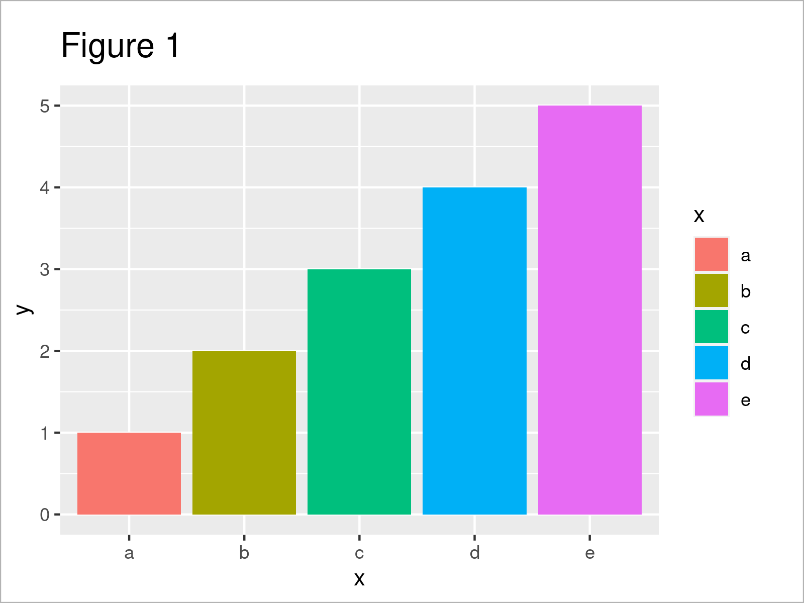
As illustrated in Figure 1, the previous code has created a ggplot2 barplot with the default color palette of the ggplot2 package.
Example 1: Reproduce the Error: Insufficient values in manual scale. X needed but only Y provided.
In Example 1, I’ll illustrate how to replicate the “Error: Insufficient values in manual scale. X needed but only Y provided.” when using the ggplot2 package.
Let’s assume that we want to change the colors of our plot. Then, we might try to use the scale_fill_manual function as shown below:
ggp +                                         # Try to change colors
  scale_fill_manual(values = c("red", "#1b98e0",
                               "#353436", "#f6f805"))
# Error: Insufficient values in manual scale. 5 needed but only 4 provided.
Unfortunately, the previous R code has returned the “Error: Insufficient values in manual scale. X needed but only Y provided.”.
The reason for this is that we have not specified the correct number of colors within the scale_fill_manual function, i.e. we have only specified four different colors, but our barchart contains five different groups.
Next, I’ll show how to resolve this problem!
Example 2: Debug the Error: Insufficient values in manual scale. X needed but only Y provided.
Example 2 explains how to handle the “Error: Insufficient values in manual scale. X needed but only Y provided.”.
For this, we have to specify the same number of colors as we have groups in our data, i.e. we are adding “pink” to the color vector within scale_fill_manual:
ggp +                                         # Properly change colors
  scale_fill_manual(values = c("red", "#1b98e0",
                               "#353436", "#f6f805",
                               "pink"))

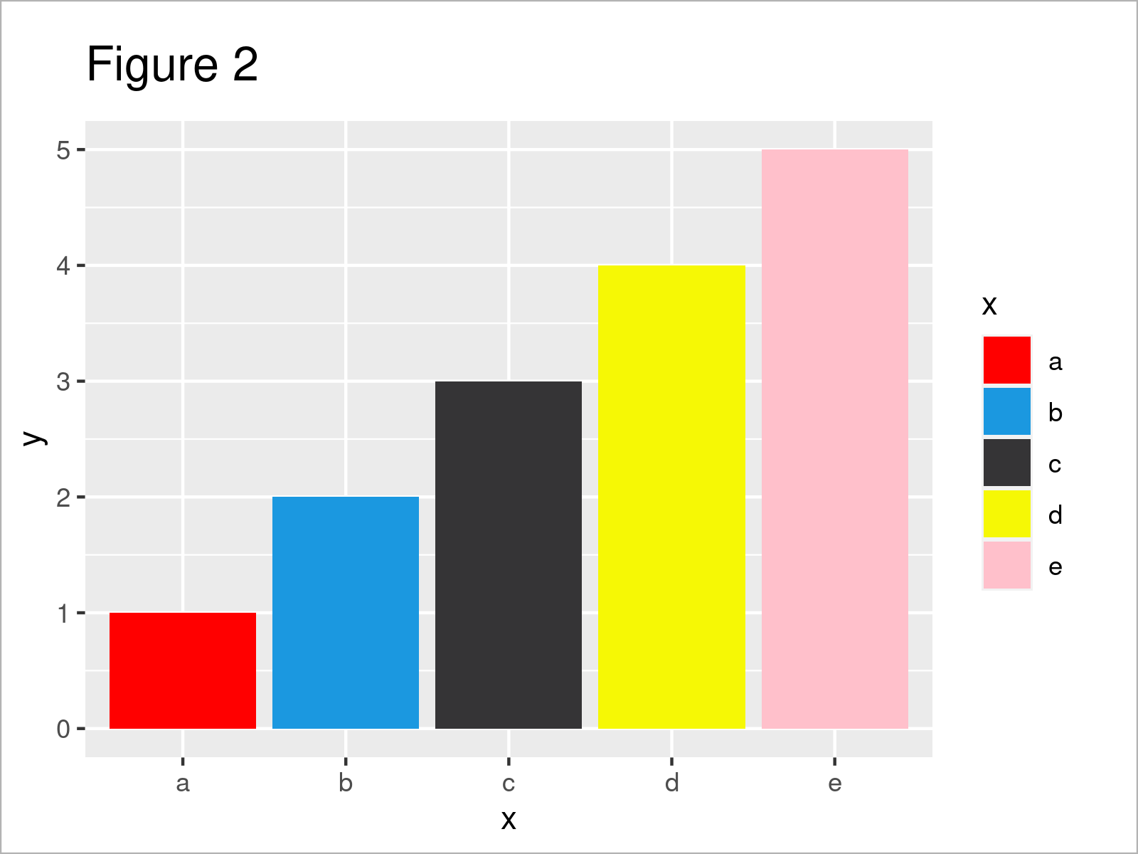
Figure 2 shows the output of the previous R programming code – A ggplot2 graphic with manually specified colors.
Video, Further Resources & Summary
The ggplot2 package has of course much more of useful and awesome functions and opportunities when it comes to data visualization in R. May you have a look at the following introduction video on my my YouTube channel.
Besides that, you might read some of the other articles that I have published on this homepage. You can find a selection of related tutorials on related topics such as ggplot2 and graphics in R below.
- ggplot2 Error: Don’t know how to automatically pick scale for object type
- Draw ggplot2 Plot with Two Y-Axes in R
- ggplot2 Warning Message: Removed rows containing missing values
- Handling Warning & Error Messages in R (Example Codes)
- Graphics Overview in R
- All R Programming Examples
In summary: This page has shown how to deal with the “Error: Insufficient values in manual scale. X needed but only Y provided.” in the R programming language.
In the present tutorial, we have used a barchart to illustrate the “Error: Insufficient values in manual scale. X needed but only Y provided.”. However, we could apply the same logic to other types of graphs such as boxplots, line plots, or scatterplots.
Don’t hesitate to let me know in the comments section, if you have further comments or questions. In addition, please subscribe to my email newsletter for updates on new articles.


