plotly Pareto Chart in R (Example)
Hi! This short tutorial will demonstrate how to build a plotly pareto chart in the R programming language.
Here is an overview:
Let’s get into the R code!
Install & Load plotly & dplyr
To install and load plotly and dplyr, run the lines of code below in your preferred R programming IDE or code editor:
# install plotly & dplyr
install.packages(c("plotly", "dplyr"))

# load plotly & dplyr
library(plotly)

library(dplyr)
Besides plotly, we need the dplyr library because it enables us to use the pipe operator (%>% or |>) to pipe lines of code together and run them as a chunk.
With plotly and dplyr installed and loaded, we can now go on to create an example dataset.
Create Example Dataset
We will use the data.frame() function to create our example dataset. Run the lines of code below to create and preview the dataset:
data <- data.frame(
  category = c("Category A", "Category B", "Category C", "Category D"),
  frequency = c(20, 15, 10, 30)
)

print(data)

#    category frequency
#1 Category A        20
#2 Category B        15
#3 Category C        10
#4 Category D        30
With the dataset created and previewed, we can now create the pareto chart.
Example: Create Interactive Pareto Chart
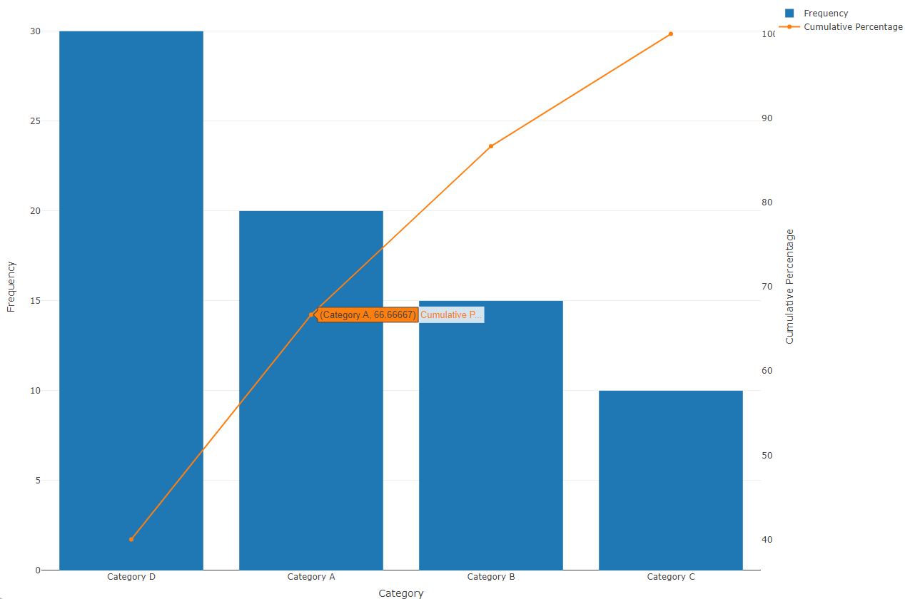
To create the interactive pareto chart, run the lines of code below:
data <- data %>%
  arrange(desc(frequency)) %>%
  mutate(category = factor(category,
                           levels = unique(category)))

data$cumulative <- cumsum(data$frequency)

data$percentage <- (data$cumulative / sum(data$frequency)) * 100

fig <- plot_ly(data,
               x = ~category,
               y = ~frequency,
               type = 'bar',
               name = 'Frequency') %>%
  add_trace(y = ~percentage,
            type = 'scatter',
            mode = 'lines+markers',
            yaxis = 'y2',
            name = 'Cumulative Percentage') %>%
  layout(title = 'Pareto Chart',
         xaxis = list(title = 'Category'),
         yaxis = list(title = 'Frequency'),
         yaxis2 = list(title = 'Cumulative Percentage',
                       overlaying = 'y',
                       side = 'right',
                       showgrid = FALSE))


fig

Here, we first sort the data frame data based on the frequency column in descending order. Then, we calculate the cumulative frequency of each category using the cumsum() function and assign it to a new column cumulative in data.
After that, we compute the percentage of each category’s frequency relative to the total frequency, multiplying the cumulative frequency by 100 and dividing it by the sum of all frequencies, and storing it in a new column percentage.
Next, we create a bar chart (type = 'bar') with the categories on the x-axis and their corresponding frequencies on the y-axis, labeled as ‘Frequency’.
Additionally, we overlay a scatter plot on the same chart, representing the cumulative percentage, where each point connects to form a line (type = 'scatter', mode = 'lines+markers').
This line plot is associated with the right y-axis (yaxis = 'y2') and labeled as ‘Cumulative Percentage’. The layout of the chart includes a title, axis labels, and formatting options. Finally, the chart (fig) is printed to display the pareto chart.
Video, Further Resources & Summary
Do you need more explanations on how to create a plotly pareto chart in R? Then you should have a look at the following YouTube video of the Statistics Globe YouTube channel.
In the video, we explain in some more detail how to create a plotly pareto chart in R.
The YouTube video will be added soon.
With that, we have demonstrated how to create a plotly pareto chart in R. Furthermore, you could have a look at some of the other interesting plotly in R tutorials on Statistics Globe, starting with these ones:
- Draw Time Series in plotly Graph in R (3 Examples)
- plotly Treemap in R (3 Examples)
- plotly Table in R (2 Examples)
- plotly Pie & Donut Chart in R (4 Examples)
- Add & Remove Trace in plotly Graph in R (3 Examples)
- Introduction to R Programming
This post has shown how to create a plotly pareto chart in R. I hope you found it helpful! In case you have further questions, you may leave a comment below.
This page was created in collaboration with Ifeanyi Idiaye. You might check out Ifeanyi’s personal author page to read more about his academic background and the other articles he has written for the Statistics Globe website.


