
Change plotly Axis Labels in R (Example)
Hello! In this tutorial, I will show you how to change the axis labels of your plotly visualization in the R programming language. It is very simple and easy to do. Just follow the steps below and you should be fine.
First, though, let us see what to expect in this tutorial:
Now, let’s get started!
Install and Load the R plotly Library
To use the plotly library in R, you will need to first of all install it. Assuming you are using the R Studio IDE, run the below code in your console:
install.packages("plotly")
Please note that you can use any other code text editor of your choice that can run R and you will be fine as well.
To load the plotly library in R, use the following code:
library(plotly)
Great! With the plotly library installed and loaded, we can now build a scatterplot in plotly.
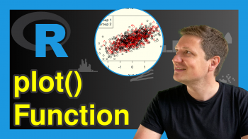
Create a Scatterplot
We are going to use the popular iris dataset for this project. If you are using the R Studio IDE, the iris dataset comes preloaded in it. Just type “iris” in the console and you will see the data frame containing the data. But if you are using another editor, you may need to download the dataset. You can download it from the UCI Machine Learning Repository.
You can take a look at the first 10 rows of the iris dataset by running
head(iris,10)
Sepal.Length Sepal.Width Petal.Length Petal.Width Species
1           5.1         3.5          1.4         0.2  setosa
2           4.9         3.0          1.4         0.2  setosa
3           4.7         3.2          1.3         0.2  setosa
4           4.6         3.1          1.5         0.2  setosa
5           5.0         3.6          1.4         0.2  setosa
6           5.4         3.9          1.7         0.4  setosa
7           4.6         3.4          1.4         0.3  setosa
8           5.0         3.4          1.5         0.2  setosa
9           4.4         2.9          1.4         0.2  setosa
10          4.9         3.1          1.5         0.1  setosa
Great! Let’s now build a scatterplot, by running the lines of code below:
library(plotly)
library(dplyr)

fig <- iris |>
  plot_ly(x = ~Sepal.Length,
          y = ~Petal.Length,
          color = ~Species,
          size = 10)
In the above code, we introduced another library known as dplyr. This library enables us to pipe lines of code together, using the pipe “|>” symbol. This makes our code easier to read and understand.
Now, when we print our scatterplot object, we will see our interactive scatterplot.
print(fig)
Awesome! We can hover over the plot to see the information each data point contains and to bring up other widgets that we can interact with. Next, we shall change the axis labels of the scatterplot.
Change the Axis Labels of the Scatterplot
Here, we are going to change the default X axis label of the plot from “Sepal.Length” to “Length of the Sepal” and the default Y axis label from “Petal.Length” to “Length of the Petal” by adding a line of code to our pipeline like so:
fig <- iris |>
  plot_ly(x = ~Sepal.Length,
          y = ~Petal.Length,
          color = ~Species,
          size = 10) |>
  layout(xaxis = list(title = "Length of the Sepal"), yaxis = list(title = "Length of the Petal"))

print(fig)
As you can see, it is super easy to build an interactive plot using the R plotly library and set or change its axis labels.
I hope you enjoyed this tutorial, and I will see you in the next one.
Video, Further Resources & Summary
Do you need more explanations on how to create interactive visualizations using plotly in R? Then you should have a look at the following YouTube video of the Statistics Globe YouTube channel.
In the video, the speaker Kirby White explains how to create interactive plots in R.
Furthermore, you could have a look at some of the other R plotly tutorials on Statistics Globe:
- How to Draw a plotly Boxplot in R (Example)
- How to Draw a plotly Barplot in R (Example)
- Draw a plotly Histogram in R (Example)
- How to Draw a plotly Line plot in R (Example)
- How to Draw a plotly Scatterplot in R (Example)
This page has demonstrated how to change the axis labels of a plotly visualization in the R programming language. In case you have further questions, you might leave a comment below.

This page was created in collaboration with Ifeanyi Idiaye. You might check out Ifeanyi’s personal author page to read more about his academic background and the other articles he has written for the Statistics Globe website.

I’m Joachim Schork. On this website, I provide statistics tutorials as well as code in Python and R programming.
Statistics Globe Newsletter
Get regular updates on the latest tutorials, offers & news at Statistics Globe. I hate spam & you may opt out anytime: Privacy Policy.
3 Comments. Leave new
Thank you very for updating this tutorial. Is it possible to bold the axis text in Plotly in R ?
Hey Azharul!
If I understood your question correctly, this tutorial of ours would help you with changing the colors manually.
Regards,
Cansu
In the previous comment, I asked how to bold text in Plotly . I found it anyhow. we can do that using title function like- title = ‘ text here . For example_
xaxis = list(title = ‘ Site label types ‘, font=list(size = 11), tickfont = list(size = 14, color = ‘black’), (color = ‘black’)).
But I am still looking at how to put color manually for different boxplot as like video tutorial