







Fit Logarithmic Curve in R (2 Examples)
In this article you’ll learn how to fit a logarithmic curve in a plot in the R programming language.
The table of content is structured as follows:
Let’s see how this can be done.
Example Data & Basic Graphic
We will use the following data as a basis for this tutorial:
set.seed(4353266)
x <- abs(rnorm(30))
y <- abs(rnorm(30) + 0.3 * x^3)
data <- data.frame(x,y)
head(data)
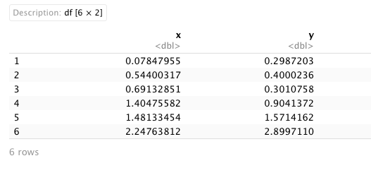
As shown, our data consists of two numerical columns. We will also need to create a linear regression model using the lm() function. This function allows us to fit a linear model to our data frame:
lm_log <- lm(x~log(y),
             data)
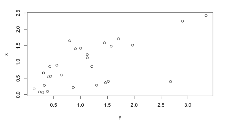
Now, we can draw our data:
plot(x~y,
     data)
Example 1: Fit Logarithmic Curve in Graph Using curve() Function
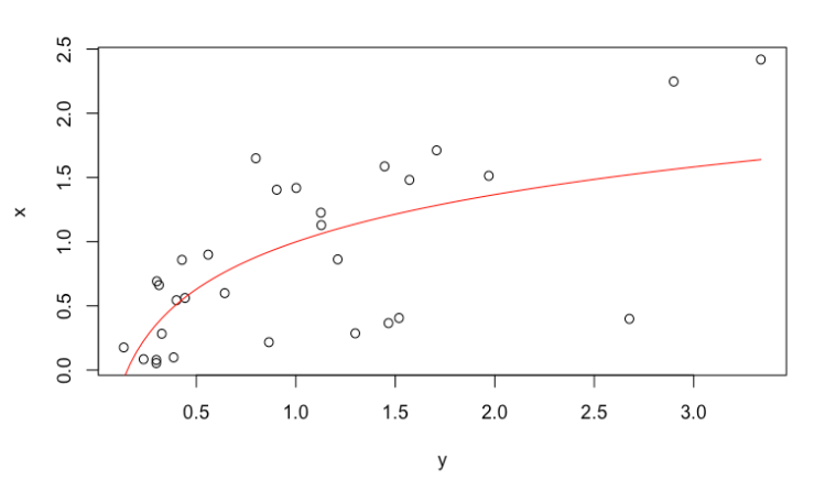
The curve() function right after our plot can help us to fit a logarithmic curve in a graphic. Let’s see how it works:
plot(x~y,
     data)
curve(coef(lm_log)[1] +
        coef(lm_log)[2]*log(x),
      add=TRUE,
      col = "red")
Example 2: Fit Logarithmic Curve in Graph Using ggplot2
In order to draw our data, please install the ggplot2 package if you haven’t installed it before:
install.packages("ggplot2")
If you had already installed it, just load the package:
library(ggplot2)
Next, we can use the ggplot and geom_point functions to draw a ggplot scatterplot and the stat_smooth function to add a fitted logarithmic line on top of this plot:
ggplot(data,
       aes(y,x)) +
  geom_point(shape = 1) +
  stat_smooth(method = "lm",
              formula = y ~ log(x),
              col = "red")
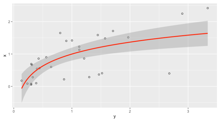
As you can see, it is possible to draw a logarithmic curve in a plot both with the curve() function and the ggplot2 package.
Video, Further Resources & Summary
Do you need more explanations on how to draw a logarithmic curve in a graph? Then you should have a look at the following YouTube video of the Statistics Globe YouTube channel.
The YouTube video will be added soon.
Furthermore, you could have a look at some of the other tutorials on Statistics Globe:
- Fit Smooth Curve to Plot of Data in R
- Create Raster Plot from Data Frame in R
- Add Line Segment & Curve to ggplot2 Plot in R
- Add Polynomial Regression Line to Plot in R
This post has shown how to add a logarithmic curve to a graphic in R. In case you have further questions, you might leave a comment below.

This page was created in collaboration with Paula Villasante Soriano. Please have a look at Paula’s author page to get more information about her academic background and the other articles she has written for Statistics Globe.

I’m Joachim Schork. On this website, I provide statistics tutorials as well as code in Python and R programming.
Statistics Globe Newsletter
Get regular updates on the latest tutorials, offers & news at Statistics Globe. I hate spam & you may opt out anytime: Privacy Policy.