Report Missing Values in Data Frame in R (2 Examples)
In this R tutorial you’ll learn how to illustrate missing data in a data table in an elegant way.
Table of contents:
Here’s the step-by-step process!
Creating Example Data
First, we need to construct some data that we can use in the following examples:
set.seed(873264)                     # Create example data
data <- round(data.frame(x1 = rnorm(100),
                         x2 = runif(100),
                         x3 = rpois(100, 1)), 2)
data$x1[rbinom(100, 1, 0.2) == 1] <- NA
data$x2[rbinom(100, 1, 0.4) == 1] <- NA
data$x3[rbinom(100, 1, 0.6) == 1] <- NA
head(data)                           # First rows of example data
#      x1   x2 x3
# 1 -0.35   NA NA
# 2    NA 0.98 NA
# 3  1.69 0.87  2
# 4 -0.99 0.00 NA
# 5    NA   NA NA
# 6    NA 0.03 NA
The previous output of the RStudio console shows the structure of our exemplifying data: It’s a data frame containing three numeric columns. Each of the columns has a non-neglectable amount of NA values.
Example 1: Count Missing Values in Columns
When inspecting the missing data structure of a data frame, the first step should always be to count the missing values in each variable. This Example therefore illustrates how to get the number of NAs in each column. For this task, we can use the colSums and the is.na functions as shown below:
colSums(is.na(data))                 # Count missing values by column
# x1 x2 x3
# 20 44 58
The previous output of the RStudio console shows that our example data contains 20 missing values in the variable x1, 44 missing values in the variable x2, and 58 missing values in the variable x3.
Those total numbers are hard to interpret without taking the size of our data table into account. The following R code therefore computes the percentages of missing values by column:
colSums(is.na(data)) / nrow(data)    # Percentage of missing values by column
#   x1   x2   x3
# 0.20 0.44 0.58
x1 has 20% missings, x2 has 44% missings, and x3 has 58% missings. This result would definitely be alarming in practice!
Example 2: Visualize Missing Values Using VIM Package
It is also important to inspect the missing data structure. Hence, this Example explains how to show the structure of missing values in a graphic using the VIM add-on package. If we want to use the functions of the VIM package, we first have to install and load VIM:
install.packages("VIM")              # Install VIM package
library("VIM")                       # Load VIM
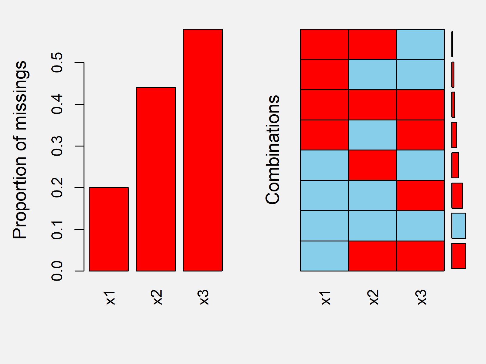
Now, we can use the aggr() function of the VIM package to create an aggregation plot of our missing data:
aggr(data) # Create aggregation plot

Figure 1 shows how the aggregation plot of our data looks like. Based on the plot you can see the amount of missing values in each column and you can see how often multiple variables are missing simultaneously.
Video & Further Resources
Do you need more info on the content of this page? Then you might want to watch the following video of my YouTube channel. In the video, I’m explaining the topics of this tutorial.
The YouTube video will be added soon.
Furthermore, you could have a look at the related tutorials of my website. Note that this page showed only a small part of the possible analysis methods for missing values. Make sure to analyze your missing data as good as possible and treat the missing values properly via imputation methods or other missing data approaches.
- R is.na Function
- colSums, rowSums, colMeans & rowMeans in R
- Count NA Values in R
- The R Programming Language
To summarize: In this R tutorial you learned how to visualize and count missing values. If you have further questions, please let me know in the comments section below.


6 Comments. Leave new
I like your style. It’s easy, short, and informative.
I have a question about the aggregation plot. I can’t understand the right graph of the aggregation plot. Can you please explain it?
Hi Saima,
Thanks again for the very kind feedback! Do you still need help with your syntax?
Regards,
Joachim
I am waiting for your response.
Hey Saima,
Based on your comment I have noticed that I have embedded the wrong image to this tutorial. So first of all, thanks for making me aware of this.
Regarding your question, the right side of the graph shows how often which combination of missing values occurrs. For example, there are more rows in our data set where the variables x2 and x3 both contain a missing value compared to the rows where both the variables x1 and x3 contain a missing value.
I hope that clarifies this image for you!
Regards,
Joachim
Thank you so much. I appreciate your help.
Thank you very much Saima, glad it was helpful!
Regards,
Joachim