Module 16 – Data Visualization Using dplyr & ggplot2
Module 16 introduces the powerful combination of dplyr and ggplot2 for data visualization in R, which is essential for conveying data-driven stories visually. This module shows how to prepare and visualize data in R, illustrating the process of transforming and summarizing data sets for insightful graphical representations. Practical exercises provide practical experience in crafting various plots like line plots, area graphs, density plots, and boxplots.
Video Lecture
Exercises
In the exercises of this module, we will work with a data set provided by the National Centers for Environmental Information (see data attribution below) containing climate data for Los Angeles and New York.
Below, I have performed some data manipulation steps preliminary to the data visualization exercises. In case you would like to follow these steps by yourself (it would be a nice chance to practice those concepts once again), you can download the raw data files on the official website or here:
In case you want to jump directly into the data visualization exercises, you may download the final data set here.
So, here are the data manipulation steps that I have performed to prepare our data for the exercises:
# install.packages("tidyverse")                   # Install tidyverse packages
library("tidyverse")                              # Load tidyverse packages

my_path <- "D:/Dropbox/Jock/Data Sets/dplyr Course/"  # Specify directory path

tib_la <- read_csv(str_c(my_path,                 # Import Los Angeles CSV file
                         "72287493134.csv"))
tib_la                                            # Print tibble

tib_ny <- read_csv(str_c(my_path,                 # Import New York CSV file
                         "72504094702.csv"))
tib_ny                                            # Print tibble

tib_la_gr <- tib_la %>%                           # Create new LA tibble
  select(DATE, HourlyDryBulbTemperature) %>%      # Extract relevant columns
  rename(date = DATE,                             # Rename columns
         temp = HourlyDryBulbTemperature) %>%
  mutate(date = date(date)) %>%                   # Keep only dates
  na.omit() %>%                                   # Remove NA rows
  group_by(date) %>%                              # Group data
  summarize(temp_mean = mean(temp))               # Summarize data
tib_la_gr                                         # Print new LA tibble

tib_ny_gr <- tib_ny %>%                           # Create new LA tibble
  select(DATE, HourlyDryBulbTemperature) %>%      # Extract relevant columns
  rename(date = DATE,                             # Rename columns
         temp = HourlyDryBulbTemperature) %>%
  mutate(date = date(date)) %>%                   # Keep only dates
  na.omit() %>%                                   # Remove NA rows
  group_by(date) %>%                              # Group data
  summarize(temp_mean = mean(temp))               # Summarize data
tib_ny_gr                                         # Print new LA tibble

tib_all <- inner_join(tib_la_gr,                  # Join LA & NY data
                         tib_ny_gr,
                         by = "date") %>%
  rename(la = temp_mean.x,                        # Rename variables in joined data
         ny = temp_mean.y) %>%
  pivot_longer(c(la, ny)) %>%                     # Convert to long format
  rename(loc = name,                              # Rename variables in long data
         temp = value)
tib_all                                           # Print final tibble

tib_all %>%                                       # Export CSV file
  write_csv(str_c(my_path, "temp-data-LA-NY.csv"))
That’s it for the data preparation part. Let’s move on to the data visualization exercises:
- Import the provided temperature data set
temp-data-LA-NY.csvinto R and store it in a tibble namedtemp_data. - Create a line plot showing temperatures over time for both LA and NY, using different colors for each location.
- Group
temp_databy month, and draw a line plot showing average monthly temperatures for each location. - Generate boxplots to visualize the distribution of temperatures for LA and NY. What do you notice by comparing the temperature variances of those locations?
- Create density plots for temperatures in LA and NY and compare the distributions.
- Compute and compare the average yearly temperatures for LA and NY using a bar chart.
- Draw a scatterplot with LA temperatures on the x-axis and NY temperatures on the y-axis. Do you see a correlation? Hint: You may use
geom_point()to draw a scatterplot. - Customize the scatterplot by using the size and color arguments within the
geom_point()function.
The solutions to these exercises can be found at the bottom of this page.
Data & R Code of This Lecture
You may download the data set used in this lecture here.
# install.packages("tidyverse")                   # Install tidyverse packages
library("tidyverse")                              # Load tidyverse packages

my_path <- "D:/Dropbox/Jock/Data Sets/dplyr Course/"  # Specify directory path

tib_yt <- read_csv(str_c(my_path,                 # Import CSV file
                         "YouTube-Geography-Data.csv"))
tib_yt                                            # Print tibble

tib_yt %>%                                        # Inspect structure of tibble
  glimpse()

tib_yt %>%                                        # Inspect Geography variable
  pull(Geography) %>%
  unique()

tib_yt %>%                                        # Line plot of entire data
  ggplot(aes(x = Date,                            # Date on x-axis
             y = Views,                           # Views on y-axis
             col = Geography)) +                  # Group colors by Geography
  geom_line()                                     # Specify to draw lines

tib_yt %>%                                        # Draw top 5 countries
  add_count(Geography,                            # Get total views by geography
            wt = Views,
            name = "Views_total") %>%
  mutate(rank = dense_rank(desc(Views_total))) %>% # Get rank by geography
  mutate(Geography = if_else(rank <= 5,           # Replace Geography not in top 5
                             Geography,
                             "Other")) %>%
  group_by(Date, Geography) %>%                   # Group by Date & Geography
  summarize(Views = sum(Views),                   # Sum of Other Views
            .groups = "drop") %>%                 # Ungroup data
  ggplot(aes(x = Date,                            # Date on x-axis
             y = Views,                           # Views on y-axis
             col = Geography)) +                  # Group colors by Geography
  geom_line()                                     # Specify to draw lines

tib_yt_top5 <- tib_yt %>%                         # Draw top 5 countries
  add_count(Geography,                            # Get total views by geography
            wt = Views,
            name = "Views_total") %>%
  mutate(rank = dense_rank(desc(Views_total))) %>% # Get rank by geography
  mutate(Geography = if_else(rank <= 5,           # Replace Geography not in top 5
                             Geography,
                             "Other")) %>%
  group_by(Date, Geography) %>%                   # Group by Date & Geography
  summarize(Views = sum(Views),                   # Sum of Other Views
            .groups = "drop")                     # Ungroup data
tib_yt_top5                                       # Print top 5 tibble

ggp_top5 <- tib_yt_top5 %>%                       # Create ggplot2 graphic
  ggplot(aes(x = Date,                            # Date on x-axis
             y = Views,                           # Views on y-axis
             col = Geography)) +                  # Group colors by Geography
  geom_line()                                     # Specify to draw lines
ggp_top5                                          # Draw graphic

tib_yt_top5_month <- tib_yt_top5 %>%              # Summarize data by month
  mutate(Date = floor_date(Date, "month")) %>%    # Create month variable
  group_by(Geography, Date) %>%                   # Group by Geography & Date
  summarize(Views = sum(Views),                   # Get sum of monthly views
            .groups = 'drop')                     # Ungroup data
tib_yt_top5_month                                 # Print updated tibble

tib_yt_top5_month %>%                             # Draw monthly graphic
  ggplot(aes(x = Date,                            # Date on x-axis
             y = Views,                           # Views on y-axis
             col = Geography)) +                  # Group colors by Geography
  geom_line()                                     # Specify to draw lines

tib_yt_top5_month %>%                             # Draw area graphic
  ggplot(aes(x = Date,                            # Date on x-axis
             y = Views,                           # Views on y-axis
             fill = Geography)) +                 # Fill by Geographies
  geom_area(position = "stack")                   # Apply geom_area()

tib_yt_top5_month %>%                             # Draw ordered area graphic
  mutate(Geography = fct_reorder(Geography,       # Specify ordering
                                 Views,
                                 .fun = sum)) %>%
  ggplot(aes(x = Date,                            # Date on x-axis
             y = Views,                           # Views on y-axis
             fill = Geography)) +                 # Fill by Geographies
  geom_area(position = "stack")                   # Apply geom_area()

tib_yt_top5 %>%                                   # Draw density plot
  ggplot(aes(x = Views,                           # Views on x-axis
             fill = Geography)) +                 # Fill by Geographies
  geom_density(alpha = 0.5)                       # Apply geom_density()

tib_yt_top5 %>%                                   # Draw boxplot
  ggplot(aes(x = Geography,                       # Geography on x-axis
             y = Views,                           # Views on y-axis
             fill = Geography)) +                 # Fill by Geographies
  geom_boxplot()                                  # Apply geom_boxplot()

tib_yt_top5 %>%                                   # Draw boxplot
  mutate(Month = factor(format(Date, "%m"))) %>%  # Extract month from Date
  ggplot(aes(x = Month,                           # Month on x-axis
             y = Views,                           # Views on y-axis
             fill = Geography)) +                 # Fill by Geographies
  geom_boxplot()                                  # Apply geom_boxplot()
Exercise Solutions
Below, you can find our solutions for the exercises of this module. Before beginning the exercises, we will install and load the tidyverse packages.
# install.packages("tidyverse")                                           # Install tidyverse packages
library("tidyverse")                                                      # Load tidyverse packages
With the packages loaded, we can now proceed to the solutions of the exercises.
Exercise 1: Import the provided temperature data set temp-data-LA-NY.csv into R and store it in a tibble named temp_data.
my_path <- "your directory path"                                          # Specify directory path

temp_data <- read_csv(str_c(my_path,                                      # Import temp-data-LA-NY file
                            "temp-data-LA-NY.csv"))
temp_data                                                                 # Print tibble
In the solution above, we used the read_csv() function, which reads CSV files, along with the str_c() function, which concatenates the strings my_path and temp-data-LA-NY.csv, to import the temp-data-LA-NY CSV file.
Exercise 2: Create a line plot showing temperatures over time for both LA and NY, using different colors for each location.
temp_data %>%                                                             # Draw temp by time and location
  ggplot(aes(x = date, y = temp, col = loc)) +
  geom_line()
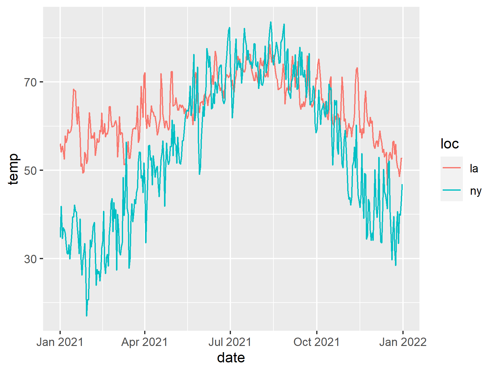
As seen, we used the ggplot() function to define the aesthetics of the graph, such as the x-axis and y-axis variables, and the coloring variable. Later, we specified the graph type via geom_line().
Exercise 3: Group temp_data by month, and draw a line plot showing average monthly temperatures for each location.
temp_data %>%                                                             # Draw monthly average temperatures by time and location
  mutate(monthly_date = floor_date(date, "month")) %>%
  group_by(loc, monthly_date) %>%
  summarize(avg_monthly_temp = mean(temp)) %>%
  ggplot(aes(x = monthly_date, y = avg_monthly_temp, col = loc)) +
  geom_line()
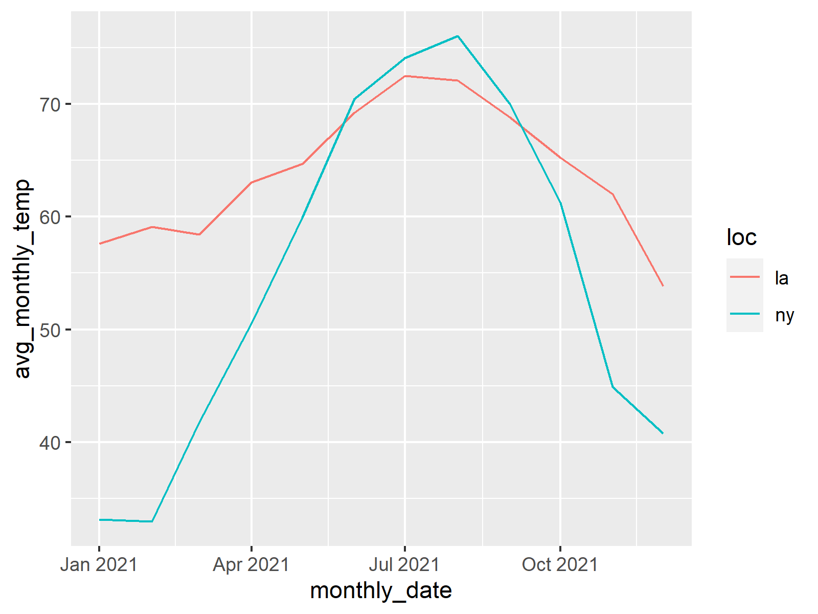
Here we used the mutate function first to convert the dates to monthly dates, then we grouped the data by the newly created monthly_date variable and the location variable loc. The summary statistic, mean temperature, is calculated based on this grouped data. Later we defined the graph aesthetics via ggplot() and specified the graph type, line graph, through geom_line().
Exercise 4: Generate boxplots to visualize the distribution of temperatures for LA and NY. What do you notice by comparing the temperature variances of those locations?
temp_data %>%                                                             # Draw temperature variances by location
  ggplot(aes(x = loc, y = temp, fill = loc)) +
  geom_boxplot()
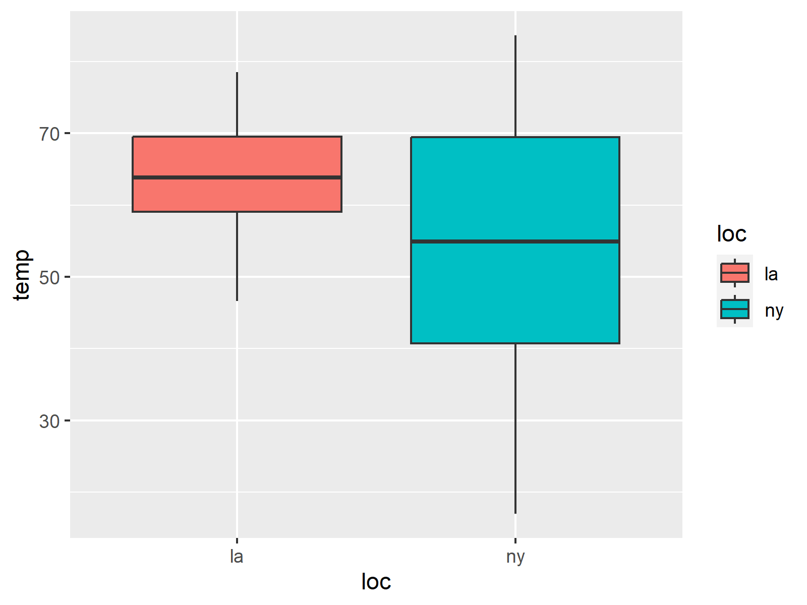
In the solution above, we used the fill argument in the graph aesthetics to specify that the boxes will be colored/filled by the location. The geom_boxplot() function is used to indicate the type of plot, which is the boxplot showing the variability of data.
Exercise 5: Create density plots for temperatures in LA and NY and compare the distributions.
temp_data %>%                                                            # Draw temperature density distributions by location
  ggplot(aes(x = temp, fill = loc)) +
  geom_density(alpha = 0.5)
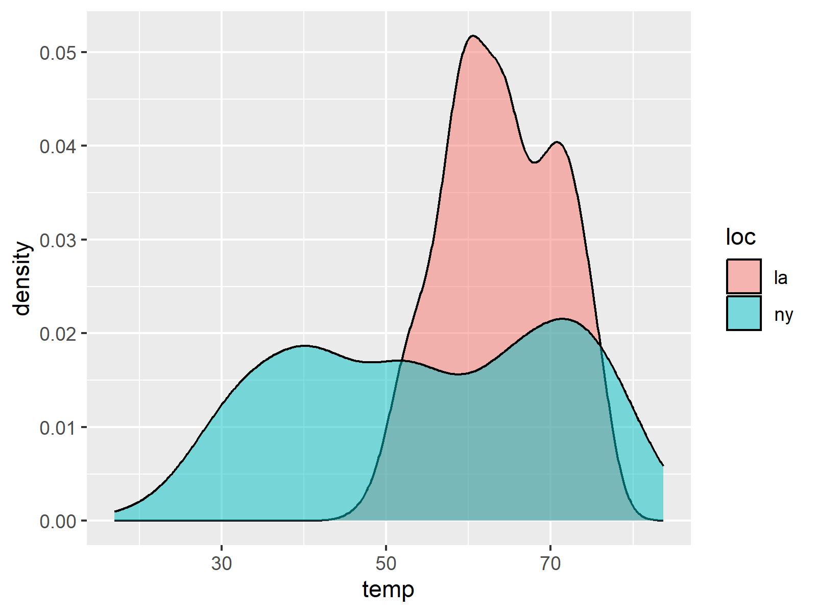
Here, we employed the geom_density() function to plot density distributions of temperature. To separate the distributions by location, we used the fill argument, which indicates that separate filling colors will be applied for each location.
Exercise 6: Compute and compare the average yearly temperatures for LA and NY using a bar chart.
temp_data %>%                                                            # Draw yearly average temperature by location
  mutate(year = format(date, "%Y")) %>%
  group_by(loc, year) %>%
  summarize(avg_yearly_temp = mean(temp)) %>%
  ggplot(aes(x = year, y = avg_yearly_temp, fill = loc)) +
  geom_bar(stat = "identity", position = "dodge")
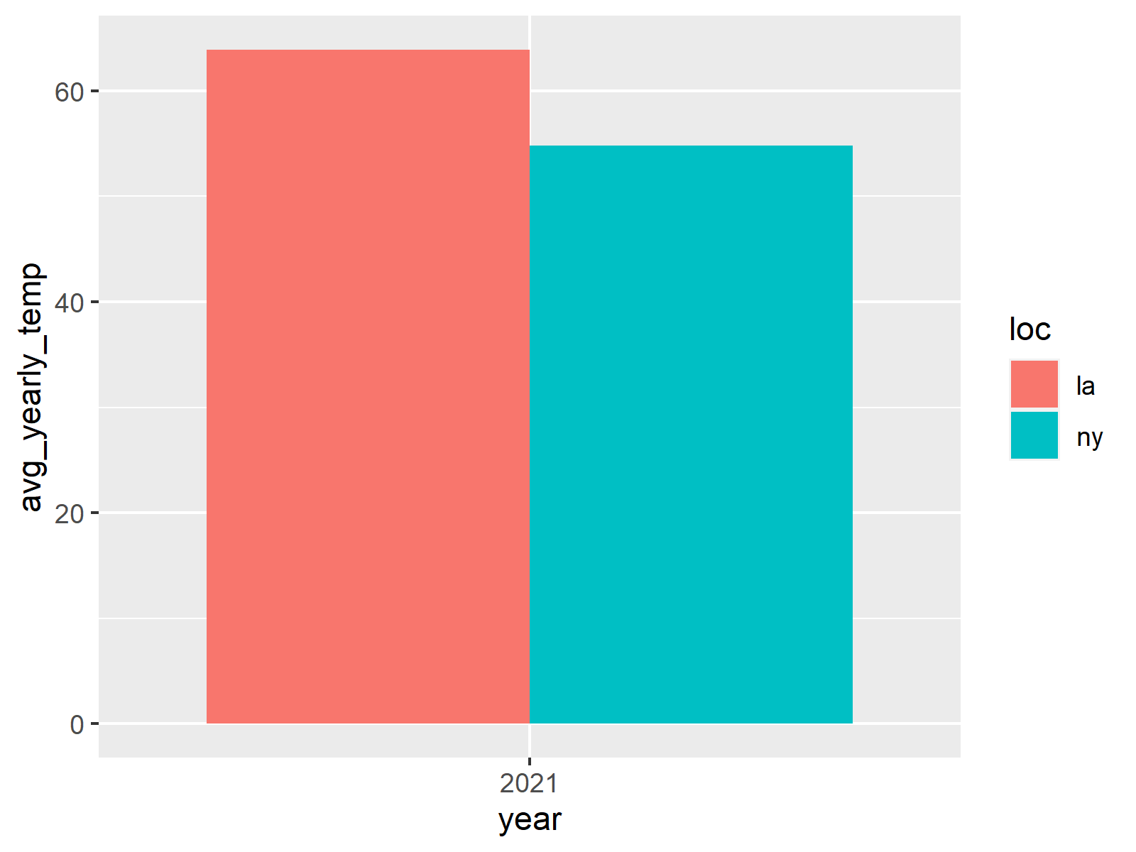
In this exercise, we calculated the yearly temperature values before plotting the graph. The application is quite similar to what was done in Exercise 3. Differently, here, we used the format() function to extract the year information. floor_date(date, "year") could also have been used like in Exercise 3, yet in that case the new column would be in the date format (you can run both alternatives and see the difference). As the question asks for a bar plot, geom_bar() was applied with the identity argument, which declared that the calculated statistics, which is the yearly mean temperature, would be shown directly without any frequency calculation. The position argument was set to dodge to place the bars next to each other.
Exercise 7: Draw a scatterplot with LA temperatures on the x-axis and NY temperatures on the y-axis. Do you see a correlation? Hint: You may use geom_point() to draw a scatterplot.
temp_data %>%                                                            # Draw scatter plot of location temperatures
  pivot_wider(names_from = loc, values_from = temp)%>%
  ggplot(aes(x = la, y = ny)) +
  geom_point()
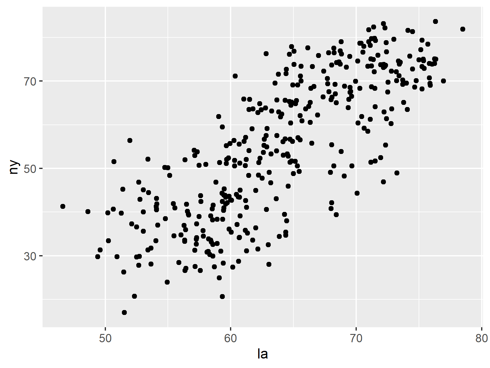
In this solution, we needed to change the format of the data set to a wide format to separate the location-based measurements into multiple columns. By doing this, we were able to define x aesthetic as the temperature measurements in Los Angeles and y aesthetic as the temperature measurements in New York. This enabled us to plot the scatter plot (using geom_point()), which shows the association between the two locations. Based on the output, there is a certain linear relationship between.
Exercise 8: Customize the scatterplot by using the size and color arguments within the geom_point() function.
temp_data %>%
  pivot_wider(names_from = loc, values_from = temp)%>%                   # Draw customized scatter plot of location temperatures
  ggplot(aes(x = la, y = ny)) +
  geom_point(size = 2, col = "red")
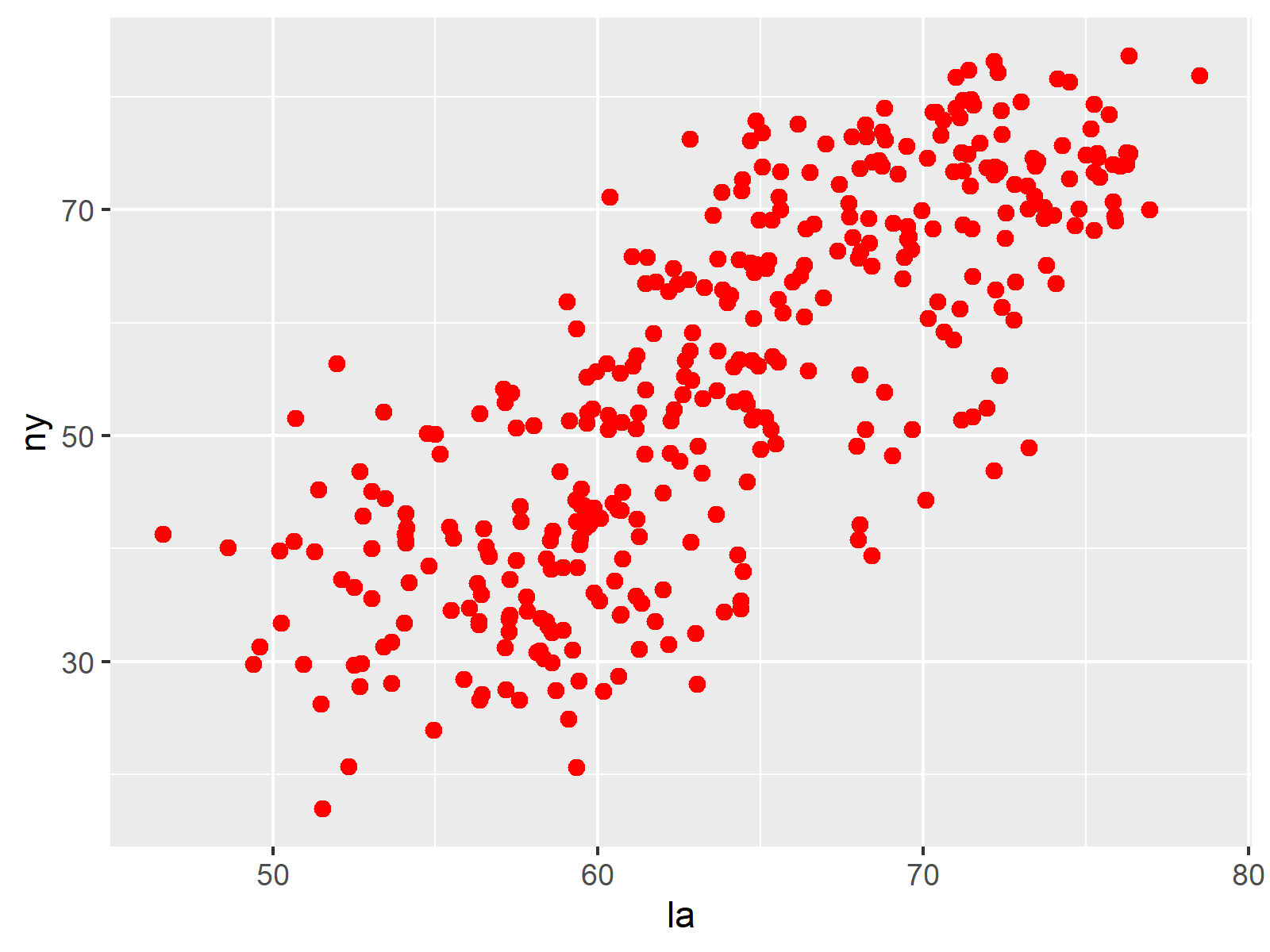
Here, all we needed to do was add the size and color arguments in geom_point() to customize the representation. By playing with these parameters, different outputs can be obtained.
Solutions to these exercises were created in collaboration with Cansu Kebabci. Thanks to her for her contribution!
Data Attribution
The data sets utilized in Modules 16-18 originate from the National Centers for Environmental Information. These data sets include climate data for Los Angeles and New York. We acknowledge and express our gratitude to the National Centers for Environmental Information for their valuable data, which plays a crucial role in our educational content. For further information and access to additional data, please visit the National Centers for Environmental Information website.
Further Resources
- Statistics Globe Article – Introduction to ggplot2 Package in R
- Statistics Globe Article – Plot Mean & Standard Deviation by Group in R
- Statistics Globe Article – Analyze & Visualize Country Data in R Using dplyr & ggplot2
- Wickham H. & Grolemund G. (2017) – Data visualisation / R for Data Science
.
You can access the course overview page, timetable, and table of contents by clicking here.


