Scale ggplot2 Color Gradient to Range Outside of Data in R (Example)
This tutorial illustrates how to set the color gradient range of a ggplot2 plot manually in R programming.
The article consists of this content:
Let’s start right away:
Example Data, Software Packages & Basic Graphic
Let’s first create some example data.
set.seed(59646)                 # Create example data frame
data <- data.frame(x = seq(- 2, 2, 1),
                   y = rep(seq(- 2, 2, 1), each = 5),
                   z = round(rnorm(25, 50, 70)))
head(data)                      # Head of example data frame

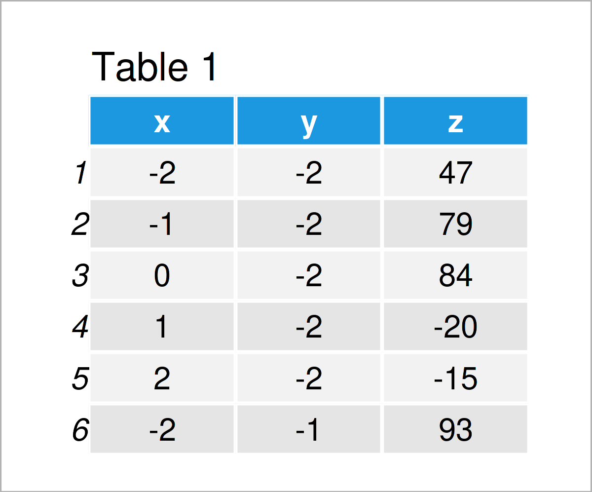
Table 1 shows that the example data has three columns.
To be able to use the functions of the ggplot2 package, we also have to install and load ggplot2:
install.packages("ggplot2")     # Install ggplot2 package
library("ggplot2")              # Load ggplot2
As a next step, we can create a graphic of the data:
ggp <- ggplot(data,             # Create raster with default colors
              aes(x, y, fill = z)) +
  geom_tile()
ggp                             # Draw raster

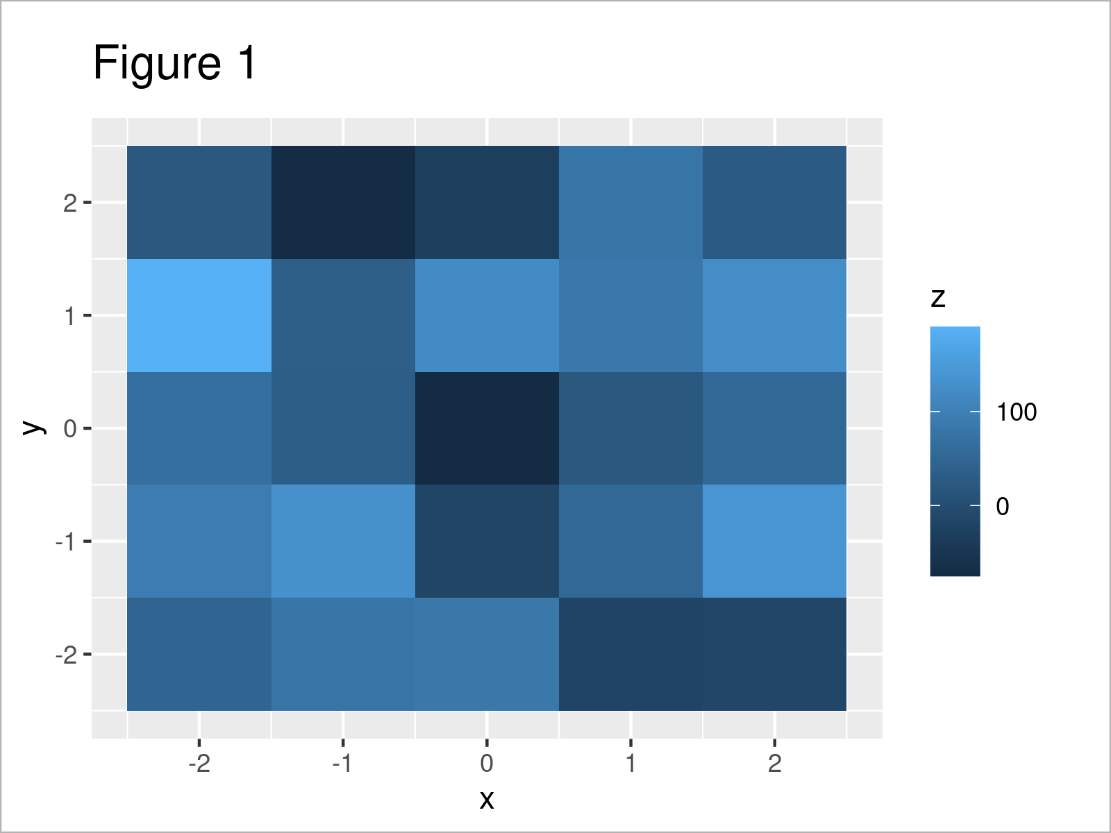
Figure 1 shows the output of the previous syntax – A plot showing our data raster that was created using the geom_tile function.
In the legend of our plot, you can see that the color range is based on the actual values in the variable z.
Let’s adjust these colors and the corresponding range!
Example: Specify Colors, Limits & Breaks Using scale_fill_gradientn() Function
The following R code illustrates how to modify the colors, limits, and breaks of a color range.
For this task, we can apply the scale_fill_gradientn function as shown below:
ggp +                           # Manually set color ranges
  scale_fill_gradientn(colors = c("#1b98e0", "#f6f805", "#353436"),
                       limits = c(- 200, 200),
                       breaks = c(- 200, - 100, 0, 100, 200))

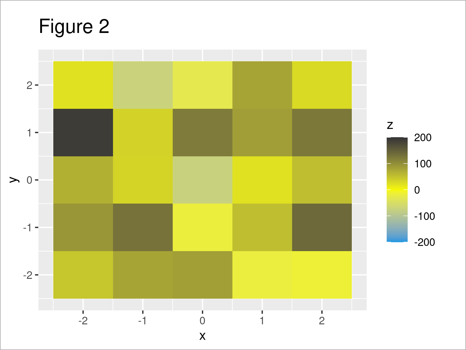
In Figure 2 it is shown that we have created a new version of our ggplot2 by running the previous syntax.
As you can see, we have changed the colors and the limits of the color range to – 200 and 200 (note that those limits are outside the actually observed value ranges in our example data). Furthermore, we have changed the breaks that are displayed in the legend.
Video & Further Resources
In case you need more explanations on the topics of this tutorial, you might watch the following video on my YouTube channel. I’m explaining the topics of this article in the video:
Furthermore, you may want to have a look at the other articles on my website. I have published several tutorials already.
- Scale Data to Range Between Two Values
- Change Continuous Color Range in ggplot2 Plot
- R Graphics Gallery
- Introduction to R Programming
To summarize: At this point of the article you should have learned how to specify the color gradient range of a ggplot2 plot manually in the R programming language. Please let me know in the comments section, in case you have additional questions.


