Draw Plot from pandas DataFrame Using matplotlib in Python (13 Examples)
In this tutorial, I’ll show how to create a plot based on the columns of a pandas DataFrame in Python programming.
The tutorial will consist of these topics:
If you want to know more about these contents, keep reading.
Exemplifying Data & Add-On Libraries
In order to use the functions of the pandas library, we first have to import pandas:
import pandas as pd # Load pandas
We use the following pandas DataFrame as a basement for this Python programming tutorial:
data = pd.DataFrame({'x1':range(1, 9),    # Create pandas DataFrame
                     'x2':[3, 2, 7, 2, 5, 3, 9, 8],
                     'x3':[3, 5, 5, 2, 6, 9, 2, 6],
                     'x4':range(15, 7, - 1)})
print(data)                               # Print pandas DataFrame
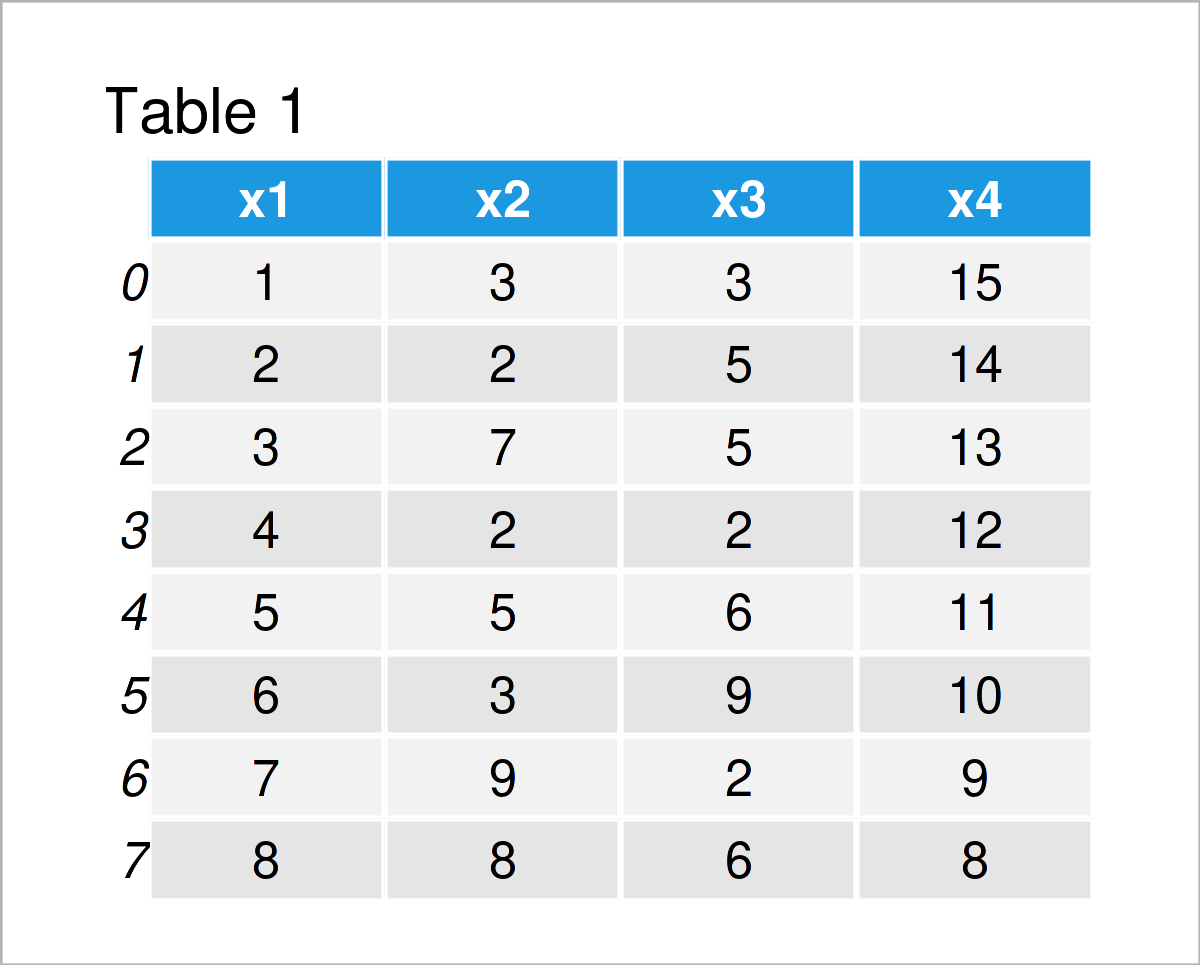
Have a look at the table that got returned by the previously executed code. It shows that our example DataFrame contains eight rows and four variables. All of these variables contain integer values.
The following examples show different ways on how to visualize the columns of this pandas DataFrame.
Let’s do this!
Example 1: Scatterplot of Two Columns
In this example, I’ll demonstrate how to draw a scatterplot (or xy-plot) of two columns in a pandas DataFrame.
To accomplish this, we have to specify three arguments within the plot() function:
- The kind argument specifies the type of plot (i.e. a scatterplot)
- The x argument specifies the column that should be drawn on the x-axis (i.e. x1)
- The y argument specifies the column that should be drawn on the y-axis (i.e. x2)
Consider the Python code below:
data.plot(kind = 'scatter', x = 'x1', y = 'x2')
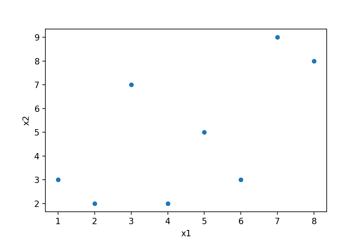
As you can see in Figure 1, we have created a scatterplot showing the relation between the columns x1 and x2 in our pandas DataFrame.
Let’s draw some other kinds of graphics!
Example 2: Line Plot of Two Columns
In Example 1, you have learned the basic functionality of the plot function. We can now change the arguments within the plot function to modify our graphical output.
This section explains how to draw a line plot of two variables in our data set.
All we have to change compared to Example 1 is the kind argument, i.e. from ‘scatter’ to ‘line’.
data.plot(kind = 'line', x = 'x1', y = 'x2')
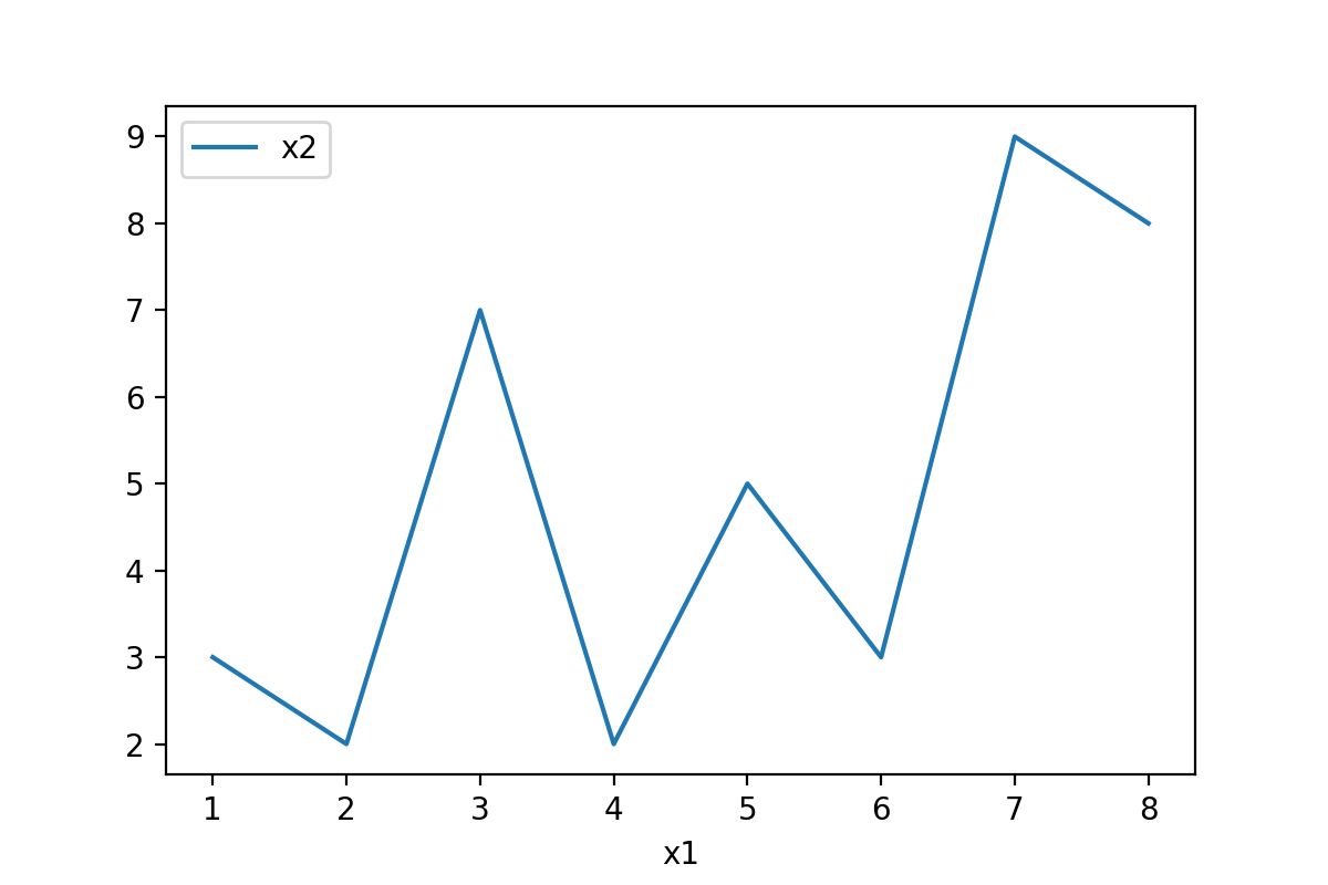
The previous Python syntax has created a line graph of our two variables x1 and x2.
Example 3: Line Plot of All Columns
So far, we have drawn only two columns in our graphs. In Example 3, I’ll show how to visualize all columns of a pandas DataFrame as lines in a multi-line plot.
The syntax for this is even simpler as in the previous examples. This time, we have to avoid specifying the x and y arguments:
data.plot(kind = 'line')
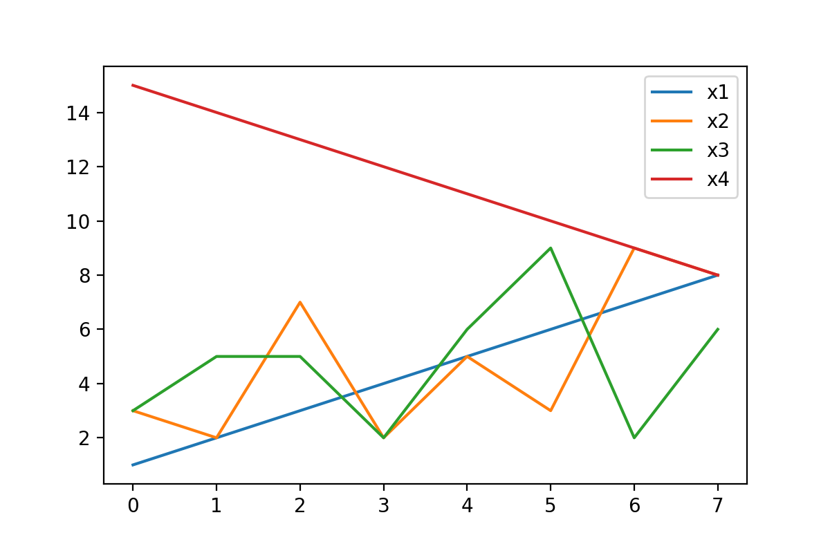
Figure 3 shows all variables of our data set as separate lines.
Example 4: Barplot of One Column
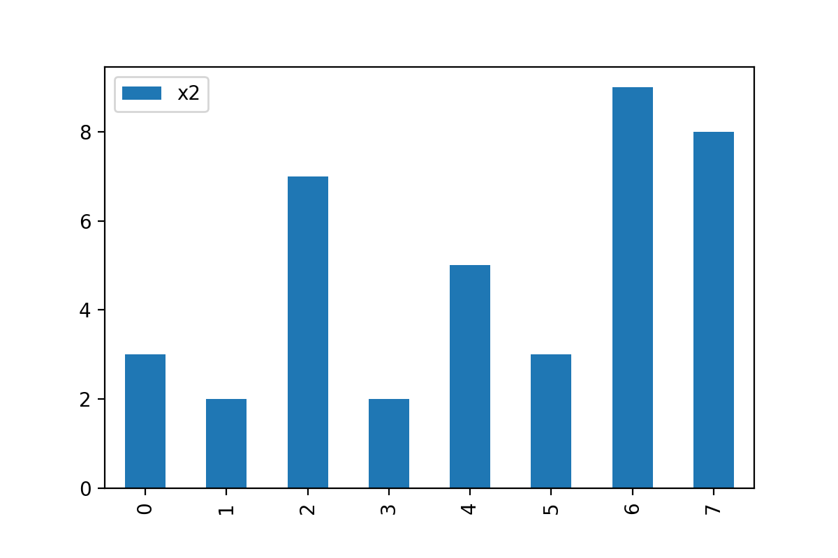
Another popular type of plot is the barplot (or bargraph; barchart). In Example 4, I’ll demonstrate how to draw one single variable of a pandas DataFrame as a barplot.
For this task, we have to specify the kind argument to be equal to ‘bar’ and the y argument to be equal to the column name of the variable that we want to draw:
data.plot(kind = 'bar', y = 'x2')
Example 5: Barplot of All Columns
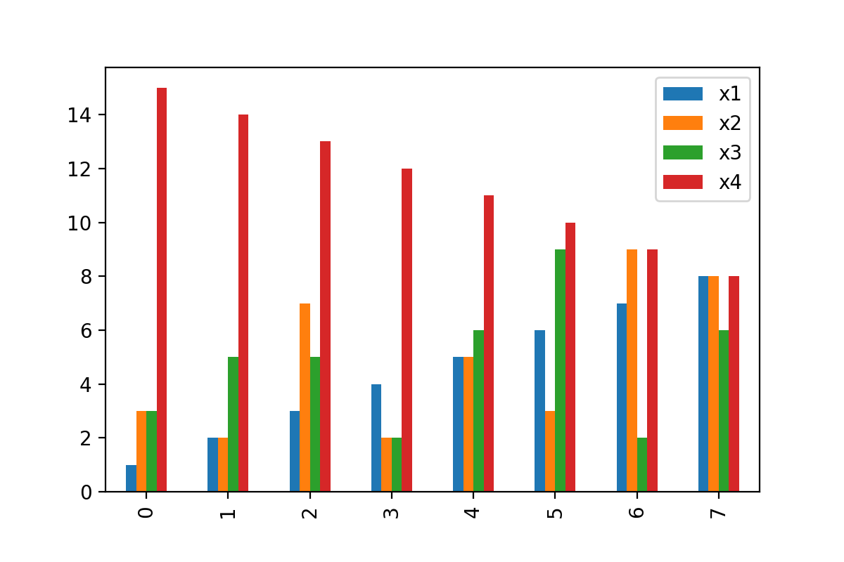
Similar to the syntax of Example 3, we can also draw multiple grouped bars based on all the columns in a pandas DataFrame.
Once again, we simply have to avoid the x and y arguments within the plot function:
data.plot(kind = 'bar')
Example 6: Boxplot of All Columns
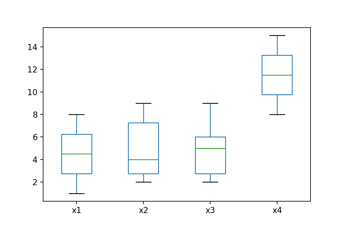
This example demonstrates how to create a graphic containing a boxplot (or box-and-whisker plot) for each column of our data set.
For this, we have to set the kind argument to be equal to ‘box’.
data.plot(kind = 'box')
Example 7: Density Plot of One Column
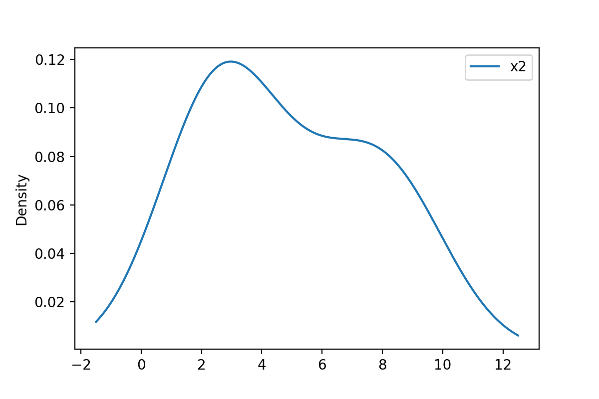
One of the most popular kinds of plots are kernel density plots. We can draw one variable in such a graph using the following Python code:
data.plot(kind = 'density', y = 'x2')
Example 8: Density Plot of All Columns
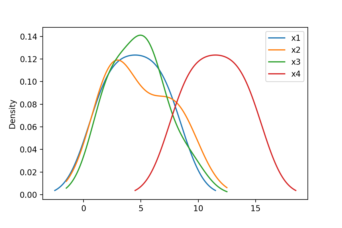
In this section, I’ll illustrate how to visualize multiple overlaid densities in the same graph.
For this, we have to get rid of the y argument that we have used in the previous example:
data.plot(kind = 'density')
Example 9: Histogram of One Column
In this example, I’ll illustrate how to draw a histogram of one variable in a pandas DataFrame:
data.plot(kind = 'hist', y = 'x2')
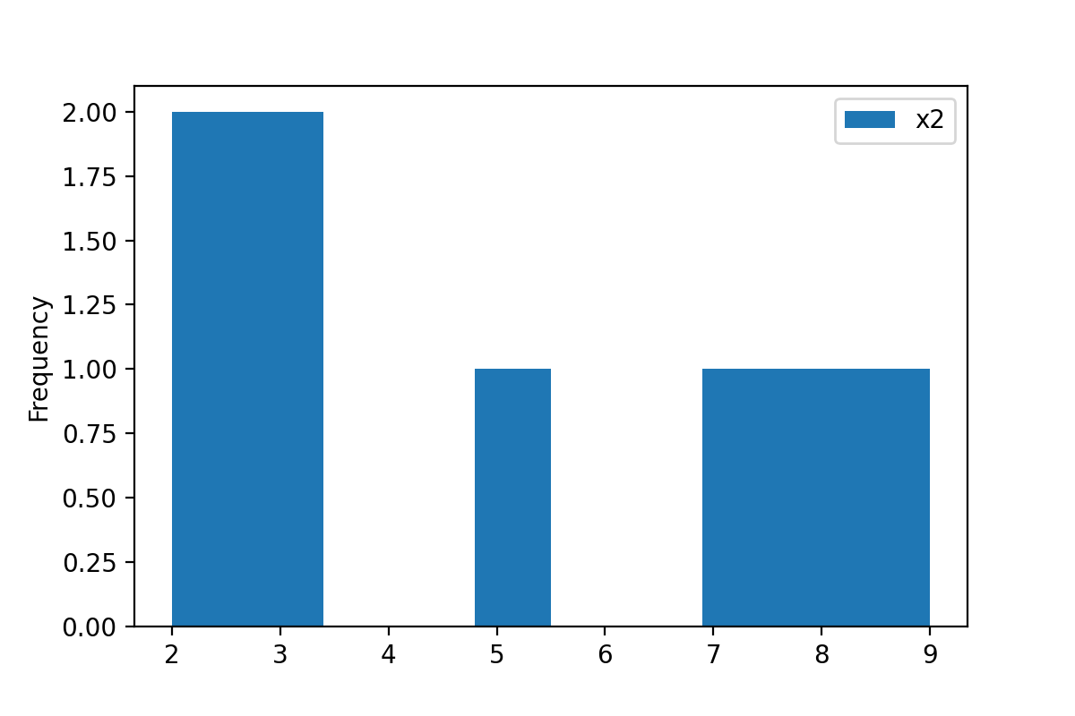
The previous image might look a little weird, since we have only so few rows in our pandas DataFrame. Histograms are usually used for larger data sets.
Example 10: Change Colors of Plot
In the previous examples, I have explained how to draw different kinds of plots from a pandas DataFrame.
However, it is also possible to modify certain elements of such matplotlib and pandas graphics, and in the remaining examples I’ll show you some of these modifications based on our example DataFrame.
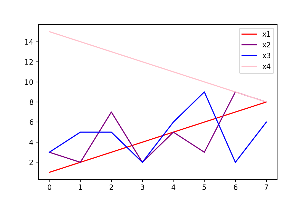
In this specific example, I’ll show how to modify the colors of a DataFrame plot in Python. For this, we can use the color argument as shown below.
Note that we are drawing the same line plot as in Example 3. However, this time each line has a manually selected color.
data.plot(kind = 'line', color = ['red', 'purple', 'blue', 'pink'])
Example 11: Change Main Title of Plot
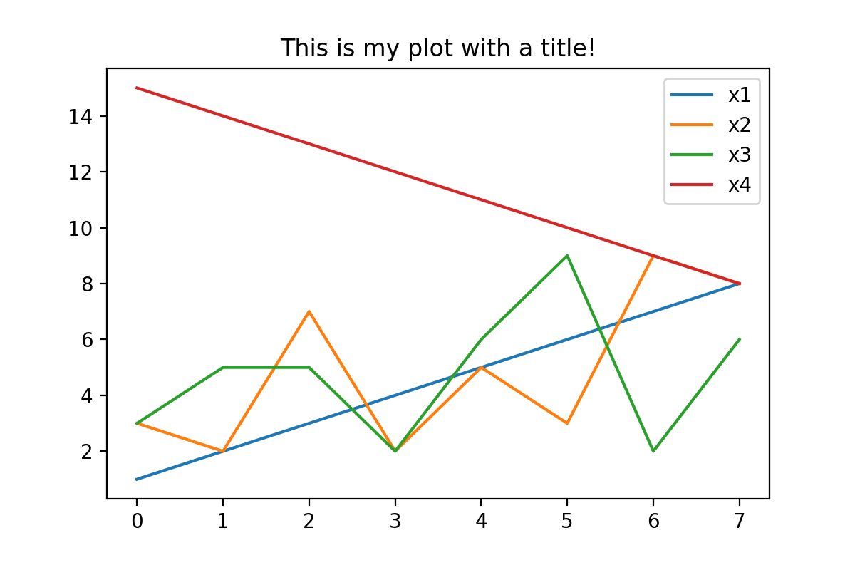
The following Python code illustrates how to change the main title of a plot.
For this, we have to use the title argument:
data.plot(kind = 'line', title = 'This is my plot with a title!')
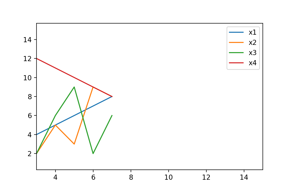
Example 12: Change Axis Limits of Plot
Another way to adjust a pandas graph is to set certain axis limits.
In this example, we’ll change the x-axis limits using the xlim argument. We have to specify a list containing a lower and an upper limit to this argument:
data.plot(kind = 'line', xlim = [3, 15])
Example 13: Change Size of Plot
In the final example of this tutorial, I’ll explain how to modify the aspect ratio of a pandas plot. This can be useful when you want to export your images in a certain size to your computer.
To accomplish this task, we can apply the figsize argument as shown below:
data.plot(kind = 'line', figsize = [10, 2])

As you can see, the previously shown plot is much wider than the other plots on this page.
Video, Further Resources & Summary
Would you like to learn more about the visualization and the plotting of the columns of a pandas DataFrame? Then I recommend watching the following video on my YouTube channel. I’m explaining the Python programming codes of this tutorial in the video instruction:
The YouTube video will be added soon.
In addition, you may want to have a look at the other articles which I have published on https://www.statisticsglobe.com/:
In summary: This article has illustrated how to draw and customize a graphic based on the columns of a pandas DataFrame in Python programming. Don’t hesitate to let me know in the comments, if you have additional questions and/or comments.
Subscribe to the Statistics Globe Newsletter
Get regular updates on the latest tutorials, offers & news at Statistics Globe.
I hate spam & you may opt out anytime: Privacy Policy.
Thank you!
Welcome to the Statistics Globe newsletter. From now on, I’ll send you regular emails about statistics, data science, AI, and programming with R and Python.
I’m Joachim Schork. On this website, I provide statistics tutorials as well as code in Python and R programming.
Statistics Globe Newsletter
Get regular updates on the latest tutorials, offers & news at Statistics Globe. I hate spam & you may opt out anytime: Privacy Policy.
Thank you!
Please check your email inbox and click the confirmation link to complete your subscription. If you don’t see the email within a few minutes, please also check your spam/junk folder.


