
Violin Plot [Course Preview]
This module introduces violin plots, a visualization that combines aspects of boxplots and density plots to display the distribution and variability of data across categories. You’ll learn how to create and customize violin plots in ggplot2 to compare distributions and reveal patterns in your data.
Video Lecture
R Code
Please find the R code of this lecture below. In this lecture, we are using the Palmer Penguins data set [see data attribution below]. You can download it by clicking here.
# install.packages("gghalves")                            # Install & load gghalves
library(gghalves)

# install.packages("ggplot2")                             # Install & load ggplot2
library(ggplot2)

# install.packages("ggstatsplot")                         # Install & load ggstatsplot
library(ggstatsplot)

my_path <- "C:/Users/Joachim Schork/Dropbox/Jock/Data Sets/ggplot2 Course/" # Path

my_penguins <- read.csv(paste0(my_path,                   # Import CSV file
                               "palmerpenguins_original.csv"))
my_penguins <- na.omit(my_penguins)                       # Remove NA values

ggplot(data = my_penguins,                                # Multiple violin plots
       aes(x = species,
           y = flipper_length_mm)) +
  geom_violin()

ggplot(data = my_penguins,                                # Add colors & legend
       aes(x = species,
           y = flipper_length_mm,
           fill = species)) +
  geom_violin()

ggplot(data = my_penguins,                                # Half for female & male
       aes(x = species,
           y = flipper_length_mm,
           fill = sex)) +
  geom_half_violin(side = "l",                            # Left side for females
                   data = my_penguins[my_penguins$sex == "female", ]) +
  geom_half_violin(side = "r",                            # Right side for males
                   data = my_penguins[my_penguins$sex == "male", ])

ggplot(data = my_penguins,                                # Add boxplots
       aes(x = species,
           y = flipper_length_mm,
           fill = species)) +
  geom_violin() +
  geom_boxplot(width = 0.3,
               fill = "white")

set.seed(44294)                                           # Seed for reproducibility

ggplot(data = my_penguins,                                # Add jittered points
       aes(x = species,
           y = flipper_length_mm,
           fill = species)) +
  geom_violin() +
  geom_boxplot(width = 0.3,
               fill = "white") +
  geom_jitter(width = 0.1,
              color = "#636363",
              alpha = 0.5)

ggplot(data = my_penguins,                                # Add mean values
       aes(x = species,
           y = flipper_length_mm,
           fill = species)) +
  geom_violin() +
  geom_boxplot(width = 0.3,
               fill = "white") +
  geom_jitter(width = 0.1,
              color = "#636363",
              alpha = 0.5) +
  stat_summary(fun = mean,
               geom = "point",
               color = "#f31f61",
               size = 5,
               shape = 18)

ggplot(data = my_penguins,                                # Customize design
       aes(x = species,
           y = flipper_length_mm,
           fill = species)) +
  geom_violin() +
  geom_boxplot(width = 0.3,
               fill = "white") +
  geom_jitter(width = 0.1,
              color = "#636363",
              alpha = 0.5) +
  stat_summary(fun = mean,
               geom = "point",
               color = "#f31f61",
               size = 5,
               shape = 18) +
  theme_minimal(base_size = 15) +                         # Apply theme
  labs(title = "Flipper Length Distribution by Penguin Species", # Change labels
       subtitle = "Violin Plot with Boxplot Overlay and Mean Points",
       x = "Penguin Species",
       y = "Flipper Length (mm)",
       fill = "Species") +
  theme(plot.title = element_text(hjust = 0.5,            # Center & bold title
                                  face = "bold",
                                  size = 18),
    plot.subtitle = element_text(hjust = 0.5,             # Center subtitle
                                 size = 14),
    axis.title.x = element_text(margin = margin(t = 10)), # Add margin to titles
    axis.title.y = element_text(margin = margin(r = 10)),
    axis.text.x = element_text(size = 12,                 # Style axis labels
                               face = "italic"),
    axis.text.y = element_text(size = 12),
    legend.position = "top",                              # Move legend to top
    legend.title = element_text(face = "bold"))           # Bold legend title

ggbetweenstats(data = my_penguins,                        # Violin plot with stats
               x = species,
               y = flipper_length_mm)
Exercises
In this module, we will work with the midwest data set, a built-in data set in the ggplot2 package. This data set contains demographic and geographic information for counties in the midwestern United States, including variables such as total population (poptotal), county (county), and state (state).
Violin plots are ideal for visualizing the distribution of numeric variables like population size across categorical groups such as states. In this module, we will explore the distribution of population sizes across different states.
To get started, install and load the dplyr and ggplot2 packages, and load the midwest data set as shown below:
# install.packages("dplyr")                               # Install & load dplyr
library(dplyr)

# install.packages("ggplot2")                             # Install & load ggplot2
library(ggplot2)

data(midwest)                                             # Load example data
Our current data set includes counties of various sizes. Let’s use a violin plot to visualize the distribution of these population sizes:
ggplot(data = midwest,                                    # Violin plots for entire data
       aes(x = state,
           y = poptotal)) +
  geom_violin()
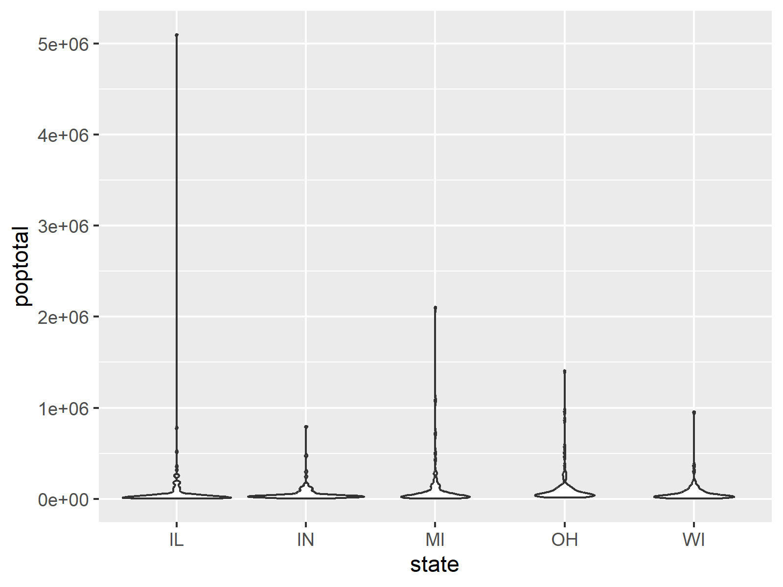
As you can see in the previous plot, the presence of a few larger counties in our data makes it challenging to analyze the main distributions. Since this analysis focuses on smaller and medium-sized counties, we will create a subset of the data to better examine these distributions:
midwest_below_200k <- midwest %>%                         # Create subset
  filter(poptotal < 200000)
Now, let’s move on to the exercises for this module:
- Create a violin plot using the
midwest_below_200kdata set to visualize the distribution of total population (poptotal) across different states. - Enhance the violin plot by adding colors to represent each state using the
fillaesthetic. - Add boxplots inside the violin plots to display summary statistics for the population distribution in each state. Use
geom_boxplot()with a reduced width of0.1and a white fill color. - Further enhance the visualization by adding jittered points to represent individual observations. Set the jitter width to
0.1, usegray30as the point color, and set the transparency toalpha = 0.5for better clarity. - Analyze the plots created in the previous exercises. Identify which state has the highest median county population size and which state has the most smaller counties based on the density of the violin plots.
Exercise Solutions
Below are the solutions to the exercises for this module.
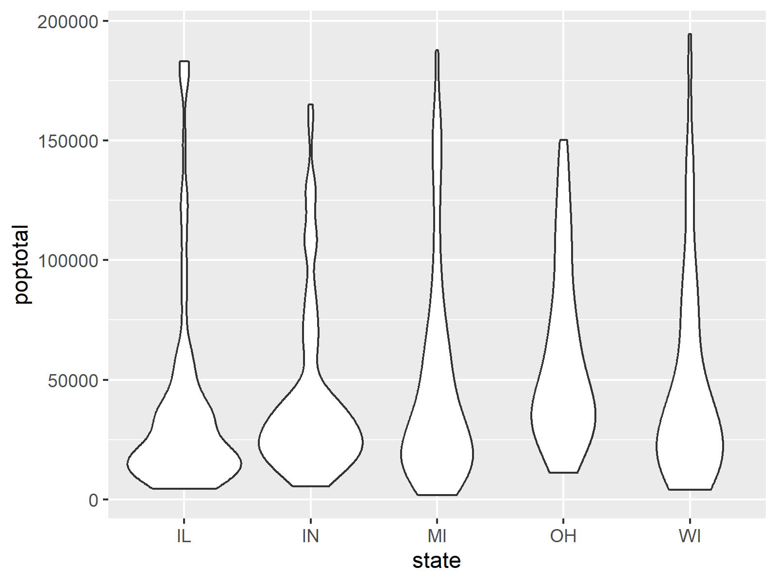
Exercise 1) Create a violin plot using the midwest_below_200k data set to visualize the distribution of total population (poptotal) across different states.
ggplot(data = midwest_below_200k,                         # Violin plots for subset
       aes(x = state,
           y = poptotal)) +
  geom_violin()
This code generates violin plots that display the population distribution of counties in each state.
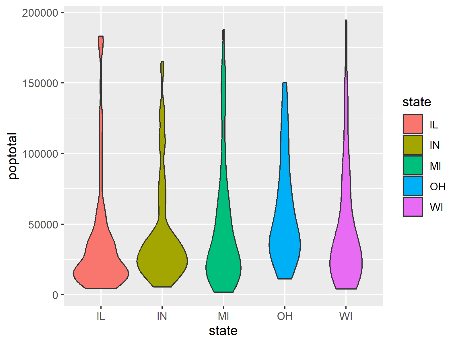
Exercise 2) Enhance the violin plot by adding colors to represent each state using the fill aesthetic.
ggplot(data = midwest_below_200k,                         # Add colors & legend
       aes(x = state,
           y = poptotal,
           fill = state)) +
  geom_violin()
This code applies a unique color to each state, making it easier to distinguish the distributions.
Exercise 3) Add boxplots inside the violin plots to display summary statistics for the population distribution in each state. Use geom_boxplot() with a reduced width of 0.1 and a white fill color.
ggplot(data = midwest_below_200k,                         # Add boxplots
       aes(x = state,
           y = poptotal,
           fill = state)) +
  geom_violin() +
  geom_boxplot(width = 0.1,
               fill = "white")
This code overlays boxplots within the violin plots, highlighting the medians and interquartile ranges for each state.

Exercise 4) Further enhance the visualization by adding jittered points to represent individual observations. Set the jitter width to 0.1, use gray as the point color, and set the transparency to alpha = 0.5 for better clarity.
set.seed(84374)                                           # Seed for reproducibility

ggplot(data = midwest_below_200k,                         # Add jittered points
       aes(x = state,
           y = poptotal,
           fill = state)) +
  geom_violin() +
  geom_boxplot(width = 0.1,
               fill = "white") +
  geom_jitter(width = 0.1,
              color = "gray30",
              alpha = 0.5)
This code adds jittered points to show the distribution of individual county populations, complementing the violin and boxplots.
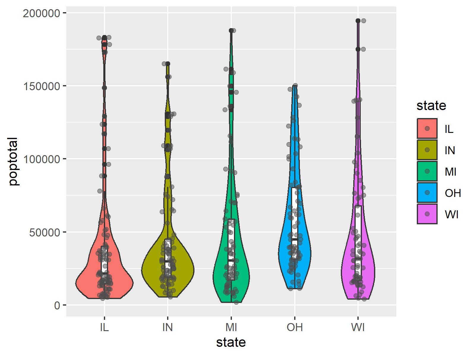
Exercise 5) Analyze the plots created in the previous exercises. Identify which state has the highest median county population size and which state has the most smaller counties based on the density of the violin plots.
Based on the plots, Ohio (OH) has the highest median county population size, as indicated by the position of the median line in the boxplot within the violins. Illinois (IL) shows the widest lower distribution in the violin plot, indicating that it has the most smaller counties.
Data Attribution
This module utilizes data obtained from kaggle.com. We acknowledge the contributors as the primary source of this data set, which significantly enhances the educational value of our course. For more detailed info and additional resources, please visit this page on the kaggle website.
Further Resources
- Violin Plot by Wikipedia
- A Complete Guide to Violin Plots by Atlassian
- Violin Plot in R by Statology
- Violin Chart by R Graph Gallery
- Violin Plot by ggplot2

.

You can access the course overview page, timetable, and table of contents by clicking here.
6 Comments. Leave new
unable to install gghalves they are saying is not available for this r version
Hey, please see my response to your other comment.
cannot install gghalves even after installing new version of RStudio and R. any help pls
Hi Forgive,
Thanks for your comment.
Could you please copy and paste the exact error message here in the comments? I’m happy to take a look and help.
Best regards,
Joachim
WARNING: Rtools is required to build R packages but is not currently installed. Please download and install the appropriate version of Rtools before proceeding:
https://cran.rstudio.com/bin/windows/Rtools/
Warning: package ‘gghalves’ is not available for this version of R
A version of this package for your version of R might be available elsewhere,
see the ideas at
https://cran.r-project.org/doc/manuals/r-patched/R-admin.html#Installing-packages
this is the message I received even after installing the new update
Hey,
Thanks for the follow-up.
It seems like gghalves has been removed from CRAN. You can find more information here: https://cran.r-project.org/web/packages/gghalves/index.html
It is still possible to install the package from the CRAN archive. The link above also explains how to do that.
Hope that helps!
Best regards,
Joachim