lowess() R Smoothing Function | 2 Example Codes for Normalization by Lowess Regression
This tutorial explains how to use the lowess function to smoothen lines and scatter plots in R. Let’s first have a look at the basic R programming syntax of the function:
Basic R Syntax:
lowess_values <- lowess(x, y)
plot(lowess_values, type = "l")
The lowess R function computes the lowess smoother. Typically, the smoothed values are used for visualization in statistical graphics. The basic syntax for lowess in R is illustrated above.
In the following R tutorial, I’ll show two reproducible examples for the application of lowess in the R programming language.
I assume that you know at this point, how the lowess regression works. If not, you may want to have a look at this tutorial first.
So without further ado, let’s start right away…
Example 1: Lowess Smoothing in R – The Basic Application
Before we can start with the example, we need to load some data into R (or RStudio). For the example, I’m going to use the beaver1 data set, a data frame consisting of time series of body temperature dynamics of beavers.
We can load the example data as follows:
data(beavers) # Load data into R
The two variables we are interested in, are the time (measured in minutes) and the body temperature of the beavers. Let’s extract this data from the data matrix:
Minutes <- seq(10, nrow(beaver1) * 10, 10)                          # Extract minutes...
Temperature <- beaver1$temp                                         # ... and temperature
Now, we can compute the lowess regression values with the R lowess function:
lowess_values <- lowess(Minutes, Temperature) # Calculate lowess regression
That’s it, the computed X and Y values of the lowess regression are stored in the new data object lowess_values.
Typically, lowess values are used for visualization. Let’s do this!
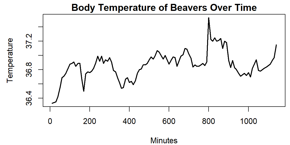
First, we create a regular line plot in R:
plot(Minutes, Temperature, type = "l",                              # Regular X-Y plot in R
     main = "Body Temperature of Beavers Over Time")

Graphic 1: Line Plot before Application of lowess().
You probably have seen such a plot many times, haven’t you?
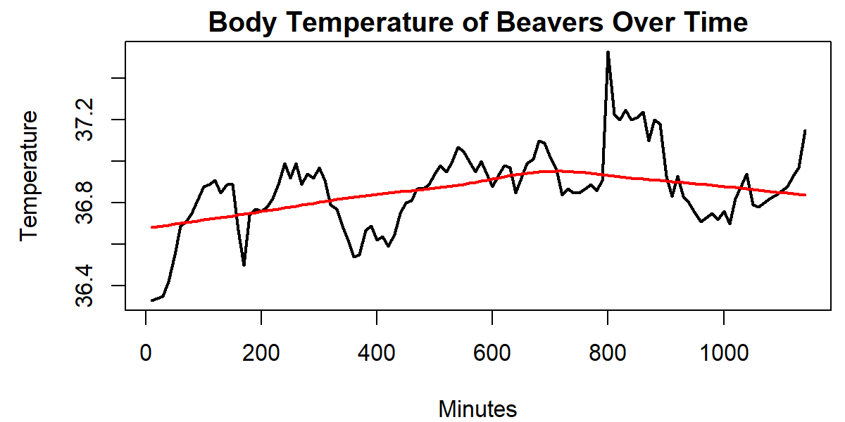
We can overlay this line plot with the lowess values as follows:
lines(lowess_values, col = "red") # Add line for lowess regression

Graphic 2: Line Plot after Application of lowess().
As you can see, the plot is overlaid by a line – the lowess regression.
Looks nice, doesn’t it? But don’t stop reading here. There’s a nice feature of the lowess R function that I want to show you in the next example…
Example 2: Lowess Regression with Differing Smoother Span
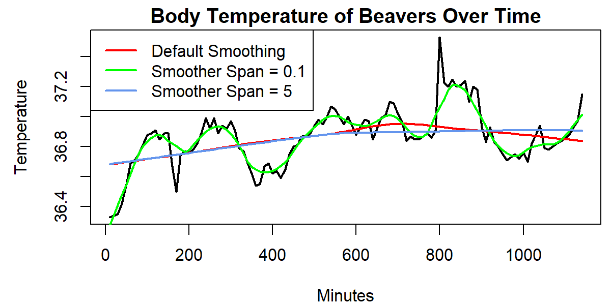
An important option of the lowess R function is the smoother span. The smoother span determines the number of data points which influence the smooth at each value. The larger the smoother span, the more extreme the smoothing.
Let’s see how that works in practice. I’m just continuing the code of example 1, so make sure to run this part of the code, before you continue here.
lines(lowess(Minutes, Temperature, f = 0.1), col = "green")     # Add lowess values with different normalization
lines(lowess(Minutes, Temperature, f = 5), col = "cornflowerblue")
Let’s also add a legend to our plot:
legend("topleft",                                               # Add legend to line plot
       col = c("red", "green", "cornflowerblue"),
       lty = 1,
       lwd = 2,
       c("Default Smoothing", "Smoother Span = 0.1", "Smoother Span = 5"))

Graphic 3: Line Plot after Application of lowess() with Varying Smoothing.
We drew two more regression lines to our plot. Once, with a smoothing of 0.1 (green line) and once with a smoothing of 5 (blue line). As you can see, the smaller smoother span leads to a much closer approximation of the observed values than the larger smoother span.
Video & Further Resources
If you need more information about the syntax of this article, you can check out the following video I have published on my YouTube channel:
Video Tutorial: Fitting a Regression Line to a Plot
Do you still have problems to understand the lowess function? No problem, there is a very good video tutorial available at the StatQuest channel of Josh Starmer. In the video, he is explaining the theoretical concept of fitting a regression curve to some real data. If you are struggling with the idea of lowess regression, the video might be helpful for you.
Further Reading


6 Comments. Leave new
In the temperature plot, how can you find the slope of the line between 400 minutes and 600 minutes and also the direction (up or down)?
Hey Sitaram,
Thanks for the comment!
One option would be to take a subset of the data you want to analyze and then calculate a linear regression based on this subset using the lm() function.
Regards
Joachim
I don’t understand what you’re plotting in the first part of the example, because the first data point is at time 840 (not 0) in the data set. Time 0 corresponds to a temperature of 36.93, so it seems like this plot misrepresents the data.
Hey Justin,
I have basically converted the time column of the beaver1 data set to minutes from the first measure. I.e. the first temperature value was measured after ten minutes, the second temperature value was measured after 20 minutes, and so on.
Regards,
Joachim
Hallo Herr Schork 🙂
Your videos about the r program are very descriptive. I’m stuck on something related to plot graph drawing and I would like to ask you.
When I draw the plot of my data with 8 digits (such as 35,258,359), the order with the largest digit does not appear completely on the graph screen. I also want to make abbreviations such as 35 Million /35 M. Or I want to write “million pieces” in the y-axis label and show the data as 35 40 50. How can I do this? I would be happy if you could come back.
Selam Yaprak,
Lütfen aşağıdaki çözümleri kontrol et.Umarım istediğin sonuçları verirler.
options(scipen = 999) # scientific görünüm yerine tüm basamakları göstermek için değişim
# options(scipen = 0) # eski ayarlara geri dönmek için
# Örnek veri ve plot
x <- 1:10 y <- c(35000000, 40000000, 50000000, 60000000, 70000000, 80000000, 90000000, 100000000, 110000000, 120000000) # Basit grafik scientific gösterimsiz plot(x, y, type = "o", col = "blue", xlab = "X Axis", ylab = "Y Axis", main = "Your Plot Title") # Basit grafik yeni birim kullanan plot(x, y/1e6, type = "o", col = "blue", xlab = "X Axis", ylab = "Value (Million pieces)", main = "Your Plot Title") Başka sorun olursa yazmaktan çekinme. İyi çalışmalar. Sevgilerle, Cansu