Fit Smooth Curve to Plot of Data in R (Example)
In this tutorial you’ll learn how to draw a smooth line to a scatterplot in the R programming language.
Table of contents:
Here’s how to do it:
Introduction of Example Data
The following data is used as basement for this R programming tutorial:
set.seed(87564832)              # Create example data
x <- 1:100
y <- sort(rnorm(100))
The previous output of the RStudio console shows the structure of our example data. It consists of two numeric vectors each containing 100 values.
Now, we can draw our data as follows:
plot(x, y) # Plot without line

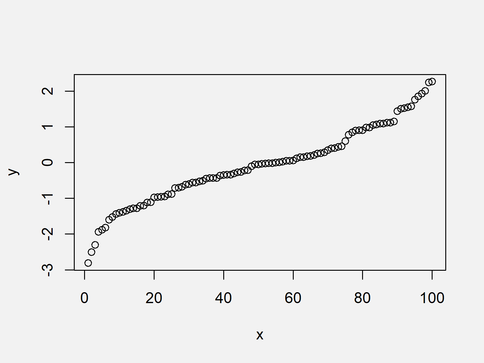
Figure 1 visualizes the output of the previous R syntax: A scatterplot showing our data. However, this scatterplot does not show a fitted curve yet…
Example 1: Creating Scatterplot with Fitted Smooth Line Using Base R
The following R code explains how to draw a fitted curve to our example plot. Have a look at the following R code:
curve_values <- loess(y ~ x) # Apply loess function
plot(x, y)                      # Plot with line
lines(predict(curve_values),
      col = "red",
      lwd = 3)

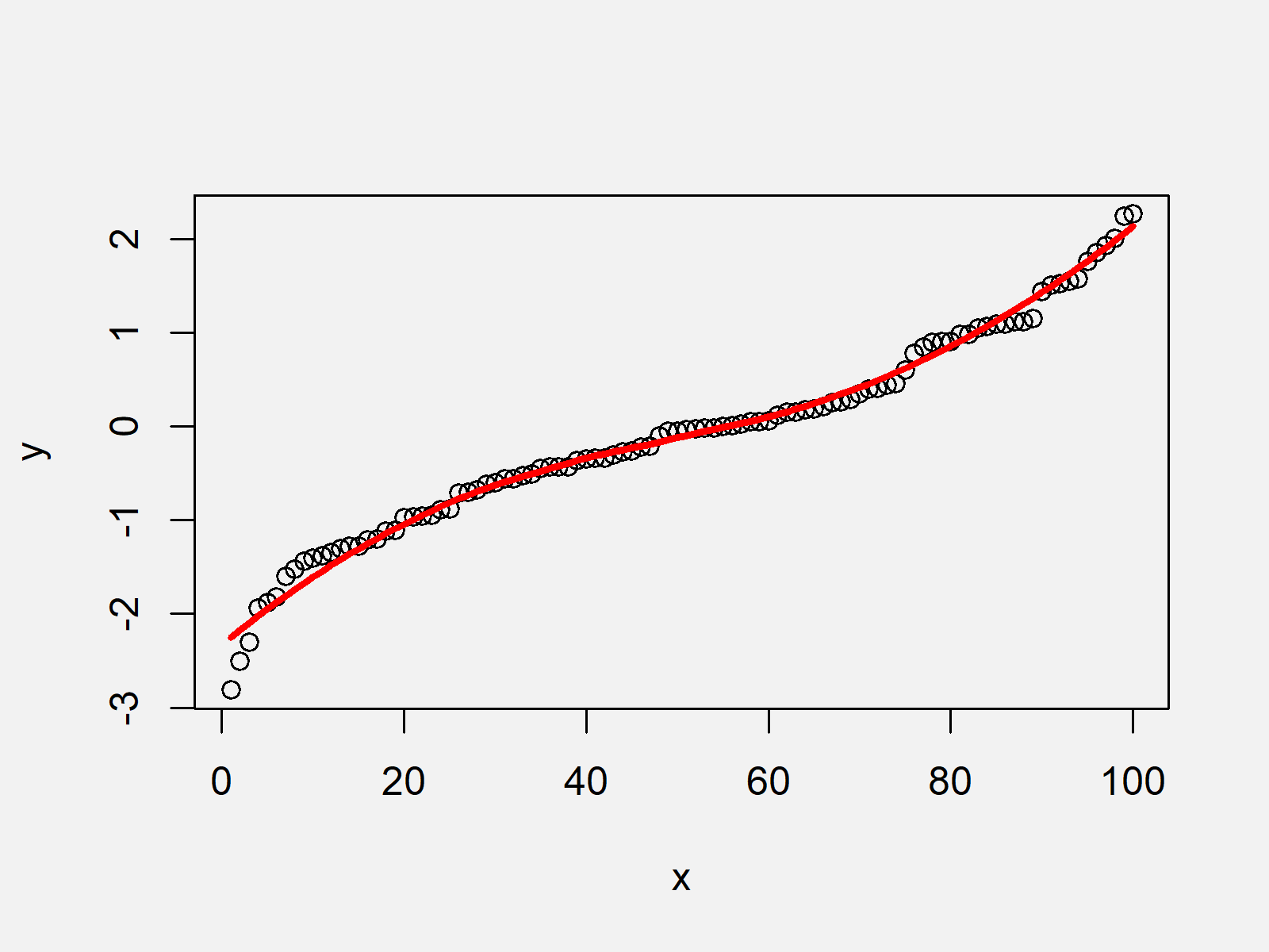
As shown in Figure 2, we created a scatterplot with a fitted curve with the previous R code.
Example 2: Creating Scatterplot with Fitted Smooth Line Using ggplot2 Package
Alternatively to Base R (as explained in Example 1), we can also use the ggplot2 package to draw a scatterplot with a fitted curve.
For this, we first have to store our data vectors in a data frame object as shown below:
data_ggp <- data.frame(x, y)    # Store values in data frame
head(data_ggp)
# x         y
# 1 1 -2.813293
# 2 2 -2.502170
# 3 3 -2.297299
# 4 4 -1.934714
# 5 5 -1.875186
# 6 6 -1.816849
Furthermore, we have to install and load the ggplot2 package:
install.packages("ggplot2")     # Install & load ggplot2
library("ggplot2")
Next, we can use the geom_smooth function to add a fitted curve on top of our scatterplot as shown below:
ggplot(data_ggp, aes(x, y)) +   # Draw ggplot2 scatterplot with smooth curve
  geom_point() +
  geom_smooth(se = FALSE,
              method = "loess",
              formula = y ~ x)

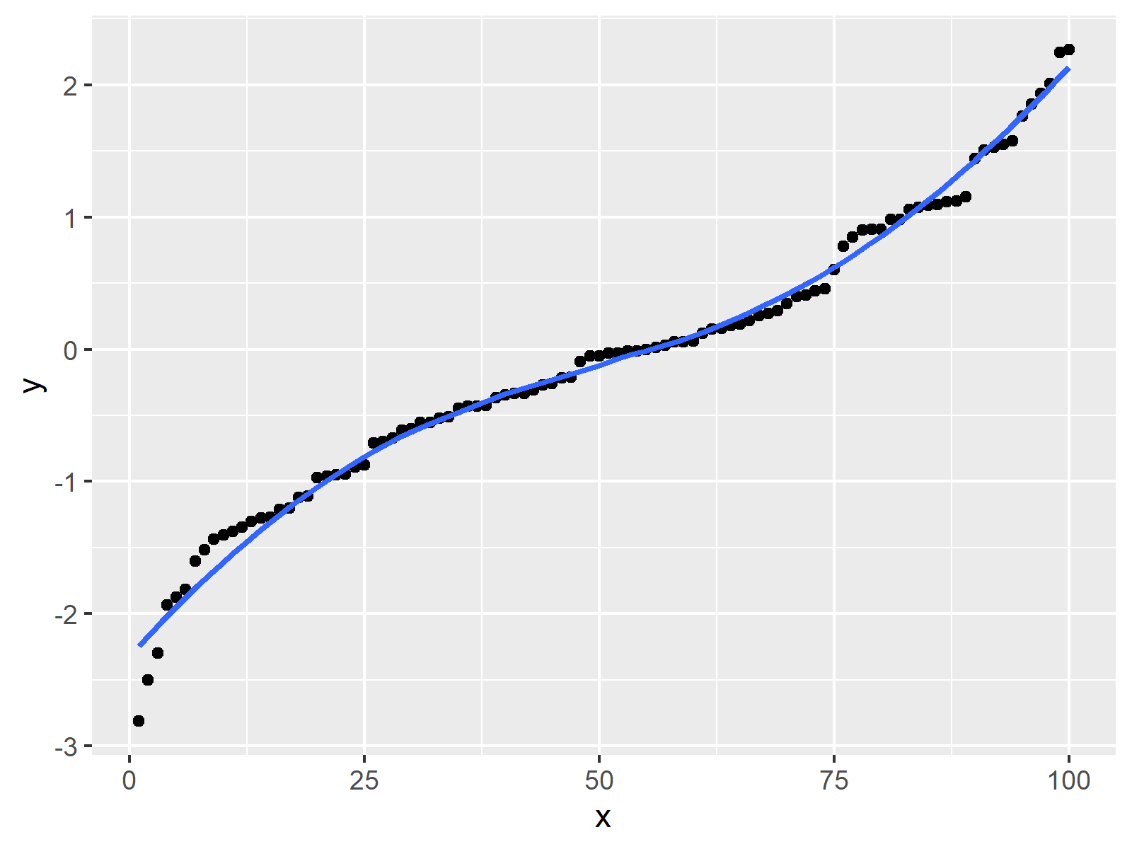
The previously shown figure visualizes the output of the previous R code – A ggplot2 scatterplot with smooth curve on top.
Video & Further Resources
Do you want to learn more about smooth curves in graphics? Then I can recommend watching the following video of my YouTube channel. In the video, I’m explaining the topics of this article:
Furthermore, you may have a look at the related R tutorials of my website. Some posts are shown below.
- The lowess() R Smoothing Function
- Overlay Histogram with Fitted Density Curve in Base R & ggplot2 Package
- The R Programming Language
Summary: You learned in this article how to add a smooth curve to a plot in the R programming language. In case you have further questions or comments, let me know in the comments section below. Furthermore, don’t forget to subscribe to my email newsletter to receive updates on new articles.


2 Comments. Leave new
Hi Joachim,
thank you for your detailed explanation! Is there a way to find out the equation of this curve? I actually have some values predicting the probability of a certain outcome (logistic regression has been performed previously). By using this variables, I want to fit a curve and use it to estimate the risk for this outcome for every single of my patients. This would be done by putting the predicting variables in the equation, right?
Thanks in advance!
Hello Lara,
It is hard to get the equation of a smooth curve, or maybe even impossible. Because geom-smooth is calculated by local regression. However, if you set a logistic curve, then you can use the predictors (x values) to predict the probability of certain outcomes.
Best,
Cansu