Change Line Width in ggplot2 Plot in R (Example)
This article explains how to control the width of a ggplot2 line graphic in R programming.
The tutorial consists of the following content:
- Creating Example Data & Default ggplot2 Plot
- Example: Increasing Line Size of ggplot2 Line Graph
- Video, Further Resources & Summary
Let’s dig in:
Creating Example Data & Default ggplot2 Plot
In the example of this page, we’ll use the following data frame as basement:
set.seed(9631)                        # Create example data
data <- data.frame(x = 1:10,
                   y = runif(10))
data                                  # Print example data
#     x           y
# 1   1 0.851141398
# 2   2 0.876296546
# 3   3 0.648471131
# 4   4 0.732913711
# 5   5 0.000567792
# 6   6 0.651257181
# 7   7 0.566334969
# 8   8 0.074362386
# 9   9 0.827380425
# 10 10 0.126809397
Our example data consists of ten rows and the two columns x and y.
Furthermore, we need to install and load the ggplot2 package to RStudio:
install.packages("ggplot2")           # Install and load ggplot2
library("ggplot2")
Now, we can draw a line plot with default specifications as follows:
ggplot(data, aes(x, y)) +             # Create default line plot
  geom_line()

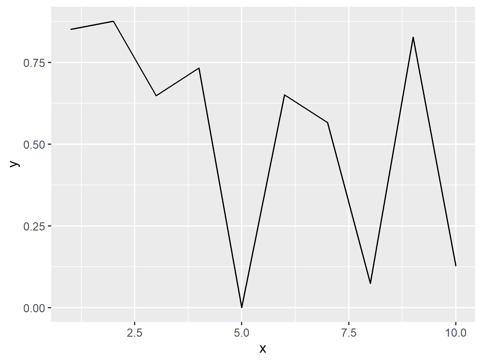
Figure 1: Default ggplot2 Line Graph.
Figure 1 shows the output of the previous R code – A basic line plot with relatively thin lines created by the ggplot2 package.
Example: Increasing Line Size of ggplot2 Line Graph
If we want to control the width of our line graphic, we have to specify the size argument within the geom_line function. Have a look at the following R code and the resulting image:
ggplot(data, aes(x, y)) +             # Increase line size
  geom_line(size = 3)

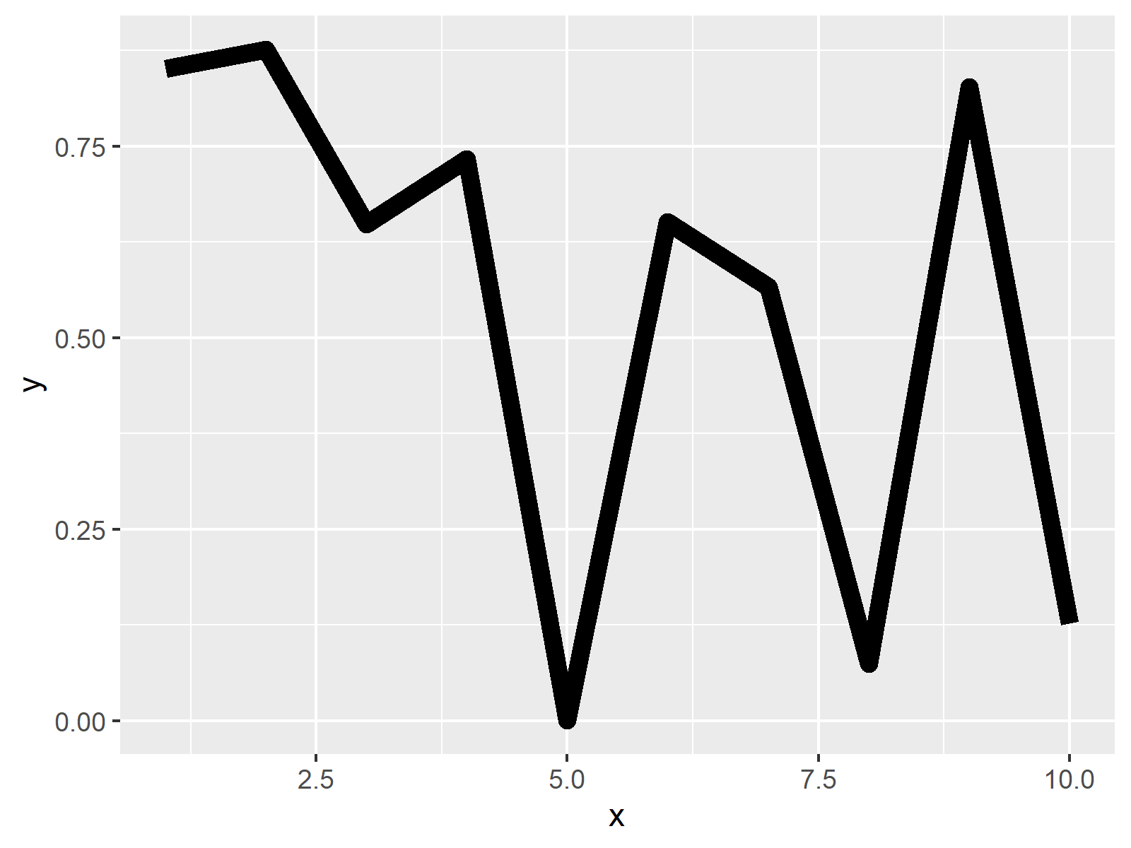
Figure 2: ggplot2 Line Graph with Thick Line.
As you can see, the previous R syntax increased the size of the lines of our plot. By increasing or decreasing the number that we specify for the size argument, we can control the width of our plot lines.
Video, Further Resources & Summary
Do you want to learn more about plotting data in R programming? Then you might want to have a look at the following video tutorial of my YouTube channel. In the video, I show the topics of this tutorial in a live session in RStudio.
Furthermore, you may want to have a look at the other articles of my website. I have published numerous other articles on the plotting of data with ggplot2 and Base R already.
In this R tutorial you learned how to modify the shape and thickness of lines in a ggplot2 plot. Tell me about it in the comments section, if you have any additional questions.


