Change Colors in ggplot2 Line Plot in R (Example)
In this article you’ll learn how to adjust the colors of a ggplot2 line graph in R programming.
The post consists of this content:
Let’s just jump right in:
Example Data, Packages & Basic Graph
First, we’ll need to construct some example data:
set.seed(82764)                                    # Example data
data <- data.frame(x = 1:50,
                   y = rnorm(100),
                   group = rep(c("A", "B"), each = 50))
head(data)                                         # Head of example data
#   x           y group
# 1 1  0.33869077     A
# 2 2 -0.73755898     A
# 3 3 -0.03718212     A
# 4 4 -1.37656427     A
# 5 5 -1.68852677     A
# 6 6 -0.61795359     A
As you can see based on the previous RStudio console output, the example data consists of three columns. The variables x and y are numeric and the variable group defines which data point corresponds to which line.
We also need to install and load the ggplot2 package, if we want to use the functions that are contained in the package:
install.packages("ggplot2")                        # Install & load ggplot2 package
library("ggplot2")
Next, we can draw a graph of our example data:
ggp <- ggplot(data, aes(x, y, color = group)) +    # Create line plot with default colors
  geom_line()
ggp                                                # Draw line plot

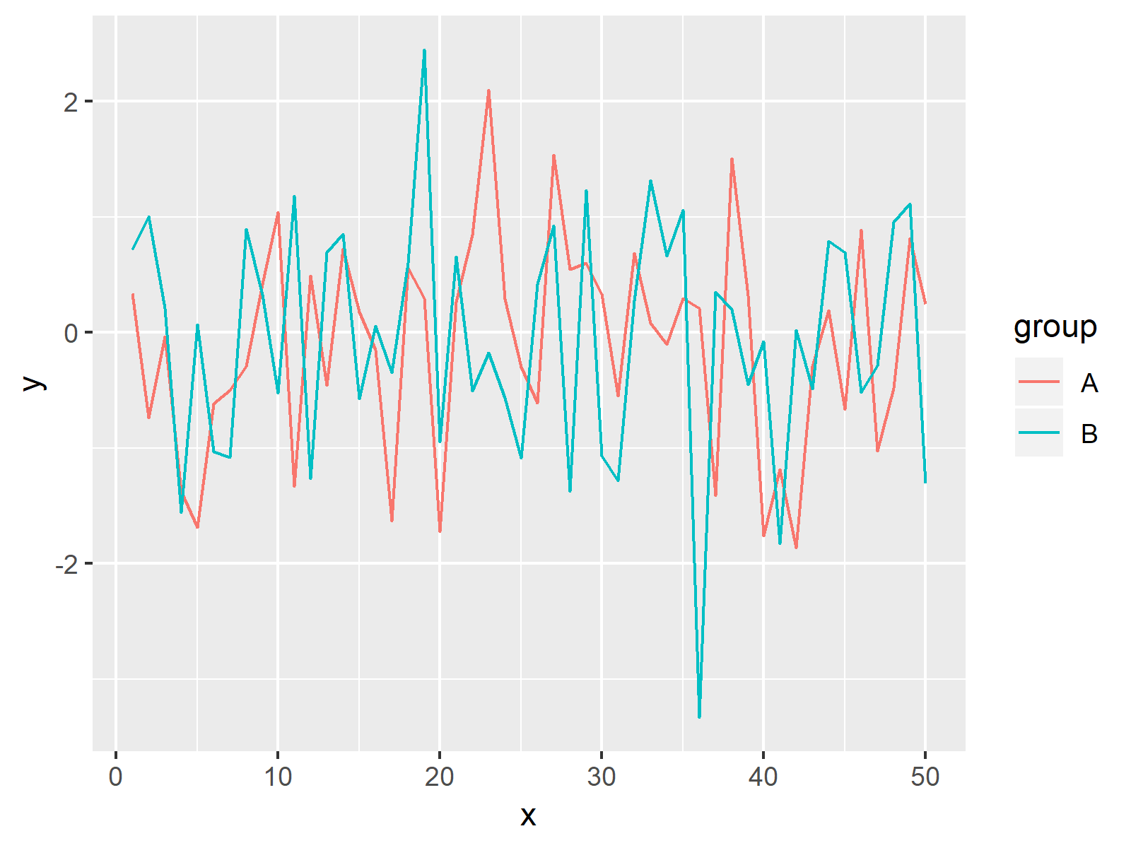
As shown in Figure 1, the previously shown code plotted a line chart using the ggplot2 package. The colors of the lines are corresponding to the default color palette of the ggplot2 package.
Example: Modifying Colors of ggplot2 Line Plot
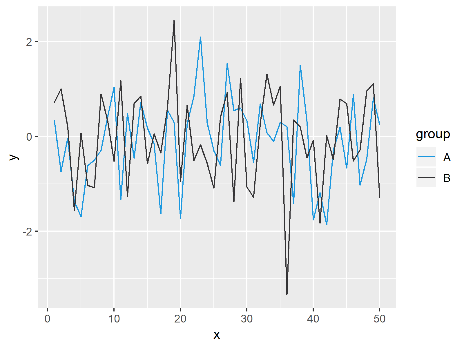
The following code explains how to adjust the colors of the lines in our line plot using the scale_color_manual function. As you can see below, we have to specify a vector of colors within the scale_color_manual.
ggp +                                              # Change colors of ggplot2 line plot
  scale_color_manual(values = c("#1b98e0", "#353436"))

The output of the previous R code is shown in Figure 2: Our example graphic with different line colors.
Video & Further Resources
Would you like to know more about the modification of colors in ggplot2? Then you may have a look at the following video which I have published on my YouTube channel. I’m explaining the R programming codes of this article in the video:
In addition, you might have a look at the related posts that I have published on www.statisticsglobe.com. A selection of tutorials about the ggplot2 package is listed below.
- Assign Fixed Colors to Categorical Variable in ggplot2 Plot
- Coloring Plot by Factor
- Extract Default Color Palette of ggplot2 R Package
- R Graphics Gallery
- The R Programming Language
In this tutorial, I illustrated how to control colors of a line graph in R programming. Please let me know in the comments, in case you have further questions. In addition, don’t forget to subscribe to my email newsletter in order to get regular updates on the newest articles.


